


Vellum Venom: 2014 Mitsubishi Mirage ES

Design School forces considerations outside of a student’s artistic comfort zone: a unique price, demographic, or geography for starters. Just don’t present a pragmatic design based in sociocultural fact: a conventional sedan for the Indian market–isolating the wealthy from their hired help and their untouchable luggage—was a fantastically stupid mistake. Cultural and profit-minded relevance aside, that’s the not-so-secret secret I’ve mentioned before in this series. Cars are made under a litany of profit-minded constraints, no matter what they may teach in design school.
And some thrive in their design constraints.
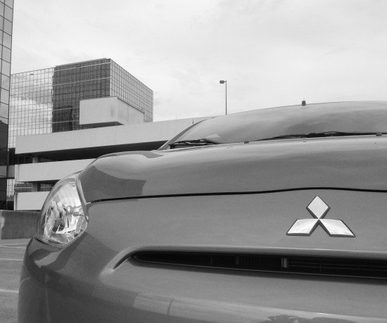
A slot. Just a slot: no big stupid Audi-esque maw, no poseur Aston Martin grin, no bullshit. The 2014 Mitsubishi Mirage ES is a snub-nosed hatchback working hard to reduce frontal area, with a .28 drag coefficient to boot. It took an unappealing template and made it work with a modicum of functional style and elegant interplay between elements and cut lines.
If only there was an ever-so-slight curve (down into the bumper) to the hood+fascia cut line.
Respect the slot…as it slices into the lower bumper.
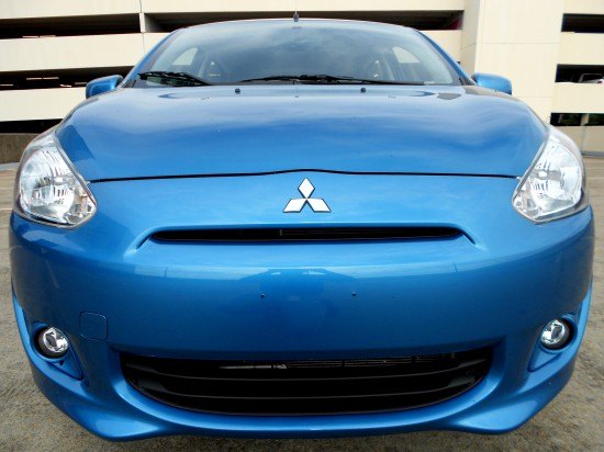
No love for the badge so big that the hood cut line must bend to clear it. This is one excruciating element in modern automotive design, a Britches-Busting Badge dominating many an automotive face for no reason.
Not necessarily Mitsubishi’s fault, but the natural contours of the body must come first.
Oh Lamborghini, why must you bring credence to this abomination of a branding exercise?
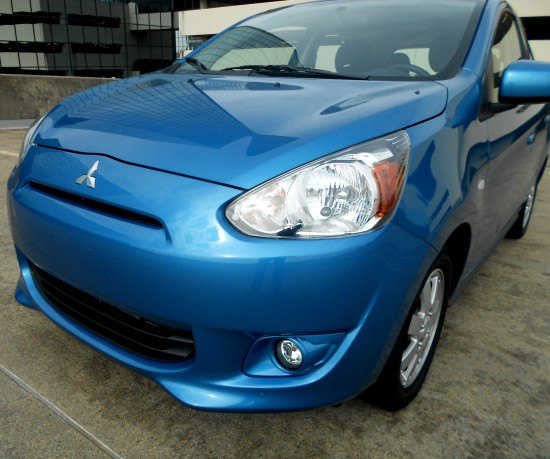
Several harmonious elements, all with a “flow” that (attempts to) draw your eyes to a long and sleek form. Like how the grille slot’s earth-bound vanishing points are shared with the lower grille. The Mirage’s lower bumper has devil horns at each corner, arcing to the wheels. Then the fog light’s recess with upward slash into the Mirage’s side. And finally, hood bulges that mimic the headlight’s contours as it flows to the windshield.
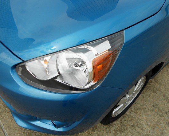
Transition to the fender: where’d the flow go? Small and cheap cars wind up with bug-eyed headlights on a stump-like face. All the flowy goodness from the last photo is gone in the name of compact car proportioning.
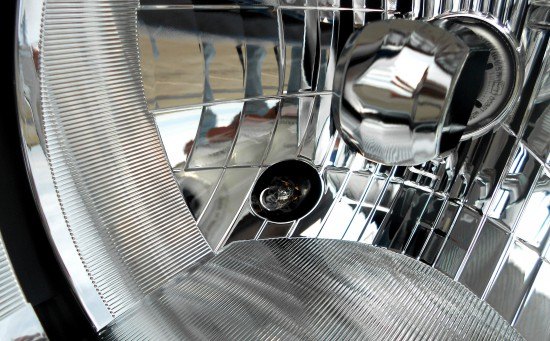
After experiencing these in my 1983 Ford Sierra Ghia in dawn/dusk conditions, the gentle glow of the headlight assembly when in parking light only mode is cool. Glad this bulb made it into the US-spec Mirage.
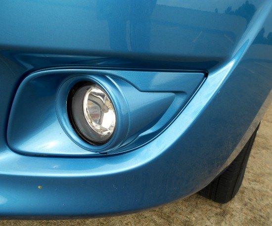
There’s a fake bezel and a fake(?) cylindrical housing inside the bumper’s fog light insert. Looked better before I said that, right?
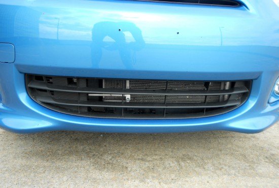
The lower grille needs a Prancing Horse emblem à la Ferrari 612 Scaglietti. Mostly to be preposterous, but also to reward the clean integration worthy of more expensive metal: a nice contrast to the uber-subtle slot just north.
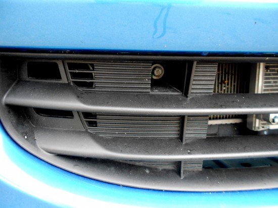
Too bad there isn’t one texture, instead of false teeth, small rectangles and larger rectangles. A dark-colored bolt would be nice too.
Here’s where the small car headlights really stand out. Even with the dimensional constraints, kudos to Mitsubishi for stamping out a reasonably bullet-nosed schnoz for such a short (length) and tall (height) machine.
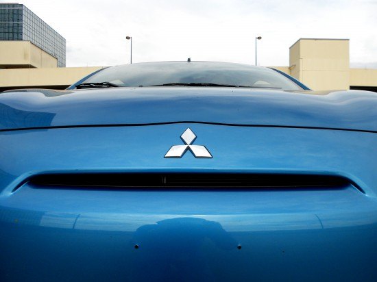
Here’s a tidy cowl area, with the requisite windshield-to-fender modesty panel in black plastic. If only the hood extended further back to (presumably) reduce that panel’s size…and still actually open.
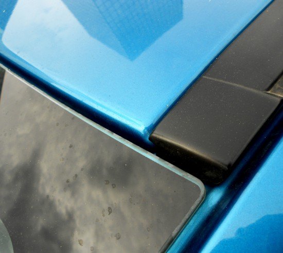
Large gaps around the windshield somewhat disappoint, but the metal work and paint quality remain respectable.
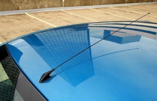
I used the term “honest” quite often in my review of this machine, no better proof than this antenna.
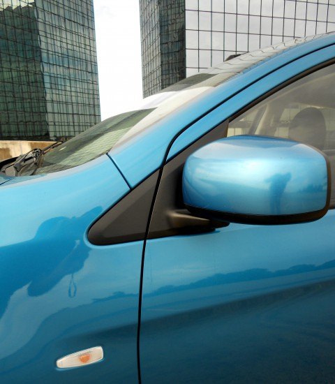
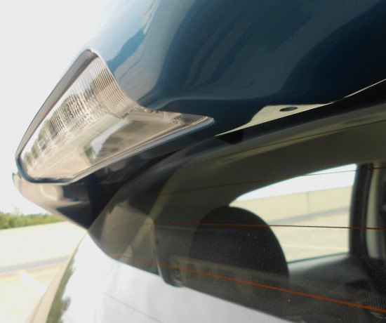
The repeater light and its subtle curve can’t take your eyes away from the DLO FAIL for long. Too bad the fender to A-pillar line can’t merge with the door to A-pillar line without losing the Mirage’s faux-sleekosity. (i.e. push the door cut line forward, making it rather boxy)

Gray rocker covers are unexpected when exposed unibody metal construction are acceptable for a cheap car. I was expecting blue-painted folds, creases and spot welds! Nice.
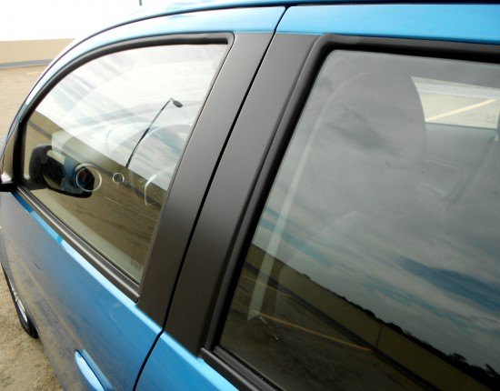
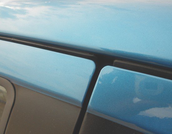
There’s a reassuring linearity and solidarity in these fast yet upright lines. The B-pillar’s black paint is a nice touch, since the belt line rubber demands a harsh transition from window to door frame. Compare this to something zany like the Nissan Cube.
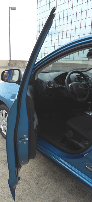
A dash of tumblehome evident when opening the door: not bad for a small car that’s surprisingly roomy inside.
Tighter and more uniform panel gaps wouldn’t hurt.
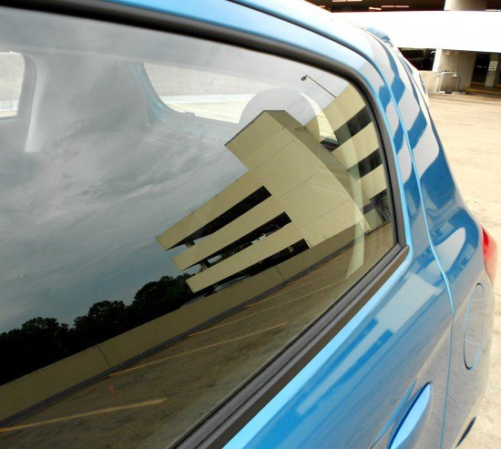
The Mirage’s DLO FAIL free rear doors and fixed window free glass was a nice touch at this price. Also note the window’s outline empathizes with the door cut line and the hatchback’s outline.
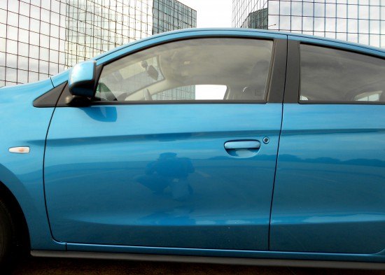
The roofline has a Prius-like, teardrop fall. If it wasn’t for the DLO fail, there’d be an elegant flow from door to roof, to B-pillar. The strong bend above the door handle along with its softer partner below adds visual excitement to an otherwise plump and forgettable form.
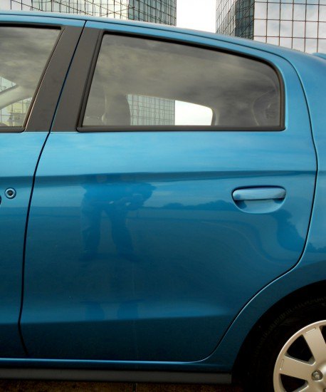
While not as pretty as the close up you saw two photos ago, the upward belt line matches the trajectory of the two sheet metal bends below. The door cut line is on point with the B-pillar, elegantly encasing the rear door.
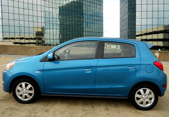
Step back and it’s still a cheap 5-door subcompact. No matter what!
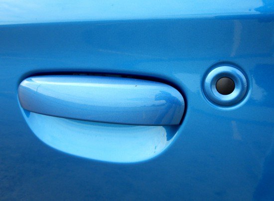
Wait…are those flush mounted, non pull-lever type door handles? My design pet peeve hurdle cleared, the replacement of a conventional key lock for the ES-grade Mirage’s keyless system is logical, ergonomic and cost-effective.
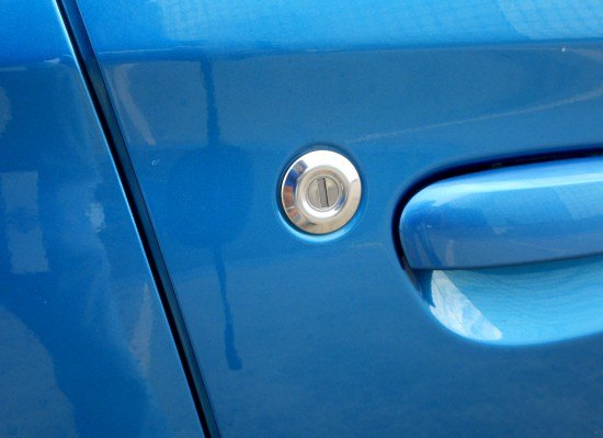
A cheap car gets away with this: plus the passenger’s key lock makes sense if the transmitter fails harder than the DLO on a Chevy Cruze.
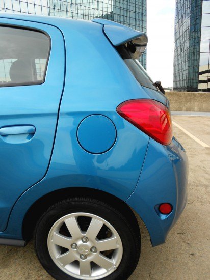
Man, that’s a huge gas door. Except it’s a normal-sized door on a small car with a seriously short overhang. If only there was a more elegant attachment point for the wraparound rear bumper. Considering this car’s intended market (crowded streets in third-world nations) the wraparound bumpers are more than mandatory.
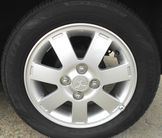
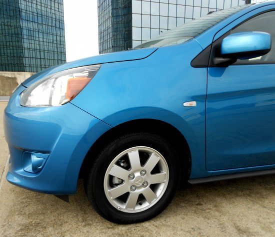
The Mirage’s 14” wheels are static and uninspiring, except not: wheels this small are a treat if you’re sick of rubber band side walls from ill-proportioned mad-tite rims.
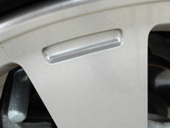
Another pet peeve: those fake slots do no favors to the wheel’s design. Either have real negative area, or make a flat casting.
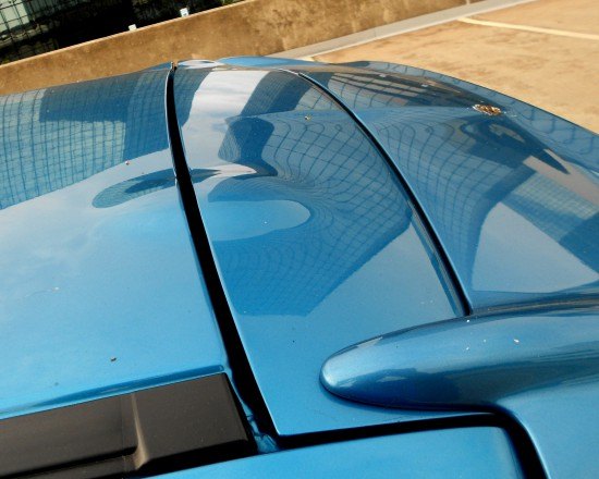
Much like the Dodge Viper coupe’s helmet friendly roof design, the Mirage has little dimples for the hinges. It’s acceptable when viewed with spoiler’s speed bumps. The huge panel gaps, however…
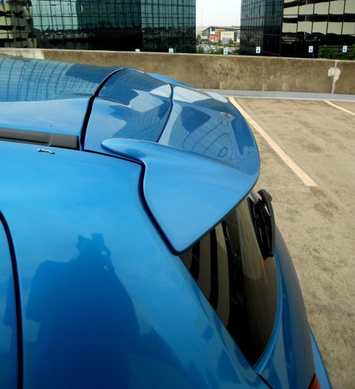
It’s a rare occasion when a car actually needs a spoiler to complete the look, and the Mirage needs it more than a Plymouth Superbird!
Too many static elements: strong and steady cut line, downward sloping wedge from the quarter panel to the bumper and another lump that expands toward the bumper’s center section. These lumps aren’t structurally relevant, get a rounder bumper cover to mimic the front end’s bullet look instead.
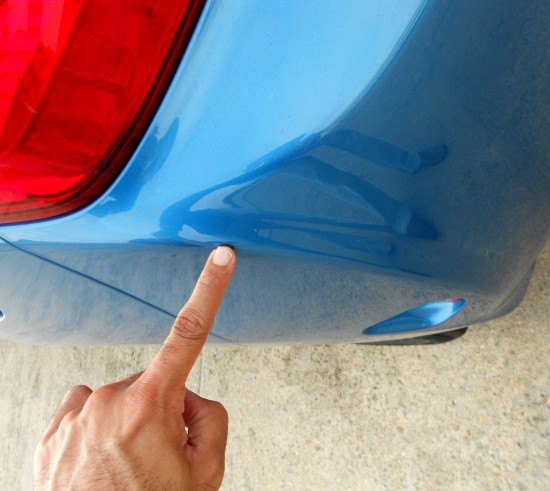
Yup, round it off. (EDIT: enlightened reader SamTheGeek mentioned this is for aero, contributing to the Mirage’s fantastic numbers. So nevermind.)
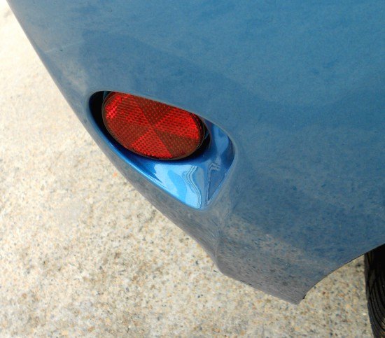
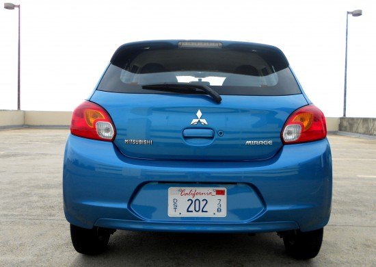
The Fallout Shelter reflector logo in the deeply sunken housing brings a smile to one’s face.
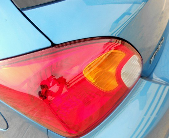
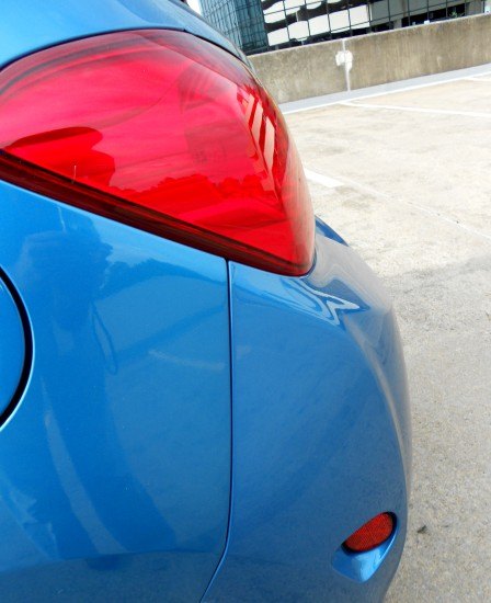
The Venn Diagram worthy tail light cluster looks outdated by today’s standards. But compare the Mirage’s eyes to the cyborg (no pun intended) look of a Chevy Spark, maybe old and boring ain’t so bad.
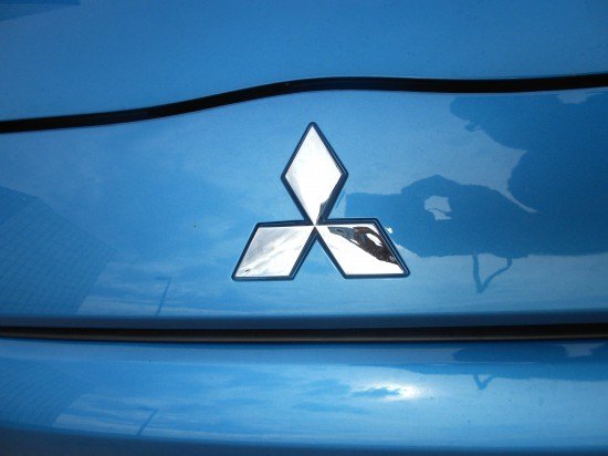
The plasti-chrome emblem was unexpected: no cheapie vinyl-jelly decal? While the bumper’s transition to the hatchback is pleasant enough, the hatchback itself could benefit from pushing the tail light “back” to create an uninterrupted flow from the base of the door to the crest of the tail light.
What was that phrase about the shortest distance between two points? Or just a gentle curve instead. Don’t fight the flow!
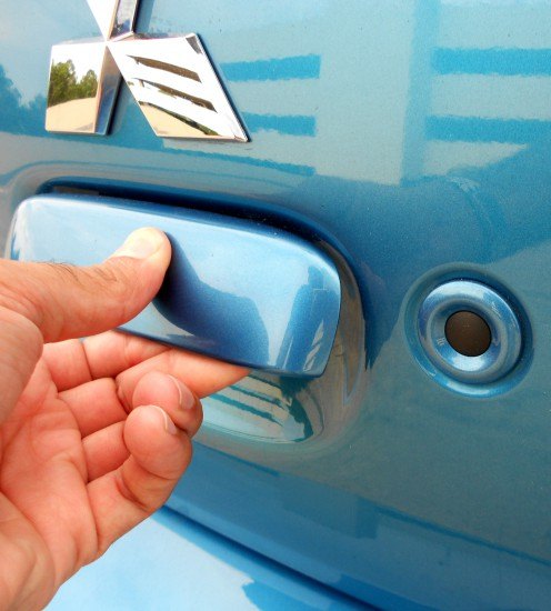
Oh wow, another unconventional handle! And that cute little button again! Replicating a design saves money, and these bits are far from offensive the third time ‘round.
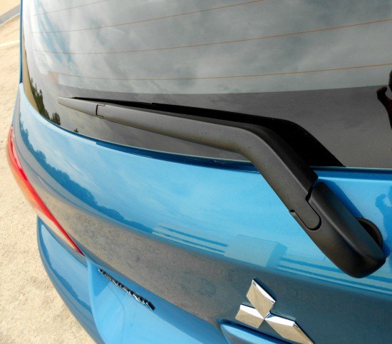
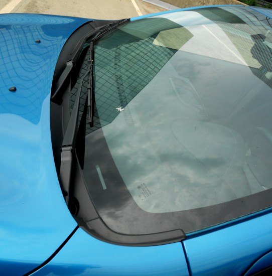
Imagine if the hatchback did indeed move in a solid, singular sweep from its base to the top of the tail light. No matter, console yourself with the clean lines introduced in the wiper arm.
The spoiler sure has a well-integrated CHMSL, too bad it isn’t red like the tail lights.
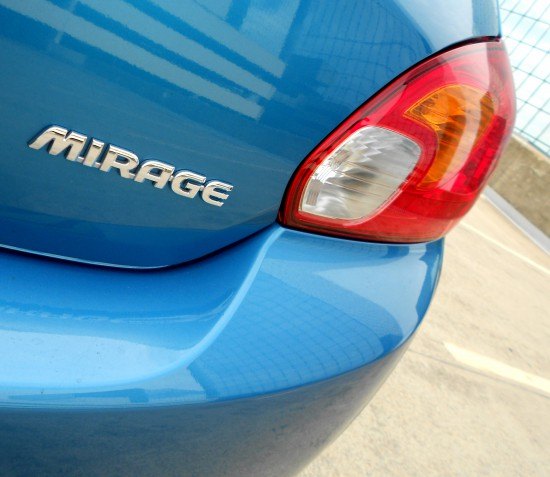
Again, problems emblematic with the brand: the logo is too big. Uncomfortably close to the handle and the transition to the rear glass, logos must stop dominating vehicle design. And imagine if the hatchback had a smoother line so it wouldn’t play second fiddle to the tail lights!
Yet here’s proof that fundamentally good, honest design lies in the most unexpected places. While the Mirage’s sins are unacceptable at a higher price, these are white lies and not all out deceit. Never in my wildest dreams could I imagine liking the Mirage to this extent. But whatever, life is full of contrasts.
Thank you for reading, I hope you have a lovely week.
More by Sajeev Mehta


Comments
Join the conversation
I can't stand the back plate. It's not mounted level and that is really bugging me.
Funny, I don't remember this in real life! Wow!