Abandoned History: The Current Buick Logo, Just One of Many (Part II)

There has been much speculation over the past week regarding General Motors’ trademark application for a new Buick logo. Likely related to a swath of new EVs on the horizon (but not yet confirmed), the news fired up the old Abandoned History thought box. Why not take a look at all of Buick’s past logos? We began yesterday in 1903, and pick up today in 1942.
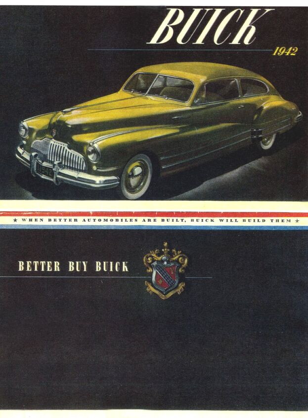
There were some extensive changes to Buick’s logo that year, as the company embraced brougham. The Buick family shield grew larger and more shield-like, with curved edges decorated in a thicker chrome perimeter. The top of the shield was adorned with a silver ball and floral flourishes, with other ribbon decorations at both ends. A diagonal blue and white banner remained, but the blue segments became diamonds instead of squares. The brand suggested you’d “Better Buy Buick.”
The new for ’42 logo was presented within a black circle with a chrome ring, though the black circle was left off of exterior badging. 1942 was a one-off logo year, as WWII intervened for model years 1943 through 1945. Production resumed in fall that year for model-year ’46. The heraldic badge returned for a second and final time.
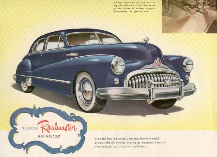
The fanciful ’42 and ’46 badge was revised extensively for 1947, with a notable removal of fussiness. Floral and ribbon decoration around the logo was removed, and the shield was no longer presented on its own. Instead, it was inset into a larger grille trim assembly in chrome. It grabbed much more attention than the shield by itself, as seen here on the ’47 Roadmaster. It should be noted the 1942 badge remained in use on Buick steering wheel centers through 1958, even though there were several exterior badge revisions.
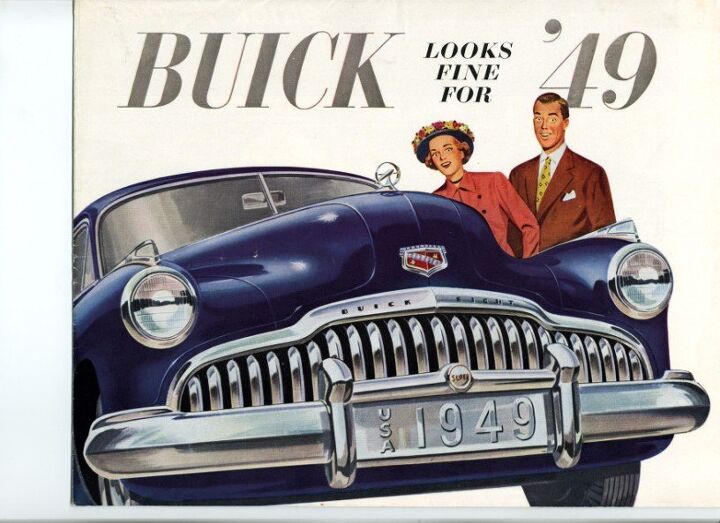
1948 Buicks reflected the inset grille badge one last time, as the shield was freed from its chrome shackles in 1949. Wider than before and ringed in a thicker chrome, the ’49 shield had new detailing in its red inner portion, with vertical lines. The deer and cross appeared once more, though sharper in definition. The cross was revised in particular and lost the cutout it had in the middle since inception. The diagonal grew wider and covered more real estate in the center of the badge.
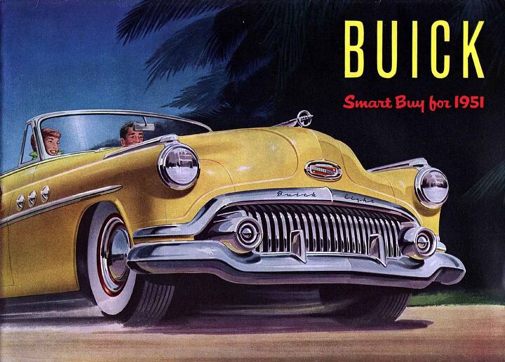
There was a revision of the badge’s shape in 1951 when it grew much wider than it was before. Again it was encased in chrome, this time an oval. Though it was much larger than before, this particular badge alteration is not typically noted by online sources.
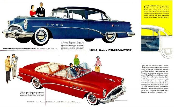
In 1954 the Buick badge disappeared altogether and was no longer presented on the exterior. In its place was block BUICK lettering. The cars gained stylized model designation badging on their rear fenders, highlighted by a red circle behind the model name’s first letter. Block lettering took the place of a badge through 1957. At that point, a red, white, and blue circular trim detail was added in the grille of all Buicks, with a chrome spear to either side.
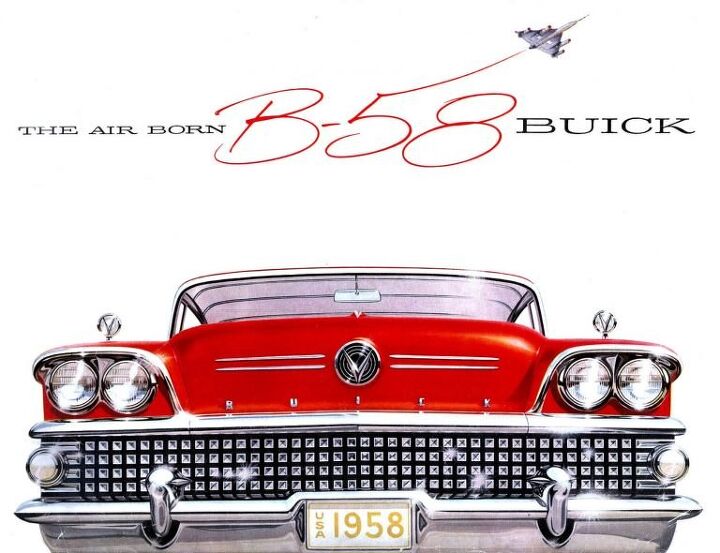
The American-themed disc was only present in 1957, as for 1958 all Buicks were restyled with the failed Fashion-Aire Dynastar look. Buick relied on a generic V emblem in the hood that year, flanked by very widely spaced Buick block lettering.
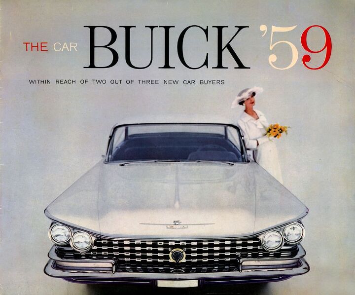
1959 saw an emergency restyling at Buick, and all the cars got very angry looking at the front. Buick lettering was written inside a white background, with a bit of additional chrome detailing. The 1942 heraldic Buick crest (sans black backing circle), was still found on interiors this year.
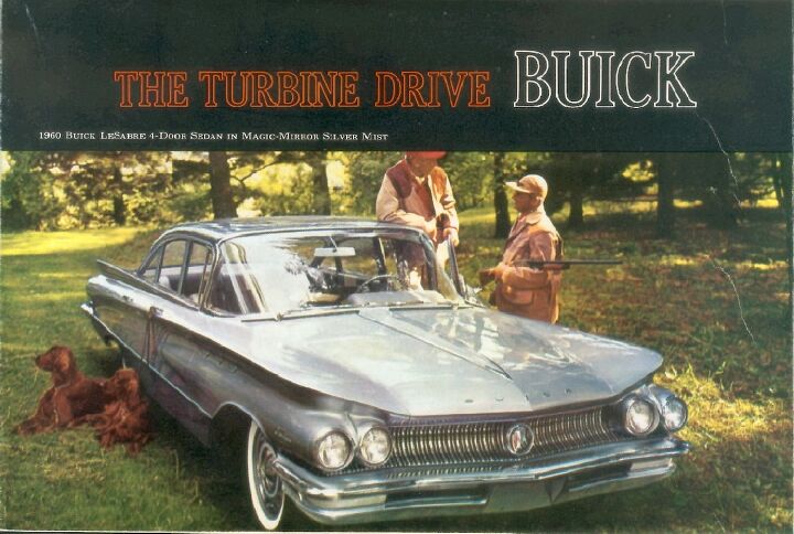
The following year in 1960, Buick completely altered its logo identity into the basic format we have today. The Buick family shield with its deer, cross, and diagonal two-tone décor was multiplied by three, and inset into a chrome circle. The shape of the shields was closest to the 1939 logo and was shown in red, white, and blue. The three shields were layered over one another slightly and stepped upward from left to right. And there was a deeper meaning: The three shields were meant to represent the full-size triple threat Buick offered at its dealers, in the form of the LeSabre, Invicta, and Electra.
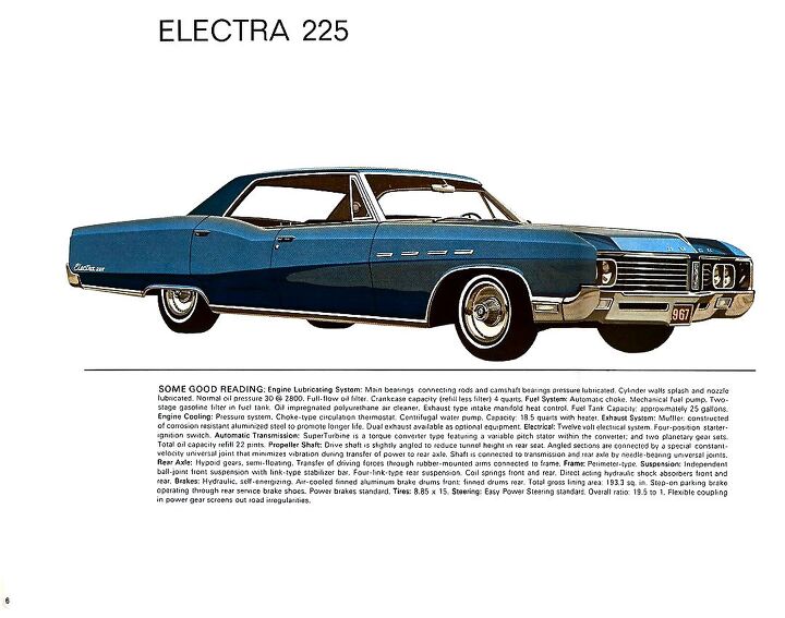
The new tri-shield logo remained unchanged through 1966, having migrated from grille to the hood ornament in the intervening years. In 1967 it transitioned to a rectangular inset grille plaque, as Buick deleted hood ornaments that year. In 1968 the plaque behind the logo went away, and the tri-shields were placed directly onto the grille trim.
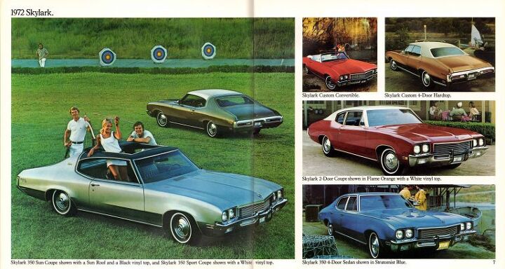
Shields migrated from the grille area back onto the hood in 1970. In 1972 the circle around the shields returned a triumphant throwback to the Sixties design. The badge became a hood ornament once more in 1975.
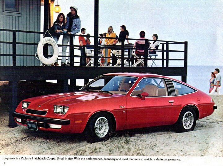
A secondary badge was added for Skyhawk models at their debut in 1975. The logo displayed a flying hawk from a side perspective, facing to the right. Around it was a chrome circle that the bird’s wings extended past. The badge was limited to the Skyhawk, while all others in the lineup kept the traditional shield badge. The unique Skyhawk badge died with the first generation model after 1980.
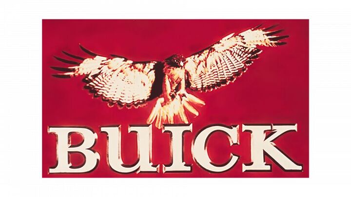
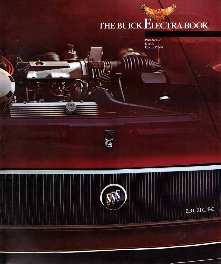
In 1976 Buick went all-in on hawk-themed marketing for some reason but did not change the tri-shield logo. To represent the brand generally, a hawk was pictured landing on the Buick lettering. This hawk branding was used in various ways between 1976 and 1990.
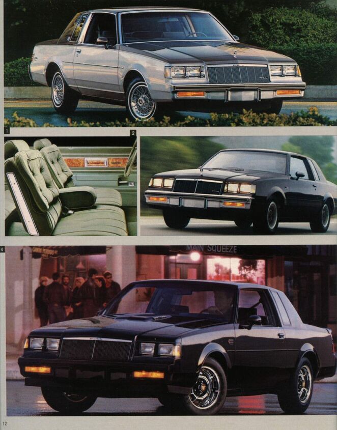
In the early Eighties, some Buicks had a hood ornament if they were more expensive, but they were cheaper or sportier (like a T-Type) they didn’t. In 1985 the Buick logo went through a notable modernization and the removal of heraldry. Gone were the shimmering facets from the shields’ diagonal banners, and gone too were the deer and cross introduced in 1937. The shields were simplified and smoothed, now in their respective red, white, and blue colors. There was a simple diagonal chrome decoration where the diamonds used to be. The logo was now backed in solid black.
Newly available was a separate and nonspecific red and black heraldic hood ornament. This was only on some models (like Electra) and again sportier or cheaper models went sans hood ornament. The following year the red and black were exchanged for a blue and white design instead. It nixed the heraldry look and was simply a square. The blue and white logo was used on more models and even appeared as a fender badge in some instances. By 1990 the various other types of hood ornaments were phased out, and Buicks returned to a logo inset into the grille or a standard hood ornament.
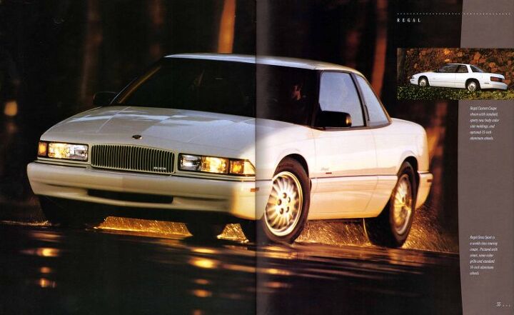
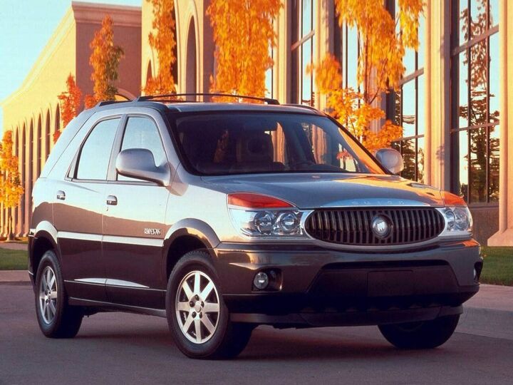
Logo design remained the same through the 1990s, and saw the introduction of a cloisonne badge on the hood or grille of higher performance models, for example, the Park Avenue Ultra or Regal GS. The ’90s and on through 2001 would be one of the longest stretches without a Buick logo switch-up, but that changed in 2002. Shall we Rendezvous?
Buick’s new crossover was the first of its products to wear a new, color-free logo. Much like it had been bitten by a large mosquito, the color drained from the Buick logo. All shields were done fully in chrome and were hollow in the center for the first time. The other models in the Buick lineup persisted with the old logo until the next time they were refreshed in one or two years. But that era was an end for traditional Buick models. Circa the middle of the 2000s decade, Century and Regal were replaced by LaCrosse. The LeSabre and Park Avenue were replaced by the Lucerne.
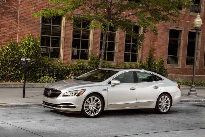
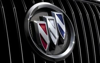
Most consumers didn’t care about the plain Jane color-free logo, but the ones who did called for the traditional Americana-themed badge to return. Buick complied in 2017 when it reintroduced the colored shields, with new detailing. First introduced to the LaCrosse, the badge was a bit more three-dimensional than it was before and ringed in a thicker chrome. There was some new detailing added back to the shields themselves, as the red, silver (not white), and blue areas received new vertical stripe detailing. The logo was once again set into a black background.
And that brings us to the present day, where there might just be another logo on the way. When it’s officially announced we’ll let you know, but until then enjoy having way more information about the Buick logo than you ever thought you needed. That’s the Abandoned History way.
[Images: Buick]

Interested in lots of cars and their various historical contexts. Started writing articles for TTAC in late 2016, when my first posts were QOTDs. From there I started a few new series like Rare Rides, Buy/Drive/Burn, Abandoned History, and most recently Rare Rides Icons. Operating from a home base in Cincinnati, Ohio, a relative auto journalist dead zone. Many of my articles are prompted by something I'll see on social media that sparks my interest and causes me to research. Finding articles and information from the early days of the internet and beyond that covers the little details lost to time: trim packages, color and wheel choices, interior fabrics. Beyond those, I'm fascinated by automotive industry experiments, both failures and successes. Lately I've taken an interest in AI, and generating "what if" type images for car models long dead. Reincarnating a modern Toyota Paseo, Lincoln Mark IX, or Isuzu Trooper through a text prompt is fun. Fun to post them on Twitter too, and watch people overreact. To that end, the social media I use most is Twitter, @CoreyLewis86. I also contribute pieces for Forbes Wheels and Forbes Home.
More by Corey Lewis
Latest Car Reviews
Read moreLatest Product Reviews
Read moreRecent Comments
- Orange260z I'm facing the "tire aging out" issue as well - the Conti ECS on my 911 have 2017 date codes but have lots (likely >70%) tread remaining. The tires have spent quite little time in the sun, as the car has become a garage queen and has likely had ~10K kms put on in the last 5 years. I did notice that they were getting harder last year, as the car pushes more in corners and the back end breaks loose under heavy acceleration. I'll have to do a careful inspection for cracks when I get the car out for the summer in the coming weeks.
- VoGhost Interesting comments. Back in reality, AV is already here, and the experience to date has been that AV is far safer than most drivers. But I guess your "news" didn't tell you that, for some reason.
- Doc423 Come try to take it, Pal. Environmental Whacko.
- 28-Cars-Later Mazda despite attractive styling has resale issues - 'Yota is always the answer.
- 28-Cars-Later Try again.














Comments
Join the conversation
Yes, I looked up photos of the 1999 Riviera, and the logo was effectively the same as on the '64.
My parents bought a 2004 Rendezvous and the one thing that's bugged me about it for it's entire life so far (I'm driving it now) is the stupid grey grill emblem. GM made it a bit better with the 06/07 models with the chrome tri-shield in that same place, which it looks a bit more like a proper Buick. I wish it had color tri-shields though. But when GM did away with the color is when they lost the plot for sure.