I recently started to think about automotive over styling. This is because many of today’s cars are styled to the point where you wonder if they had some contractual obligation with the supplier to put in as many unnecessary curves and creases as humanly possible.
This all got started when I walked by an E36 BMW 3 Series a few weeks ago. That is a handsome car. It has clean lines, and clean panels, and virtually no unnecessary curves or surfaces or trim. The thing is all purpose, all business, and somehow it still manages to be beautiful. I love it.
Modern cars aren’t quite so purposeful. One example is the Toyota Camry, which used to be pretty damn dull. In order to un-dull it, Toyota has apparently decided to change the grille and the fenders and the bumper and really make it “stand out” — for better or for worse. This is because Toyota knows it can’t really change the driving experience or else it’ll lose its loyal fan base. But it can change the styling, because people will buy the Camry almost regardless of how it looks, provided all the other desired items are present.
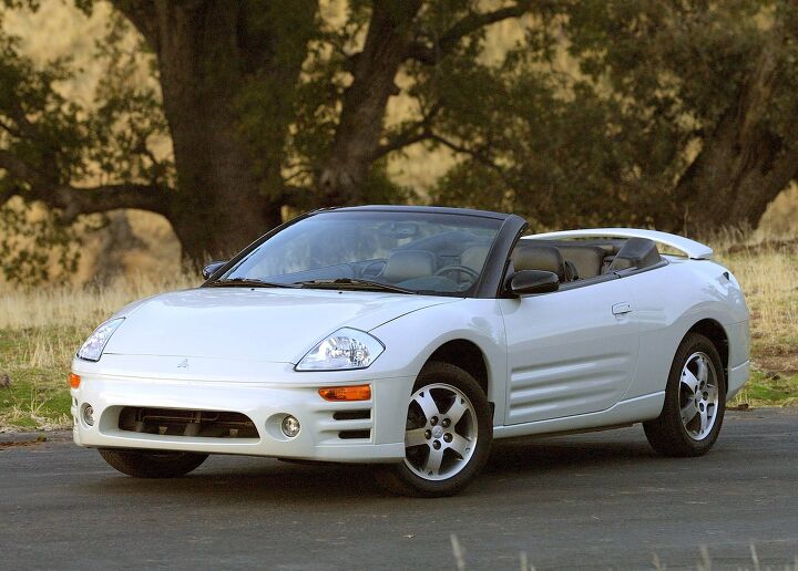
The first car I ever realized was over styled was the 2000 Mitsubishi Eclipse. Do you remember this car? The first few Mitsubishi Eclipse body styles had been handsome and clean and simple, and then the 2000 Eclipse came out. There were three lines inexplicably placed in the door, and three more lines inexplicably placed in the front bumper, and the taillights were weird circles, and I never really understood why the fuel filler cap had visible rivets in it, as if the Eclipse was some sort of classic car or off-roader SUV.
But I think the 2000 Mitsubishi Eclipse has nothing on today’s most over-styled car, which is undoubtedly the GMC Terrain.
For those of you who have not seen a GMC Terrain on the road, allow me to explain it for you. Here is a fairly standard compact or midsize SUV, depending on your definition, with fairly standard sizing, and fairly standard powertrains, and fairly standard pricing, and fairly standard options, and a design that looks like it should be bringing aid to earthquake victims in hard-to-reach places.
The overall profile of this thing is boxy and blocky, much like you’d expect to see from a real, terrain-tackling SUV. And then there are the boxy wheel arches, which are so ridiculously over styled to make the Terrain look like an off-roader that you have to wonder if the designer was cringing even as he was sketching the thing on paper.
There are two other funny things about the Terrain that make it seem even more over styled — if that’s possible.
One is the fact that it shares virtually every mechanical component with the Chevrolet Equinox, which is a fairly normal looking crossover with curves and sweeping lines and normal wheel arches. In other words: in an effort to distinguish the Terrain from its Equinox sibling, General Motors went hilariously overboard.
And then there’s the other hilarious thing about the Terrain’s styling: the damn thing has absolutely no off-road capabilities at all. Not only do most Terrain models come with a four-cylinder engine that can barely pull the thing around, but there’s no ground clearance, no decent approach or departure angle, no advanced 4-wheel drive system. Effectively, this is the showiest, most non-off-road off-road-looking SUV since the Hummer H2.
I can’t entirely blame the GMC Terrain for its styling, because this is a trend, this whole over-styling thing. Everyone is doing it, because everyone wants their cars to seem like more than they really are. You can’t just have a Camry; you have to have a sporty Camry. You can’t just have a Terrain; you have to have a rugged Terrain. You can’t just have a minivan, you have to have a cool minivan.
Or at least that’s apparently how the majority of car shoppers think based on current styling trends. Me, I prefer the clean, simple look, like that old E36. I’d rather my car didn’t look sporty if it isn’t sporty; I’d rather it didn’t look fast if it isn’t fast, and I’d sure as hell rather it didn’t look rugged if it isn’t rugged.
In other words: I’d get the Equinox.
Stricter crash regulation requires significantly higher beltlines than 25 years ago. Without creases and curves all that sheetmetal would look awfully slab sided.
That’s funny….my W 126 Mercedes-Benz 420 SEL is 25 years old, has clean lines, and does excellent in a crash. So what gives?
How would a pedestrian fare, though? I lot of this styling (including high belt lines to match the high hood) are to blend in the pedestrian impact requirements in Europe
Perhaps it has an influence but I believe much of the bad styling is by choice.
Well…with hidden wipers and collapsing hood ornament, prob not too bad. The headlight wipers might do some damage…like scratches maybe. I suppose that’s why new lux cars have retractable sprayers.
The only person I ever knew that hit someone, did it intentionally and killed them. Vehicular homicide isn’t uncommon, you know.
But seriously, you can’t save everyone. Even though the manufacturers are trying. Now you know why cars are getting uglier. I’m sure technology will help though.
PS. The new S-Class reaks of style, safety, and good taste.
The manufacturers arent trying so much as governments are.
You do realize that a lot of what we see is mandated, regulated and dictated, right? Think of how ugly side marker lamps were when they first became required. They were particularly bad on 1970s Japanese cars (as they were not required in Japan so they just stuck them on for the US market *after* the car was styled, making them literally an after thought). Eventually, they grew less noticable and more flowing with each new car’s design. Thats they way it works: first you must comply to sell the car, THEN you work on trying to make it look good.
As a whole, cars are much safer today. A car as safe as an older Benz S-Class is now affordably priced and plentiful,not as large and with much better mpg. Safety is no longer the sole domain of luxury cars.
No, it wouldn’t, compared to a modern car. There have been numerous tests demonstrating this.
your claim that a 25 year old W126 would do well in a crash is a little vague. If you mean to say it would fare well in either an offset frontal or side impact, that’s an extraordinary claim and will require extraordinary evidence. “I like Mercedes” won’t cut it.
my father was rammed in a w126 by a transit bus on the drivers side while driving, pushing the car 5-6 meters sideways. The safety cell held. Even the wood on the inside split without any sharp pieces as it is designed to do. He walked away without injury. The vehicle started and was able to be moved under its own power. This was a pre facelift model without any airbags
Mercedes-Benz has been crash testing vehicles as long as….if not longer than, VOLVO. My car has ABS, dual front airbags, shoulder belts fron and back, crumple zones, soft touch interior materials, etc. In 1991 (my model year) It was the last of an 11 year run…beginning in 1980. How many other cars, can say they had the first in that, and many other safety features STANDARD. NONE. Although Volvo comes close. S-Class has always been on the forefront of safety and technology. Please do some research before dismissing my remark as simply “liking Mercedes”.
I also own a 2013 S550 and an older XC70.
PS. Thanks OM617…U just proved my point.
Not exactly. Crash performance is nearly as much market-driven as it is regulation-driven, but either way this is not what has driven high beltlines. This is what has led to really big roof pillars and poor visibility, as well as big, bluff front ends. High beltlines are partly a result of fashion, and partly a result of packaging. Interior packages tend to be noticeably taller than they were in cars say 10-15 years ago, often with an H-point (in between the driver’s hips) that is at least a couple of inches higher, with a floor height that hasn’t really changed. (Look at, say, a new Camry vs. a ’93 Camry)
Otter’s right. There isn’t a requirement to get 5 stars on side-impact tests, and pedestrian safety standards only result in an 0.8 inch increase in hood/cowl height (the clearance you need above the engine). Or you could add a pop-up hood like the 2016 Miata gets in Europe (doesn’t need it in the US, apparently).
Look at concept car sketches from the ’90s – they already wanted high beltlines and tiny windows. Styling has always wanted to go that way and starting with the Audi TT, it finally did. Everyone loved it. Shortly after, you had the story of the focus group that felt the PT Cruiser needed a smaller rear window for a more secure feeling. It was going to happen even without regulations.
“Everyone loved it.”
When did we get to vote? And what manner of bizarre creatures voted to drive windowless coffins?
MR. MARK STEVENSON – PLEASE CHECK YOUR EMAIL
I left some CANDY for you.
I wasn’t sure if you got it or not.
I got it!
Awesome!
1. Toyota Mirai
2. The front fascia of any of Lexus’ newest models.
Lexus RC, because it’s rear wide hips and horizontal strakes just don’t, uh, mesh
The Lexus LF-NX gets my vote. It’s ugly so it sticks in my head. Just look at all the odd angles and weird pieces that look like George Lucas bolted some crap on it to make it a Star Wars runabout or space tug. I don’t see too many cars beating this in a overstyled car contest.
The Toyota Mirai is pretty damn close to the ugliest car I’ve ever seen. It seems like Toyota is actually trying to ugly their cars up across the board. I don’t understand “modern” styling at all. So many ugly cars coming out.
The question was not “What car is ugly?”, it was “What car is over-styled?”.
Drzhivago138, you don’t think the Mirai qualifies as overstyled? (Aside from ugly).
The new Lexus RX is bad enough to make baby Jesus cry.
EVERYTHING made by NISSAN.
+1
My god – what have they done to the new Maxima – Yuck!
Agree except for the Versa Note, which is a cleanly-styled, honest little hatchback. If they made a Versa Note SE-R with the 2.5 and suspension tweaks from the NISMO Juke, I’d buy one tomorrow (assuming it was cheaper than a Fiesta ST).
Yes, the new Maxima. I don’t necessarily think it looks bad, but it has way too many design features.
But the interior makes up for it in spades. Except I hear the seating position is crappy and the seats are not as comfortable as plain-looking ones in the Altima.
The new Max interior isn’t nearly as well executed as the one in the Murano. The crossover comes first today.
And Hyundai (mostly) and Mazda.
Can we have a car without a swooping wedge beltline and creases jagging down the sides, for God’s sake?
The monster creases of Hyundai, BMW, & Mercedes–especially when they try to ‘hide’ the door handles in the crease–are an offense to nature.
I hate the high belt lines, especially how they aggressively rise. It ruins visibility, especially in the back seat, and throw the proportions of the car out of whack.
bigtruckseriesreview @ Youtube – – –
Not so. The 2010 Nissan Frontier is very conservative and appropriately styled, IMO….
=======================
I don’t think the Terrain is ugly, not the most attractive car on the roads, but not ugly. My pick would be the outgoing Dodge Avenger, that was an ugly sucker.
From directly in front or behind, it has the visual profile of a tombstone.
Too tall, not wide enough.
I think the 3rd gen Sebring was worse than the Avenger. Mostly because of those stupid lines on the hood.
That Sebring (and a couple of other Chryslers from the time), with the timeless look of a currogated metal roof!
Every time I see one, I look for rust.
Classy, like moonshine and an aging couch on your porch!
Maybe it looks OK to people who’ve always lived in the city…
Remember that “overstyled” is not quite identical to “ugly”.
(Nor is all ugliness caused by being overstyled.)
Angry, furrowed, creased, pouty, you-flex-on-me-brah?, I swallow-you-whole-brah! Lexus leads the way:
https://www.thetruthaboutcars.com/wp-content/uploads/2015/02/DSC03721.jpg
EVERYTHING made by LEXUS
A NIKE check mark???
Seriously???
Or an L… Like their logo.
Or a NIKE check mark… like they think people are stupid enough to waste money on…
…oh wait.
$300 Jordans… Maybe they are correct.
Not new. Just bigger and more dramatic. The parking lights on my 2008 LS460 are referred to in the owner community as the “Nike lights.”
1. The European Civic Type-R. (F&F gone overboard)
2. Nissan Juke (it reminds me of Tetsuo from Akira as he mutates)
3. Mirai (WTF were they thinking?)
The Juke, like the Aztec, offended me greatly when it first rolled out. Unlike the Aztek, the Juke has grown on me somewhat. Of course that could be my 14-year-old daughter’s influence since she thinks they’re “adorable like a hideous puppy”.
We’ll probably end up with a decent used one in a couple of years….
I’m one of those weirdos who actually like the Juke. When I first saw it I thought if AMC still existed, this is what the Gremlin would have evolved/mutatated into.
The Gremlin was the bomb. I mean a real bomb. I blew mine up in high school.
I always thought of the Juke as the new Datsun F-10.
Anything Lexus or Cadillac.
Nissan isn’t far behind.
Nissan’s cars are so ridiculously styled – they look like ELECTRIC VEHICLES.
If they were Electric Vehicles – they’d actually look normal.
It’s like a bad sci-fi movie out there.
The streets are a mess.
That same Nissan styling has been carried over to the Infiniti cars – saw someone visiting the neighbor across the street. His Q50 – or whatever it was – was just oddly proportioned. Very fat fenders, like a sumo wrestler.
Cadillac has exterior styling nailed, but they need to fire every single person who has a hand in their interiors. They’re completely overwrought, which wasn’t such a problem when they were selling the STS or the first-gen CTS, but is disqualifying in the market they’re trying to play in now. Who could possibly sit in an A6 and a CTS back-to-back and choose the Caddy?
Cadillacs look like they should dispense Pez.
@RideHeight
That’s my best laugh of the week so far!!!
More generally, automotive styling has never been worse than it is now.
What the writer is calling “overstyling” can work well in the hands of a master stylist, like Chris Bangle. But today’s cars would be ugly without the “overstyling.” it just squares the ugliness.
@David H.
I agree modern styling is atrocious but I also have some empathy for those who must do that styling.
Between safety regs and aero for CAFE, what latitude do stylists still have beyond the front fascia and those ever taller slab-sides?
Find a book on deep water fish and copy one nobody else has yet for the front, hire a serial slasher and let him go to town on the clay model’s flanks. What else is left?
hmm…… Chris Bangle and master stylist in the same sentence?
Okay then, sure.
Astigmatism
Personally, I feel Cadillac’s exteriors are dated and their interiors are better.
I would add powered headrests, powered thigh cushions and massage cushions.
I am otherwise satisfied with their interiors – but they need to get rid of CUE because it sucks.
The EXTERIOR choices I’m not crazy about.
Backup lights on the bottom??? Why aren’t they on the main fixtures?
The CTS front end should be swapped with the XTS. That front end is too gawdy for a smaller car.
The Elmiraj is too small and needs to have the interior volume of the S-class Coupe (I saw it in person at the car show).
The CT6 is a sad pathetic JOKE compared to a German luxobarge.
Those gigantic tail lamps on the Escalade are a Volvo-like horror.
“The CTS front end should be swapped with the XTS. That front end is too gawdy for a smaller car.”
Your opinion is bad and you should feel bad.
http://i.lvme.me/oy8dbgh.jpg
My opinion is FACT.
My logic is undeniable.
No. CTS front end >>>>>>>>>>>>>>>>>>>>> XTS front end.
Headlights are better. Grille is better. hood lines are better. Maybe, just maybe the XTS has better looking fog lights. Maybe.
@BTSR
Are you sure you’re not the ODB and you just faked your death? Because those sound like ODB’s bizarre style of lyrics.
Did you also get the government lost on Gilligan’s island with your undeniable logic?
The entire XTS is the shape of a Jerusalem cricket, and is thus unsuitable for any transfer to other vehicle of any sort.
Totally disagree with Cadillac…I find the ATS to be almost austere in its styling…Clean, elegant.
Totally agree with you on Nissan….including Infiniti
A clean car simply doesn’t appeal to customers these days. Everyone is riding the latest premium thingie. The higher segment is seen as the segment that determines the auto-fashion. The once distinctive and somewhat dull British Jaguar has transformed itself into something fresh, exciting and obscene. It seems to me more than ever that an expensive car has to look like a fighter plane. Is that the buying audience in the Middle East and Russia coming through?
Another thing: Girlies buy more make-up when the economy is bad, dunno if the same is truth for all the premium cars but a see a comparison.
Robert Opron about the Citroen XM: That car has so many lines, I can make an extra car out of it.
I would pay extra for a pointy nosed sedan, where the end of the hood was somewhere around my shin, or at least below my knees.
Instead I have a car that the nose would LITERALLY hit me in my ribcage.
cbrworm, I hear you and I totally agree.
However, that is actually on purpose. The car is meant to hit you in the ribcage, because if you were 5 years old it is less likely to kill you.
Car designers are not allowed to make a hood that is as low as your knees.
You are more likely to survive a crash if you go over the hood than under the car.
The higher the nose, the less likely you are to go over the car. But adding space between the hood and stuff in the engine bay make you more likely to survive going over the hood. I think much of the faux ground effects are actually intended to knock ankles out of the way and keep you from going under the car–exactly what a low nose used to do.
I don’t think a 5 yr old has any chance against today’s cars, from poor visibility to the blunt face, they’re hosed.
Trouble with low hoods and pointy noses is there is nothing to style. The droopy hood takes up half of the “canvas” that is the frontal aspect. In the late 80’s all the droopy hoods with slits for lights and grilled under the bumpers, well it looked to me like stylists were running out of ways differentiate their models. Stylists need somewhat of a billboard front end upon which to scribe their bumper / headlight / grill art statements.
I have always loves sleek pointy cars starting with the 1963 Corvette when I was 11 years old, but they are a challenge to festoon with distinctive styling.
“look like a fighter plane” The f-117 domes to mind: creases, folds, angles, and facets galore. Combine the F-117 and a whale shark and there is the inspiration for the Lexus styling.
Hey guys. As I do now and then, I forgot to change the author for this post. It’s by Doug, not me. It’s all fixed now.
OH GOD. Now I have to stop commenting. Just now saw this part.
Douglas is getting old. Bitchin’ about all this modern crap.
To clarify, I’m saying “Overstyled” is adding things for the sake of just having something there. The Ford Escape is the biggest offender from the front fenders forward. The grille lower is 80% blocked off but is massive. The left and right parking/fog light housings are also completely blocked off while being huge. The upper grille is completely blocked off. There is a faux vent in the headlight housing. There is a faux vent on the front fender. The rest of the car is fine, but the faux vents/openings are way too large and numerous on the front clip.
I think Ford bought way too many faux vents at a supplier’s yard sale and just throws them on the Escape and Taurus to get rid of them.
Something happened. At first glance, it was a handsome vehicle. Then I started noticing the details and it was wrecked.
The refresh will be better. It’ll look more like the Edge, which doesn’t have a bunch of stuff stuck on it. If the just fix the fenders forward and add a new tail, I think it will look great. That is, if Ford can restrain themselves from adding plastic vents and other Pepboys grade accessories.
Look how much better the Vertrek concept looked compared to the current Escape:
http://www.caranddriver.com/news/ford-vertrek-concept-ford-escape-news
So Much Cleaner!
Not true! They were put in the very spots the paint is most likely to fade, and/or where little dents will appear from parking in supermarket lots.
Agreed. The Camry and Eclipse in the photos above are good examples: much of the “grille” on the Camry is fake mesh just to have something there, as you say, while the Eclipse shows that a simple small functional opening can look good. For more modern examples than the Eclipse, see various Porsches including the front-engined Panamera.
How about adding stuff to make it look like something it’s not? The CLA is a non-descript compact made to look like a real Mercedes.
Amen to that! Take the Ford Escape… please! On paper, it was the car I wanted, but it stayed in the styling shop much too long. So many sharp, clashing angles that I”d be afraid to hand-wax one, it might slash off my fingers. Overstyling give the opposite impression of confidence and quality. The car becomes like a pesky kid in a group photo, jumping and shouting “Look at me! Look at me!”
One big reason I’ve stayed with VWs so long is the relative simplicity of their styling, inside and out.
Obviously, cars are increasingly shaped alike because of regulations and aerodynamic logic. So designers are trying to set their babies apart with dynamic lines and doodles, like tattoos in steel. I’d much rather they tap into the great unexploited resource– color. I’d rather have more color options, like green, brown, copper, yellow, even two-tone.
I was about to say that whatever VW’s many faults, they know how to make a car look nice. The B5 Passat was about the pinnacle of subtle and elegant styling.
Completely agree. VW, may it rest in peace, was the only manufacturer to bravely defy the ichtysization of passenger cars across its entire model line.
+10
Then why weren’t they selling? The only VWs that were selling worth anything here in the US were the ones that were very distinctive–not bland. The Passat overall was VWs worst-selling model here.
A lot of that has to do with perceived reliability problems.
The problems were not perceived. I owned a B3. Usually cars are worth more than the sum of their parts, but I’m pretty sure B3 Passats were worth more as parts.
The reliability problems on my Jetta were very real. It ate 2-3 01M gearboxes for every oil change.
I did like the way it looked, and I loved the interior design. Elegant, but understated.
Too bad it was about as reliable as my father’s late 1960s Volkswagen minibus. It was a total POS.
Pretty, though.
I just wish I could have a ‘square box on wheels’ again – something like an old Chevy II.
My olde E46 isn’t half-bad, a little more melty than the E36. Of course the BMWs since have been thoroughly through the microwave.
New cars just turn me off, stylistically speaking. The high gun port windows, the narrow rear window, and the absolutely huge swooping plastic bumpers. Gah…
Today’s “square box on wheels” is a bit rounded off and called a CUV. The plainest of them all, the CR-V and RAV4, sell in astonishing numbers.
The Styling Problem is related to the Naming Problem.
Crash and emissions dictates, as well as legitimate market forces, have forced cars in any given segment to gradually become slightly-different versions of each other, in terms of features, performance and styling, even if they’re made by different companies.
Which is why you see vehicles styled according to the Four Wheeled Literbike School of Design. It’s sort of like those Grateful Dead stickers people used to put on their cars. Five identical bears, just colored differently.
The car companies can’t really do much with the basic shape of the car, so they drunkenly meander panel lines about the surface of the car in an effort to disguise the fact that the vehicle is shaped like an boot. They put useless recurves on headlights and flame-surface the sides.
Short of using some revolutionary new source of power, cars can’t get better fuel economy if they aren’t sleek and since the laws of aerodynamics are the same regardless of vehicle, the cars all start to look alike over time because the fuel efficiency dictates keep getting more onerous.
Which brings me to the Naming Problem. New models don’t have names anymore, they all bear alphanumeric designations because there are only so many names out there that aren’t trademarked, unless you want to just start making up words. The laws of linguistics, so to speak, have only so much room for accommodation, much like the laws of aerodynamics.
Which is fine – the Japanese do it, usually by cutting the end off of a real word and adding an “A.”
Just don’t do it like the Europeans, where their cars all have androgynous, nonthreatening, Nerf World names like Twingo and Punto. It’s as if the product planners over there had a meeting to come up with the nanciest names they could think of, names that wouldn’t cause all the Special Snowflakes and Enlightened Souls to curl up into the fetal position and wet themselves due to not being able to handle the microaggression of a cool car name.
But yeah, Nissan’s current design language is horrid. The first time I saw the current Maxima, I just did a Talk To The Hand wave and walked away.
The Juke’s another fine example of both the Styling and Naming problems. Horrible styling. Horrible name.
Yeah, it’s unique, but unfortunately, it’s unique in a They Might Be Giants kind of way that makes you sympathize with bullies and jock douchebags.
Nissan pretty effectively combined the words Joke and Puke for that car – a Yappy Little Toilet Brush Dog rendered in metal and plastic.
“Just don’t do it like the Europeans, where their cars all have androgynous, nonthreatening, Nerf World names like Twingo and Punto. It’s as if the product planners over there had a meeting to come up with the nanciest names they could think of, names that wouldn’t cause all the Special Snowflakes and Enlightened Souls to curl up into the fetal position and wet themselves due to not being able to handle the microaggression of a cool car name.”
Or, y’know, they wanted a name that didn’t mean anything crude in any of the many languages spoken in Europe.
And Twingo makes me feel all sparkly!
But Punto makes me think I’m standing in the ticket counter line behind some mexican boxers.
The Nissan Sentra looks much better. The Nissan Micra is good looking, for a subcompact only for Canada, 370Z is Hot! I just wanted to acknowledge some decent looking Nissans.
Personally, I’m not fond of Hyundai cars styling. It’s like it’s trying to be Ford in the ’80s. We get it…they’re aerodynamic. At least their sister cars KIA are trying.
What I find interesting is…chrome accents making a comeback. Not long ago, it was seen as old fashioned or gawdy. Now…it seems all the rage.
What’s next? Landau roofs and opera lamps? Although, I think cornering lamps should be a standard part of lighting. It is great lighting an entrance, when there are no other lighting sources.
As far as styling goes…well, it’s all about what sells, or what we are told the trends are. You ultimately vote with your money…so make it count.
kmars2009 – – –
“What I find interesting is…chrome accents making a comeback. Not long ago, it was seen as old fashioned or gawdy. Now…it seems all the rage.”
Yes, mostly stemming from styling critics like Robert Cumberford, who writes for “Automobile” magazine. His view is that cars as a whole are beginning to seem a bit “bland” visually, despite all the sculpturing, creasing, aerodynamic curves, and other modern devices. He said he would enjoy seeing some tasteful chrome accents to brighten things up a bit, but certainly nothing as gaudy and severe as the use of chrome in the 1950’s and 1960’s.
BTW: I am very happy with the styling and use of chrome on my 2010 Nissan Frontier, but I think that “Big Truck’s” anti-Nissan styling comments were principally meant for cars, not trucks.
=======================
I like the chrome…it’s just funny how trends are.
Also, the Sentra, Micra, and 370Z are CARS…last time I checked. BTW the comments I saw here were about Maxima or Nissan in general.
Anyway, chrome is fine…as long as it’s done with a good design in the first place.
How about the Buick Verano, with those weird chrome eyebrows over the taillights?
The right eyebrow is always misaligned… like it is giving you the Dwayne Johnson raised eyebrow.
I like the Verano…from any angle but the rear. Its terrible.
But if it didn’t have angry eyebrows, how would I know it was a Buick?
Anything from BMW M, Cadillac V-series, Jaguar R, and Mercedes AMG.
It’s not like they can’t do tasteful, like the first E55, CTS-V, and S-Type R’s. But that end of the market doesn’t seem to want subtle.
I think modern designers have forgot the difference between style and trend. ‘Style’ is an Armani suit, ‘Trend’ is having your pants half way down your legs. Mercedes cars used to be stylish, they could turn heads and get quiet nods of approval. Their new cars are so full of creases and curves with the grille poking way out front that it basically looks like their pants are half way down their legs.
“‘Trend’ is having your pants half way down your legs.”
You’re waiting in line for the naked scanner and what do you hear up ahead?
“Please pull your pants up, Sir.”
Today’s Mercedes look like road warts–ugly bubbles rising from the ground.
My parents have one of these crap wagons. The center stack reminds me of a Predator face. There’s no order to the button layout either. And the interior is very small, especially the cargo area.
It’s the 4 banger so it makes a lot of noise but not much else. It sounds like a Briggs and Stratton is under the hood and running but it’s not bolted to anything. It really sounds bad and very rough. Plus they got a notice from GM about the engine having high oil consumption.
It does look cool, I will admit.
When the wife and I were looking to trade last year we drove a Denali version. It wasn’t any better. You can really tell GM used economy car bones and parts bin materials for the Terrain.
I seem to recall that the Terrain was first intended to be a Hummer.
When you look at things like the greenhouse to body and the contours of the fender flares, it certainly seems plausible. Compare it to a Hummer H3 – it looks somewhat like a 5/8 scale copy.
For some cars, that extra styling has a definite aerodynamic effect to the positive; improving fuel mileage by helping to reduce drag. Unfortunately, this is not true of all cars.
Unpopular opinion: The GMC Terrain is actually pretty clean and slab-sided, fenders notwithstanding. The problem, as was touched on here, is that you’d expect that kind of styling out of an SUV rather than a CUV.
You should have sounded the “Incoming Terrible Opinion Horn” before posting.
(I kid, the Terrain is just terrible looking in Denali form. Everything else is just “meh”)
+1
Ram Rebel
The Raptor may have you beat, but the Rebel sure isn’t far behind.
‘Dat nose job….
>>Today’s Most Over-styled Car Is …
Obvious. That yellow Corvette Stingray sitting above this article.
It almost looks like the worst of the Japanese overstylists. Way too much stuff goin on. Looks like it could be called the “Corvette Starion”.
The C6 is worlds better in the styling dept than the C7.
Pretty much everything is poorly styled, even the trucks now have jumped the shark.
The best styled mainstream car left is… the Ford Mustang.
Look ma, I can see. Kinda.
Ford is pretty good at not f#cking up the Mustang. But somehow they let some d!ck designer give the C-Max two grilles.
The Aston grill was a very nice touch I will give them, but their stylists have serious issues with their other models. The two best styled ones are the Mustang and Expedition IMO (and Ex was not designed by the current crop of bong smokers)
The Expedition still looks good. It was basically styled during the Clinton administration, but that may actually be a good thing.
I loved the Mustang when they went retro in c 2006. The best was when they deleted the full-size secondary lights in the grille (MY 07, IIRC).
The Mustang has steadily gotten uglier since then. I find the current one to be the ugliest since the ’90s curvy-melted looking one.
“even the trucks now have jumped the shark”
This! As their front clips become blockier than a dumpster, their windshields get more slanted and greenhouses reduced.
The new Corvette is over-styled. But with the exception of the C2 and C4 it always has been.
The Charger and Dart come to mind too, along with most anything from Nissan, Toyota, Lexus and Acura.
10 years ago, I would have said “any BMW styled by Chris Bangle” but those look good to me now. Who knows? Maybe the new Maxima will grow on me as well…
C4 FTW!
I think the Dart is about as anonymous looking as a modern compact can get.
As I have been saying, those simple lines just age better. The 90’s was really a good time for car design, and IMO an extremely important decade. Smoothness came into good effect through modern computer design, and improvements in manufacture meant better panel gaps and general trim fitment.
These simple lines!
http://photos.ecarlist.com/VL/87/4a/q7/Ly/2n/Ty/nI/OK/LZ/3Q_800.jpg
Wonderful.
http://www.mcsmk8.com/97-TOWN-CAR/HR/CARS-02.JPG
Lovely.
http://i.kinja-img.com/gawker-media/image/upload/krhxtrhgearjvqizykqq.jpg
Amaze.
http://static2.businessinsider.com/image/542069feeab8eaca534b6b61-1200-800/8173647293_01331c7d05_o.jpg
Yaas.
Squared-off looks can work too, as long as it’s simple and smooth. To wit:
http://www.carandclassic.co.uk/uploads/cars/land_rover/6150444.jpg
But this doesn’t work, and won’t age well, and isn’t graceful or timeless.
https://upload.wikimedia.org/wikipedia/commons/d/d4/Lexus_RC_300h_front-right_2013_Tokyo_Motor_Show.jpg
Gross.
http://www.automobilesreview.com/gallery/2013-subaru-xv-crosstrek/2013-subaru-xv-crosstrek-05.jpg
Ew.
And why Sajeev no add commentary to vellum venom type article?!
I agree that simpler lines age better, but I have a hard time finding any feelings for any 90’s designs. Luckily a lot of 90’s cars were just improved 70’s and 80’s design with better fitment and more rounded corners.(as in most examples you posted) The fear of sticking out, and the newfound enthusiasm for aerodynamics made for a lot of downright boring designs, but it did help a few manufacturers like Honda, BMW and Audi that already had aced ‘boring/clean’ designs, and now had a chance to show off how well it can be done.
As for new designs, well, there are some manufacturers that have never hired a designer with proper 20/20 vision I guess.
I forgot to include the 9000, which is certainly a top 10 90’s design as well. I get where you don’t have any “feels” for them. They’re nice from a design and clean look standpoint, but are not emotional like 70’s muscle or quirky early 80’s Japanese stuff.
http://s1.cdn.autoevolution.com/images/gallery/SAAB9000CS-1907_3.jpg
Gosh I love the 9000.
Again, the first generation 9000 was an 80’s design, and it was one that was vastly improved upon in the 90’s (I do have a weakness for large hatchbacks) And although stylish, it is a pretty bland box in 4 door sedan form, even if I’d love a late hatchback version. (strangely enough, the first generation was a reasonably fast, economical and even quite reliable Turbo-car. 30 years ago… (apart from the ignition casette thingy)
The BMW and LR look good still. The XM is OK just for the weird Frenchness of it. The other two, though, horrible.
You come here and criticize aero Panther and Trofeo? Oh dear.
I think we burn heretics at the stake for such offenses.
Indeed the Church of 3800 and Temple of the Panther band together in such instances to condemn.
I have been unable to contact the Trinity of Guigiaro to see if the XM commentary is acceptable.
No one questions a Giugiaro. It’s a law of nature. Designing good looking cars is his superpower.
I’m partial to the better Japanese cars of that era.
Second-gen MX-6: one of the most classic designs in car history.
Second-gen Legend sedan: the best-proportioned large sedan ever (and a likely future car of mine).
Fifth-gen Civic: the perfect FWD subcompact.
Second-gen Lexus ES: the most graceful oval design of the oval era.
I’d rock any of those cars today. It was a great time in exterior design. (Interiors, not so much. We had modern plastics without having figured out how to make them look classy.)
Also, the MKT is more over-styled and gross than the Terrain. Sorry bball.
http://www.iihs.org/frontend/iihs/ratings/images/api-model-year-image.ashx?id=2236&width=730
http://static.usnews.rankingsandreviews.com/images/Auto/izmo/309535/2010_lincoln_mkt_angularrear.jpg
It’s not more overstyled, the grille is just worse. Poor styling choices do not necessarily equal overstyling.
I’ll give you another example: Acura ZDX. Not overstyled, but ugly because of questionable styling choices.
I’d say almost any new car out there is overstyled (and I don’t mind it), with an exception for the new xc90. It may not be as clean as the previous one, but in todays traffic it’s a lovely car to behold with it’s understated sober lines.(and I’m all for overstyling myself when it comes to ‘fun’ cars and my artworks, despite driving a very cleanly and subtly styled 2nd. gen CR-V)
As for most overstyled, it’s obvious that we have called Nissan, Toyota and Lexus boring just enough to tip them completely over the edge. In some cases it does work though.
I used to think the X6 was extreme, but after seeing the X4, I’ve realised the design itself isn’t so bad when it’s more reasonably sized.
We must have reached a new 1959/60 by now, and clean is going to come back soon. (but I’ve been saying that for some years now….)
And I agree. People’s tastes in styling differ. As long as it sells, that’s all that matters, overstyled or not.
I happen to think that some of the nicest styling on the road today is that of VW, yet they don’t sell.
But that would be for any number of reasons……
All of Jaguar’s new sedans make me very sad to look at.
I agree. They were really between a rock and a hard place. Their old identity was no longer able to evolve, but they needed a stunning home run to create a new identity as distinctive as the old one. They didn’t get it.
I have always joked with my brother that GMC’s look like they have crown molding.
There have been many recent contenders from the ranks of J.A. Pan & Company (which is to overstyling as Kentucky is to thoroughbreds), notably from Lexus, but I will go with the tried-and-true Infiniti QX80.
They had to have started out with ugly in mind…there is simply no accidental way to have arrived where they got to. A true spiritual successor to the Datsun F10.
I’ve said it before, auto styling is currently in another of its periodic dreadful periods. I am aware of two earlier ones:
1) 1957-60. Compare a 1955 to a 1958 Chevy. The 1958 cars from everyone except Rambler and Volkswagen were the most hideous concoctions ever. Reaction against these led to the Big 3 Compacts of 1960 and the clean lines that prevailed through most of the 60s and into the 70s.
2) Roughly 1976-1982 – the period when all curves were removed from all vehicles; every surface had to be a perfectly flat plane; all corners had to be sharp right angles; everything had to have opera windows and padded vinyl roofs.
And I think now is the third of these periods. In ten years we will all look back and say “what on earth were they thinking?”
Finally, I do not accept the claim that regulatory standards drive the ugliness of current cars. Don’t tell me that the beltline of SUVs has to swoop way up in the back, preventing visibility, because of regulations. Mark S alluded to needing to raise a hood 0.8″ to meet pedestrian safety regulations. That sounds about right; not the weird stuff they are coming up with.
I hope that the pendulum starts to swing back toward taste and restraint pretty soon. It’s very rare that any artistic object is improved by adding goop.
Finally some mention of the late 50’s. There is an entire panoply of ridiculous overwrought vehicles. in the ’58-62 range.
The rolling baroque castle / bordello interiored opera window early/mid 70’s vehicles with gigantic jutting chrome bumpers is another dismal chapter in automotive over styling.
Off topic I guess, the article title is “today’s” styling.
The C7 Corvette generally looks good, but GM went overboard with black-contrast elements.
The Nissan Maxima is the result of adding every single trendy design feature ever, onto one car. This is the worst styling exercise in my book.
Off-topic: Why on earth does GM keep putting a huge downward-pointing plastic shroud underneath every single model’s front bumper (except the Corvette and the trucks)? It looks like it serves no purpose except for people to scrape on every ramp.
I like the Terrain, and I MUCH prefer it to the “squished” Nissan crossovers. The first Rouge was bland, the new one looks like its melting, as does the Pathfinder. Infiniti isnt far from this “melting blob of metal, plastic and LEDs” look.
The entire Lexus lineup is tops in “overstyling gone too far”. The newer Camry and Corolla are in the running for “how to make a boring car not look boring by making it ugly”.
I am not the biggest fan of Ford’s Aston grille, but that being said, the Fusion is easily one of the most classy midsize cars you’ll find, followed not too far behind by the Chrysler 200. My personal reservations about the Aston grille aside, the Focus and Fiesta also look clean and neat upside the Hyundai Elantra, the Corolla or Versa sedan. The new Scions are hidious from the front, following in line with the Toyota and Lexus lineups.
I think the refreshed Explorer looks better than it did, easily more handsome than the bland Traverse or the over-done Highlander.
For those who said the Raptor, a lot of that is form forced to meet function. The track is wider than the stock F-150, the body panels including the grille have to be shaped differently to accomodate. Black block FORD letters may be huge, but they pretty well blend into the surrounding grille, unlike the giant chome “RAM” letters others mentioned. And, its side vents are functional for venting heat from the engine bay. I am not a fan of fake vents/port holes/etc.
I like the Terrain too. Sure, it’s over-done, but in the opposite direction of everyone else, blocky instead of swoopy. The Flex does it much better, but style points to the Terrain for going big.
I used to hate the previous-gen Subaru Impreza for being so boring, but now I find its plain, simple lines rather appealing, now that 4-door coupes have cornered the market.
I agree about the new Explorer, looks pretty good.
GM definitely screwed up the Corvette with those black contrast “grille” elements, it’s almost like random gear from a Pep Boys bargain aisle. It could have been a truly beautiful car had they gone a little more subtle.
One man’s overstyled is another man’s bold and badass. That E36 is boring monochromatic nonsense. As a Terrain owner the styling is the one of the key reasons we own it. The Equinox looks homogeneous and feminine in comparison. The general wedge-of-cheese shape, silhouette, rising beltline, etc of an Equinox, CRV, Rav4, Escape, SantaFe, etc are virtually identical. The Terrain (and Patriot) look different. Yes its not offroad capable; so what? I want the advantages that come with a CUV designed for purely onroad use without the feminine looks/profile. And the 300hp V6 certainly pulls it around quite well. Then again the Terrain fits my preferred styling profile to a T (upright, blocky, level beltline/hood, big front end with grille inline with headlights, etc). I love styling the Silverado, Ram, 4-runner, Durango, Charger, Challenger, etc.
In short, there’s no such thing as overstyled considering style is a purely subjective metric. We all like different things; I’m just happy there’s both and Equinoxes and Terrains in the styling world. Now if GM built an RWD Terrain with a small block…
Mirai and that new Prius they showed. Especially the tail light area. Ughh. also the Velocitor or whatever. Over pontiaced for sure. A few years ago, the STI could have claimed some of this, but the world has rushed on by in the area of “designer could not put down the pen” disease. A lot of pickkups could list here too, but the RAM deserves special mention, and man does it get it. Front, rear, outside and in.
That new Prius is a fail with all the black plastic out back to emulate windows and create the floating roof line. UGH.
The forked headlights need to lose the bottom fork and simply be a graceful slender slit of a headlight.
Doug hit this nail pretty squarely on the head. I just tend to smirk and shake my head when I see a Terrain. Now that’s a rugged, badass SOB! Really? The gag reflex is reserved for the Juke, but it’s supposed to look goofy…
It’s easier to say which models aren’t overstyled. Let’s see. The Outlander and some VW’s. Done.
“. . . no advanced 4-wheel drive system.”
That’s usually the sign that the vehicle is a capable off-roader, assuming it actually has 4WD.
Bob Lutz said it best, a number of years ago..
“Why do so many cars look like angry appliances?”
Lexus NX,RX, new Nissan Murano, Maxima all wear the description.
Lexus/Toyota, Infiniti/Nissan, BMW …
Pretty much everything on the market right now looks terrible. Makes me want to hug my Gen 1 Chrysler 200.
I think it all started with Toyota. They seem to manufacture cars that look progressively worse with every refresh and new release.
The Jeep Grand Cherokee and the current Honda Accord sedan are probably the only vehicles that have some appeal to me. In the case of the Accord, the dashboard is hideous–they should have maintained the conservative (yet tastefully appointed) theme with the dashboard.
Volkswagen tends to have conservative styling–both inside and out–but I wouldn’t feel comfortable owning a VW product (and it has nothing to do with the diesel “scandal”).
The current Chrysler 200 is a big disappointment to me. It looks like a Kia and nothing like a Chrysler. As for the 300, I actually thought it was a sharp American luxury car and a huge improvement over its predecessor until they did a “facelift” on it this year. It has completely ruined the frontal fascia–the bumper looks melted and distorted, and the grille was much better off with the billets rather than the anonymous, cheap-looking honeycomb grille it now has.
I was considering a Mercedes C- or E-Class after I grow tired of my 200 about ten to 15 years from now. I don’t think I will do so if MBZ considers their current lineup their best shot. All of the current MBZ models look as if the company has been bought out and is under the total influence of Hyundai or Kia. The previous C-Class, E-Class, S-Class, GL-Class…absolutely sharp and distinct. Their replacements? Terrible-looking and bears no resemblance to a Mercedes. The interior looks like they’ve used engineers from Fisher-Price and threw woodgrain accents in to balance it all out.
Don’t even get me started on anything from Toyota, Lexus, Nissan, Acura, Infiniti, Hyundai, Kia, Cadillac and Lincoln. Terrible, icky, gross, repulsive, a complete eyesore.
It’s going to be really, really difficult for me to go car shopping when it comes time to replace my 2013 Chrysler 200, which is nicely appointed in my opinion.
Ferrari 458. hideously overstyled, the headlights come close to the side mirrors, too many creases, the nods to the Dino simply don’t work.
Looking at the beauty of the lead photo E36 front, compared to the newest iteration on the M2 coupe, I am nauseated! The new “agressive” styling looks like some type of bottom feeding fish sucking water into its’ mouth! But that’s just MY opinion! :-)
A couple cars I miss for their simple, yet gorgeous looks:
– First gen Mazda6
– Prior Lexus IS
The current Mazda6 is a good looking car, but I miss the clean simplicity of the first gen. Like the rest of Lexus’ lineup, the IS is an huge step backwards.
Ridiculously oversized faux brake intakes*, faux fender vents, chrome as either a structural piece or so badly applied (S model Corolla) as to look aftermarket, lumpy, bumpy light capsules..
*what’s the point,really,of this? Put a fog light in it and move on!
Noticed this evening: Mercedes sedan and Hyundai SUV look the same from the front with lights on – that is, the LED marker light strip over the projection bulb under it look like a eye, together appearing to be either angry or sinister …. sheesh.
Land Rover Evoque. It has all the panache of a baseball cap on backwards. When cutesiness so trashes functionality (rear seat headroom, rearward visibility) it comes across as pathetic. Just my opinion.
Excellent observation. In a sea of poorly designed cars, the Evoque is king.
The most exasperating aspect of the Evoque’s bunker butt is that I can’t demonize CAFE mandated aero (may allah regurgitate upon it) in this particular instance.
Google up a side view; the actual roof surface slopes rearward no more egregiously than do those on RAV4s or Escapes. The ass is so jacked up that the beltline coming up to meet it closes-off the rear visibility more than does the roof sloping downward.
CAFE is clean on this one, the immense distance between top of rear wheel well to beltline is pure styling stupidity.