


What's Wrong With This Picture: Total Recall Edition
Published: July 12th, 2010
Share
More by Edward Niedermeyer


Comments
Join the conversation
That doesn't really do much good without knowing what % of vehicles sold were effected.
Definitely social networking/internet and harmonization of platforms and parts. The former - an educated consumer is a car companies best friend and worst nightmare. Real/believable/verified product complaints can be shared by millions in minutes and this ability isn't going to go away anytime soon. The latter - is self explainatory but you have to wonder why the testing of parts isn't to a higher standard then it used to be given the cost/risk of failure has gone up by a factor of 3 or 4.
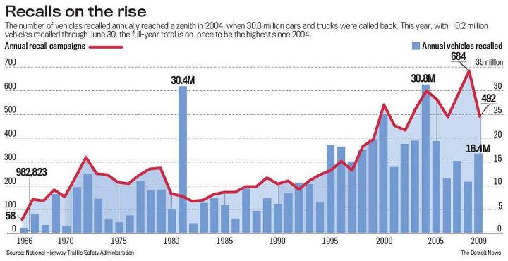
This seems like a simple, yet least useful way to spin the data... I assume this is a graph of the years in which the cars were recalled, since there were probably not 30 million cars sold and all recalled in 1981. Wouldn't it be more useful to show the cars for the model year that they were built? Or how about average recalls per car by model year? Seems like the graph just shows how much better govt/customers/lawyers are getting at finding problems, corellating them and making it a big deal until the mfr recalls them. There are so many different possible hypotheses that it seems like this graph data doesn't tell us anything useful at all. I guess that is what is wrong with the picture.
Was 2004 the year Honda had their MASSIVE recall. You know, the recall for a typo in their owner's manual that gave a wrong phone number.