


Vellum Venom: Honda N600

What’s the difference between car design and styling? My stint at CCS in Detroit makes me think styling is the shallow, frilly, cosmetic side of car design. Freshman designers are (were?) trained to focus on styling, but anyone integrating with marketing/accounting/engineering departments after school knows the real deal. They gotta know car design.
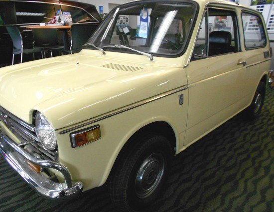
The folly of a sheltered life aside (don’t us delusional autobloggers know it?) the Honda N600’s heavily constrained blueprint came to life with nearly to zero style.
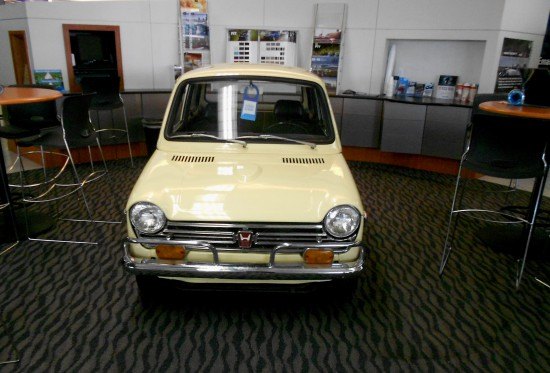
Is this a golf cart with mad retro styling? Those pub style tables could seemingly support the N600’s shockingly small footprint. Except not, but compare the N600’s seats to the chairs. Then note how “open” the greenhouse is relative to the diminutive body underneath. Like many of our younger readers, I never saw an N600 in person…they actually sold a car this small in America?
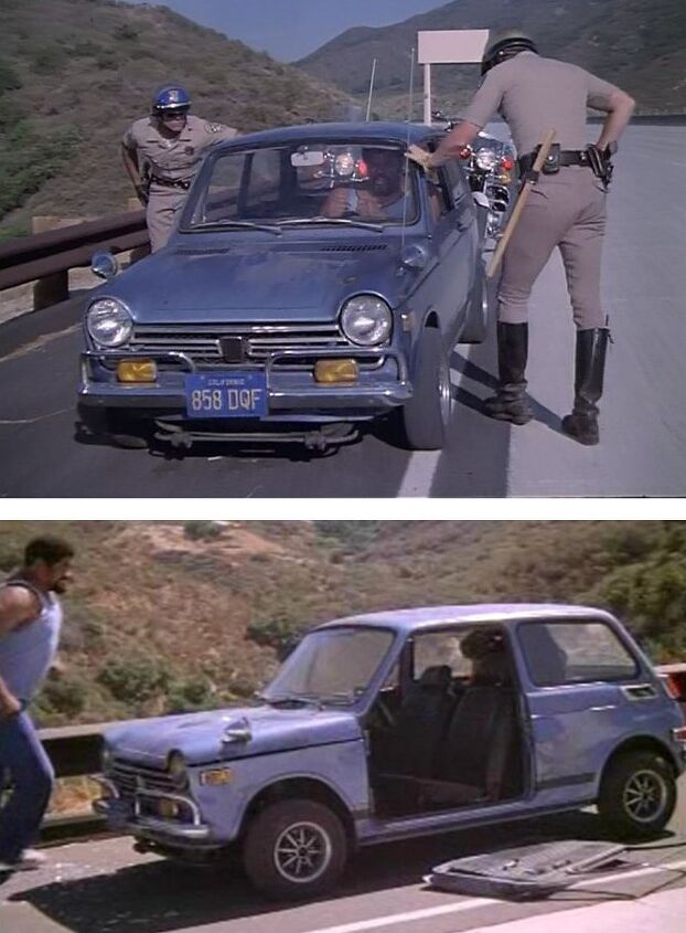
photo credit: imcbd.org
My only recollection of the N600 was “CHiPs” reruns as a kid. Watching a huge guy destroy a perfectly servicable machine horrified took me aback, yet most viewers probably found it entertaining.
Be it Architecture, Graphic, Product or Car design; I wonder if designers recoil in horror when their art (so to speak) extends past its prime in such a public manner. It’s gotta hurt.
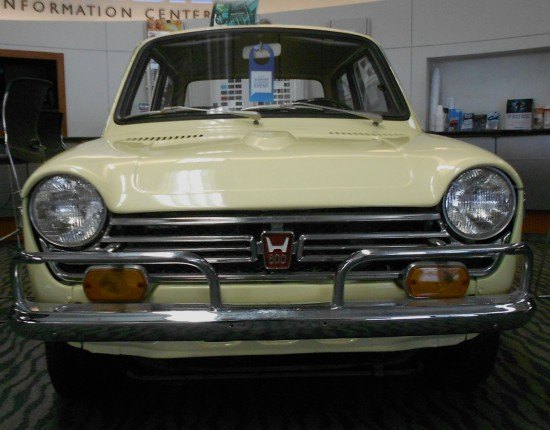
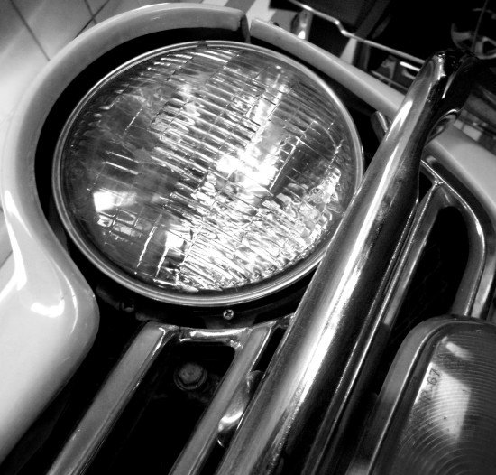
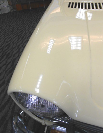
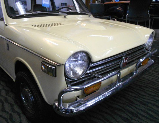
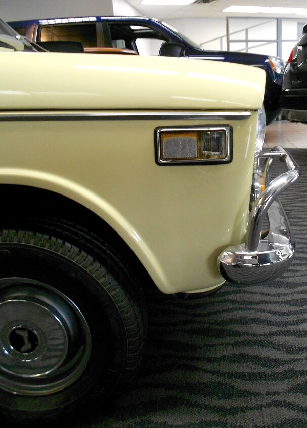
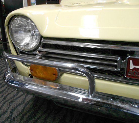
To see it is to understand the term “bare bones.” With a healthy smattering of chrome, that is. The N600 cleanly mounts headlight pods, a toothy grille and a subtle emblem into its tiny body. The signal lights are an unfortunate afterthought. But the massive bumper must be a last minute addition for the American market. It’s an interesting dynamic, but like damn near any car from the early-to-mid 70s, looks better with small bumpers.
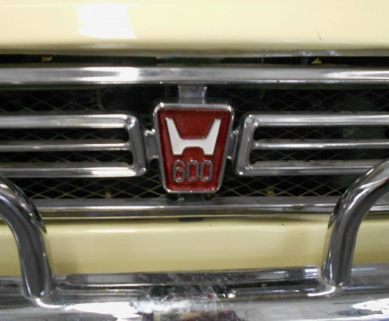
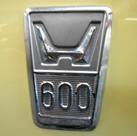
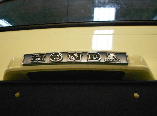
This emblem, like the bodywork, has been refinished. This blend of midcentury modern in the “H” with a prominent model designation within a clean wedge of a badge does work. But the dual grille texture (metal bars with latticework behind) is an unexpected surprise, adding depth and…um…excitement?

Shame about the protective bumper tubing: note how the hood tapers down to the grille and effortlessly surrounds the headlight’s northern hemisphere. Without that merry-go-round grab handle, the N600 would be an appealing little car.
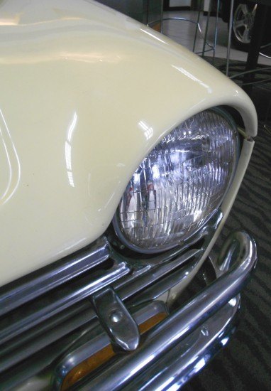
Even better, there’s no odd cut line separating the front fascia from the headlights. And there’s the hood’s logical end point at the headlight’s center line. This ability to hide cut lines at natural transition points is something we love in today’s Aston Martin, and rarely elsewhere.
Too bad Aston craftsmanship is so damn expensive: exposed bolts/screws and slip-fit panels are the marks of a super cheap whip.
This wee machine can’t fit all its mechanical bits inside the body!
I’m enamored with the N600 from this angle: looking like the Plymouth from Stephen King’s “Christine.”
Sadly all the subtle integration, the blend of flat planes and voluptuous curves of the front end absolutely disappear once you turn the corner. VW Beetles and MINI Coopers rest easy: this is design over styling.
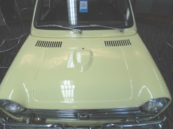
Some strange bits: the blocky, stagnant negative area making a hood valley, on something small enough to need no contouring for curbside appeal. And the teardrop bulge, which I was couldn’t verify was needed, as the hood wouldn’t open. A tricky latch, that!
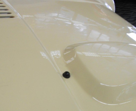
The washer nozzle is adorable.
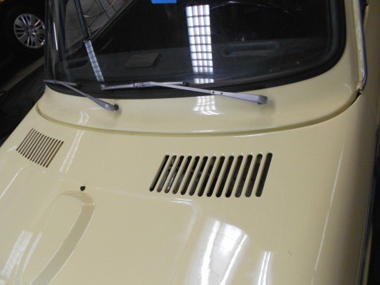
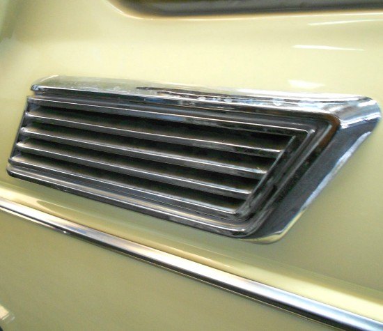
The hood vents cleanly integrate into the N600’s form, even if they shouldn’t need to “fight” the valley in the hood. The simple cowl treatment looks clean, staying that way those who battle snowfall or falling leaves/debris.
Wait, where did all the round-ish and somewhat appealing style go? Uber static lines! Gone, in the name of design?
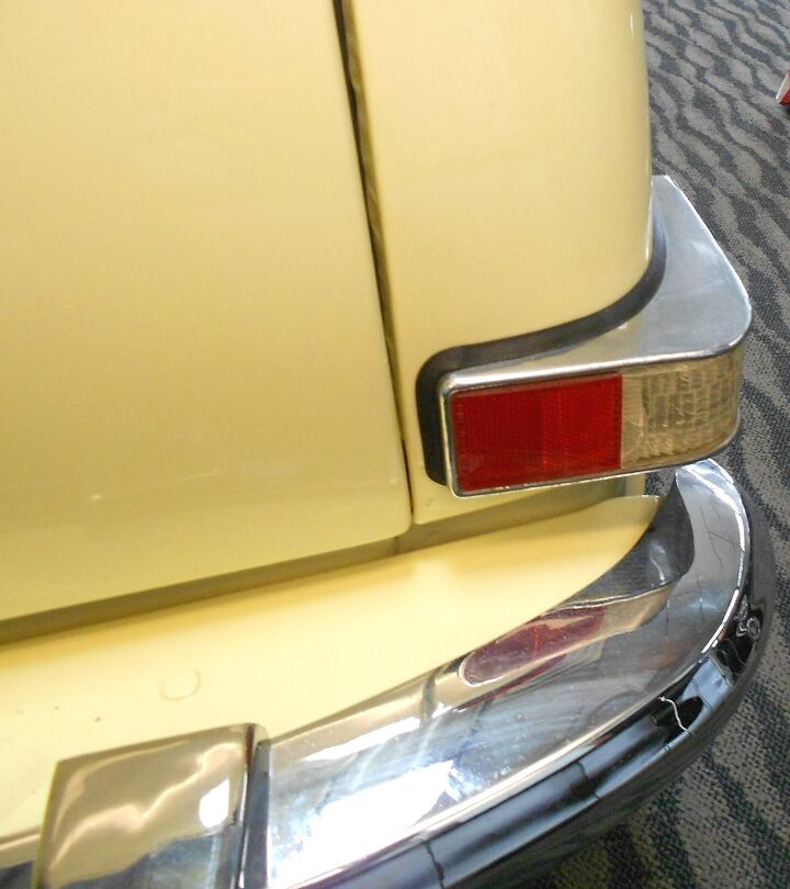
Afterthought chrome aside (needed for chrome hungry Americans?), there’s nothing appealing from this angle. It’s in stark contrast to the front.
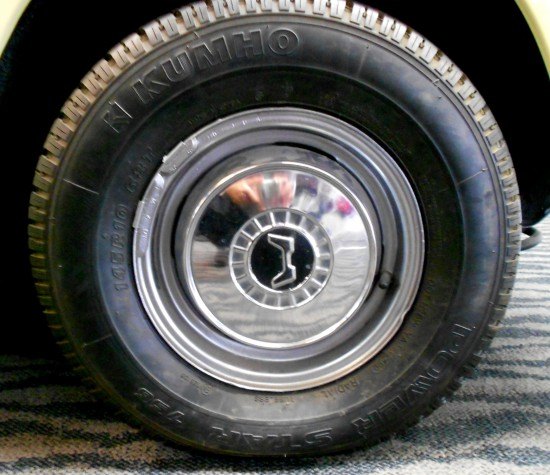
Much like the grille’s emblem, the N600’s hubcap makes a strong statement in its minimal form: that Mad Men worthy Honda emblem inside a “keystone” perimeter with a subtle lip at the cap’s edge is a nice touch. The size of the hubcap relative to the wheel makes it close to a full wheel cover, and more chrome here means the N600 is less warehouse trolley-like.
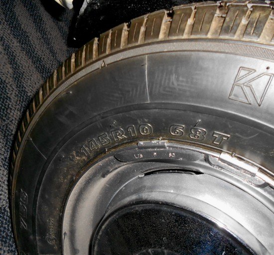
SITTIN ON KUMHO TENZ, Y U HATIN SON???
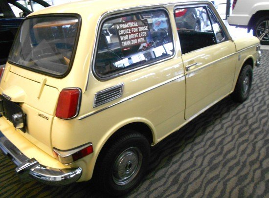
The N600 is cleaner/faster looking without the chrome spear. And note again how large the greenhouse is relative to the body: necessary considering the N600’s cramped cockpit.
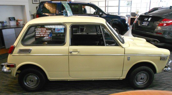
Practical says the decal? Some Americans embraced the N600’s appeal, but Detroit ruled the roost back in the early 1970s. They had size, and style. The N600’s uncanny ability to lack any sense of style a la VW Beetle, Mini Cooper or Fiat 500 musta hurt sales.
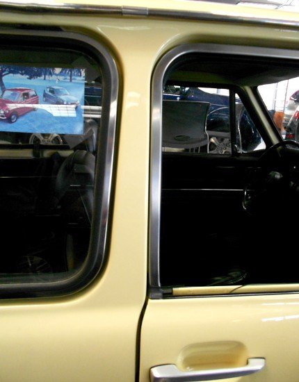
To wit, note how the A-B-C pillars lack a cohesive flow in terms of complementary rake, size and shape.
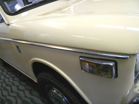
The fender emblem possesses similar elements to the one on the grille, but with unique textures/topography. It’s cooler than the front emblem.
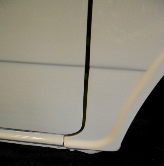
Clearly a victim of an almost-professional restoration, yet I suspect door/rocker panel gaps weren’t laser perfect back then anyway.
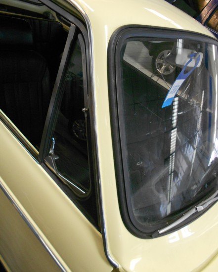
The A-pillar is rather fast and sleek on its own, not to mention the full length rain gutter accentuating the speedy demeanor. The windshield rubber is another sign of a lost era…for good reason.
Poor paint/body work, but still more appealing than a modern car’s black plastic triangle of A-pillar DLO fail.
Not only does the B-pillar fail to emulate the A-pillar, it’s not symmetric! Square off the lower portion of the quarter window (or round the door) and curb appeal increases.
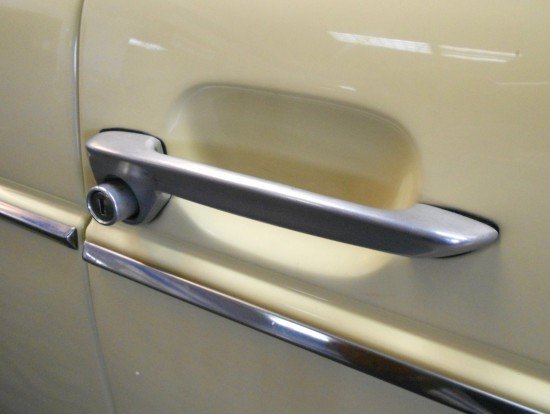
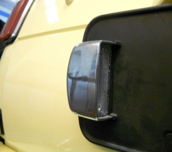
While the integrated release button/key cylinder is trick and space efficient, the flat profile and lumpy negative area do not help with the N600’s lack of cohesive style. Is there any room for style on this machine?
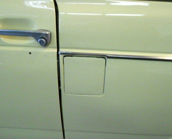
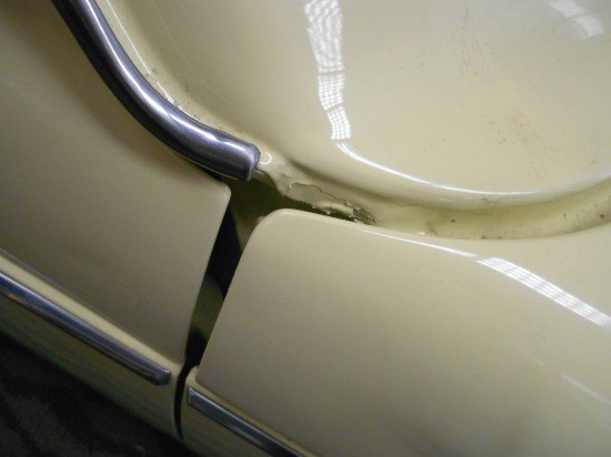
Real estate for a fuel door is in Manhattan-grade short supply on the N600’s body.
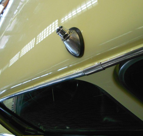
It doesn’t get more honest than a roof-mounted antenna, perfectly mounting on a curved shape. Nice.
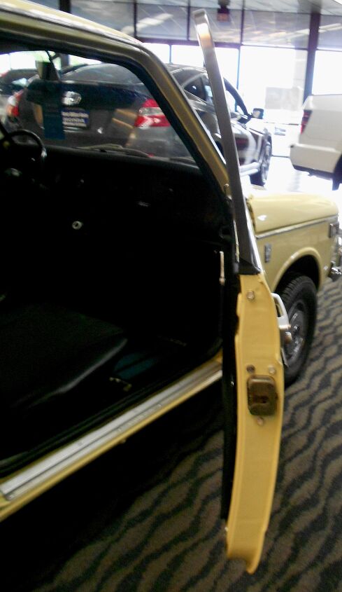
While the front end’s roundness was a stark contrast to the fender’s solidarity, the N600’s middle section softens up thanks to a modicum of tumblehome (seen in the door cutaway) from the base of the door to the roof.
Curves, they are a good thing.
Imagine how much more “wrong” the N600 would look without that tumblehome from this angle!
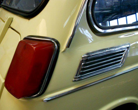
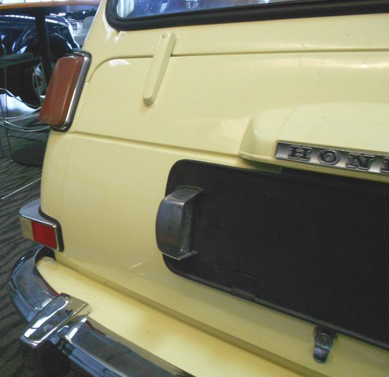
While the tail light flows into the body like that clean roof antenna, the rain gutter, molding and vent louver are necessary(?) afterthoughts.
But it’s quite fetching by itself!
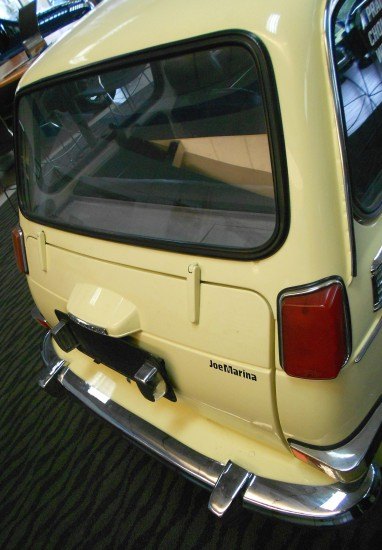
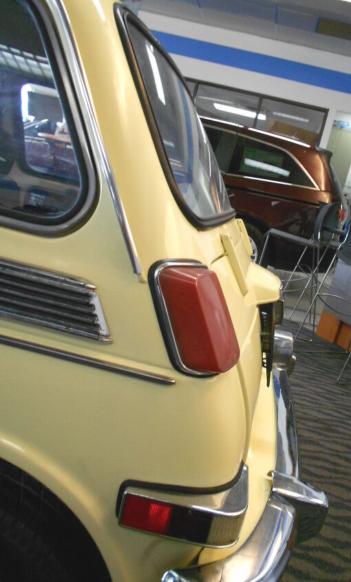
The N600’s proto-CVCC DNA is showing! The taillights and trunk cutout is a nice cross between pre-war automobile construction (exposed hinges and a bustle trunk) and the future of hatchback design once a little more rear overhang was deemed necessary.
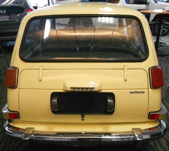
The back end’s flattened demeanor is very MINI Clubman, without the charm. Or the functionality, thanks to the fixed rear glass. Luckily there were no Sam’s clubs back then.
The pudgy, cheeky contour of the trunk is both ungainly and adorable at the same time. Design over Styling!
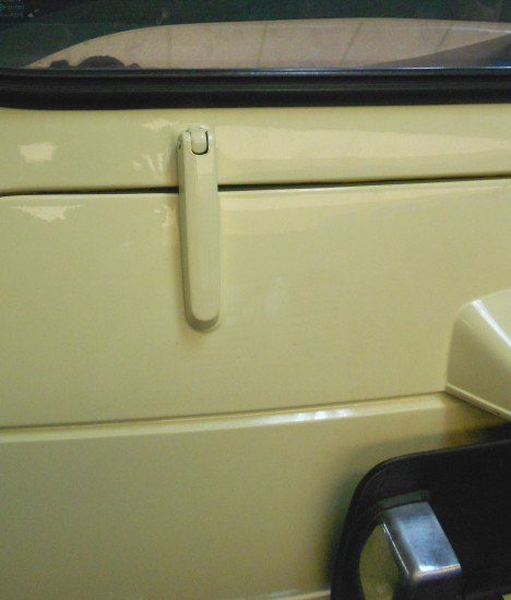
Nice bit of retro kit functional design for the grab handle, I was tempted to fix the logo’s problem with a Testors enamel marker.
Quickly glance at this shot and you’d be forgiven for thinking this is a whip from L.A. Noire.
Logical and well-designed license plate light, note the exposed screws that’ll make bulb replacement a breeze. Hopefully.
Exposed hinges in the 1970s? No wonder that dude on “CHiPs” ripped it apart so easily!
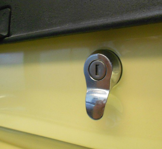
There’s a material heft and functional beauty presented in the lock cylinder’s one piece, polished design. Pictures fail to show the craftsmanship.
Now let’s bring it home: no overhang is a big, BIG problem.
How can you “style” a design this restrictive? Imagine your job if your boss halved your budget. Or didn’t give you one in the first place! Therein lies the “beauty” of the N600, so to speak.
The Honda Civic that followed was a leap forward, the public’s reaction to Honda’s design and engineering prowess was logical. Because when you give enough room (literally and figuratively) to a design department, they will can make a nicely styled vehicle.
Thanks for reading, I hope you have a lovely week.
More by Sajeev Mehta


Comments
Join the conversation
Hey, the reference "imcbd.org" is mistyped. It's imcdb.org. Otherwise you're offered all kinds of car based adds from some domain squatter.
I used to see one of these when I went to college. The tiny tires were hilarious, but then I saw one parked at the end of the row, with a Honda street/trail motorcycle, the contrast between the 10" donuts on the 600 and the 21" on the motorcycle made me laugh hysterically for 15 minutes. I was almost late to class.