


Vellum Venom: MINI Cooper Hardtop (2012)

The end of the year, the end of an era for a famous British Marque. Let’s get crackin’ before the ink on the vellum dries for the (all new) 2014 model.
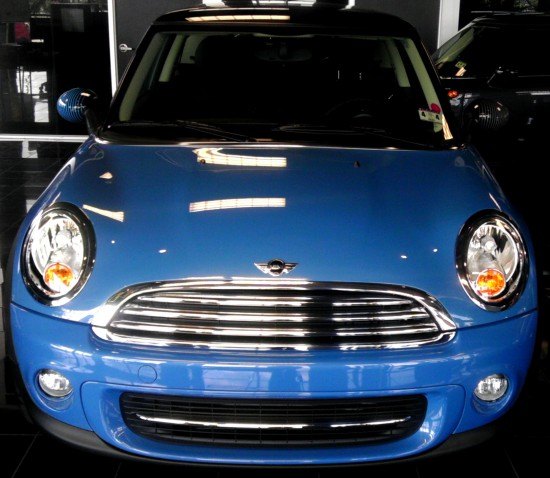
Everyone knows this face, it’s Brand Recognition 101. Or maybe 202, as the original MINI (the 100% British one) was redesigned even less regularly/extensively than the BMW-owned MINI. Perhaps not even Ford’s iconic Mustang remained this true to form. The MINI’s snout sports a traditional grille and round headlights on a small canvas, but the bumper could be any modern car.
The proportions are right. The elements are well-formed and harmonize together quite well. Just like it’s always been for this brand.
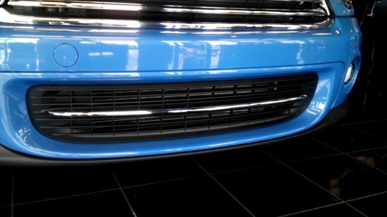
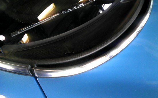
Both grilles work well together, the bottom opening is almost a mirror reflection of the top, as it pushes into the air dam’s real estate much like the grille’s forcible entrance to the bumper. Well thought out and clean!
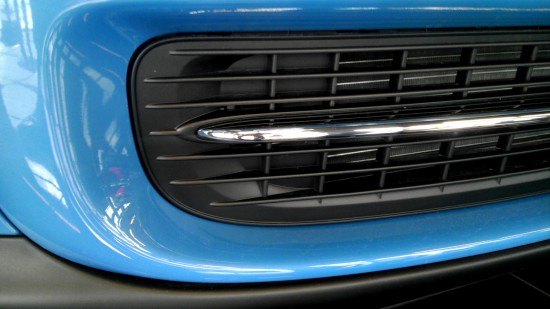
And even though this is a small and (somewhat) cheap car where corner cutting is acceptable, well, this lower grille is a rather fancy casting. The solid portions of the egg crate are deeply recessed, so it takes a while to see the mass-market cheapness. Add the chrome strip in the middle and perhaps you’ll never even bother to notice this doesn’t belong on a high dollar 7-series BMW! Well…
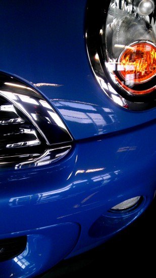
If the grille didn’t slide down into the bumper, the MINI would be surprisingly devoid of panel gaps. That’s the beauty of a clamshell-style hood: the insurance industry may hate replacing these in a minor accident, but the way the hood and fenders blur into one panel is a work of fine art.
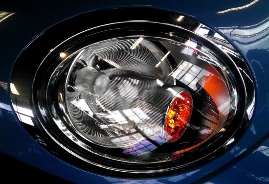
MINI’s always had the coolest headlights in its class, if not one of the coolest designs for any budget. Just the right amount of chrome inside the lense (not swept back into functionless blingy real estate) so there’s room for an expensive looking outer chrome ring: a modern interpretation of vintage Jags, Ferraris, etc.
More kudos for not using the chrome signal light body (or the cap for the headlight) for a branding opportunity. That notion’s been played out. And there’s a nice corporate logo on the hood if you think this might be a Ferrari.
OMG YES CLAMSHELL HOOD. But seriously, note the reflection of the lights above: there’s a subtle fender flare from the headlights on back. It’s beautiful. It is really such a sin to want more affordable vehicles with fewer breaks in the body for the singular reason of aesthetic delight?
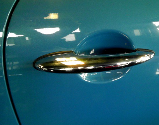
A cheap(ish) car with expensive old world craftsmanship: the chrome trim around the clamshell is another subtle reminder that you coulda bought a more car for the money at damn near any other dealership…except that you actually wouldn’t!
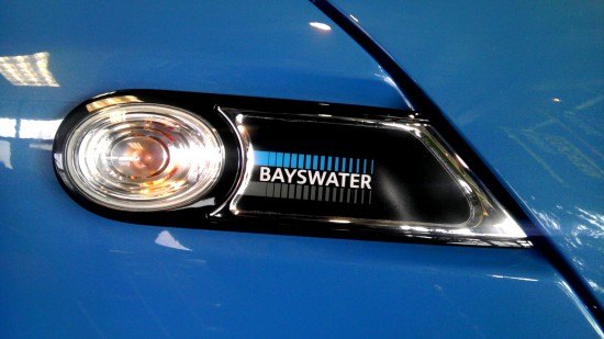
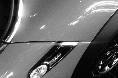
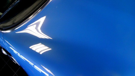
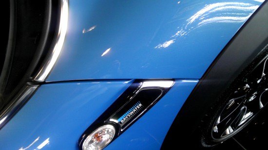
The Bayswater Edition replaces the standard logo with something straight outta 1981. I think I have the same pattern when I crank up Giorgio Moroder on my Pioneer cassette player’s VU meter. But still, this mini billboard (get it?) should be binned for straight sheet metal around that light. Cleaner is better on a vehicle with a clamshell hood with such a racy cutline!
Oh yes, I did say racy.
MINIs are all about customization to an owner’s needs, and the Bayswater definitely appeals to my inner Max Headroom. But wait…do I see…
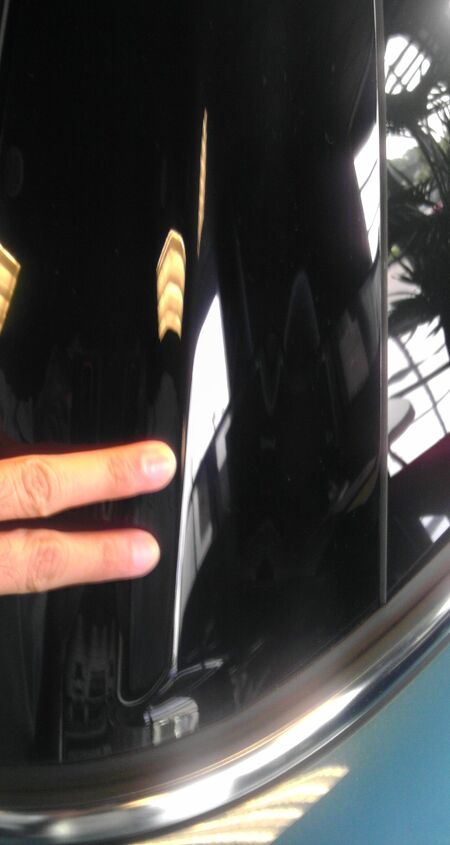
No DLO FAIL! Even better, the black A-pillar blends nicely into the greenhouse, while that chrome trim continues around the side. The three blue panels, the clamshell hood, the cowl paneling (for lack of a better phrase) and the door cut lines aren’t necessarily minimal, but they work well together.
If only the clamshell’s end point was the same as the front door’s beginning point like a C4 Corvette!
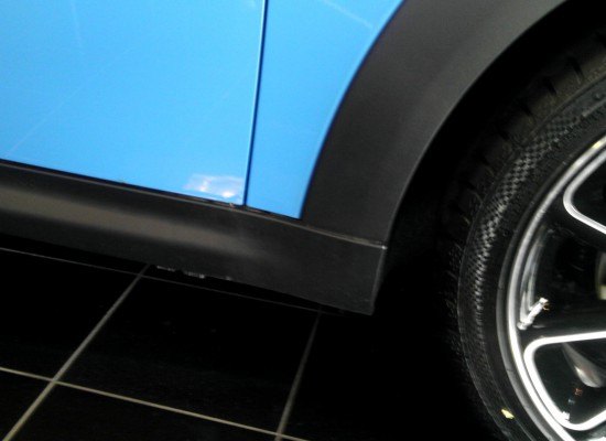
While that backslash on the clamshell is a MINI hallmark, using another horizontal line above this rocker moulding instead lets the clamshell go all the way back to really spice up the package.
Then again, the (rear hinged) hood probably wouldn’t open if that request came true…damn you reality check!
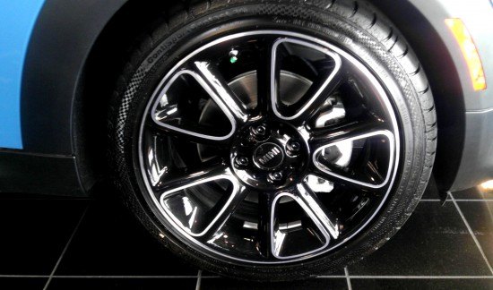
The gloss black wheels are a unique touch, only because the leading edge of the spokes and the rim’s lip is polished. The wheel’s lines are logical and symmetric, so this bit of color ingenuity is certainly welcome and not outstanding like a black eye on a pretty face.
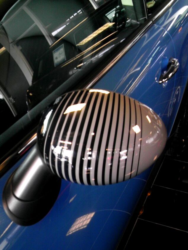
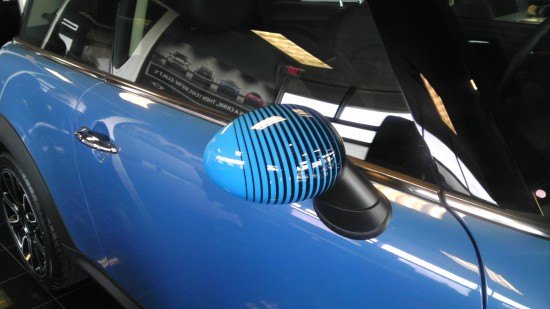
So much for logical! Perhaps employees of New World Pictures approve, yet both mirror skullcaps should be the same color. This is nonsense, and not that systematic failure endemic of a failed organization nonsense that brought us the Pontiac Aztek…it’s just plain silliness with no value on an automobile.
Whatever graphical theme the Bayswater name implies, this isn’t how you do a gray and blue color scheme.
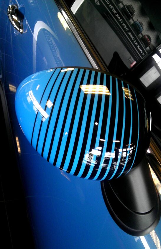
Although it might look better if both mirrors were that french gray instead of radioactive blue…what say you?
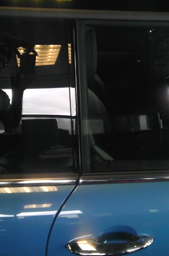
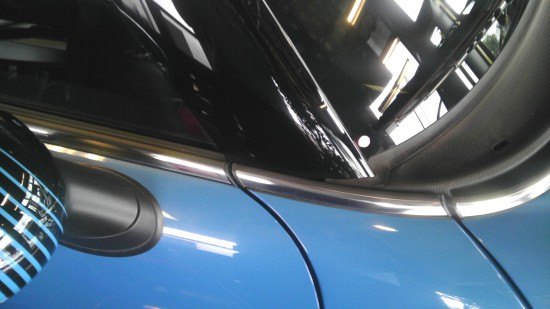
Invisible B-pillar that lines up well with the door cutline. Unlike the CTS coupe, MINI did a fantastic job hiding pillars under glass. Also note the chrome trim that started on the clamshell continues apace.
Sure, this is a round and cute vehicle. But the round theme is more of an ovoid, and the negative area behind the door pull should emulate the shape seen in the headlights. Or the ovoidness seen here in the door cutline. This is “too round”, if such a thing is possible.
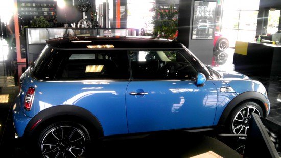
No A-pillar. No B-pillar. No C-pillar. Be it wrapped in glass or covered in gloss black, the MINI does a fantastic job looking far more expensive than anything else at this price point. All it needs is (illegal) limo tint and the greenhouse would look like a pillarless space ship! Very cool, very much approved.
Cute proportions, charming interplay between design elements, short overhangs and cheap yet expensive detailing.
This is why people love the MINI: staying true to it while advancing the game. This is what us Panther Love/RWD American Sedan fans wanted.
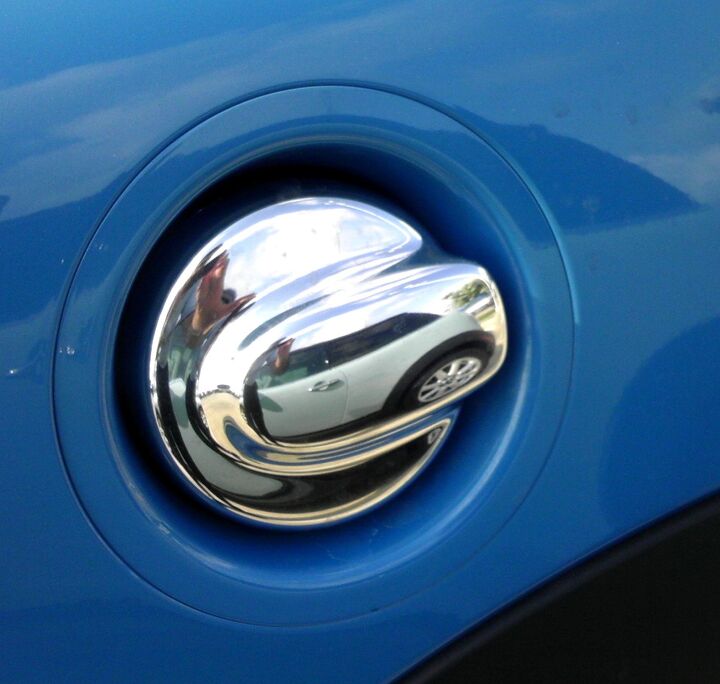
Retro gas caps usually look out-of-place (SN-95 Bullitt Mustang) but if there’s one mainstream machine that needs one…and it’s a clean and flowing design elegantly recessed into the body.
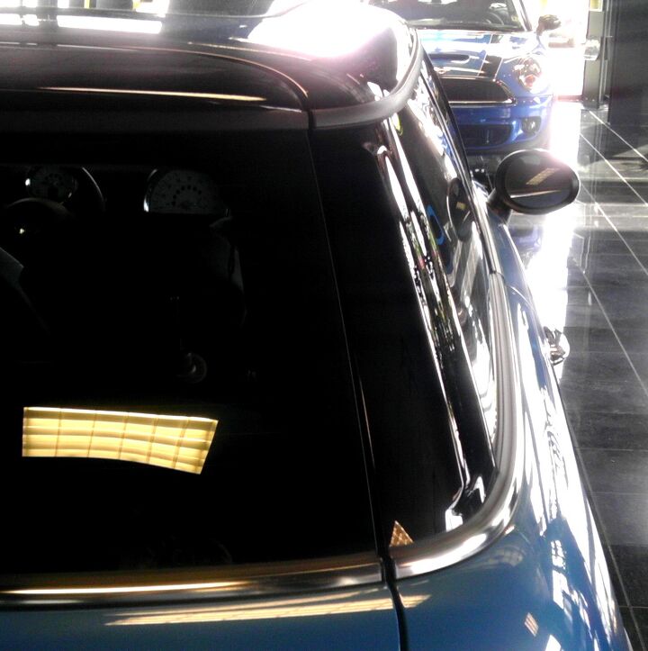
Just like the side profile, the MINI’s rear greenhouse looks surprisingly sharp with this chrome strip. The glossy C-pillar helps, as does the black roof. A brighter roof color to accentuate the attention to detail in the glass work and pillar trimming is actually preferable! Whether or not the Union Jack treatment is needed is always up for debate.
Like many small hatchbacks, the C-pillar has a ridge to keep the cute little MINI tracking straight in stiff cross winds on the highway. Supposedly these details matter, consult your local Aerospace Engineer if you don’t believe me.

Another aero touch: the spiraled antenna on the roof. It’s surprisingly tall for such a small car. Or perhaps the MINI-ature dimensions are why it seems small!
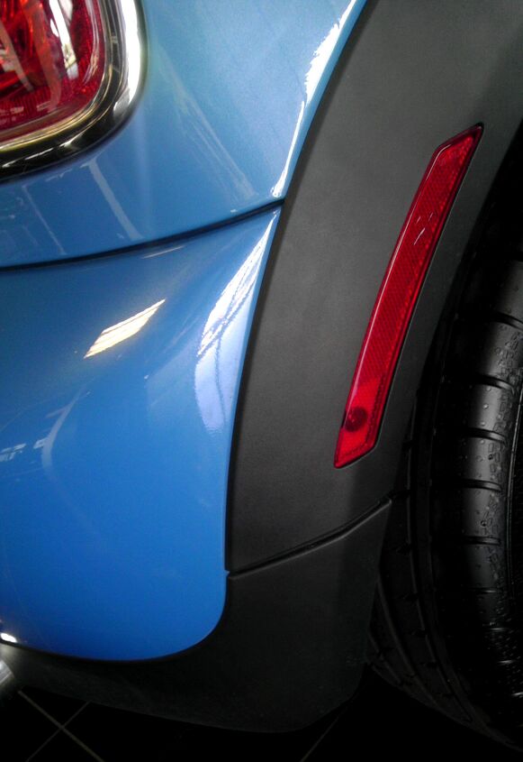
Speaking of, the reflector/marker lights both front and back must be placed on the wheel arches because there’s simply no other place available! Short overhangs have their benefits!
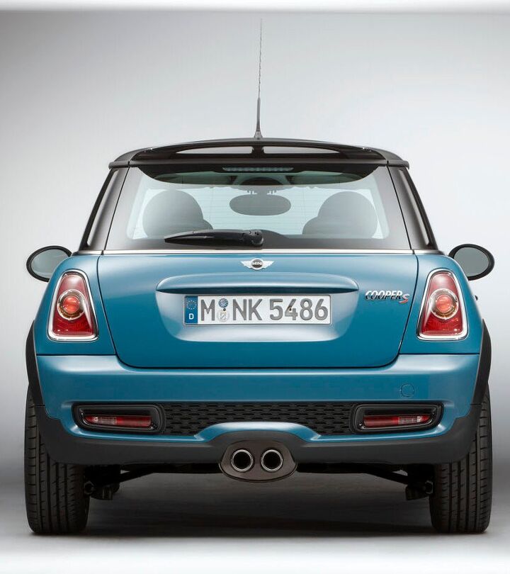
Because of poor lighting at my “test” vehicle’s location, here’s a stock photo showing the Bayswater from the back. Note how low the side view mirrors sit (at least on the Euro spec model) and the stilt-like tire width. This model also has a different bumper (with fake grilles) and a central exhaust, which sells more exotic performance than the wrong-wheel-drive MINI can possibly produce.
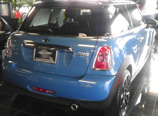
Logical cut lines for the hatch and bumpers. A complete chrome “belt” at the base of the greenhouse. Chrome rimmed lights and something that only works on British cars like MINIs and Jags: a chrome mustache above the license plate that both adds English charm and is a handy place for a grab handle and license plate lighting.
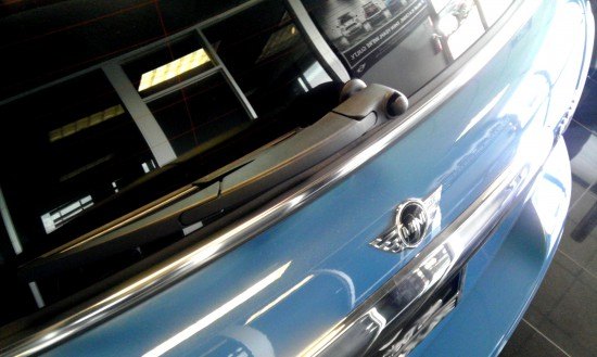
The sleek rear wiper arm is another modern touch that proves that classic designs can always live to see another day…or millennium.
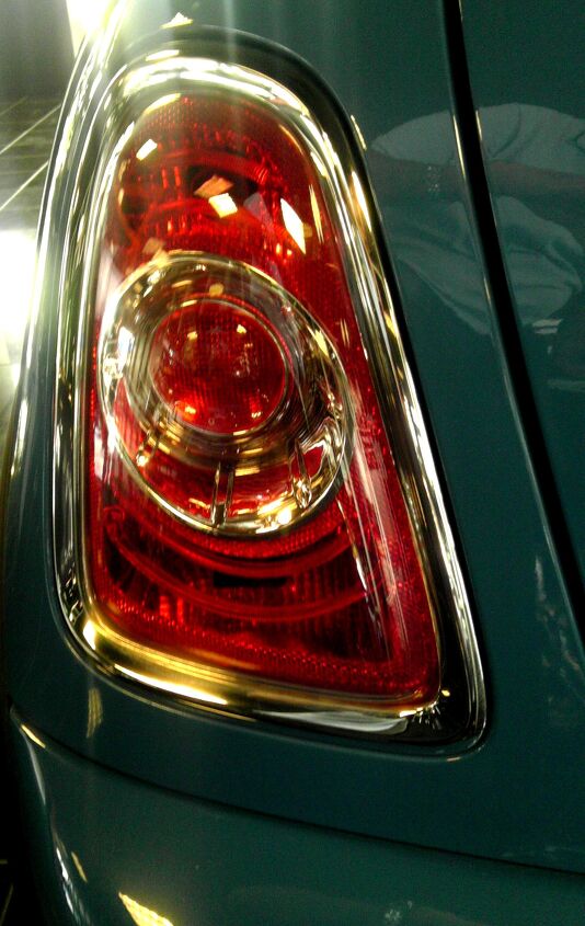
While not as punchy as the headlights, the logical use of chrome inside and the upscale chrome rim outside are hallmarks of good vintage British design.
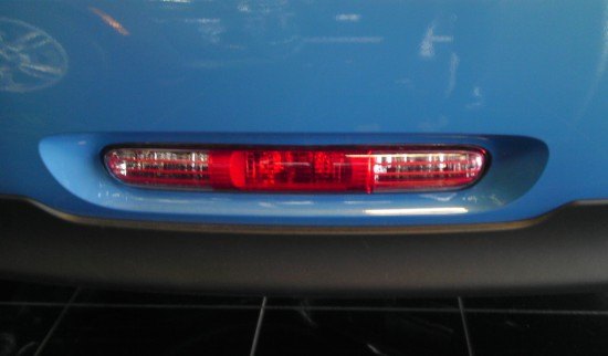
Last and perhaps least, the central lighting pod with backup lights, and used for a rear fog light in Europe (maybe America too?). It, just like the front grilles, extends into the black lower valance to continue that theme. All of which is in very good taste, at any price.
Thank you all for reading, I hope you have a lovely New Year’s Eve…and beyond!
More by Sajeev Mehta


Comments
Join the conversation
I agree with your design summation on just about all points. A very nice-looking car that has been designed very well. Concerning the reliability issues of past models, it's nice to know the Mini has improved substantially. The car is quite comfortable, too, at least in the front.
Ah, the Mini. In theory I like them a lot. In practice the interior is just stupid, they ride like buckboards (though the handling IS great), and they cost WAAY too much once you start ticking a few option boxes. Plus the closest dealer is 120 miles away, which is less than convenient. Luckily, FIAT showed up with the Abarth, which cured all of those dilemmas for me.