


Vellum Venom: 1970 Dodge Charger RT-SE

My departure from the cloistered world of automotive design was anything but pleasant: leaving the College for Creative Studies scarred changed me, possibly ensuring the inability to conform to PR-friendly autoblogging. Luckily I am not alone. While Big Boss Man rests in Chrysler’s doghouse, a remotely nice comment about their door handles perked the ears of the local Chrysler PR rep…and she tossed me a bone.
Perhaps you’ve never heard of Hovas’ Hemi Hideout: so here’s a slice of Mopar history worthy of a deep dive into the Vellum. Oh, thanks for the invite, Chrysler.
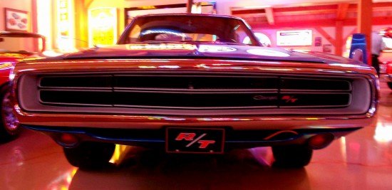
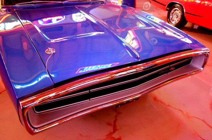
An unforgettable face: the iconic 1968-1970 design was Chrysler’s most memorable effort to spook insurance and safety special interest groups into forcing “better” vehicles on the public. Sure, we’re better off now, but is a fragile chrome halo of a bumper really that useless?
Isn’t this bumper (and complex hidden headlights) worth the extra insurance premiums? Worth it to have a disturbingly clean and minimalist design? Probably not…
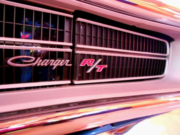
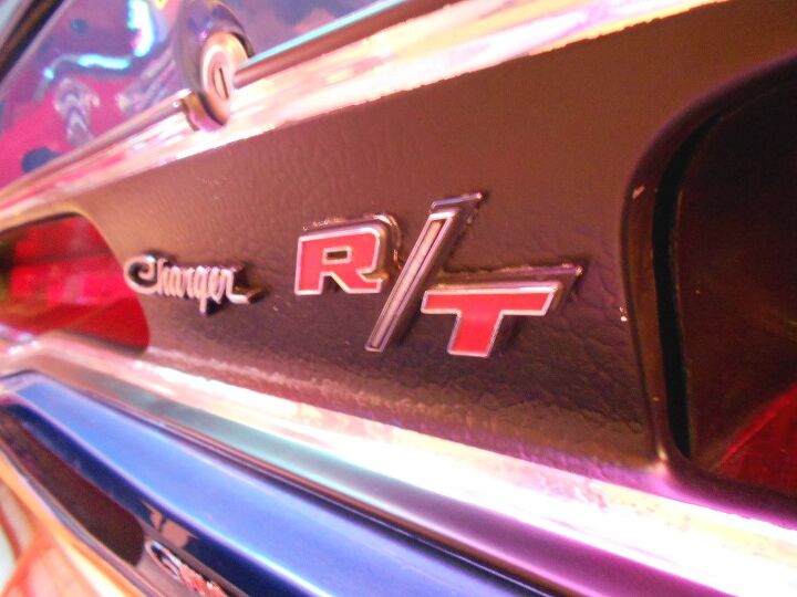
But still, you can’t argue with how stunning and shocking this is. While nothing like Marcel Duchamp’s Nude Descending a Staircase, the Charger’s front clip is a timeless work of art. The blackout grille extends over the headlights, encased in a deep silver rim, topped with a chrome bumper…wrapped up with a name: Charger R/T. This nose and this name made a promise to would-be new car racers of the era, and its aged phenomenally well.
That said, my favorite grille of this body style was the cleanest: the 1968 Charger was the one to have. It makes the otherwise clean 1970 Charger look downright fussy!
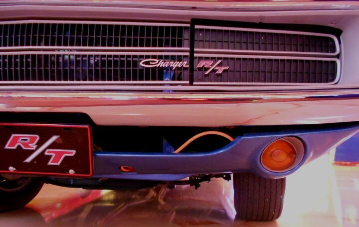
Things fall apart as you look closer, however. Maybe the solid grilles over the headlights look cheap, and the panel gaps are too sloppy. The round signal lights look like a leftover assembly from the 1950s. Or perhaps the license plate should be located even lower as to not interfere with the bumper’s strong minimal form.
Even though the front end looks flat from many angles…
Note how the chrome bumper tapers in near the headlights, then pushes back out at the ends of the fenders. The silver rim accentuates this dance, ditto the fenders and hood. But that black sheet of grille? It peaks at the middle and nothing more. The different high/low spots are phenomenally beautiful, it is fantastically executed on this front fascia.
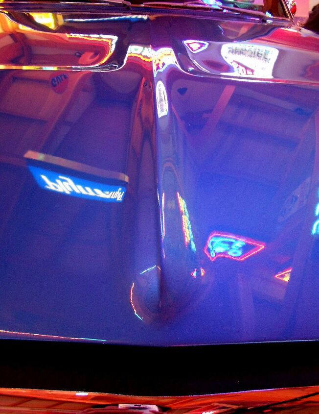
The hood’s recesses and that strong center mohawk add a bit of excitement to an otherwise far-too-subtle design for a Mopar Muscle car. If you had a problem with Mopar Minimalism!
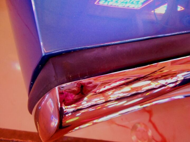
Somehow I doubt the meaty rubber trim does anything to protect the Charger’s painted body from the front bumper. Not to mention the horrible fitment of this (replacement?) trim. I’d hate to be a broke-ass dude in the 1980s when someone slams their 5-mph bumper’d Monte Carlo into my otherwise cherry 1970 Charger. The damage would be extensive…and would go unrepaired!

Hood pins are cool…but following their cable to this horrendous gap in the rubber trim leaves much to be desired. Damn, son!
But it’s less offensive when you step back a little.
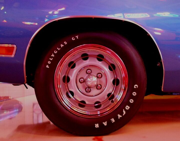
The only thing cooler than Rallye wheels and Goodyear white letter polyglass tires on this Charger would be the new-age 17″ repros with fat steel-belted rubber. I love the proportioning of a proper 1970s muscle car with 17″ rolling stock: it’s perfection.

The hard bend (with a slight upward angle) at the end of the fenders just “ends” me. It’s another snapshot on vehicle design that emulates the timelessness of the infinity pool in modern architecture. Combine with the Charger’s long front end and deep fenders (i.e. the space between the hood cutline and the end of the fender) and this is simply a fantastic element.
The hood’s negative areas add some necessary excitement, otherwise this would be too boring for an American muscle car. There’s just too much real estate not to do…something!
The signal repeaters at the beginning of the negative area’s cove are a styling element that I wish could come back. But no, we need standard bluetooth and keyless ignitions instead…probably.
I’d trade all that standard technology for a hood this menacing, this modern.
Mid Century Muscle?
Mad Men Mopar?
Don Draper’s mid-life crisis machine?
All of the above.

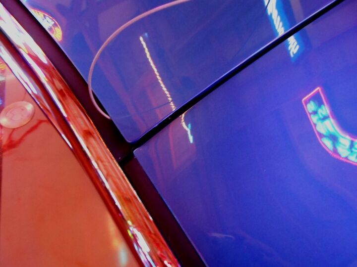
The intersection of the cowl, fender, hood and door isn’t terribly elegant. Newer cars have “hidden” cowls, an advancement that’d make the Charger shine. Because not having the fenders and hood sweep over THIS space does THAT front end a huge disservice. Plus the panel gaps kinda suck, too.

At least there’s no DLO fail. But imagine this angle with the 1980s technology of hidden cowl panels!
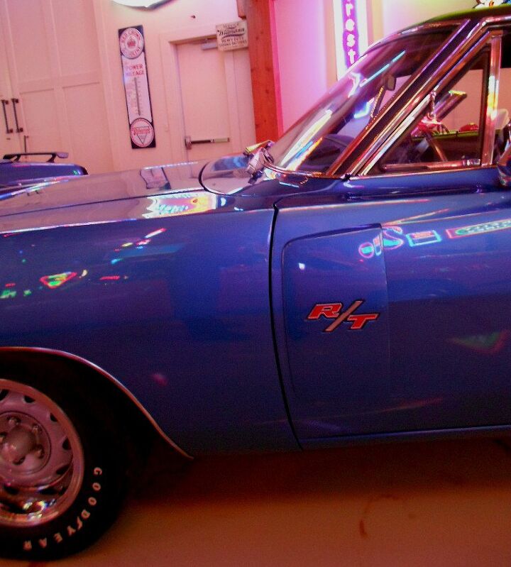
A little faster A-pillar would also be nice, it’s too static just like the cowl. But asking for such changes 40 years later is beyond idiotic. And while the R/T door scoop isn’t nearly as hideous as the afterthought scoop on the 1999 Ford Mustang, you gotta wonder how “ricey” this looked to old school hot-rodders making sleepers out of Tri-Five Chevys and boring 1960s sedans.

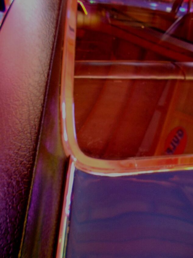
The pivot point for the vent window is an interesting bit of kit.
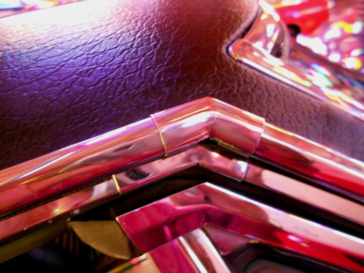
Chrome elbow sleeves, because a computer couldn’t bend/cut one piece of bling for us back then. Bummer.
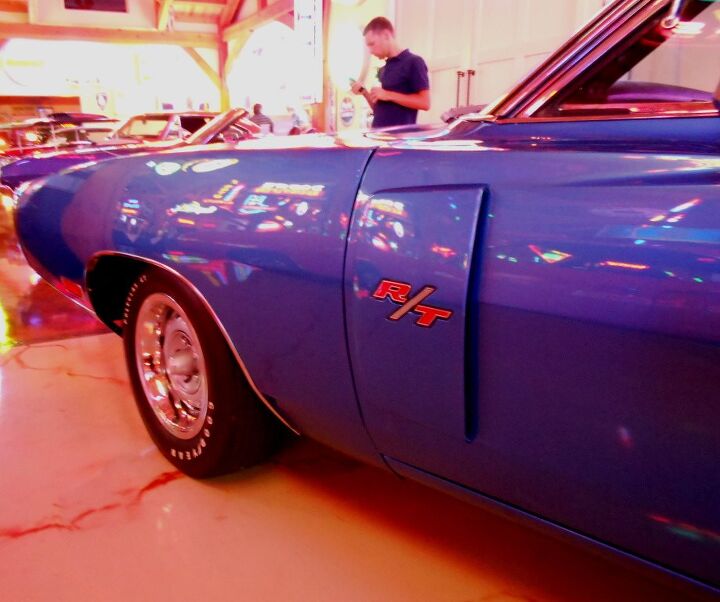
Yeah, the R/T’s useless scoop is pretty much Muscle Car Rice. While it kinda accentuates the genesis of the door’s muscular bulge, it’s completely superfluous.

Chrysler’s side view mirrors for the time were pretty cool by themselves…but they didn’t match the max wedge (get it?) demeanor of the front end.

I never noticed the three lines inside the R/T’s slash. Definitely adds some excitement without today’s emblem marketing overkill.
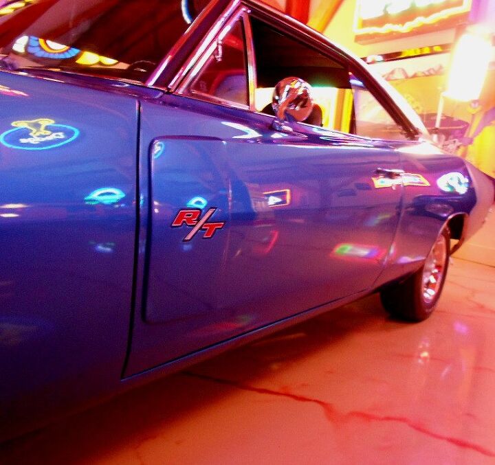
Note how the R/T scoop does match the contrasting muscular wedge of the door. Problem is, the scoop is obviously a tacked-on afterthought. Negative area like the hood was a smarter alternative. But the interplay between doors lower wedge and the strong upper wedge coming from the fender is quite fetching. As if the Charger is ripped from spending years a the gym.
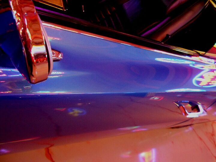
Yup, toned and perfected at the gym. Too bad the door handles belong on Grandma’s Plymouth. Perhaps we all shamelessly raid the parts bin…
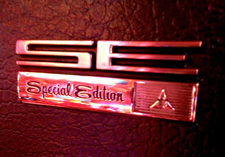
The SE package was always the Super Classy Excellent model to have. The vinyl top, these “proto-brougham” emblems and the interior upgrades are totally worth it. What’s up with the pure modern “SE” lettering with that almost malaise-y script below to explain what SE stands for? I’d cut the emblem in the middle and only use the upper half.
I’d save the lower half for the disco era, natch. I mean, obviously!
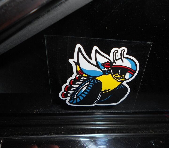
Vintage Mopar marketing sticker? Check.

Classic Detroit is present in the Charger’s profile. Long hood, long dash-to-axle ratio, long fastback roof, long quarter panels and a long deck. That’s a lotta long!
The only thing too short are those doors: the cutline should extend several inches back for maximum flow. And from the subtle curve in the front fender to the stunning hips above the rear axle, does the Charger ever flow!
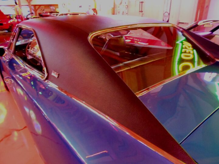
Aside from the obvious problem with rearward visibility, how can you hate this buttress’d roof? The fastback C-pillar is a long, daring and classy affair when trimmed with chrome and textured vinyl. Keeping the roof from being too boring was the rear window’s use of a different vanishing point than the C-pillar, which translates into a different stop on the blue body.
To make up for the different vanishing points, more chrome and vinyl. I can dig it, but perhaps such design novelties are better off on a less mainstream product. Or perhaps not…because how many people wanted a Charger back in 1970? And how many people want one now? Me thinks the number is exponentially higher today.
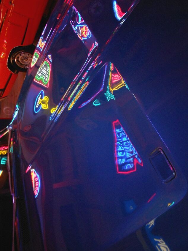
Yes, I know these pictures suck. But you can’t imagine how painful it was to coax a cheapie digital camera to do the right thing under the harsh lighting provided by half a million dollars worth of vintage neon lights. And now I hate neon lights.

Chrome and vinyl: so happy together.
The different vanishing points for the C-pillar and rear window make for a little problem: the trunk’s cutline should be much closer to the rear window. And while that’d make a stupid-long trunk, it would look stupid cool.
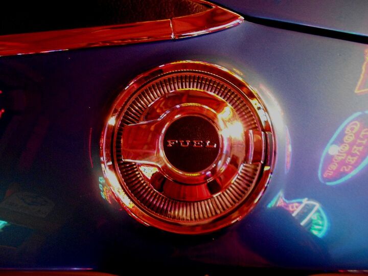
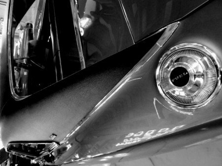
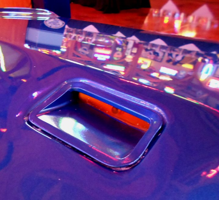
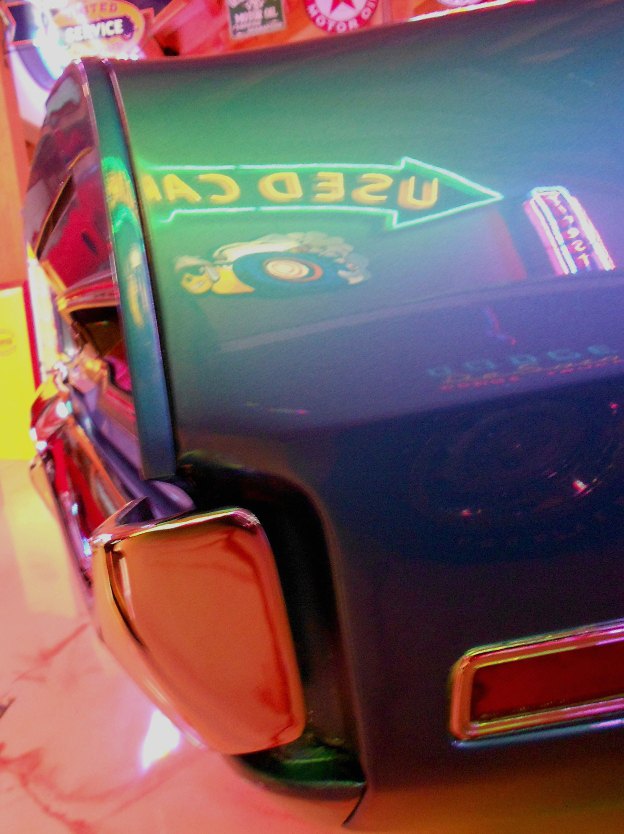
Just in case you didn’t know where the new Challenger got that fuel door idea from. Too bad the new Challenger doesn’t have the Charger RT’s sense of chrome trimmings elsewhere to integrate it into the package. That said, this is a beautiful piece of outstanding metal on a minimalistic body. Which makes it a wart…and by definition, warts must be destroyed.
Killed with fire. Or splashed with acid. Or whatever it takes for a Dermatologist to knock ’em off a beautiful body.
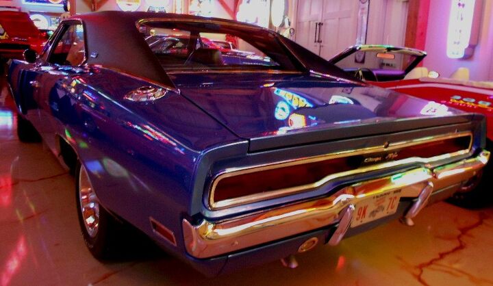
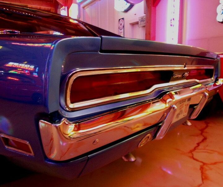
A part of me wishes the Charger’s back-end had the same round chrome bumper treatment as the front. And no chrome around the red tail lights. Actually just graft the front end entirely back here, and replace the black grille with red tail lights. A bit stupid perhaps, but it’d make a completely cohesive and eye-catching design.
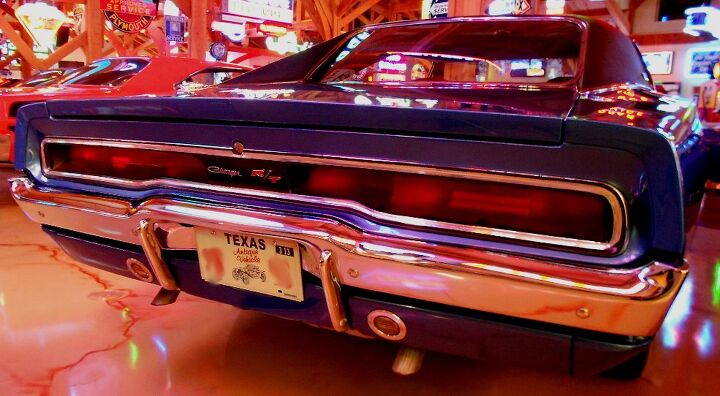
That said, the Charger ain’t no slouch in the posterior. The vertical bumperettes need to find lodging elsewhere, ditto the round backup lights. But the space between the lights is the perfect location for a branding emblem, and the impossibly thin decklid looks quite sharp.
There’s a subtle dovetail at the end of the trunk, a nod to modern aerodynamic designs. I love it, don’t you?

Can’t say the same for the undefined space between the rear bumper and the quarter panel. Yeesh, this was acceptable in 1970?
The trunk’s gap also leaves something to be desired. While I like the interplay between the chrome bumper and the tail light trim above the license plate area, it’s a bit too subtle. Wait, did I actually mean what I said?
The difference in “heights” at the license plate should either be a bit more aggressive, or completely, exactly the same as the rest of the light/bumper ratio.

Maybe the crude black paint on the tail light’s chrome trim is the byproduct of a terrible restoration…but considering factory correct restorations elsewhere include similarly sloppy craftsmanship to mimic the factory…
Oh boy.
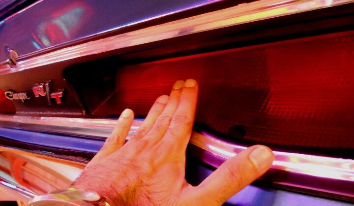
The tail lights are sunken significantly into the body, just like the grille up front. Me likey enough to adore: such use of aggressive negative areas needs to come back in a BIG way.
There’s something about the chrome trim’s application around the trunk lock…

Even the camera-infurating action of all those neon lights can’t hide the ugliness here. Maybe my idea of having an all-encompassing chrome bumper instead of chrome around the tail light isn’t such a stupid idea after all. It’d certainly address this problem.

The round backup light does this design no favors. Exposed screws on the chrome bezel makes it worse. Weren’t there some square lenses Chrysler coulda parts-bin’d instead?
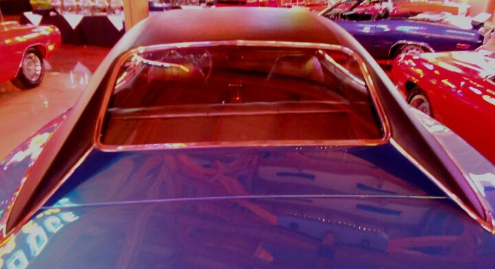
No matter: the 1970 Charger is an unforgettable machines. I can’t imagine owning one when new, only to move on to tackier metal from the disco era. And if a 1970 Charger owner was loyal enough to stick around during the Iaococca era and beyond, well, they’d be justified to hate everything made after 1970. Just look at that roof!
Thank you for reading, I hope you have a lovely week.
More by Sajeev Mehta


Comments
Join the conversation
I firmly believe there are two cars that made me love the automobile. One is my mom's '72 Buick Riviera, the other is the General Lee. So I was pleased to see you take up the Charger for a VV. I do think in this case though that your critique leans too heavily on modern expectations which takes the car a little too far out of perspective. The panel gaps here appear pretty typical and the rubber issues could have as much to do with aging/shrinking than sloppy fitting. Your comment about reflecting the front treatment on the rear is particularly interesting though. The '65 Buick Wildcat tried that trick, so now I'm curious what your take on it might be.
I think the back up lights are a great touch! , It tends to be a mirror image off the dual exhaust pipes. Some of those panel to bumper gaps look to be worse than the factory originals? I suspect the Charger is chock full of rattles and squeaks , so common for those years.