BMW Gets Another New Logo, Insists Symbol Never Stemmed From Aviation

BMW is updating its logo for the modern era. The old glossy emblem with the dated lighting effects the company has leaned upon for the last 23 years will be replaced with a new transparent image that nixes the black background entirely while maintaining the lettering and central blue-and-white roundel. You’ve probably already seen it on the Concept i4, or are perhaps familiar with its monochrome cousin intended to help distinguish the brand’s flagship models.
The manufacturer has said the new logo aims to establish a new corporate identity for online and offline communication purposes, so it could be reserved for press materials and advertising. Yet it has appeared on one automobile already, indicating the brand may eventually have bins of them at the end of every assembly line. Is it a fashion faux pas or the perfect reimagining of the brand’s longstanding iconography?
Volkswagen would probably say it’s the latter, as it also recently reformatted its own logo to appear flatter and more consistent with the digital age. We’re disinclined to agree. Without the black background, the new BMW emblem (above) will undoubtedly be harder to read at a distance and be less impactful on cars — though it hasn’t yet been tapped for any production models.
That leaves the propeller-based roundel to do most of the heavy lifting for strained eyes, though the company issued a quick reminder that the symbol isn’t supposed to have anything to do with aviation. Despite building airplane engines during both World Wars and adopting the “propeller” image in 1917 (smack dab in the middle of the first global conflict), BMW claims the roundel is simply its own take on the Bavarian flag — which we totally see. But we also understand why the company would want to distance itself from anything that would be reminiscent of its wartime activities. Some of the decisions BMW made during the 1940s aren’t the kind of thing you’d want to bring up in polite conversation.
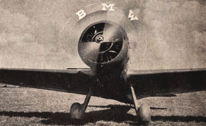
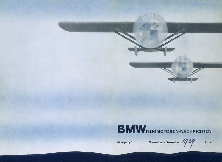
We’re not here to chide the brand for missteps made before most of us were born, so we should instead address the screw ups occuring now. This is the second time in the last seven months that the company has gone out of its way to tell everyone that the emblem has no ties to aviation … even though it changed its logo when it “had no end customers to solicit” and did most of its business with the German Air Force. It also featured the logo atop actual aircraft in advertisements published between 1929 and 1943. BMW even set up an LED display on a vintage plane in 2013 so that the propeller would display its logo while spinning.
With a little digging, we found examples of BMW pushing the anti-plane narrative going back to 2015. What has the automaker gained from this? A handful of lazy articles taking BMW’s press releases at face value and more people using the internet to verify the propeller claims/refutation. There’s still no real consensus online and digging deep enough will have you reading all about the company’s temporary strategy of using forced labor. Maybe the image never officially had anything to do with planes, but you can forgive millions of people for making that association.
Perhaps BMW’s marketing team has never heard of the Streisand effect.
But the past is the past and we’re moving on to that new logo. The manufacturer has maintained that the image is to be chiefly used for communication purposes and said there were no plans to slap it on any cars or dealership signs. That’s assuredly subject to change on an executive whim but we can’t really see it working on the hood of a non-black car.
This also probably leaves you wondering what’s the point of changing the logo if you aren’t going to use it broadly. It apparently has something to do with digitalization, though the marketing jargon BMW laid upon us was a little thick. We thought the brand just wanted something that looked a tad more modern but the little emblem actually represents a major evolution.
“BMW is becoming a relationship brand. The new communication logo stands for openness and clarity,” Jens Thiemer, BMW’s head of brand management, said in a statement. “We want to use this new transparent version to invite our customers, more than ever, to become part of the world of BMW. In addition, our new brand design is geared to the challenges and opportunities of digitalization for brands. With visual restraint and graphic flexibility, we are equipping ourselves for the vast variety of touch points in communication at which BMW will be present, online and offline, in the future. This additional communication logo symbolizes the brand’s significance and relevance for mobility and driving pleasure in the future.”
[Images: BMW]

A staunch consumer advocate tracking industry trends and regulation. Before joining TTAC, Matt spent a decade working for marketing and research firms based in NYC. Clients included several of the world’s largest automakers, global tire brands, and aftermarket part suppliers. Dissatisfied with the corporate world and resentful of having to wear suits everyday, he pivoted to writing about cars. Since then, that man has become an ardent supporter of the right-to-repair movement, been interviewed on the auto industry by national radio broadcasts, driven more rental cars than anyone ever should, participated in amateur rallying events, and received the requisite minimum training as sanctioned by the SCCA. Handy with a wrench, Matt grew up surrounded by Detroit auto workers and managed to get a pizza delivery job before he was legally eligible. He later found himself driving box trucks through Manhattan, guaranteeing future sympathy for actual truckers. He continues to conduct research pertaining to the automotive sector as an independent contractor and has since moved back to his native Michigan, closer to where the cars are born. A contrarian, Matt claims to prefer understeer — stating that front and all-wheel drive vehicles cater best to his driving style.
More by Matt Posky
Latest Car Reviews
Read moreLatest Product Reviews
Read moreRecent Comments
- DO I have owned a 2012 LR4 since day one and it has been the best vehicle I have ever had the pleasure of having in the garage. I know how easy it is to hate on Land Rover but this LR4 is comfortable, has a ton of storage room and is so versatile. With 110k miles, mine is now relegated to ‘other’ car use but is still the go to for off road adventures and snow runs. Nice to see one featured here - I think they are so underrated.
- Tane94 I'd be curious to know whether 87 octane is no longer the most popular grade of gasoline by sales volume. My Costco often runs out of Premium grade and I suspect 93 octane might now be the most popular grade of gas. Paying 40-50 cents more per gallon 87 vs 93 octane because of turbo engines is the real story
- Redapple2 125 large? You re getting into 911 territory.
- Redapple2 Industry worst quality prevents any serious consideration. I ll take an Evil gm Vampire Denali first.
- MaintenanceCosts Thing mentioned in the article: 77 pounds lighter than the standard version!Thing not mentioned in the article: The "lighter" curb weight is 3902 pounds. That is a few pounds heavier than my 2011 335i *convertible*.









Comments
Join the conversation
Like guys with blonde highlights, BMW is synonymous with “villain” in the eyes of non owners. I don’t want a relationship with any company, much less one that created the X6.
I merely went to the BMW official history website for the answer on their emblem. For some reason, copy and paste won't work on it, but all it says is that the emblem was used on every BMW product from 1917, but the first advertising use was in 1929 on that airplane ad shown here. It says the logo has been regularly reinterpreted over the years. And that's it, folks. No more. It's TTAC causing BS confusion, accusing BMW of trying to change their history every six months. Can't help it if every Tom Dick and Matt get so wound up about the BMW logo, they basically squirm at the very thought that BMW would change their tune on the logo's interpretation, when I see no sign they EVER did. It was all in the observer's minds, probably from the Brits who had actual car test magazines in the 1920s, which tended to be written by people as smitten by themselves as the muttering rotters at TTAC.