


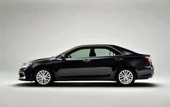
Vellum Venom Vignette: 1991 Toyota Camry (emblem)


The last two Vellum Venom editorials discussed the differences between 1980s and 2000s automotive design aesthetics, for two vehicles with similar missions for their respective brands. The point? We’ve gone silly in our proportions and we need way more ATD (attention to detail) from the auto makers. Behold, my point coming to life: the 1991-ish Toyota Camry.
Before we proceed, remember what one of my design teachers said: success depends on proportion, proportion, proportion!
Aside from the ill-scavanged, left-hand backup light assembly on the decklid, this was a clean example of one of the more respected Toyotas ever made. While I never found their styling exciting, these GEN-II Camrys are honest and well executed. With plenty of ATD! But check out the gigantic Toyota badge cribbed from a newer model.
See how proportioning is so important to the rest of the car?
And, regulations and requirements aside, have we gone juuust a little crazy in our quest for larger cars?
One day we will have smaller badges on our sedans, and smaller butts to go with. If the Camry is any indication, a smaller butt means more rear overhang + less C-pillar so we can actually have a more usable cargo footprint too. Oh, what a feeling!
More by Sajeev Mehta


Comments
Join the conversation
Sajeeve, Regarding the "ill-scavanged, left-hand backup light assembly on the decklid", could it be that Toyota was simply using a common lighting design to meet both US and European (mandatory rear fog light) lighting standards?
I have a hunch that part of the reason for today's bulbous-ness in car design has something to do with the vehicle being more safe. Still, I wonder what would happen if an automaker decided to to conservative-eighties/nineties on us again, what would happen.
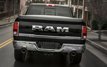
You want to talk about emblems and bad proportions? I'm a Mopar cheerleader, but even I think the "belt buckle" emblem on the door of the Ram Longhorn is absolutely ridiculous! http://cache.gawkerassets.com/assets/images/12/2010/09/ram_longhorn_laramie_1.jpg
I've always liked Acura's emblem. A compass in a circle to indicate precision in design and engineering.