


#chromostereopsis
Why Do Police Cars Use Red & Blue Lights? They're Visually Confusing
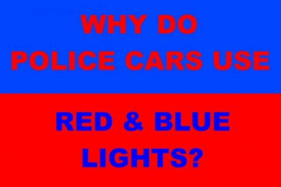
Sorry for the tease but to get the full effect of this post you’re going to have to click on Read More. It’s not that we want the additional clicks, it’s just that I’m using a graphic to illustrate this post that is so eye-searing that the layout and graphic designer in me just couldn’t put it on the front page above the break.
Once you do make the jump, you may have trouble focusing on the text in the image below. That’s because of a phenomenon known as chromostereopsis, which the American National Standard Institute ( ANSI/HFES-200, Part 5) defines as “the perception of depth resulting from the close proximity of two colors of disparate wavelengths”. There’s a good explanation of chromostereopsis here. Because of where in our eyes the receptors for different colors are, and how our eyes focus, we perceive different colors as being at different distances. Printers and others who do graphic layout have long known that because they are at opposite ends of the spectrum, it’s not a good idea to use blue letters on red backgrounds and vice versa. Most people perceive blue as closer than red, and as a result the human eye cannot focus on both red and blue at the same time, causing the optical illusion of blurry letters in the graphic below.


Recent Comments