


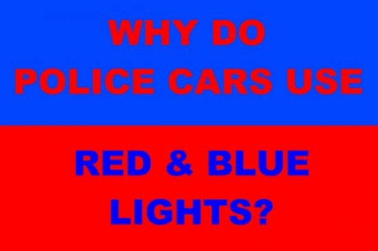
Why Do Police Cars Use Red & Blue Lights? They're Visually Confusing
Sorry for the tease but to get the full effect of this post you’re going to have to click on Read More. It’s not that we want the additional clicks, it’s just that I’m using a graphic to illustrate this post that is so eye-searing that the layout and graphic designer in me just couldn’t put it on the front page above the break.
Once you do make the jump, you may have trouble focusing on the text in the image below. That’s because of a phenomenon known as chromostereopsis, which the American National Standard Institute ( ANSI/HFES-200, Part 5) defines as “the perception of depth resulting from the close proximity of two colors of disparate wavelengths”. There’s a good explanation of chromostereopsis here. Because of where in our eyes the receptors for different colors are, and how our eyes focus, we perceive different colors as being at different distances. Printers and others who do graphic layout have long known that because they are at opposite ends of the spectrum, it’s not a good idea to use blue letters on red backgrounds and vice versa. Most people perceive blue as closer than red, and as a result the human eye cannot focus on both red and blue at the same time, causing the optical illusion of blurry letters in the graphic below.
I apologize for for the eye strain but I was literally trying to illustrate a point. It could have been worse, I could have made it a flashing, animated GIF. To remove that visual abomination, click on read more.
Isn’t that better?
Back to the topic.
In addition to chromostereopsis, as LEDs have proliferated, people have come to realize that its harder to focus on pure blue lights than on any other color. Our retinal receptors are known as rods and cones. Visual acuity comes from rods and is mostly a black and white phenomenon. Color is added by cone receptors. Rods are sensitive mostly to light in the yellow-green part of the spectrum. Pure blue light doesn’t activate rods sufficiently for clear vision.
Flashing blue lights make it hard to focus but flashing red and blue lights together is an even worse idea. To begin with it makes it hard to estimate the distance of an emergency with flashing red and blue lights. More dangerously, when your visual system is being flooded simultaneously with bright red and blue lights, the effect is almost blinding, certainly visually confusing. It’s a problem for motorists but it seems to me it would create an even more dangerous situation for police officers who have to make out shapes and distances in visually confusing lighting situations.
So why do police cars use blue lights in the first place and even worse, red and blue lights together? I suspect the reason is partly historical. In some states police used red lights and in others blue lights. It made sense for manufacturers to offer units with both colors. However, I think the main reason is exactly chromostereopsis. I think the companies selling emergency lights have to be aware of the phenomenon, and they wanted to come up with lights that would surely get your attention. Does the sign above get the attention of your visual system?
A while back I contacted a handful of companies that manufacture and supply emergency lights to police agencies abpuit chromostereopsis but none would comment. It’s not as though the phenomenon is not well known. Just about everyone who works with color knows not to do two-tone with red and blue.
So why do police cars do use red and blue flashing lights?
Ronnie Schreiber edits Cars In Depth, a realistic perspective on cars & car culture and the original 3D car site. If you found this post worthwhile, you can dig deeper at Cars In Depth. If the 3D thing freaks you out, don’t worry, all the photo and video players in use at the site have mono options. Thanks for reading – RJS

Ronnie Schreiber edits Cars In Depth, the original 3D car site.
More by Ronnie Schreiber


Comments
Join the conversation
Terrible article. The actual truth is that studies have shown red lights are most visible during the day and blue most visible at night and amber the best compromise. A mix of red/blue is the best all around. Not being able to judge the distance to the source (even if that were true) is a non-issue to any driver who isn't a moron. As soon as emergency lights are seen you should start slowing down and be prepared to stop.
This article is wrong in so many ways. As 'TheJB' wrote, red has been proven to be the better color in the daylight and blue the best color for night. Amber is the best 'all round' color but it's a warning color for work vehicles, not a color for emergency vehicles. Where I live ALL ambulance, fire and police vehicles have been using red/blue beacons for well over ten years under Workplace, health and safety reasons..