QOTD: What Do You Think of Citroën's New Logo?

Now that Stellantis owns Citroën, there's a chance North America may see automobiles wearing French badges populating its streets once again. However, the corporate emblem may look a little different from the one you remember – assuming you're old enough to recall seeing them before the company pulled out of the market in 1974.
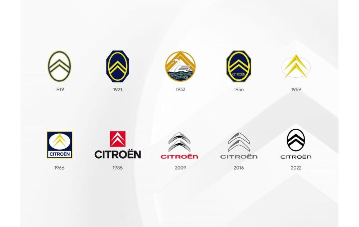
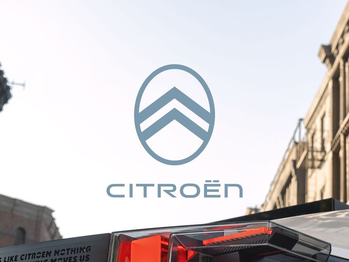
While the chevrons haven’t gone anywhere, they’re now encapsulated in a roundel that harkens back to the ovoid Citroën badges of yesteryear. Officially, the manufacturer said the new design was directly inspired by the original 1919 emblems selected by founder André-Gustave Citroën. At the time, old André wanted the piece to be tied to the herringbone gear system where two opposite helical gears meet to create a V shape, and felt a couple of chevrons encapsulated in an oval wheel served as the perfect representation.
Color always seemed less important, however. While some automakers are intrinsically linked to specific colors – Ford or BMW, for example – Citroën’s former adherence to yellows and dark blues hasn’t played much of a role since the 1980s. This new graphic is effectively a redux of the original badge and doesn’t seem to have a preferred palette. Citroën showed the redesign off in a series of hues, with tomato red being the most common so far. Technically, this color is called “Infra-Red” and will be replacing the signature red the brand used to use. But most corporate materials will have the logo in grayscale with its name running across the bottom in an updated font.
We’ve actually seen the basic shape crop up before. The manufacturer slapped it onto the all-electric 19_19 Concept that debuted in (you guessed it) 2019. While not identical to the version we’re looking at now, it shows that the company had been considering the change for a while and was looking into the past for inspiration.
Citroën said the updated roundel would “initiate a new direction in product design language in which the visually prominent badge will become an immediately recognizable signature element of all Citroën models.”
The company even previewed the new logo on what is very obviously a concept vehicle, stating that it was an upcoming model intended for families. That’s pretty broad and the only other items we have to go by are extremely tight photos of the grille where the words “Nothing Moves Us Like Citroen” are carved into it. That particular phrase happens to be the brand’s new slogan and is pretty clever until you realize that these vehicles eventually start breaking down. But maybe nobody will think to mock it if the brand decides to slap it onto production cars.
While the vehicle in question is assumed to pop up at the 2022 Paris Motor Show in October, if not sooner, the new logo won’t see active duty until the middle of next year. Though we still don’t know if Citroën plans to fit it on existing models, or simply roll it out gradually on new models as part of its evolving design language.
[Images: Citroën]
Become a TTAC insider. Get the latest news, features, TTAC takes, and everything else that gets to the truth about cars first by subscribing to our newsletter.

A staunch consumer advocate tracking industry trends and regulation. Before joining TTAC, Matt spent a decade working for marketing and research firms based in NYC. Clients included several of the world’s largest automakers, global tire brands, and aftermarket part suppliers. Dissatisfied with the corporate world and resentful of having to wear suits everyday, he pivoted to writing about cars. Since then, that man has become an ardent supporter of the right-to-repair movement, been interviewed on the auto industry by national radio broadcasts, driven more rental cars than anyone ever should, participated in amateur rallying events, and received the requisite minimum training as sanctioned by the SCCA. Handy with a wrench, Matt grew up surrounded by Detroit auto workers and managed to get a pizza delivery job before he was legally eligible. He later found himself driving box trucks through Manhattan, guaranteeing future sympathy for actual truckers. He continues to conduct research pertaining to the automotive sector as an independent contractor and has since moved back to his native Michigan, closer to where the cars are born. A contrarian, Matt claims to prefer understeer — stating that front and all-wheel drive vehicles cater best to his driving style.
More by Matt Posky
Latest Car Reviews
Read moreLatest Product Reviews
Read moreRecent Comments
- Jeff One less option will be available for an affordable midsize sedan. Not much can be done about GM discontinuing the Malibu. GM, Ford, and Stellantis have been discontinuing cars for the most part to focus on pickups, crossovers, and suvs. Many buyers that don't want trucks or truck like vehicles have moved onto Japanese and South Korean brands. Meanwhile large pickups and suvs continue to pile up on dealer lots with some dealers still adding market adjustments to the stickers. Even Toyota dealers have growing inventories of Tundras and Tacomas.
- Lorenzo This car would have sold better if there was a kit to put fiberglass toast slices on the roof.
- Lorenzo The Malibu is close to what the 1955 Bel Air was, but 6 inches shorter in height, and 3 inches shorter in wheelbase, the former making it much more difficult to get into or out of. Grandma has to sit in front (groan) and she'll still have trouble getting in and out.The '55s had long options lists, but didn't include a 91 cubic inch four with a turbo, or a continuously variable transmission. Metal and decent fabric were replaced by cheap plastic too. The 1955 price was $1765 base, or $20,600 adjusted for inflation, but could be optioned up to $3,000 +/-, or $36,000, so in the same ballpark.The fuel economy, handling, and reliability are improved, but that's about it. Other than the fact that it means one fewer sedan available, there's no reason to be sorry it's being discontinued. Put the 1955 body on it and it'll sell like hotcakes, though.
- Calrson Fan We are already seeing multiple manufacturers steering away from EVs to Hybrids & PHEVs. Suspect the market will follow. Battery tech isn't anywhere close to where it needs to be for EV's to replace ICE's. Neither is the electrical grid or charging infrastructure. PHEV's still have the drawback that if you can't charge at home your not a potential customer. I've heard stories of people with Volts that never charge them but that's a unique kind of stupidity. If you can't or don't want to charge your PHEV then just get a hybrid.
- AZFelix The last time I missed the Malibu was when one swerved into my lane and I had to brake hard to avoid a collision. 1 out of 5⭐️. Do not recommend.












Comments
Join the conversation
It's okay. And since nobody asked, my favorite logo would be '09.
the slogan seems a little weak. "Citreon... nothing moves us"