Seth writes:
Hey Sajeev,
I’ve always had an aversion to dashboards where the main gauges are in the center of the car (Mini, Yaris, etc.). I can see why an automaker would do it if they sell internationally. Once, back when I used to listen to the Autoblog podcast, one of the hosts said that having the gauges in the center made them faster and easier to read. No way! That just can’t be so. I think I stopped listening to the podcast right then and there.
Would you care to comment?
Sajeev answers:
Would I care to comment? Asking an auto journo for an opinion about car design is akin to feeding a bear honey via pouring some on your hand.
Luckily TTAC readers care about my CCS design school experience, so let’s do it…to it.
No.
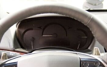
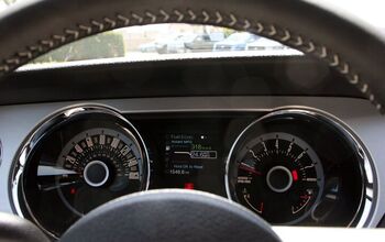
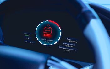
I do not like center mounted gauges for the vast majority of interiors, even the smaller confines of niche/boutique products like the Panoz Esperante. Ergonomics and human factors demand gauges that share the steering wheel’s center line, at least for the primary gauges such as the speedometer and tachometer. For most cars and most eyeballs, you can quickly dip your eyes lower to catch the gauge readouts with several layers of your peripheral vision.
For you armchair analytic gurus, please consult your eye care professional and this Wikipedia page about peripheral vision applications, but the graphic above laid over the central/paracentral at the horizon line (hat tip – psarhjinian) should show what’s the best place for both primary and secondary gauges.
Secondary gauges like oil pressure, volt meter, fuel level and maybe even engine temperature can go in the center, or preferably to one side (or both) of primary gauges.
So classy! Which begs the question, does this matter in today’s high-tech environment?
Yes and no. Definitely yes regarding the MINI Paceman’s idiotic center speedometer around the circumference of the multi-function screen. (EDIT: there’s a speedo in a screen within the tach) Mercifully, the “normal” MINI has a big ass speedo adjacent to a smaller tach.
We are bombarded by information thanks to in-car connectivity. The dash’s center is a fantastic place for non-essential information: smartphone interface, HVAC, audio, navigation, and even the aforementioned secondary gauges.
In a perfect world where design constraints (cost, durability, etc.) are non-existent, a dashboard with smartphone-type crap in the center, a basic set of gauges and a multi-functional screen (for navigation, audio, etc.) inside the circumference of the steering wheel, and a heads-up display shooting your speed — and little else — onto the dashboard shall be perfect.
Put that in your often rambling and sometimes pointless auto journo podcast and smoke it. And I know these things are dumb, as I even tried it once. We all have regrets in our lives!
Off to you, Best and Brightest.
[Image: Shutterstock user Kurt Achatz]
Send your queries to [email protected]
Personally, I hate the center placement also. The design simply seems awkward. I’ve never owned one, but I have to believe all it would do is give my wife a clearer picture of exectly how far over the speed limit I am actually going.
I think center placement only works for those fools who drive slumped down and over to the right, generally with just their left hand on the wheel. I presume that these fools think they look cool, but I think it would have to hurt your back.
They are also the ones who can’t sit in a seat unless it’s reclined all the way.
I thought el cheapo left hand, right hand market solution.
How about Sentra SER/ Spec V oil & g-forces gauges?
Didn’t Jack do an article on this a short while ago? Or am I misremembering?
“A Vestigial Tale”.
https://www.thetruthaboutcars.com/2015/07/no-fixed-abode-vestigial-tale/
My wife’s ’03 Mini Cooper has a blend of gauge locations – but the big speedo and warning gauges are right in the middle of the dashboard. At first I thought I would hate it – but, like anything, you get used to it. It doesn’t bother me anymore.
When I ordered my 2005 Mini Cooper S I chose the optional gauge package, which put the speedo and tach in front of the driver, where they belong. Only the secondary instruments ended up in that big central circle.
I don’t know this to be the case, but I always figured that the original Mini had its gauges in the central position to save money when tooling up for lefthand drive versions. Maybe they should have done a McLaren and put the driver in the centre too!
Was the speedometer with the tach a standalone option, or did you have to get navigation to move the speedometer from the center of the dash to steering column? If it was a standalone option, I can’t believe I wouldn’t have specified it when we ordered our 2003 Mini Cooper.
The speedometer and tach in front of the driver was offered only if you ordered the nav system, which would reside in the circle. However, at the dealership, you could ask for that gage cluster to be installed.
I believe the original Mini had a hole in the center of the dash for manufacturing purposes. It provided a pass through for the body shell lifting mechanism. The clever idea was to take advantage of that hole by using it to mount the speedometer. Once a concession to manufacturing efficiency, now a styling trademark for the brand.
Original Mini had the hole in the center of the dashboard to match the hole in the rear seat back support; these holes allowed the body to built on a rotisserie, like a chicken, while assembled.
Also, it was standard at that time for English cars to have the guage cluster in the center, so that it could be the same on RHD & LHD cars.
Absolutely ridiculous.
Laughable.
Stupid.
It is bad enough for me when I see back up/navigation screens sitting 4 and 5 inches below the top of the dash and it is hard enough to work the media and climate controls in the center without the really important info. right there in front.
They do actually work very well. I have an Echo with them, and, using Sajeev’s graphic and my own measure, it’s a 12 degree lookaway, versus 20 degrees or more for gauges below the wheel. More importantly, it’s in the same focal plane as the road. This is nice for just about everyone, and a huge boon if you have bifocals.
ETA to clarify: Sajeev: that graphic should be overlaid with central/paracentral at the horizon, not the steering wheel. You look at the road, not the wheel rim, when you drive. By that metric, gauges below the wheel are very, very far away from centre.
The Saturn Ion is set up similarly to the Echo/Yaris. Even better was the first-generation Suzuki Aerio, which placed the gauges at an 8 degree lookaway and in the same plane. The Toyota Prius did something similar, albeit not as effectively.
The Mini Cooper is a bad example: it’s a 25 degree lookaway and in a different focal plane: the worst of both worlds, and a definite example of fashion over function.
So yeah, they are a good thing. Those podcasters are right. Unfortunately, auto enthusiasts are some of the biggest curmudgeons on the planet and will fight change, even when it’s for the better.
ETA to clarify: Sajeev: that graphic should be overlaid with central/paracentral at the horizon, not the steering wheel.
Amended, thank you.
can’t.
no way no how are these closer than the dash in front of the driver.
Do not know how you got your measurements or the placement of the car seat and wheel…but there is now way a side glance gives you same good view as a straight ahead view. the angle simply cannot be as you describe. the view of the circle alone on a side view would be compromised.
this isn’t that difficult to see why time has proven this. designers and consumers would pick the top position and comfort for driving.
The market would have driven this direction is it was better.
I would also add that the Yaris/Echo and Ion keep the gauges in-line with the ICE and climate controls. The Echo places them a bit too low, but it’s still a shorter lookaway from the gauges and the road to the controls than in a “normal” car.
People really exaggerate the lookaway and ignore the focal plane issue.
we don’t exaggerate our feelings. i have driven and sat inside these…well, the mini, anyhow…and this comes from my experience.
I would give a darn how it was done if i felt good about it when using.
no horse in the race.
“we don’t exaggerate our feelings. i have driven and sat inside these…well, the mini, anyhow…and this comes from my experience.”
The Mini is much worse than the Echo/Yaris and Ion: it’s gauge cluster is very low in the stack. It’s the worst of both worlds: you have to look away AND down AND into a different focal plane.
I drive an Echo and I like it’s centre pod, but I find the Mini’s just as objectionable as you do.
perhaps because some of these, unlike the mini, slant sufficiently the center stack towards the driver???
If they do this I might find it workable. Then the angle would not force the head movement…and actually be easy to see with side very minimal glances.
the easier the glance, the more workable.
“perhaps because some of these, unlike the mini, slant sufficiently the center stack towards the driver???”
The Echo is definitely cantered toward the drive. Here’s the Echo:
stuff.silverorange.com/images/echo_dashboard.jpg
It is hard to beat the clean look and funtionality of mid 90’s Honda Accord gauges. Clean, easy to read and simple.
I like the Corvette layout above except for that cheap looking steering wheel getting in the way.
Put me down as always in favor of full instrumentation (as long as it does something and isn’t just a fancy “idiot light” with a needle attached.)
When you’re copying late 70’s-early 80’s German clusters, you cant really go wrong.
Audi clusters from the 80s looked superb. Well, except the part where they were lit up like a Christmas tree.
While teaching young, new drivers how to drive, and I have done a few, the most important motor skills I work into their heads are rapid eye movement and looking ahead for possibilities. Planning ahead.
The glancing learned from practice teaches the mind’s motor memory to take over long after the early years of consciously doing it.
I show them how doing it all the hard time in the early years will find their eyes doing rapid checks unconsciously in the future.
They will find themselves aware of what is going on all around them without consciously working at it.
But trying to do this is hard enough without having to look long distances on the dash for important second to second glancing. You almost should not have to move your head very much except for the passenger side mirror. Everything else should be available without turning the head…much.
“Off to you, Best and Brightest.”
Some car makers have tried to increase ergonomics similarly to having HUD, but using less expensive technology. This was the case with the first generation Yaris where the center gauge used mirrors on the EU-spec models in order to give the illusion that the gauges were far away. This lessened the change in depth that the eye has to adjust when shifting between looking at the road and checking the speed. Unfortunately this was also a very expensive experiment and Toyota used traditional gauges in markets where price was of essence.
When i had my major stroke in 06, one major loss (there were many) was my peripheral vision…one of my once better skills.
It was very difficult for me to drive since I found myself having to turn directly at anything I wanted to see.
Glad that it has come back entirely today…one of the few parts of the mind that has return to normal. Grammar and eye hand still major struggles, as you folks can tell from my work here. Most times I still do not recognize how words are misspelled or totally out of place in a sentence until rereading later. Things I think to say or type do not always get done as planned….
So I am particularly sensitive to this design. It makes driving hard. The dash design should make driving easier…
I remember reading a review of a Saturn that had them in the center. Reporter said they were easier to see, in a better place. I think he just signed his name to Saturn’s PR.
Drove a rental car that had them in the center of a car. Hated it. What are designers thinking?
I will never buy a car that has them in the center of the car.
I had a business trip and rented an Ion to go from Indy to Pittsburgh and back, and while I think it would take some getting used to, I didn’t think it was all that bad. While it was off to the side, it was higher up. I found it to be as easy, or easier to see than any conventional cluster.
That said, I’d prefer the Civic’s cluster, with the speedo high up and everything else in the regular place.
I will say, although it’s not the supposed intended reason for centre-mounted gauges, there is a small benefit. I have a relatively long torso and and shorter legs, so often, I can’t adjust the steering wheel high enough to not cut off the top of the gagues – putting them in the middle gets rid of that (minor) obstruction.
It’s funny that you mention that – I’ve got long legs and a short torso, and have the exact opposite problem. The seats in small cars never go back far enough (but I ALWAYS have enough headroom, especially with the way even compact sedans are closing in on what used to be SUV heights). The steering wheel invariably cuts off the bottom of the guages. I’ve long had to lean up and peer over the hub to see the odometer, unless I have the wheel so low that I have to splay my legs to the side.
Is there anything about the Ford Elite that is not brilliant?
You know, I didn’t think twice about the Ford Elite back in the day. But, looking back from 2015, it was a solid effort for the time. The Elite was a slightly restyled Mercury Cougar and both were variants of the Ford Torino, as was the Mercury Montego. Ford’s mid-sized platform was pretty good.
If there is something not brilliant about it, I don’t wanna know about it.
If loving the Ford Elite is wrong, I don’t want to be right.
351 standard with a 402 or 460 optional
3 speed automatic
Power steering and brakes
Landau top
Opera windows (!)
Metallic Glow paint (!!!!)
And that gauge stack
It meets all my personal luxury coupe needs. I’d still rather have a Mark IV or Riviera if I get to choose an early-mid 70s PLC (70s Riv > 70s Eldo).
Oooooooo.
Landau with opera windows my man.
Glorious.
just the name…
With the 2-tiered instrument panel, the 2006-2015 Honda Civic, made an interesting attempt at displaying important info above the steering wheel. It caught much flack from keyboard warriors, however it worked well. I wouldn’t be surprised if other brands implemented similar designs.
+1 I’m in total agreement.
It got a lot of oos and ahhs in the first two years or so. Then the novelty wore off and people criticized it. But I agree, it was highly functional, and is a precursor to the heads-up displays being explored today.
Considering Honda’s moving away from the 2-tiered gauges for the next Civic, I sadly doubt it. Which, is unfortunate, because it did work really well.
I mostly agree with Sajeev and the comments posted so far. But there’s one situation I found the steering spokes blocking my speedo — the curving off-ramp. When there’s room, I like to take it fast. How fast? I dunno… the steering spoke is blocking the needle.
Another scenario — my wife is driving and I’m in the front passenger seat. “How are we doing on gas?” I ask. Unwilling to be bothered with precision, she answers with either “more than half a tank” or “less than half a tank.”
I can hear the B&B now:
1, Take the curve faster, until the needle becomes visible over the spoke.
2. Trade in the wife for a more accurate one.
:)
Wait for the straights to check your gauges. If you’re actually going fast on an off-ramp, the speedometer isn’t important. You should be focused on your line!
@rpn453 – “You should be focused on your line!”
You are absolutely right! And that’s what a did the first dozen times until I found my line. The speed is more for curiosity at this point.
If the steering spoke blocked the needle, then you know where the needle is, within some margin of error; otherwise, you’d be able to see see it..
@redav – “…then you know where the needle is, within some margin of error”
Yes, I have an approximation. I enter at 40mph and prefer to turn in early. When the tires start to squeal (not squall) I know I am at my limit.
BTW, I don’t play like this when the road is wet or when it’s dark out, I look ahead and at various times have seen deer at the side of the road, a sneaker in the middle the road, and two cars in a fender at the end of the off ramp. Like tire squeal, I regard these sign-posts that I am at my limit.
Eh Wot? No Panther love for this topic?
I think the layout of the gauges and instruments on my 97 Grand Marquis are clean, easy to locate and interpret while driving, etc.
The only advantage for a center cluster is for the manufacturer…only needs to design and install one dash, instead of LHD/RHD models.
But in heavy fast traffic, I want to be able to check my gauges every few seconds at most, but with my eyes away from the windshield for the least amount of time possible.
With the cluster in front of me, I can do split-vision and check the gauges while still being able to see red lights go on in the car in front of me. With a center dash, it is much harder to interpret and react to the vehicle ahead while I am looking at the gauges.
In other words, center gauges? Not just no. HELL NO!
2009 Scion XB owner here.
I’ll admit my hands-down favorite dash of all time is the 1977 Pontiac Grand Am. Driver-centric center stack, main gauges in front and easily seen through the steering wheel. But you also have to be sitting down low in the vehicle for it to work.
http://image.highperformancepontiac.com/f/features/9151264+w799+h499+cr1+ar0/hppp_0302_07z%2B1973_Pontiac_Grand_Am%2BSteering_Wheel_Driver_Side_Interior_View.jpg
But centering the gauges behind the wheel does force some design tradeoffs. The W123 Mercedes has, for the most part, excellent ergonomics and gauge visibility, but you pay the price in having a steering wheel that belongs on a bus.
What Scion did allowed some good things. First, the digital speedometer graphics are very large, so your eyes track directly to it even with a casual glance. Second, it permitted the use of a smaller steering wheel which eases entry. Not having a large diameter wheel actually improves forward field of view. Third, it made room for a neat little tray in the left side of the dash for your wallet. Sure beats sitting on it. Was it perfection? no, but if they had tweaked the design some more in the mid-cycle refresh that never happened, there would be even less to complain about.
On balance, it was good enough the first time around that it didn’t present any problems for me as a driver. I’d consider another vehicle with center gauges any time if the execution is well-thought out.
I am almost blind in my right eye. To see the central speedo on a MINI would require me to swivel my head 30 degrees, verses dipping my eyeballs if it’s in the “proper” position.
So any company pandering to trendy ergonomics or trying to pay homage to engineering deficiencies/cost cutting of the past automatically loses me as a customer.
I also shy away from HVAC controls which can’t be set completely by touch (ie. three-knob)
The contrast between those mid 70s IPs and that of the Mini shows what happens when you allow overgrown children with computer fetishes to design machinery.
With TV sized touchscreens now becoming standard, no one ever seems to ask the question “although we can do it, should we?” Also typical of immature designers, who think the road to success consists of jamming every possible gewgaw into the product – and without any thought as to whether there’s any commonality among platforms.
I expect that soon some auto “designers” will start putting the accelerator pedal on the left, the brake on the right, and the clutch in the middle. Or changing the orientation of the steering wheel so that clockwise rotation of the steering wheel makes the car turn left.
If you guys had actually been in a MINI instead of blathering on about a car you haven’t actually sat in, you’d realize the tach and speedo (digital) are mounted front and center above the steering wheel. That thing in the center of the console is just a gimmick
Amended.
I had both a 76 Corvette ‘Stingray’ (white interior) and a Ford Gran Torino Elite (Ford’s classic dark brown). So those photos brought back a lot of (good) memories.
‘Deja vu all over again’ in tribute to the just passed legend Yogi Berra.
Prior to that one of the first Cordoba’s in Canada and followed them with a 78 T-Bird which I thought was very nice to look at and sit in but an absolute mechanical nightmare.
And the Old Man had a ’60 Austin Mini Minor (as they were called) traded his 56 Ford for it at Rootes Motors in Scarborough and detested the placement of the gauges in the mini. Traded the Mini after just over one year for a VW Beetle, which in reality was a far superior automobile in terms of durability, reliability and even interior comfort. Although neither were perfect for a driver who was just over 6’1″ and about 235lbs at the time (a serving police officer who trained 5 times per week) and had to fit himself, his wife and 3 male children into them.
The theory is that center-mounted gauges are further away than conventional gauges, so your eyes don’t need as much time to refocus. I don’t like them but it’s probably only out of habit.
Also, if they’re not perfectly centered (like in the 1st-gen xB), they’re a smaller angle away. That xB gauge is one I actually like – it’s about halfway between the steering wheel and the center of the dash, and it’s very high up.
I loved Car & Driver’s first take of the Ion, concluding it was the most disappointing all-new American car in a decade (which it was) and likening the enormous airbag cover to a chicken pot pie (which it is).
There were a lot of very, very wrong things about the Ion, but the gauge cluster wasn’t one of them.
The chassis redeemed itself with the Ion Redline, but it still sucked something awful otherwise. The steering wheel, though, yeah. That did suck. A lot.
psarhjinian, you’re right. The gauge cluster was probably the best part of the Ion. The rest of the car was a flawless design flop in what not to do with car design.
The biggest issue with the placement of the gauge cluster in the Ion is it leaves that awful expanse of cheap plastic in front of you forcing you to really notice that awful bumper-car steering wheel.
1968 Firebird… now THIS is where the tachometer belongs.
http://www.dailyherald.com/storyimage/DA/20141229/entlife/141229566/EP/1/2/EP-141229566.jpg
The upcoming new (US-spec) Civic marks a return to one-tiered instrumentation:
http://img2.netcarshow.com/Honda-Civic_Sedan_2016_1024x768_wallpaper_03.jpg
The original Twingo dash worked really well, but maybe because it was extremely simple, easy to read and high up.
http://media.autoweek.nl/m/m1fygd6bmmyi_480.jpg
At least the Twingo’s gauge cluster was aligned with the centre of the car. Unfortunately its steering wheel wasn’t aligned so well with the driver’s seat.
2 things that auto engineers NEED to take:
1. Interior design
2. Ergonomics
Too many times have consumers been forced to the BAD design layout of the vehicle interior because those engineers have NO clue how to design the interior in a ‘clean’ or usable fashion.
The older Japanese cars have better designs/ergonomics than the current Japanese cars, American and esp. the Euro cars which is a joke.
To many auto engineers, it’s all about ‘functionality’ when it should NOT be!
For example, why do you put a display on top of the center dash when you clearly see that it should NOT be placed there?! [Looking at ALL the Euro automakers]!
Hiring some artists to work with the engineers.
Many of the interior, and exterior, designs nowadays are just terrible!
More aptly, “functionality” is NOT separable from ergonomics.
(As Jobs said, “design is how it works”; functionality should/must *include* ergonomics and usability.
It ain’t functional if people can’t stand to use it, can’t read it, or can’t operate it.
But on the other hand, I’m not so sure it’s “clear” that there should not be a top-center-dash display for *secondary* information; that’s very much in “peripheral”, which suffices for information of less importance.
For your primary drive-time information? No – which is why those same Europeans also [in the examples I’ve seen] put e.g. driving directions in the main console inside the speedo.)
I don’t believe engineers design the interiors any more than they design the swoopy curves & creases of the sheet metal. Engineers just make the pieces fit within the envelopes created by stylists.
When I bought my 1st-gen Scion xB, I thought to myself, “This is weird, I’ll never get used to it.” But I did.
Now that I’ve been driving it for 6+ years, I just added a ’90 Intergra to my fleet. It has a “normal” IP. When I first sat in it, my reaction was, “This is weird, I’ll never get used to it.”
http://www.alfabb.com/bb/forums/attachments/alfetta-gtv6-1972-1986/103940d1211814761-alfetta-gt-dash-gtv6-paul-007.jpg
On the HUD speedo thing…
I like the idea of an HUD for quick information, definitely.
And I don’t mind an HUD showing speed.
But I’m not sure it’s ideal as the primary speed indicator, because:
I find that I use the speed of the needle movement as a guide to how quickly the car’s accelerating or decelerating (because RPM alone can’t tell me, and with hills and such the disconnect between what my foot is doing and how the engine sounds and *exactly* how I’m acc/decelerating can be meaningful).
Watching – even at a glance – a needle swing provides more information than just a number you see change every MPH, and sometimes that number’s meaningful.
(Doesn’t mean a car with just a digital speed readout is *bad* or anything; just that I think some indication of rate-of-change is also more useful than we realize.)
My biggest complaint with regards to IPs isn’t so much the placement but rather the lighting. While driving on isolated highways in moose country at night, I find my VW’s inability to sufficiently dim the backlighting to be very distracting. To make matters laughably worse, when you have the high beams on, the bright blue indicator light (witch doesn’t dim at all) emits enough light to cause my eyes to become irritated and uncomfortable.
Otherwise, good speed control, or cruise control in lieu of, will negate ever having to worry about where to focus on your speedometer. A simple glance should be enough.
Student pilots are strongly encouraged to learn to fly by keeping their eyes focused on outside references. Once that skill is mastered, desired performance will usually be achieved.
@ imatt: agree 100%. One of my nitpicks regarding my Sonata is that I can never get the dash lighting as low as I want.
Wish that all cars had the Saab style ‘blackout button’.
Long Live the Center Cluster, Long Live the Ion!
My folks being Saturn buyers from the intro in 1991 own an Ion and like it. I’ve driven it a couple of times and find the center cluster ergonomics to be awful.
I think it’s a pre-92 Cutlass Supreme. By 92 it would’ve had the six-button steering wheel, methinks.
I never knew that the ’76 Vette had a steering wheel from a Vega!
What grinds me even more, for some reason, is all of the goofy shapes into which the review mirrors are contorted on some cars, that MINI exhibit “A,” but also Porsche and a host of others; I don’t want a mirror “smiling” at me, and most of them designed this way are too small to see anything of note, which isn’t a good thing considering most cars have the outward visibility today of a bunker! The mirrors in the larger Benzes or the “standard” self-dimmer, a nice beefy piece of plastic that won’t loosen after 2,000 miles, is perfect!
That steering wheel was also used on upscale models of the Nova and Camaro.