


Vellum Venom: 2003 Volkswagen Jetta (MK IV)

Did you see an instant classic at last week’s Detroit Auto Show? Maybe that new Stingray. And hearing that the first C7 Vette was on the auction block to support the College for Creative Studies made me a little proud of my former school, too. But, aside from the always nerve-racking bus ride between CCS and Cobo Hall, my “instant classic” moment from the (1999) NAIAS was the introduction of the MK IV Jetta. All of a sudden I couldn’t keep my eyes off of Jettas, especially a silver one in the lower hall of Cobo. And time hasn’t changed my opinion…aside from making it more extreme.
14 years later, the MK IV Jetta is still the best looking of the breed. I sampled this from our old friend Captain Mike Solo, who apparently has a thing for VAG products. Driving this Jetta around made me feel far superior to the current (MK VI) Jetta, and like a God among Men compared to the MK V. Just park one of these next to one of those.
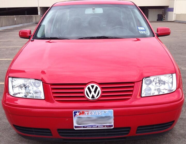
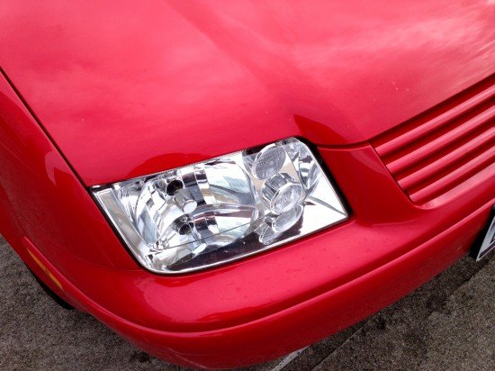
How many cut lines do you see? Not many. Because so many cut lines originate from the headlights and most are parallel to the strong grille lines, there might as well be none. Well, at least compared to so many busy designs from the past 20 years.
The MK IV Jetta has a certain “1970s-80s clean wedge” theme about it…without being a boring wedge. Utilizing “modern” plastic casting technology for the bumpers and headlights, there is the ability to add a flair of curves and circles not seen back then. But real subtle, never showy. This is perhaps the best of both worlds: a specific design aesthetic adapted to make a new look for a new era.
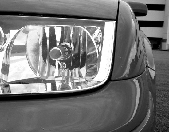
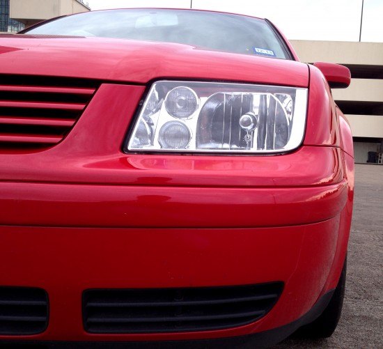
Note how the base of the headlight sweeps upward, complementing the shape of the bumper, forming the beginning of the fenders and the end of the hood’s horizontal cut line. The “J” theme presented here is certainly the most distinctive element of the MK IV Jetta. And damn, it’s so frickin’ beautiful.
Transposed “J” theme. The body color grille doesn’t take away from the theme, and the power bulge in the hood is a natural extension: filling out the “shelf” of the bumper in the center. There’s another important design concept presented here: surface tension. Never flabby or overwrought, the Jetta has acres of surface tension in its mid-sized body.
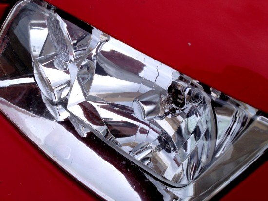
I like round headlight themes confined to square-ish headlights. It adds excitement, without making a front end look like some sort of goofy creature with roundish, amoeba-ish eyes. If it had the MK V’s cool VW logo in the headlight’s reflector cap, it would make the MK V Corolla Jetta a wholly extraneous design in the history of the Jetta. Well, maybe not.
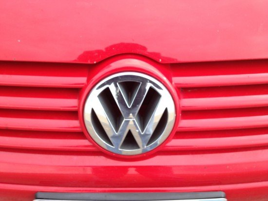
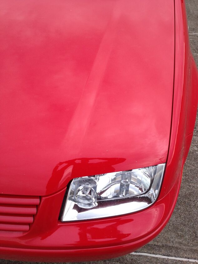
I never liked the emblem butting into the hood’s cut line. I always wanted it straight up there, doing that with the bumper instead. This looks like a wart, while my suggestion would be cute and cheeky. But VW certainly doesn’t agree: this theme continued into the next two generations. Oh well, can’t win ’em all. Or any of them.
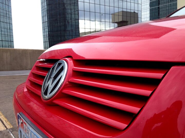
What do you think of the hood’s little circle of discontent? But the grille slats are very Mercedes SL like. Which is cool.
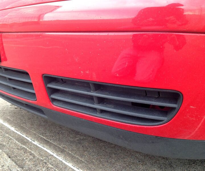
The strong parallel lines are most obvious down below. But even more surprising, the grilles look surprisingly multi-layered and expensive. Not like the cheapy one piece units found on many cheap sedans…or the fog light assembly of the Cadillac CTS-V coupe.
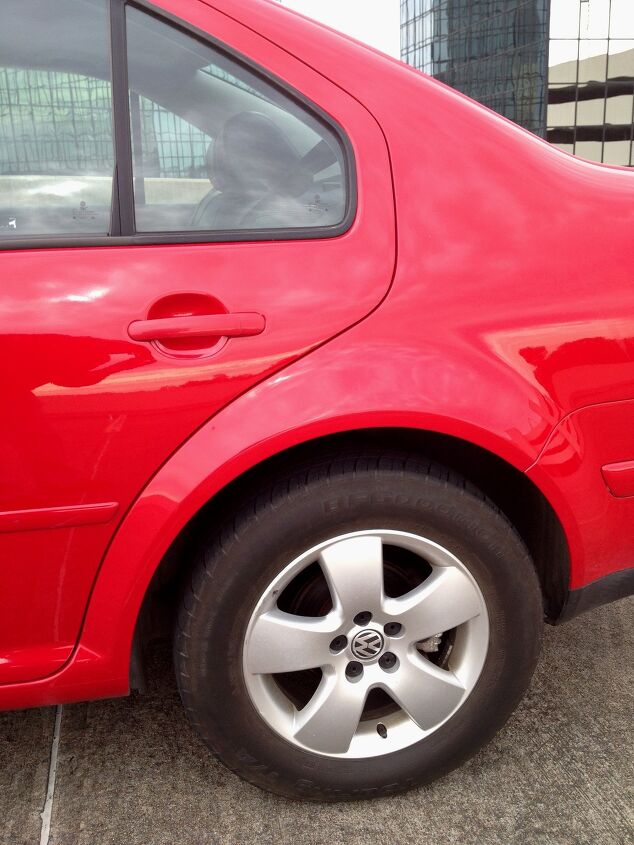
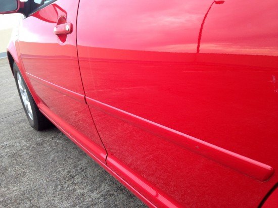
The clean lines continue all the way to the front wheel. I like how the flat black lower trim visually thins the bumper.
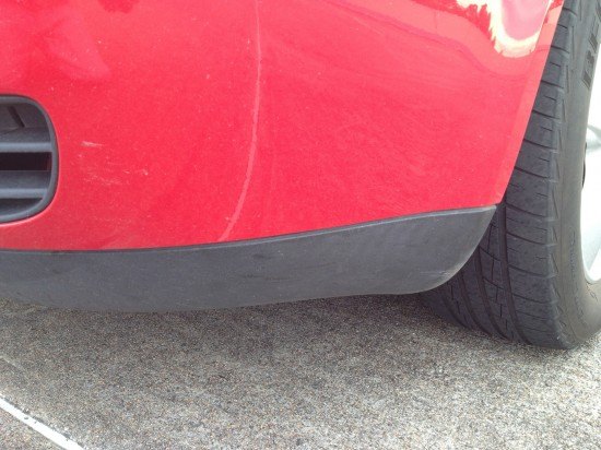
The clean, parallel rub strip incorporates a marker light that bends and ends as a perfect compliment to the rub strip. Clean.
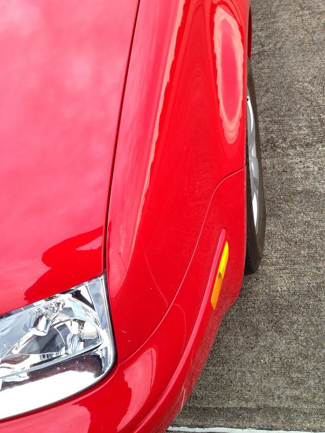
The “J” theme looks fantastic as you walk around the fender. While Saturn already did this with the 1996 SL, the bumper’s cut line and gap size makes this a far nicer implementation. And Ford aped this with their 2005 Focus…and failed. The Jetta’s tight panel gaps and bullet like shaping trumps ’em both.
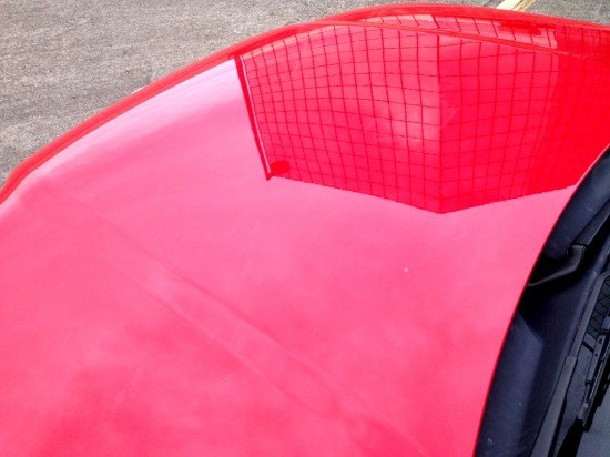
Acres of surface tension on the hood. Note the warpage of the building’s reflection on the domed hood. Combined with the neatly tucked away plastic cowl trim, this is such a beautifully modern and minimal design.
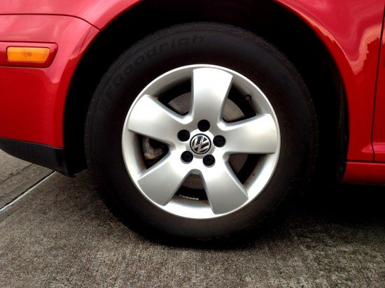
The base wheels are a snooze, especially how the plump spokes meet the rim. The double-5 spoke 17″ wheels available from this era (on the VR6 model?) really added punch to the entire design.
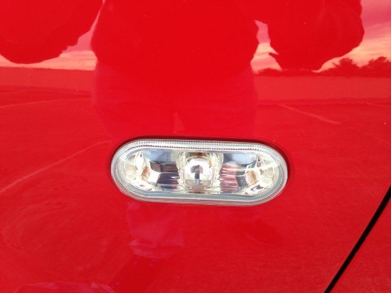
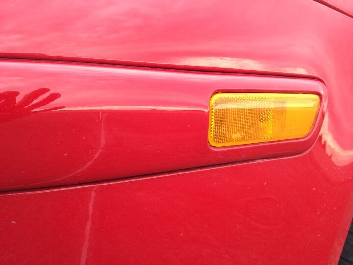
The complex reflector design of the side marker light is hip and Euro: no wonder so many moderately aspirational people (i.e. Sorority Girls) flocked to the design.
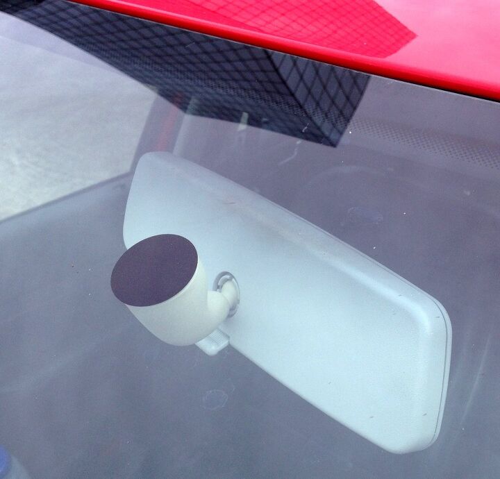
This quirky mirror mount proves the Germans have a good sense of humor. Not that I am laughing, I merely applaud a good zinger within a subtle statement. Well done.
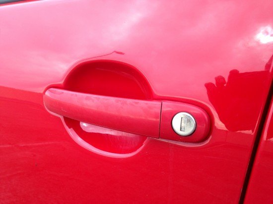
Functional and nicely tucked away door handles. The negative area doesn’t try to impart a sense of style, it just does the job. Which is beautiful in itself.
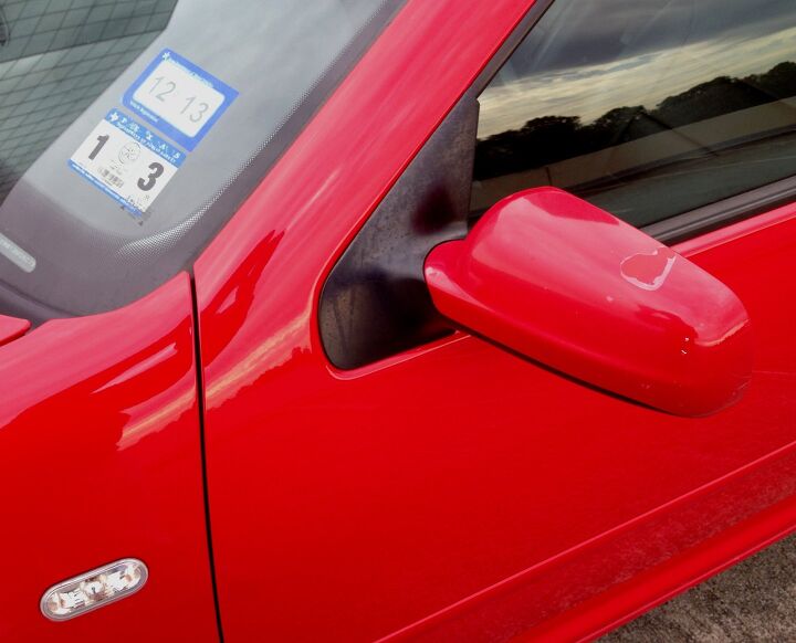
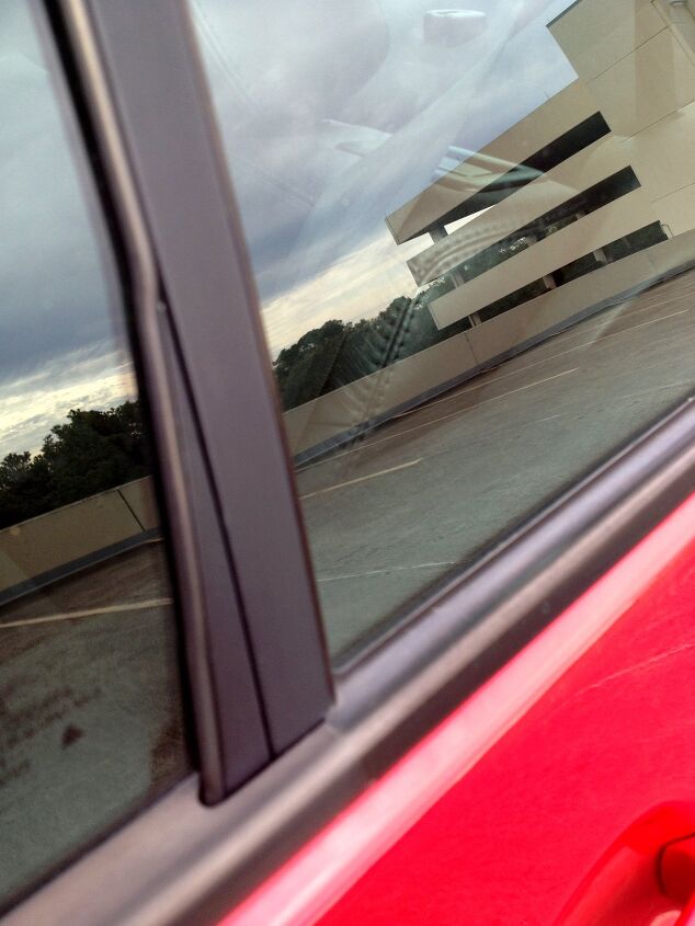
Wrap around door pillars need to make a comeback, even if they are harder to seal or assemble…or something. With it, the fender, hood and A-pillar blend seamlessly (well, except for the two modest cut lines) into a green house with no non-functional plastic triangle of DLO FAIL. (daylight opening) Instead of the FAIL, there’s a cute little footprint for a sleek side view mirror. While the newest Jetta is by no means hideous from this angle, it isn’t this beautiful.
This car is a modern classic, people. Stop and stare at one soon.
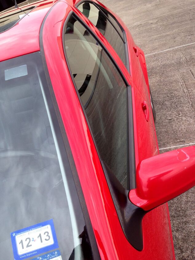
While this shot exaggerates the size of the greenhouse, there’s so much unfettered space here. It’s delightful considering the submarine stance of most new sedans, even the latest Jetta.
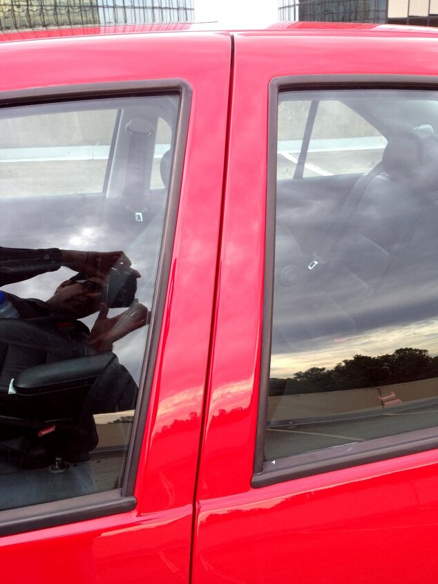
Such a clean and strong B-pillar. The canted cut line looks both fast and solid at the same time. And while newer Jettas try to hide this pillar with blackout trim, the MK IV makes it a significant styling statement. It’s refreshing, because it doesn’t look cheap…even if it is.
Sometimes less is more…see???
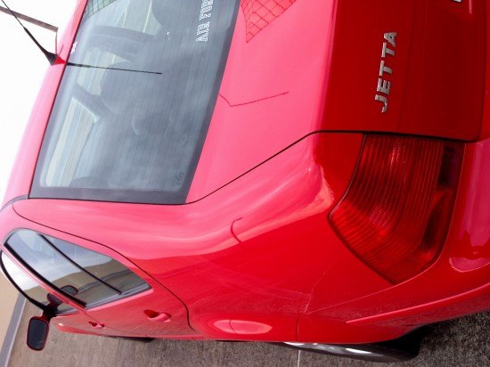
The fixed rear window is necessary on the rear door, but VW wisely made the black trim hiding the runner (for the not-fixed window) as small as possible. Apparently it needs to be a touch wider at the bottom. Instead of fattening up the whole part, there’s a clever line added to keep your eyes on the slim and tall part, not the fatter part at the bottom. It works, even though I have mixed feelings about that line…maybe the runner would look slender enough without it.
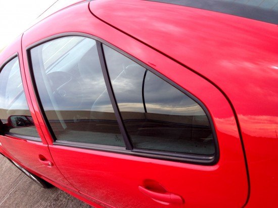
That’s a lot of glass. And there’s no fake window/black plastic triangle giving the illusion that the Jetta is sleeker. Instead, a big ass fixed window. It looks fantastic. Any day without the triangle of DLO FAIL is a good day.
I adore a rear door (get it?) that wraps up and over the area above the wheel arch. It looks curvy, like the hip of a beautiful woman. Problem is, it makes for a gigantic fixed window (or aforementioned DLO FAIL) as the moving window can’t roll down into the tire. And some people think this design makes it difficult to get in/out of a car.
I beg to differ. While this vintage Jetta’s door is smaller than the “less sleek door” of the current model, one must remember to aim their head for the center of the interior, even if there’s a temptation to slide towards the back? And the door makes for a good weapon, as it’s far “pointier” than a blocky door. Which isn’t a problem on the new model, but it’s also stodgy…and this is sleek.

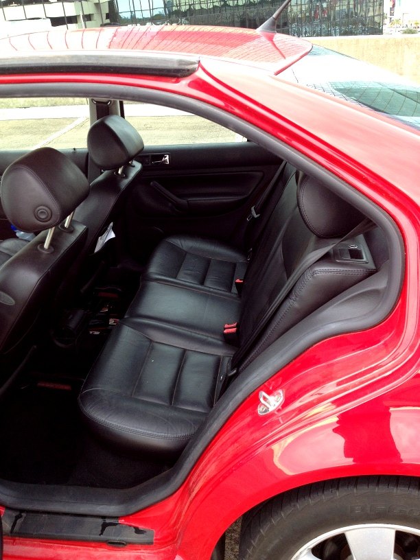
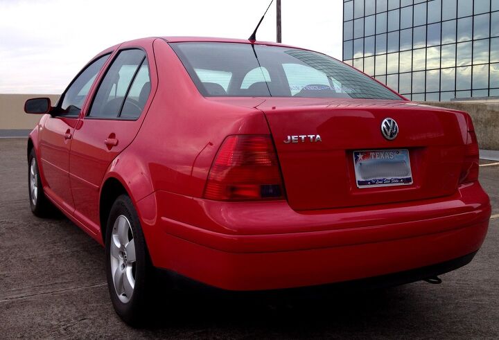
This is just a gorgeous family sedan. Perfect front-wheel drive proportioning and enough space for 5 non-American adults. Every line in its place, simple and pure. Also note the low belt line where the glass and sheet metal meet. This means that visibility is quite good in the Jetta…even with that tall and blocky butt.
Even the door molding is thin and sleek. More parallel lines to boot. Just a pretty design!
As mentioned two pictures ago, the green house is low and provides fantastic views of your world. It’s in stark contrast to the short and fast rear window, which is commonplace in today’s vehicles. This dichotomy is a blend of past and present. It’s a fantastic transition, I believe it shows the evolution of passenger car design. And, for the love of all that’s right with car design, it needs to come back to we can have our visibility again!
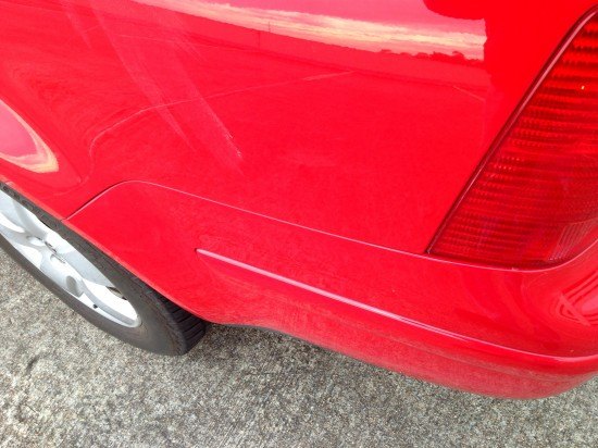
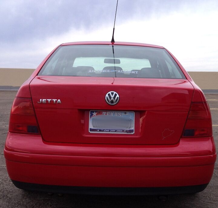
More clean cut lines around back, and there’s something unique about the tail light texture. More on that later.
While everything is sleek and rakish elsewhere, the Jetta’s rear is tall and blocky. Not a bad thing, if you actually use a sedan to carry people and their crap. There is still, like the front end, plenty of surface tension on this boxy butt: the crease above the license plate, the gentle curves of the bumper and the top of the trunk. And, as always, the normal looking rub strip on the bumper is much appreciated. Two things are still outstanding: the tail lights…and something else?
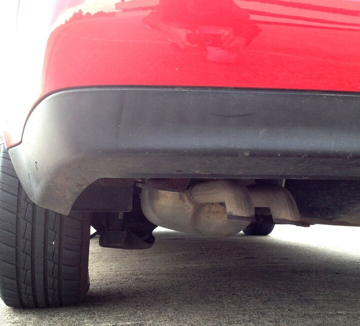
Yup, the lack of a flashy tail pipe. Who cares about pipes on a family sedan with such nice lines? Much like the butt of the (C4) 1984 Corvette, the turn-down pipes make the exhaust essentially invisible to the casual observer, which is very cool for some designs. Designs with C4 or MK IV Jetta levels of cleanliness deserve turn-down exhausts.
The extra trunk line (of surface tension) starts logically where the signal lights (within the entire lighting cluster) end. There is plenty of tumblehome in the roofline, making the Jetta’s body look quite sleek for a small-ish sedan.
The MK IV’s trademark rooftop whip antenna is adorable and annoying at the same time. Like Mr. T’s mohawk, this is an authoritative statement that also leaves the body sides uncluttered. According to the Wikipedia article on this car, there are aerodynamic advantages here too. Which makes sense, even if I dropped out of Fluid Dynamics in college…to pursue a car design degree at CCS. Oh boy, let’s move on to a new subject.
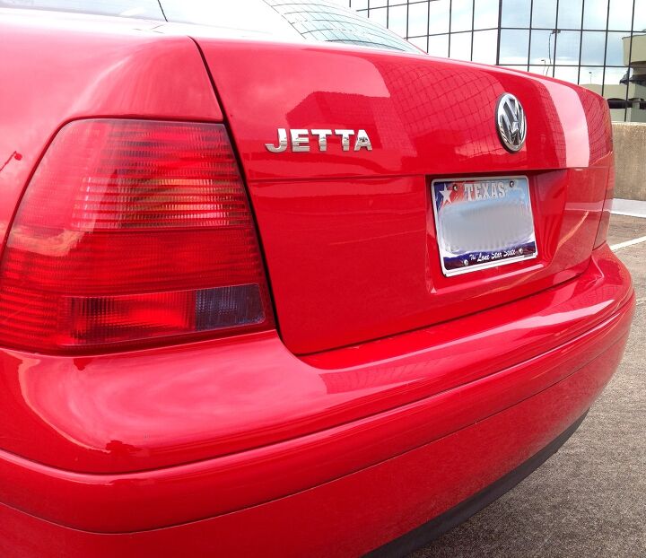
Okay, here’s the big thing about the taillights. As Capt. Mike mentioned, VW went waaay out of their way to blend all the lighting elements into one form. The yellow signal lights? They are striped with red bands. The back up lights? Tinted a purple-ish color. Added to this car’s red paint, and the lenses are essentially invisible.
Which is so damn cool. And musta cost a pretty penny too. Too bad these tail lights didn’t make it to term with the rest of the MK IV Jetta: the clear bits added to the later lenses are likely a cost-cutting measure masked as a “product redesign.” Or maybe I’m too much of a cynic. Whatever.
Another cool detail: dat trunk lock cylinder. Not resorting to an expensive sliding cover, the MK IV Jetta simply slides the lock within a perfectly sized Vee-Dub logo with black paint in the negative areas. Damn son…THAT IS SHARP.
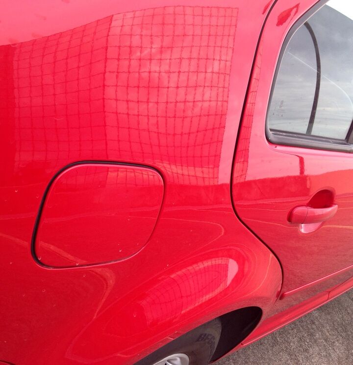
While not the MK IV Jetta’s finishing touch, the gas cap is a good ending to this article. It has a logical location and remains relatively flat (not smeared on a fender flare) and purely functional. Good design never dies, it only gets better.
The sad reality is these Jettas are far from good cars as they age: expensive and difficult to repair when fully depreciated. And now I see far too many of them in the junkyard. Which saddens me, much like my shattered dreams as a CCS student dreaming of his career at the NAIAS many moons ago. But that’s life, and that’s Vellum Venom.
Thank you for reading, I hope you have a wonderful week.
More by Sajeev Mehta


Comments
Join the conversation
Thanks for masterfully reviewing one of my favorite designs ever. We had a black 2001 GLX VR6 with the double-arm 5-spoke wheels. Easily the best-looking car we owned (which included a 2010 CC). To compliment its subtle and and handsome exterior was a beautifully-detailed and upmarket interior. Soft touch plastics all round, fabric-trimmed A-, B- and yes C-pillars! Try finding that today in a car south of an S-Class. Efficient, yet upmarket switches and controls, and, of course, that iconic purple-blue interior lighting.
Reading this made me realize how similar it looks to the earlier-90s Audi 90.