Esoteric Article on Road Signs Challenges ADD Pistonheads
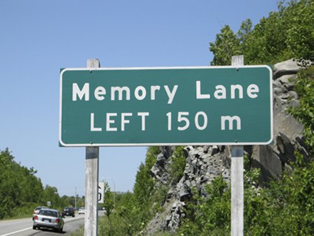
"The letter shapes of Highway Gothic weren’t ever tested, having never really been designed in the first place. 'It’s very American in that way — just smash it together and get it up there,' says Tobias Frere-Jones, a typographer in New York City who came to the attention of the design world in the mid-1990s with his Interstate typeface inspired by the bemusing, awkward charm of Highway Gothic. 'It’s brash and blunt, not so concerned with detail. It has a certain unvarnished honesty.'" Still with us? Then don't miss the six-page Sunday Times article on highway signage, specifically one man's quest to change the typeface used thereupon. No, really. "There was the original Highway Gothic; British Transport, the road typeface used in the United Kingdom; Univers, found in the Paris Metro and on Apple computer keyboards; DIN 1451, used on road and train signage in Germany; and also Helvetica, the classic sans-serif seen in modified versions on roadways in a number of European countries." Let us know how it turns out.
More by Robert Farago














Comments
Join the conversation
Gardiner Westbound "I haven’t even gotten into the latest talking traffic lights, like the talking elevators in some office buildings." I thought the talking "walk" "don't walk" signs in Blade Runner were pretty cool, but so were the flying police cars.
The Times devotes six pages to the quest for improving the typeface specified for road signs, but not a word on standards for signs' contents. The latter must be left up to each state or, as it seems, the lowest ranking guy in the road crew. Wherever I travel I see sign language that is incomplete, ambiguous, too complex for drivers going 88 feet per second, irrelevant (e.g., announcing the exit for "Elbow Avenue" when most traffic needs to know it's the way to "Chicago"), and too abrupt (e.g., "Lane Ends 50 Feet"). Sometimes it's even wrong! For many years an exit on I-40 in Oklahoma City was marked "Classen Avenue." It did not, however, lead to that street, resulting in many confused motorists. The sign was a vestige of a never-built plan for an extension of the access road to Classen. Eventually the highway department ended the confusion, by draping a tarp over the sign. As a highway department employee once told me, "We really don't like signs; they divert drivers' attention from the road."
The pictographs I most like are the open-cab 1930s fire engine with the little toy driver, to mark a firehouse ahead. And the equally archaic farm tractor with the little upright Farmer Brown driver in an old-fashioned straw hat, which I guess means watch out for tractors.