#BrandEmblems
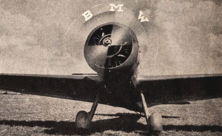
BMW Gets Another New Logo, Insists Symbol Never Stemmed From Aviation
BMW is updating its logo for the modern era. The old glossy emblem with the dated lighting effects the company has leaned upon for the last 23 years will be replaced with a new transparent image that nixes the black background entirely while maintaining the lettering and central blue-and-white roundel. You’ve probably already seen it on the Concept i4, or are perhaps familiar with its monochrome cousin intended to help distinguish the brand’s flagship models.
The manufacturer has said the new logo aims to establish a new corporate identity for online and offline communication purposes, so it could be reserved for press materials and advertising. Yet it has appeared on one automobile already, indicating the brand may eventually have bins of them at the end of every assembly line. Is it a fashion faux pas or the perfect reimagining of the brand’s longstanding iconography?


Recent Comments