I sparked a minor Twitter argument this week after offering up an image of a brand new car that’s available in a truly horrible exterior color. Public Car Twitter opinion mobilized quickly and angrily against my take, and only a couple others were brave enough to take my side against such a visual crime.
Today we talk paint.
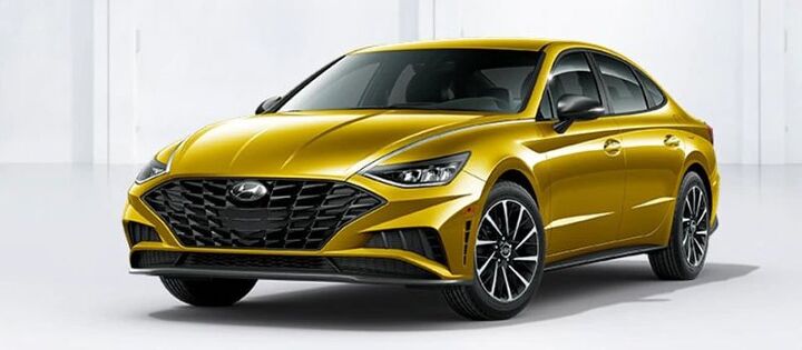
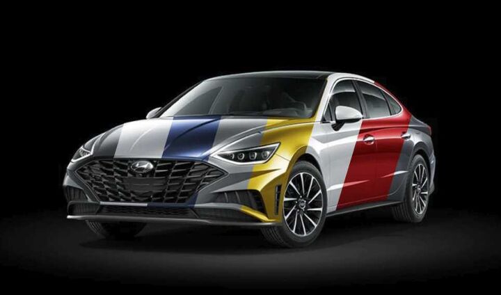
For reference, the Twitter thread is here. I’d seen a press shot of the new Hyundai Sonata, which happened to be painted a dreadful Hot Gold Metallic color. It’s too mustard, a bit downmarket, and worst of all, will age any car painted this color in short order. Some other gold-painted things which didn’t age well include the Jaguar XJ-S, the first generation Porsche Cayenne, and the 1998 Lincoln Town Car. And here’s another example:
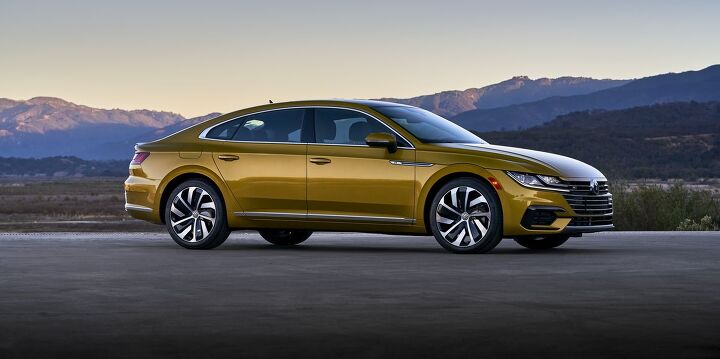
That’s right, the Spicy Gold available on the similarly shaded Volkswagen Arteon is also bad. “Well, good luck with silver or black then, jerk,” they seemed to say. A bit hyperbolic, says me. I’m all for availability of different colors, and even personally stay away from silver or black rides. But some colors are just bad. The Arteon up there is great in other colors, and I’d go for an electric blue (available), that orange color from the Tiguan (not available), or teal like a C4 Corvette (not available).
That leads to our question today, which happens to be a two-part affair. First, I’d like to get your opinion on the gold metallic lacquers shown above — whether I’m right about the 1979 Dodge Monaco vibes, or if I’m just way out of touch. For the second part, let’s hear some more examples of factory paint colors that proved very questionable. Off to you.
[Images: Hyundai, Volkswagen]
“I’m just way out of touch.”
Out of touch in the worst way. Metallic yellow and gold are good.
“let’s hear some more examples of factory paint colors that proved very questionable”
Silver anything that isn’t from a German brand.
Even the most awful color, and that jaundice eyeball yellow is one of them, is worlds better than grayscale.
First off, I like the metallic gold/mustard color shown above, what a relief from the silver/gray/black/white of every car for the last 20 years. That being said, I do question the rather bright lime greens that have shown up in recent years on many vehicles. I don’t like lime green :(
Lime green is THE BEST. Especially fluorescent lime green, a la 1978 Toyota SR5 pickup (with a little meringue, ideally, e.g. the fanciest white fiberglass camper shell out there).
70’s Porsche Lime Green (ie Jack Baruth’s Audi)
Ford has offered some hideous golds/yellows on the Focus and Escape. Not sure what Ford and the buyers were thinking, but I guess there’s a butt for every seat. It looks like one of the terrible colours I’m thinking of was “Karat Gold”, available on the 2015 Escape.
Do not diss Jackpot Gold, son. To this day I’d drive the dickens out of a Focus ZTW wagon in Jackpot Gold with the Mazda 2.3 liter.
It’s not a great color, but I still prefer it over the “50 shades of gray” that seem to permeate the market.
Heck I miss that 1970s “Rusty Brown”.
I’m not a big fan of the MINI current “yellow” which has too much orange in it. But again, it’s better than Parchment White, which looks aged out of the box.
Gold works great on some cars. Oldsmobiles of the ’60s and ’70s looked great in gold. Some Mercurys, too, and the old Imperials.
It doesn’t work well at all on cars of the ’80s and ’90s, probably because of the styling. The ’80s were the “shear look”, all boxy and square, while the ’90s were all jellybeans.
Gold works better when car styling is more baroque, with a lot of embellishment in the trim and bright-work. I believe this is where were are now, repeating the late ’50s and the ’70s.
1970 Ivy Green Metallic on my Ford Torino. An olive green that quickly went out of style as did most greens in like forever.
Yes that gold is future ugly too.
Real-world photos of the ’20 Sonata in that color don’t look too bad – I rather like it, and if I were in the market I might go for it, just because. Normally I stick to dark grey, because it just looks nice – and because I have a long, dirt driveway that means it’s impossible for any bright color to look good for more than 20 minutes – but there’s something to be said for sticking your neck out a bit once in a while.
Agreed – can’t go by the CGI renderings which aren’t anywhere close to the real color.
Normally, dislike yellow, but based on videos, it’s a pretty nice shade of mustard gold.
But even videos can’t show how the color changes based on viewing angle and in different light.
There’s an entire rainbow of color people could use. Why do the OEMs and dealerships insist on boring monochromatic greyscale non-colors? I’m personally a fan of warmer, earthy colors from green to brown to orange and yes, some reds. I’m sick of the lack of variety.
Bring back the 70s palette, baby. I need some green and brown and orange.
Judging only by the pictures you have here, I say the Arteon looks okay but not the Sonata. But I believe that you have to see them in person to give a fair assessment. And colors are definitely subjective to each of us. I have what I call a gold 2012 Hyundai Genesis that I feel like is a beautiful color for the car and the thing is it seems to look better and better all the time to me. I will also say that (yes) in general Gold is not a good color for most cars or vehicles.
I like the availability of colors like in the pics. Right now I love that metallic orange on new Nissans, although I wouldn’t buy a Nissan. Yay to more choices.
I’m all for cars painted colors that stand out, but the mustard-brown-gold thing above is just bad. I think the Rogue comes in something similar (or at least did at one point). Can’t imagine how someone would choose it.
Then again, I had a very early XV Crosstrek in it’s now-signature orange color. At first, I felt like a boss. I’d get thumbs up from bros driving older WRXs, and people would compliment me at gas stations all the time. However, after a year or so, I got sick of people I know spotting me around town wherever I went. Moreover, now every orange Crosstrek seems to be driven by a woman in her 50s. I kept the car about three years, and do miss it sometimes. Now they’re everywhere though (at least here in New England), so I wouldn’t be nearly as unique.
I saw a Sonata sitting on a dealer lot in that exact color just the other day. It looks just as terrible in person. My first thought was “oh god Hyundai brought back that Morning Piss Gold they used on the PT Cruiser”. It was awful then and its awful now. I’d actually go so far as to say it looked better on the PT Cruiser.
For reference: http://images.gtcarlot.com/pictures/28528866.jpg
Even more interesting is that the Kurkuma Yellow on the Arteon was also available on the VW Atlas for a time. If there’s anything worse than a bad color, it’s a bad color on a vehicle too big to ignore. Can you say “resale poison?”
As far as other examples, I nominate the pinkish rose-gold color that INFINITI offered in the Q30/QX30. I think they called it Liquid Copper.
Oh there’s also an Arteon gold on the Q60, and it costs like $1,800 extra. Solar Metallic or something.
Correction, it’s a Nieman Marcus limited edition and was $63,000.
https://www.torquenews.com/3768/why-infiniti-believes-q60-could-be-your-fantasy-car/amp
They had that one at the car show a couple of years back. LOVED it.
Somehow, that looks worse than the VW color.
You, sir, are incorrect. :)
The Atlas in that burnt mustard yellow is pretty bad. Id have to say that VW’s Orange, as found on the new Jetta and I believe the Tiguan, is also fairly ugly and likely to be resale poison. I actually had a 2019 orange Jetta as a loaner and was sort of embarrassed to be seen in it. Ridiculous color. (My wife has a silver Atlas)
No other cars spring to mind as truly horrible but I’m sure a there is at least a few more out there.
Funny thing about that pinkish rose gold color is how much little old ladies like it on furniture… except they call it mauve.
I worked at a furniture store one summer when I was in in college and if they didn’t come in asking for something in mauve they would be delighted if you let them know it is available in mauve.
Outside furniture I’ve never heard of mauve ever!
1994-95 Jaguars in Rose Bronze. Do a Google image search, it’s awful.
I can’t stand this color. It’s similar to austin yellow on the most recent BMW M3/4 (F80 generation). I called it steaming hot p1ss yellow. Actually that car didn’t come in any good real colors- sakhir orange and whatever that smurf blue was called were also terrible. They finally offered imola red on a limited edition M4 at the end of the model run. Mine was white– at least that was free.
You voluntarily bought a white car despite not being a 47 year old housewife dabbling in real estate. It’s safe to say your opinions on colors probably shouldn’t be given much credence.
It’s reminiscent of Phoenixgelb on the old E46 M3s, looks awesome. Long live actual colors on cars.
I can’t stand this color. It’s similar to austin yellow on the most recent BMW M3/4 (F80 generation). I called it steaming hot p1 ss yellow. Actually that car didn’t come in any good real colors- sakhir orange and whatever that smurf blue was called were also terrible. They finally offered imola red on a limited edition M4 at the end of the model run. Mine was white– at least that was free.
Remember the Phoenix Yellow on the E46 M3? It was a metallic yellow mustard color with a faint green/brown tinge to it, and was universally and justly known as Baby Sh!t Yellow. Yet somehow it’s aged well.
Photos somehow don’t do it justice, but here: https://bit.ly/2u4BZRx
VW has a spectacular palatte of colors…in Europe, where custom orders are the normal way cars are bought, not our grey, silver, silver-grey, blue-silver, and white. Look at the UK VW site, or the German site…lots of very cool choices. Just not here.
If you’re willing to spend something like $3k, the e-Golf and Golf R can be ordered in roughly 40 different colours for North America as well.
Golf-e, R, and wagon dead after 2019. Only 2020 Golf option here is GTI.
On one hand, I now know what it’s like for my wife to have to deal with my autism spectrum pedanticism.
On the other hand, I just checked vw.ca, and it’s letting me build out a 2020 e-Golf with the specialty paint (I did say North America).
Fair enough! There’s a lotta spectrum in here.
I forgot Canada was an exception in this case AND I didn’t know you were Canadian. Now I’m informed.
The Spektrum program was limited to originally 250 cars, and not all of those orders were filled. That program died in fall 2019 when the MK7 production ended. I’d love to see that program across the line, but I bet at 3k they couldn’t justify setting up facilities for doing that on the more pedestrian choices.
I’m all about giving people choice. Just becuase I don’t like it doesn’t mean everyone else will hate it. Of course, I drive a Chevy Bolt in the color “Shock”. So, if you want a gold car, go for it.
The only thing that would make Shock better is more green. Too yellow as it is. They’re going for tennis-ball but it’s a little too taxicab, not quite enough 90s glow stick.
The M3/M4 has some polarizing colours…Austin Yellow and Yas Marina Blue come to mind. A colleague recounted to me how she told her husband to go out and get any sports car he liked…”and then so he pulls up in this SMURF BLUE CAR!!!. I’m like oh my gawd…”.
White Sand Beige on the 2011-era Kia Sorento always looked particularly hideous to me. Also up there are Kiwi and Plasma Purple metallic on the 2014 Mitsubishi Mirage and Passion Fruit on the Chevy Spark.
That gold is good for the immediate short term, awful for the next 35 years, then cool when the car becomes eligible for classic car plates.
The previous-gen Camaro offered a Synergy Green metallic paint (should have been called Acid Green) that seemed to be a tough sell.
1) bleh. gold went out in the ’70s. but the Sonata has way more going on than that paint; only black could somewhat hide that offensive “depressed catfish” styling
2) “Questionable” depends on the car. Bright green might seem silly, but it works on a Mustang yet would look ridiculous on an S-Class. But the Panther Pink/Moulin Rouge on ’70s Dodge/Plymouth cars looks ridiculous anywhere.
My 1968 Mustang was Sunlit Gold from the factory. When I restored it the first time in the late 80’s I changed it to black with parchment interior, because I couldn’t even imagine driving a gold car. Fast-forward 30+ years and the car is now in mid-restoration. Unfortunately, I already had the seats re-upholstered in parchment, but I don’t think I want to paint it black again. I’m seriously considering going back to the original Sunlit Gold exterior, black C-stripe, turn-signal hood stripes and all. It would mean a do-over on the interior, but that’s not out of the question.
Golds and similar hued metallic colors might be more suitable (or palatable) on classic cars, but it’s hard to tell because there aren’t enough late model vehicles on the road in these colors to really judge.
Agreed on that color on the Sonata – it ruins the car, which looks darned good otherwise. On the other hand, I saw one in a very cool gloss battleship gray:
https://pictures.dealer.com/a/arapahoehyundai/1919/bddc317cba842cf1952e28a29a509b79x.jpg
https://pictures.dealer.com/a/arapahoehyundai/0229/6f04d372785ac68a86c5042645ccd57fx.jpg
I think the grill needs a bit of lighter-gray contrast, but otherwise, it looks darned good.
I could go with a more cheerful/sunny yellow like Mopar’s “Top Banana”, but these are a bit too much “Calf Scours” for me.
“let’s hear some more examples of factory paint colors that proved very questionable.”
A matter of personal opinion: the Volkswagen Harlequin paint scheme about 25 years back. First one I saw I wondered if someone’s uncle owned a junkyard or chop-shop. On the positive side it makes minor collision repair easy; no color-matching to the rest of the body when respraying the affected panel.
To each his own…..
I love nonstandard paint colors, love the two gold colors shown above and would happily drive a car painted in those shades. Ford had a super cool color last year called Electric Spice, which was a burnt orange version of the Hot Gold above and it was wonderful. Purple Jeeps? Bring it on! Voodoo Blue Tacoma? Definitely! School bus yellow F150? Count me in!!!
Anything to make our streets and driveways more colorful and not just varying shades of gray.
Besides having to run the Jetpack gauntlet, now I’m stuck in moderation…..
While I look forward to the debate of a good or bad color on a car, this article is a bit too hard to comment on…
I had no idea what spicy gold looked like and when I Google Imaged it, I got at least 3 different shades of what I assume was the same paint color. It all depends on way too many factors used on the published picture – lighting, filters, exposure time, if the picture was a reprint, etc.
Also, if you see the same car in real-life the paint shade could look very different from any of the published photos.
The picture here looks worse than the one in the twitter thread.
That said, as long as they are producing actual colors I am all for it. I don’t like the pale blue Ford used on their cars, but others like it well enough. Blues and purples are my favorites on cars but that one is such a shallow color. It reminds me of the plumbers putty brown cars, but in blue.
People would make fun of me if I got that Arteon, but I love that yellow. Social stigma from people driving white, black or grey/silver/dark grey/dark silver vehicles is funny, but the stigma is real.
I’m ashamed of myself for not being stronger.
Apparently TTAC also is shaming me, as the above comment got flagged for review. Now THAT’S funny!
everything was “stuck” for a while.
Heck, I ain’t even mad. I’ll applaud *any* manufacturer that paints their cars *any* color that’s not on the greyscale.
As for resale… I drive a car that’s painted Silver Pine Mica. And I specifically sought out that color when I was used-car shopping. And probably paid a bit MORE than I would have if I was willing to accept greyscale. Maybe an interesting color is a harder sell, but someone out there is specifically looking for it, and will be willing to pay MORE.
Because there aren’t enough pointless things to argue about.
Personally, I like choice. I’m not offended by someone’s choice of colors, especially for their car.
Some don’t understand the difference between objective and subjective. They’re probably more likely to argue merit based on color. They seem to seek conflict in all aspects of life.
The greenish gold is not my favorite color, but I’d much rather look at that than a black car. At least it has some interest.
I think the color Kyree referenced is a good example of a color that … while I appreciate the color in itself … I don’t think it looks good on a car. At least not a car like that Infiniti, with sinuous curves. I think it’s too close to a flesh tone, and it puts the car in the “uncanny valley” somehow.
https://youtu.be/7bquIkX_czA?t=65
On that note, there is one color that I have seen in recent years that I truly detest. A chalky fleshtone tan available on some Kias. They call it “White Sand Beige”, apparently. Here is a link to a picture. It looks even worse in person.
http://nysportscars.com/car/87341977.html
I noticed a couple of manufacturers have brought back Battleship Gray (I don`t know what they call it) – a color I thought would never return.
Myself, I own a Mazda 6 in Soul Red, to which everybody I knew said `your car is red!` when they first saw it.
I noticed that the color is more like gloss primer gray. And that hideous trend to have flat colors. Why pay upwards of $50k for a BMW or like snob car to have it look like a 16 year old’s first car covered in primer?
You left out the horrific nuclear snot green that Honduh puts on its bloated Civic. That color is absolutely vomit-inducing.
If my memory serves me correctly, a 2017 Ford GT in a bright Lamborghini green sold for about $1.1 million dollars at Barrett Jackson, while a dark red one sold for $1.3 million. Seems like a $200,000 color mistake – plus the owner had to pay quite a bit extra to get the car painted in that green in the first place.
The only time you need black color is when you driving current Civic. All other colors are fine
“Some other gold-painted things which didn’t age well include the Jaguar XJ-S…”
HOW DARE YOU
Now, the worst of your bad takes for the day aside, that Arteon looks quite good, and I at least salute Hyundai for trying something weird on a mass market product, especially something that sells to a fairly conservative audience.
I don’t hate the gold, but I don’t love it and would never choose it for a car of mine.
But anything is better than gray scale – and I say that despite choosing to buy a white car (GTI) and a metallic black car (Fiata) for my last two new car purchases. In my defense, GTIs just look right in white due to the red detailing (and the car sits outside in the FL sun, so dark colors were right out), and metallic black on a Fiat Spider is also just right – it looks “aubergine” in the sunlight, lol. Both cars came in mostly awful colors anyway.
When VW released the Alltrack in the US in 2017 most of the press cars were red. Yet for the model years 2018-2019 only about 7% of the Alltracks sold here were red.
My guess is that most cars on the dealers lots are black, white, and gray because they are inoffensive colors that people will accept, as opposed to colors that might be a little polarizing so the dealer has a harder time selling it.
I spend much more time inside my vehicle looking at the interior than I do looking at the outside of my vehicle.
So I would rather manufacturers spend their money/time on restoring different interior colours. Colour matched instrument panels, door inserts and seating.
I cannot stand black interiors. They look penal and are uncomfortable in the summer.
@Arthur Dailey: “I cannot stand black interiors. They look penal and are uncomfortable in the summer.”
While I don’t disagree with the sentiment (interiors could really use some color) I also have to note that one place where color is least desirable is directly underneath the windshield and back glass. I don’t know how much time you spent in 70s and older cars but when those dashboards and rear shelf areas were colored, especially with lighter colors, sunlight created a reflection on the glass often so glaringly bright you couldn’t properly see through the glass. In fact, it wasn’t all that long ago that one brand garnered numerous complaints about having a bright dashboard that almost literally blinded the driver when the sun was shining.
As such, the top of the dashboard needs to be dark, though underneath the overhang could get away with some color. Even then, however, the tint and texture of the color needs to be somewhat subdued because sunlight coming in through side windows can still strike the color panels and create an undesirable glare at certain times of day.
That’s why most interiors are black or dark grey today. I do believe darker shades of red, brown, blue, etc. would work but brighter colors can be distracting if they can be seen on a reflecting surface like glass, metal or acrylic.
@ Vulpine, I ‘came of age’ in the 70’s and had numerous vehicles with different interior instrument panel/dashboard colours. Maroon (my favourite), blue, white, tan and brown. Even had a Type IV VW with a blue interior.
And of course some older vehicles with the by then outlawed, painted metal instrument panel/dashboard.
Never experienced the dread glare problem in those. But certainly have in newer vehicles with ‘digital’ instrument/read outs.
Possibly because windshields back then were much more vertical. Remember a tall friend who was near sighted who often left nose prints on the inside of his VW Beetle’s windshield, while driving.
The longer, more sloped windshields of modern vehicle might be the cause of the glare problem?
@Arthur Dailey: Hmmm… I wonder if we didn’t know the same VW driver… though mine claimed driving with his chest against the steering wheel was safer in the event of collision… he wouldn’t tip forward into the wheel when the lap belt held his hips in place on the seat.
As for the glare on the windshield… you’re partially right but I do remember seeing that glare anyway–especially in the rear-view mirror on the window shelf.
In the 80s there was this tasteful pale metallic gold we called champagne. Turned a 911SC’s presumed owner from “probably a douche” to “a distinguished gentleman.”
My truck is fleet white and my car is pearl white and I have my reasons. But because my vehicles are boring white, I am not allowed to disparage any other vehicle colors (it’s the rule). [Bonus: expressive colors on other vehicles make it easier for me to find mine in a parking lot.]
I enjoy seeing some of the fairly-recent non-metallic paint colors (for example the beige/taupe color which seems like it showed up first on Toyota trucks).
If I were an OEM, I’d seriously consider introducing a larger metal-flake from the factory. And something with a little bit of flop. [Because there is a lot of potential variation with paint besides just ‘color.’]
I’d also look at matte finishes, although most of the world isn’t ready.
And I’d introduce an option package with a spiffy name where you get extra clear-coat on high-wear areas of the paint (front fascia, front of hood, rocker panels, bottom of rear fenders).
Speaking of safety:
https://www.victimslawyer.com/blog/which-color-car-gets-in-the-most-accidents/
Matte seems tough to care for.
I don’t like the greenish gold much at all, but IMO, the two worst colors are “Destroyer gray”, and F8 Green on Mopars. Other companies have similar colors, and they are always ugly, no matter how great the car looks otherwise.
When I bought my Challenger, they had one perfectly optioned car in stock at the dealer, and it was in Destroyer Gray. Oh hell no. They traded for a TorRed car. My last Challenger got a lot of negative reaction from women for it’s color, Hemi Ornage. They would say, “I love your car, but I hate that color!”. The only negative things guys ever said was it was “too flashy”, and “That’s too bright and will attract the cops!”. Guess what? I never got a single speeding ticket in it, and believe me, I deserved a few. I got pulled over right after I bought it so an OSP trooper could take pics of it.
When I worked at a Lexus dealership years ago, we had this one CT200h that was painted in “Daybreak Yellow.” The color was so ugly that the car sat on the lot for the better part of a year without being sold. At one point, we started calling the color “Daterape yellow,” a name that was truly as awful as the color itself, and challenges sprung up to see who could actually sell the thing.
And the CT had enough issues moving off the lot as is, without a mustard color.
The problem with that Sonata isn’t the color. Who thought angry cat-fish was a good idea?
It might look good in one of the dark chameleon colors from the late 90s.
I like color choices, but that car…yeesh.
FCA has a bunch of colors that I dig.
Admittedly, the yellow/gold color wasn’t a great choice but at least it’s not a shade of gray. The world needs to brighten up and fill it with cars that are a TRUE color instead of a shade of gray. I’ll take a blue or green car all day long.