I stood face-to-fascia with a childhood dream, thanks to a tangential connection to Houston’s 2016 Lamborghini Festival. And yet, like all designs born pure and modified to remain relevant, the original Lamborghini LP400’s purity of form is sometimes absent in this time capsule, all-original LP5000.
But please believe that, LP400 or no, it took every fiber of my being to avoid the typical auto journo blather on this sheet of vellum.
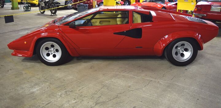
No offense to the 2005 Ford GT, but the Countach was—and remains—the Pace Car For An Entire Company. Its DNA lies within Lambo’s latest iron: strong triangulation/trapezoidal themes, an impossibly low nose, and those unforgettable rear-engine supercar proportions are present on today’s Huracán and Aventador. Peep this photo for proof.
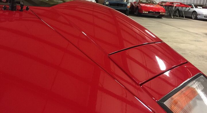
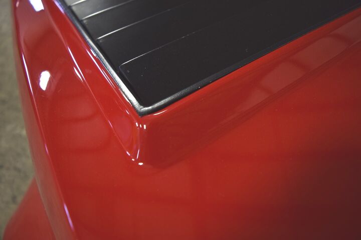
The Countach’s beauty lies in how every hard bend and geometric shape changes its demeanor relative to one’s vantage point. Like the trapezoid hood above versus the last photo. Also note how the fender haunches protrude above the hood’s plane, less obvious in the last photo.
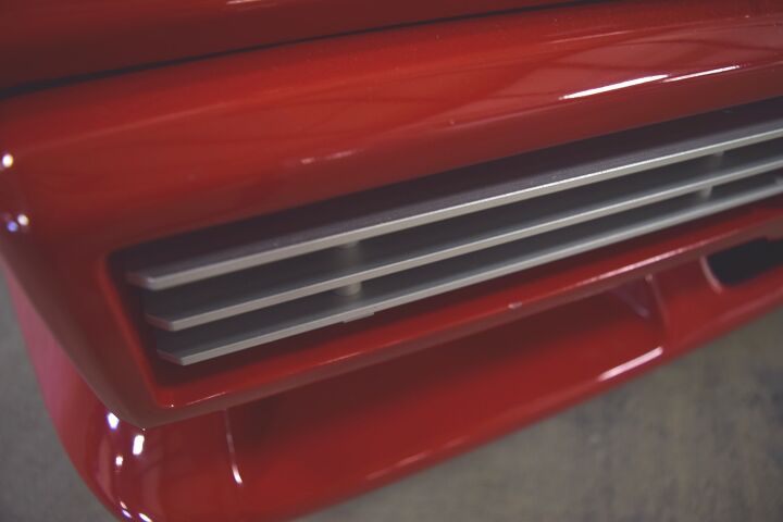
Yep, real aluminum slats. Sadly, the LP400’s useless, flat-faced aluminum “non-bumper” befits the body better than this bumperette.
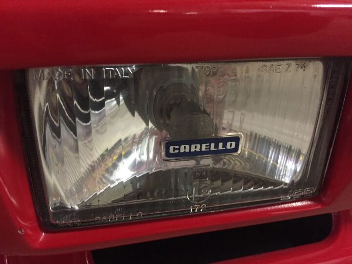
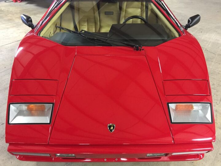
This gorgeous lighting pod naturally draws your eyes to the brand name.
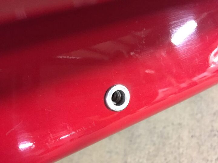
I’d expect the Countach to be hastily assembled in the Italian supercar tradition, but the threaded license plate hardware says otherwise.
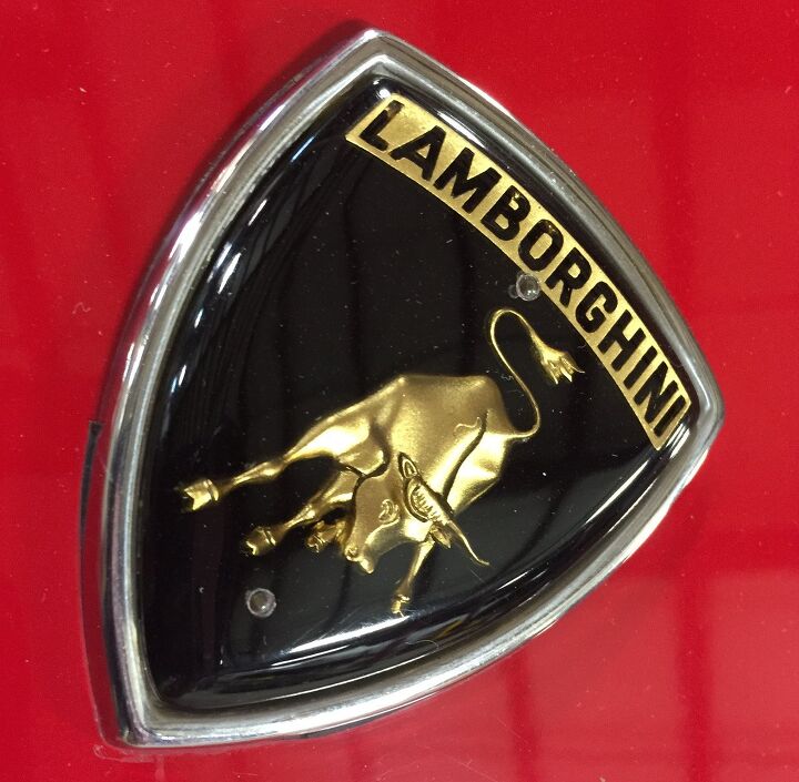
I hope someone knows the reason for the emblem’s two clear bubbles. Other manufacturers have done better for decades before this.
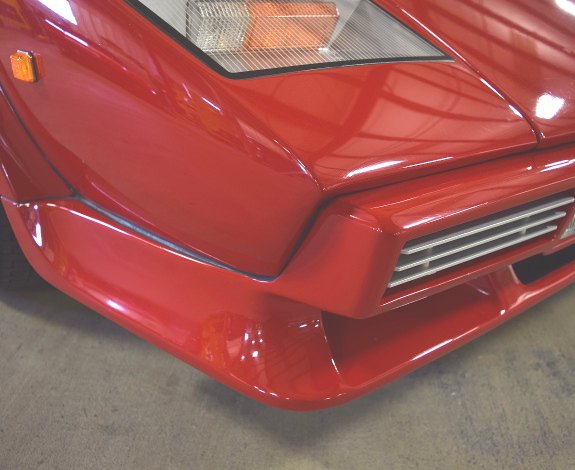
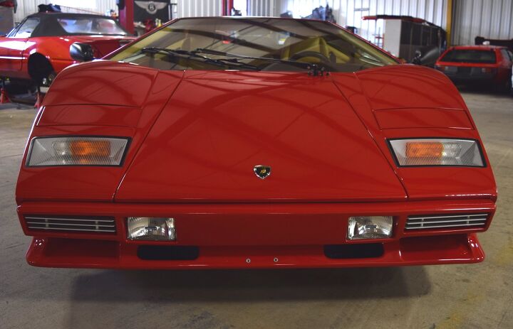
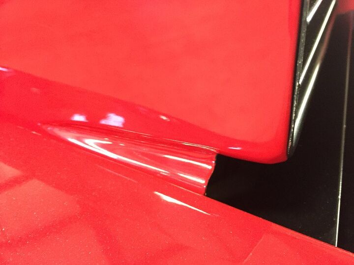
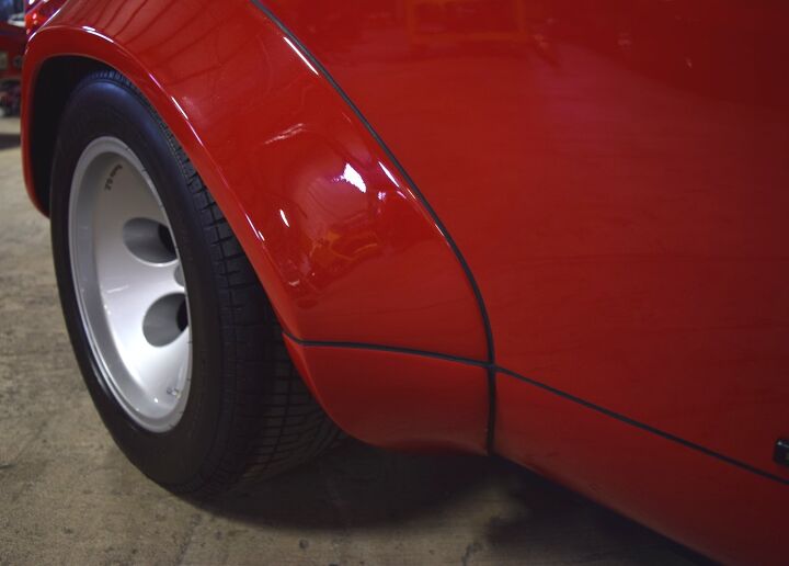
Compared to the aforementioned LP400 panel, note how the evolution to a bumper to meet (a modicum of) accident protection completely changes the shape of the “fender”. Shame — the LP5000 Countach has a “double chin” look.
And no, this isn’t an American-bumper double chin: this is a Euro-spec LP5000.
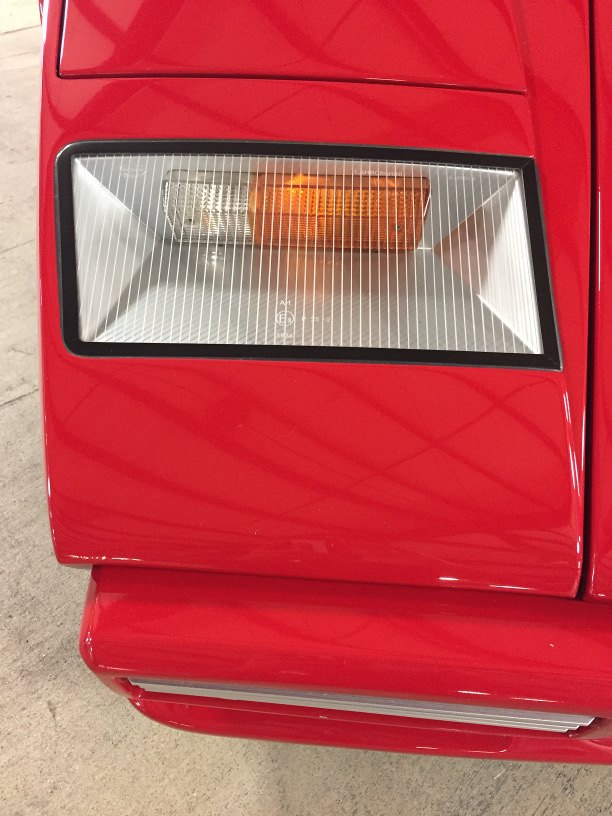
The double chin bumper adds an unnecessary plane to the body’s flat, powerful thrust. It also distracts from the delightful sliver-toned negative area where the signal/marker light resides.
Perhaps this nit couldn’t be picked if the bumper mirrored the fender’s vanishing point.
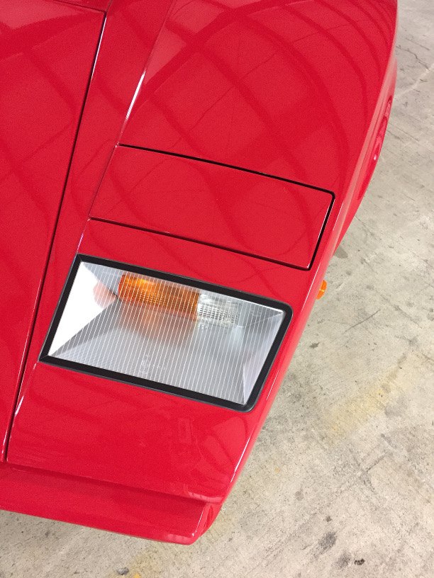
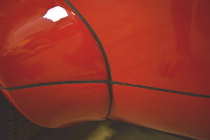
But said vanishing point looks properly parallel from a higher angle. The contrasting trapezoidal hood cutline adds more excitement, just like on a modern Lambo.
And so much taper in that fender!
Hidden headlights (within an unassuming panel) were all the rage in Italian design studios. They did a great job lowering the nose and increasing the “less is more” aesthetic. Both are sorely missed today.
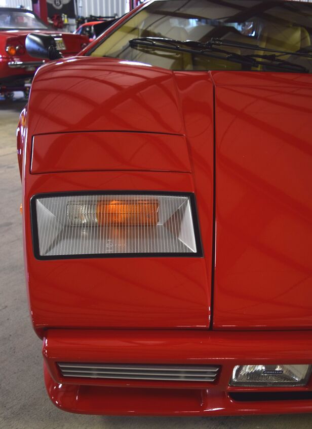
There’s that ill-advised bumper vanishing point again! Owners of LP400s can squat this low in admiration of their rides, but the hood/fender surface tension goes awry with afterthought bumpers.
Bumpers aren’t a liability at this angle. Adding that legendary trapezoidal windscreen and we’re done.
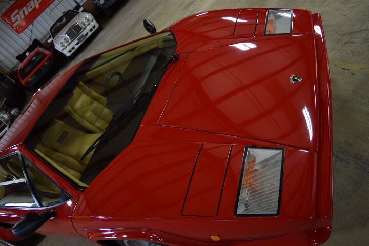
The surface tension between the hood and fenders is clear(ly stunning).
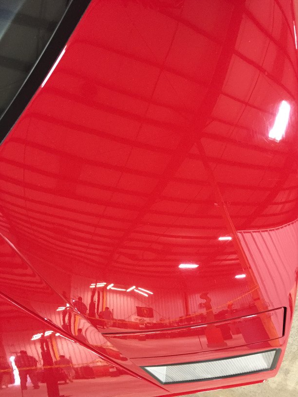
Note the ceiling’s bent fendertop reflection: stunning surface tension!
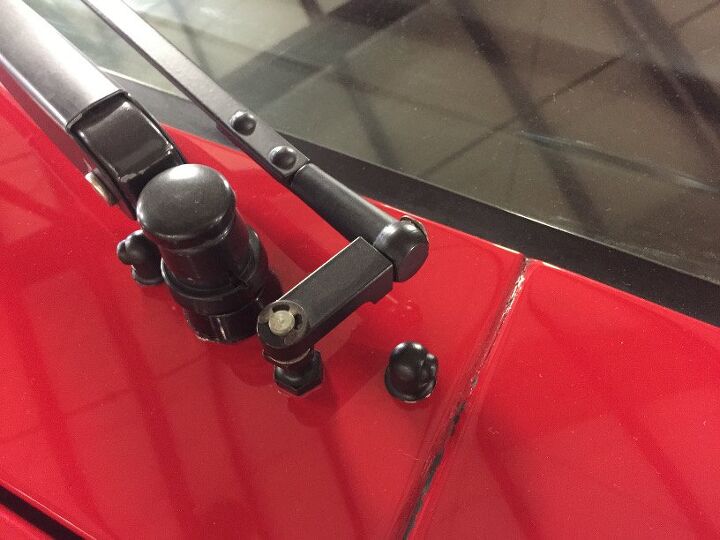
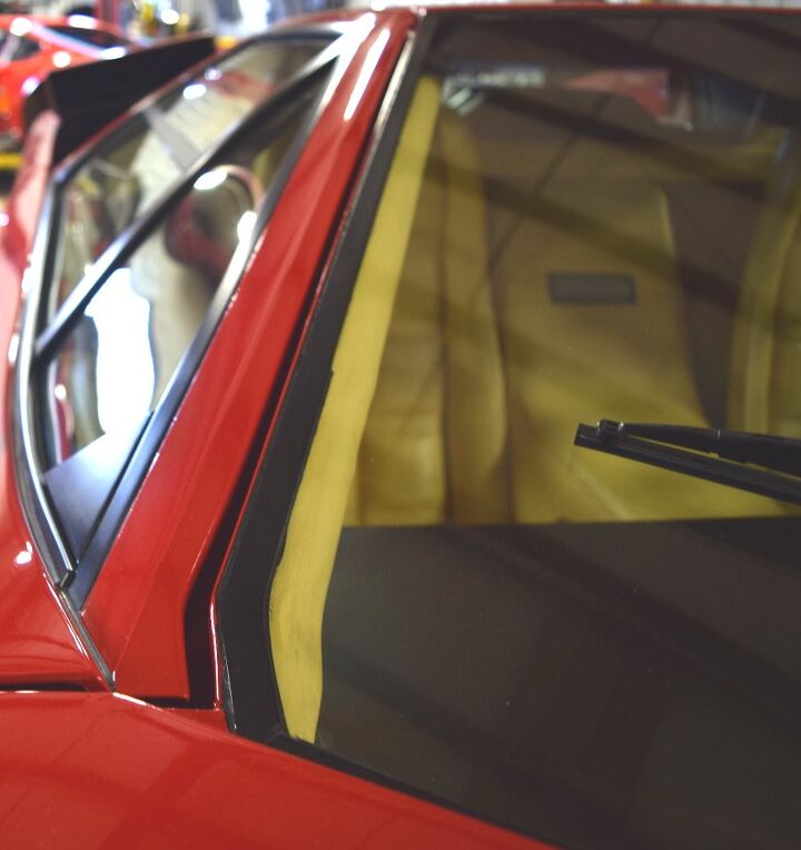
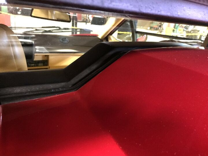
A canvas devoid of clutter earns a hall pass for exposed wipers with c-clip. Perhaps it adds to the Countach’s engineering fortitude?
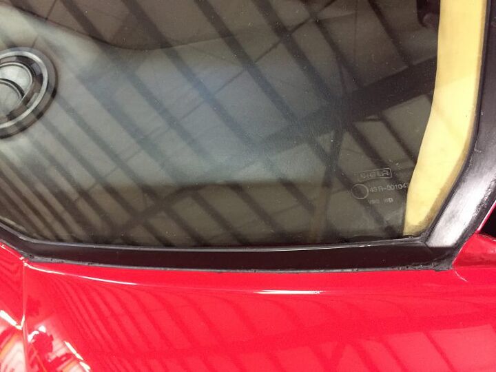
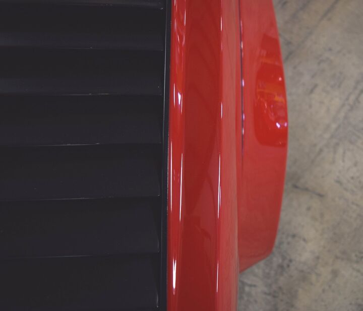
The use of silicone(?) adhesive is everywhere. Such “handcrafted character” is thankfully a relic.
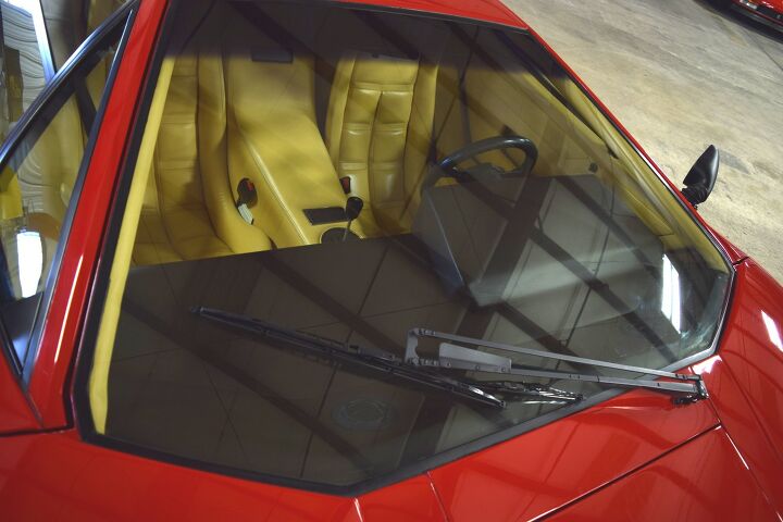
But step back, and who cares? That windshield is pure 1970s fantasy, a sign of unreachable 1980s status. The strong triangular elements are, once again, pure Lamborghini DNA.
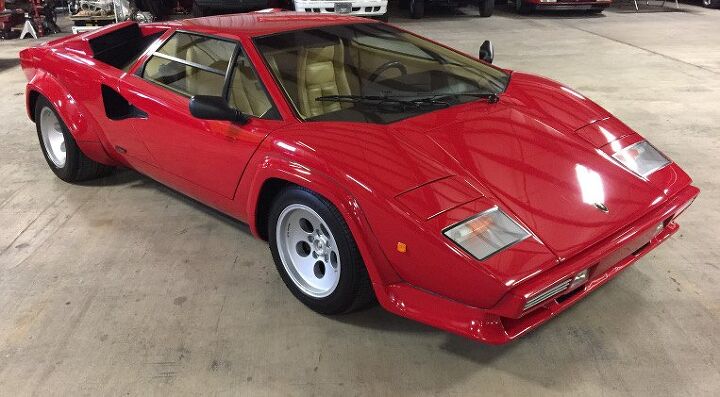
Sure, those slapped-on bumpers, fender extensions and large air-intake feature are over the top. But all will step back in awe at the brutalist triangular elements and low slung, rear-engine proportioning.
This car once ruled the world. For good reason.
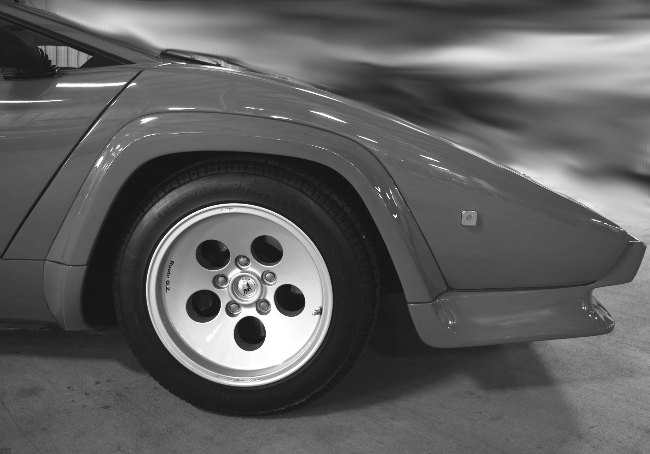
The LP400’s less angular, flat wheel arches disappeared for these iconic LP5000 trapezoidal flares, integrating the “heavy” feeling bumper and echoing triangle DNA.
(Please disregard the mere Jaguar in the background!)
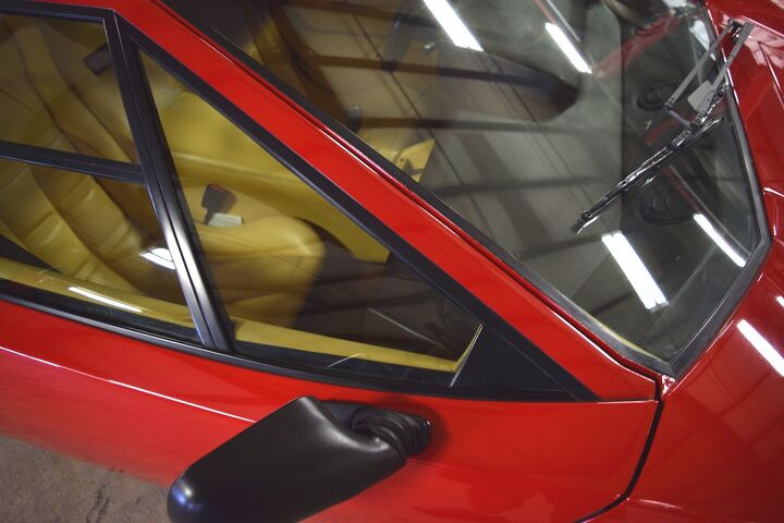
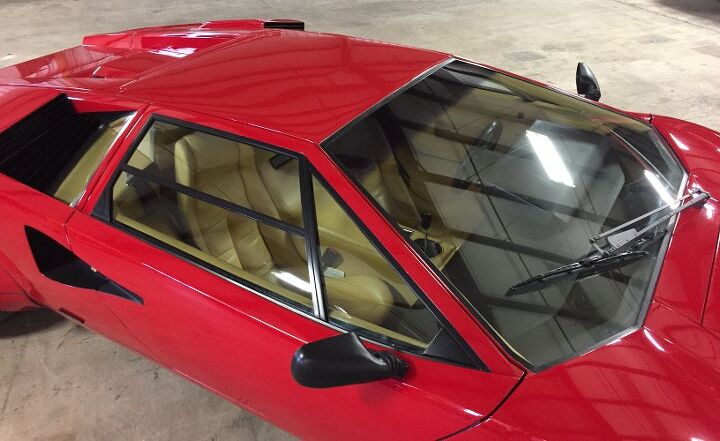
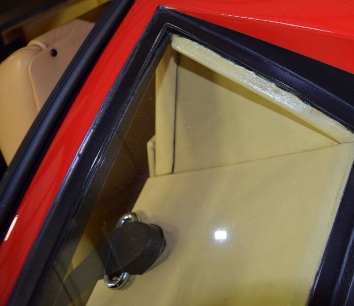
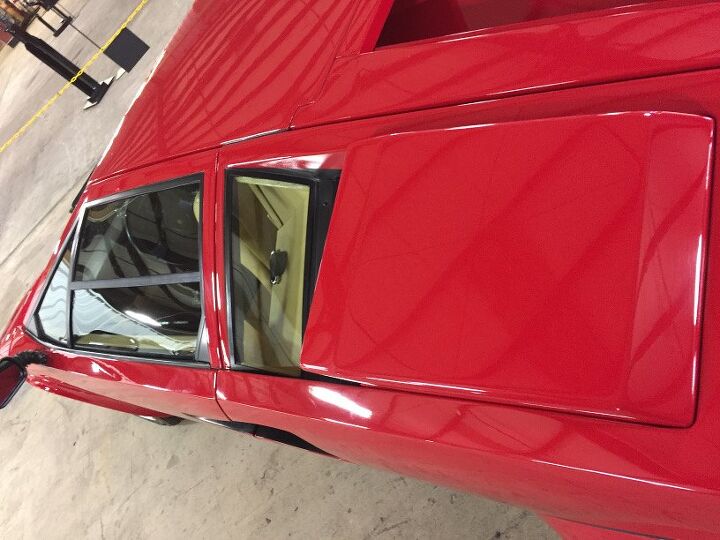
More Triangle Talk: windscreen, the front fixed window, the depressing little DLO non-failing spot, and the lower half of the door’s cutline. Much DNA present.
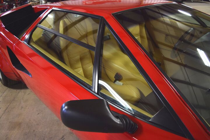
It’s all quite perfectly triangulated, by design.
Too bad the fixed vent window glass couldn’t extended further and eliminate this DLO non-fail.
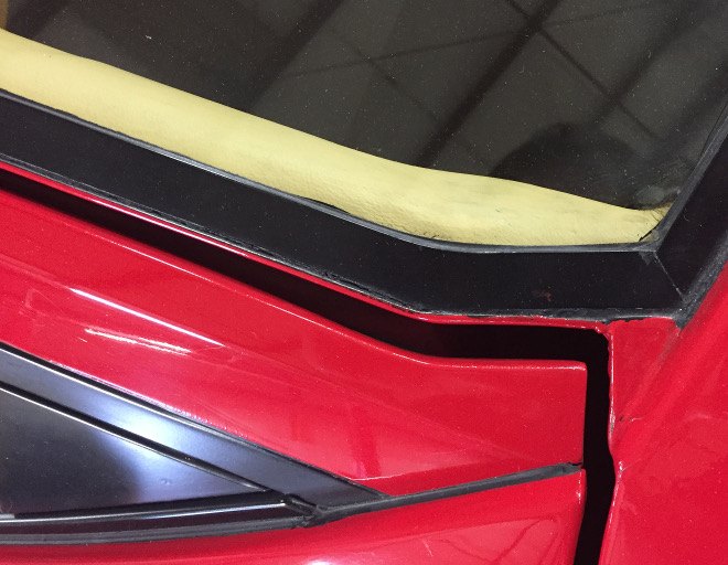
Oh, that Italian supercar panel fitment! Only bested by exposed black adhesive.
Most 1970s designs were aerodynamically challenged by 1985 standards, and these doors must have been a nightmare to seal at high speed.
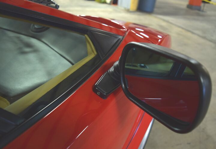
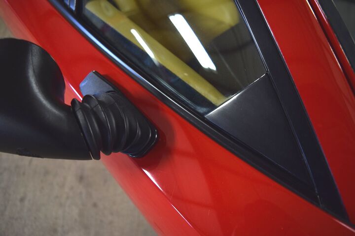
Can you imagine this with a bespoke mirror design? The adjustable rubber boot affair get the job done, but they detract (rather than seek inspiration) from the body.
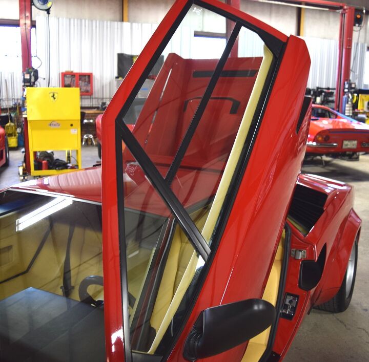
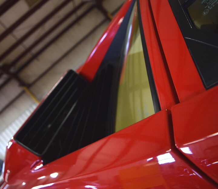
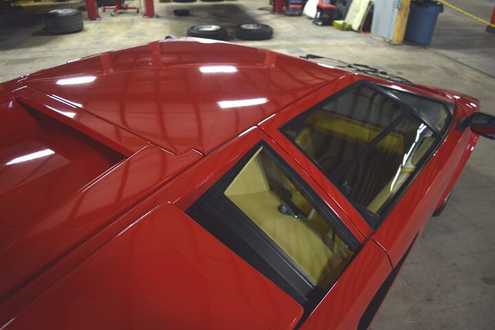
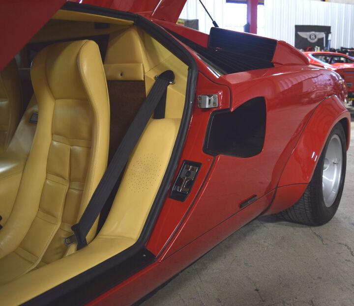
And the triangle theme grows stronger when the portal swings open! Such a staggeringly steep line guarantees a triangle theme! The Aventador is Dodge Avenger mundane from here.
Admire the low slung, triangle-intensive greenhouse: daring doesn’t cover it.
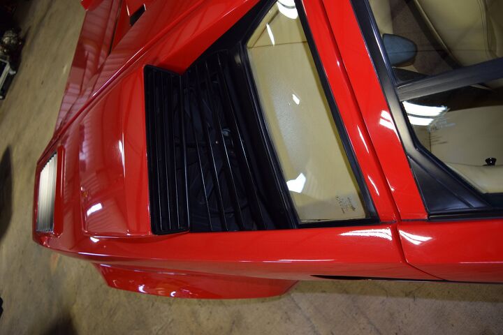
The quarter window (as it were) drops deep, transitioning to intake vents.
So deep that the plane containing the seat belt anchor continues the triangular theme inside!
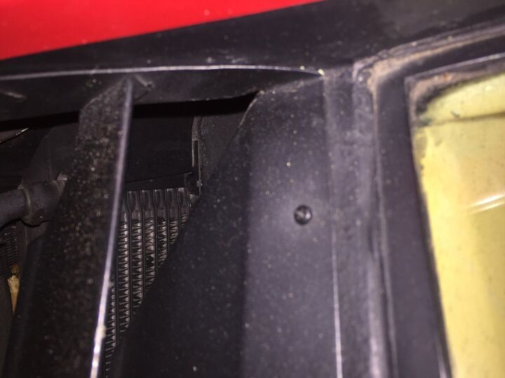
No surprise, there’s cooling functionality behind the grilles.
The quarter window looked square a few photos up, but here? Totally triangulates with the theme, plus it kind of looks like the Diablo!
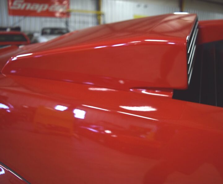
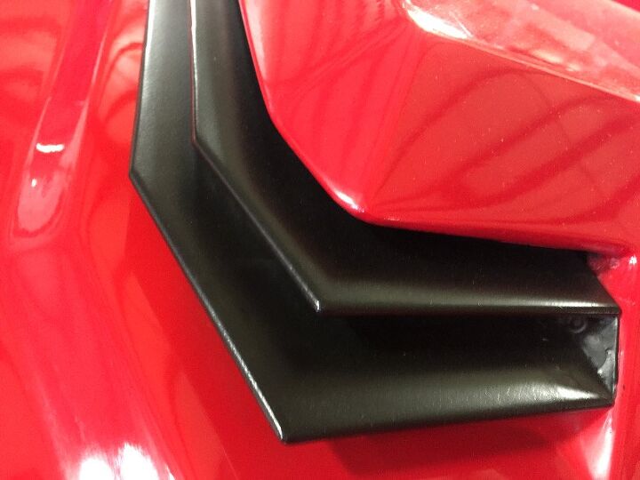
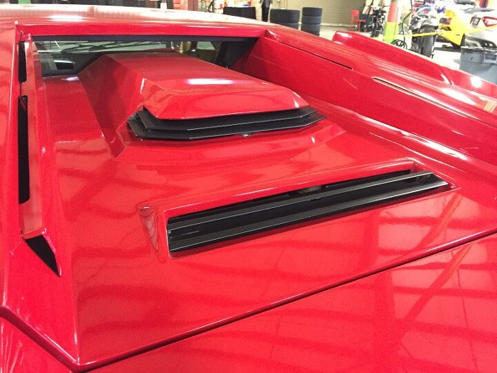
The forward facing scoop is pure sci-fi spaceship. Note surface tension from the “bent” top.
The scoop’s “neck” looks unfinished at the front: a brutal transition for sure.
Triangles, rhombuses, squares and rectangles at countless angles. Depending on your vantage point, sometimes a rectangle appears like a rhombus and vice versa.
Flame surfacing is a stupid way to make a car come alive — instead, have faith in one’s ability to walk around a cohesive design that changes shape as you move with it.
The intake scoop’s full profile is a logical (yet jolting) addition to the greenhouse’s natural lines.
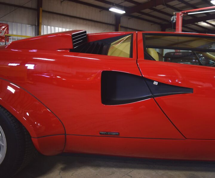
If only that scoop had the same level of tumblehome (i.e. the top-to-bottom taper) of the quarter window: far less jolting. But the further back and lower you go, the Countach rewards with rounder elements equalizing the brutalist geometry.
Note the chrome release for the scissor doors: if only the 1990s automotive aftermarket didn’t marginalize this.
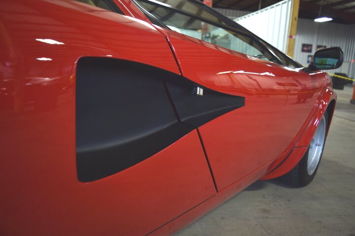
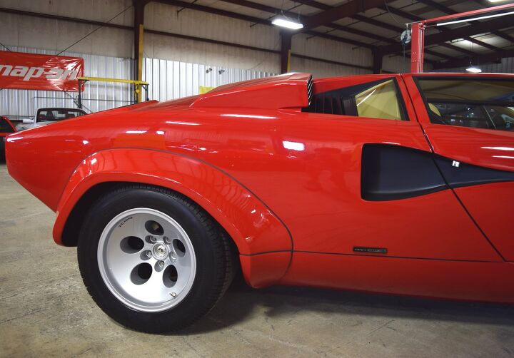
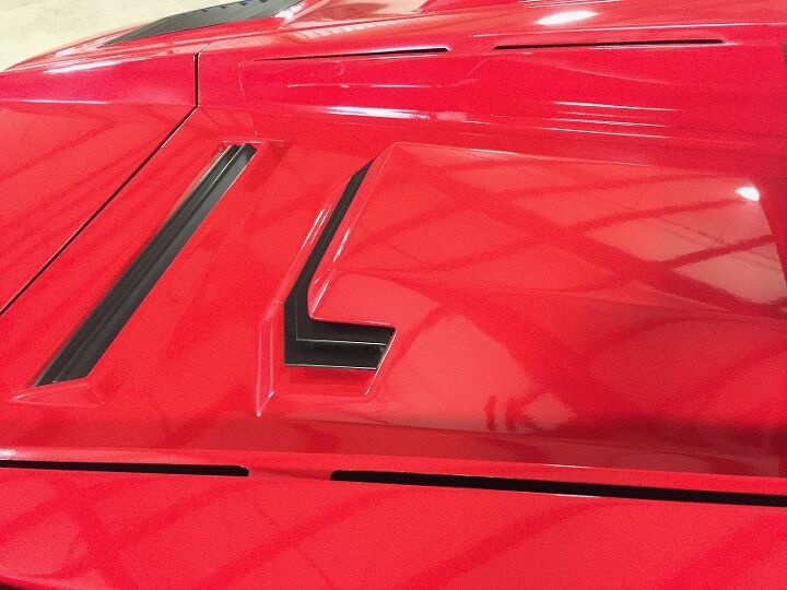
This massive triangle-esque body scoop element is an almost vulgar interruption to an otherwise clean bodyside.
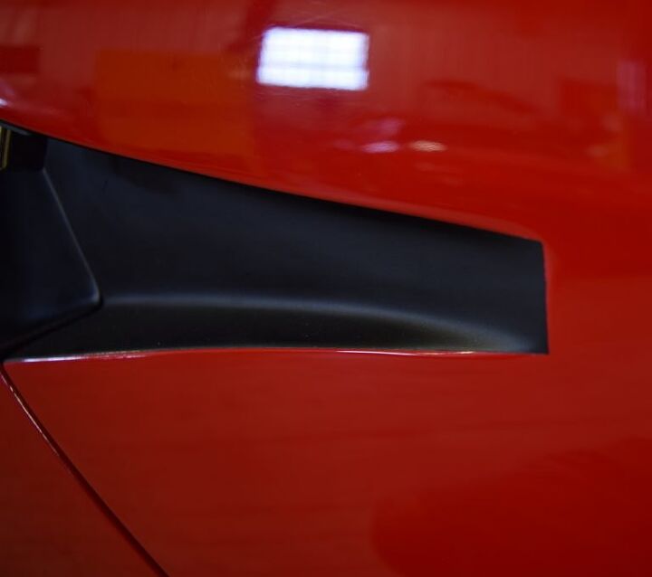
Why vulgar? The arbitrary tape line of this all original (i.e. nobody’s painted it) example’s flat-black design feature: less iconic and more kit car. A slight transitional dip in the body would let the black paint “sit” nicely in a proper home.
Pininfarina didn’t half-ass the Testarossa like this mixed bag.
Note the rounder elements of the rear wheel arch: not perfect, but a logical solution for wider tires on the narrow LP400.
It would have been nice — real nice — if the body scoop’s most rearward line shared a vanishing point with the door cutline, as they currently fight each other.
But the body scoop’s upright status complements the upper scoop.
This is a challenging car to critique.
So step back and soak those proportions, those minimalist geometric undertones. Too bad Pablo Picasso died the year before the LP400 hit the assembly line. I reckon the cubist co-founder would be rightly inspired by it.
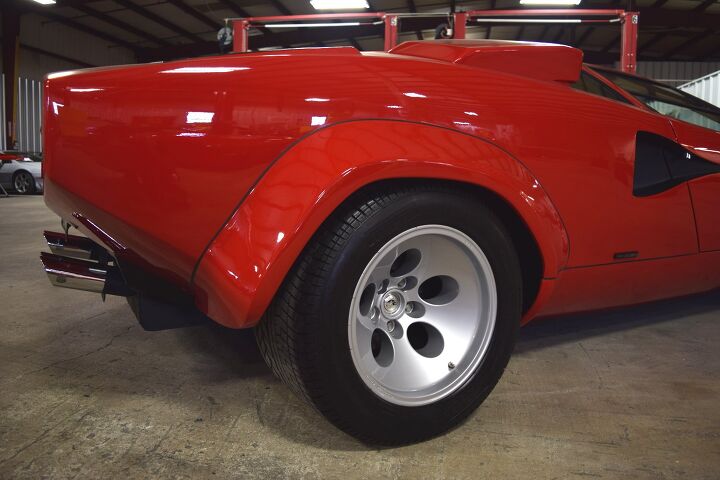
The LP5000’s extra flare detracts from the hard-nosed brutalism present in such a strong drop from the rear bumper (as it were) to the rear wheel.
The same story at the front wheel well, to a lesser extent.
Just imagine if the wheel arch/flare was gone — such brutality in form! While not without its charms, the flare changes the demeanor of the conversation.
There’s something disconcerting about the number of parts to make this flare. Perhaps it goes against the spirit of the LP 400?
Oh dear. Just like the windscreen, there’s black silicone (?) used like grout between tiles.
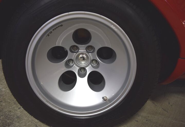
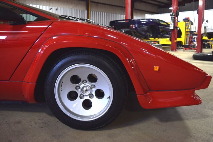
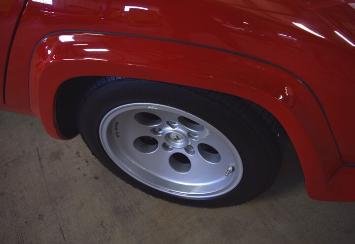
Countach wheel DNA peaked a few years before. Originally with cylindrical barrels projecting from each hole like a six (well, five) shooter pistol, these restyled hoops seem almost pedestrian.
Their fate was sealed when the Honda CRX and Ford Escort/EXP copied ‘em.
Delaminating chrome is sad on a low mile original example. WWGD? (What Would Gandini Do?)
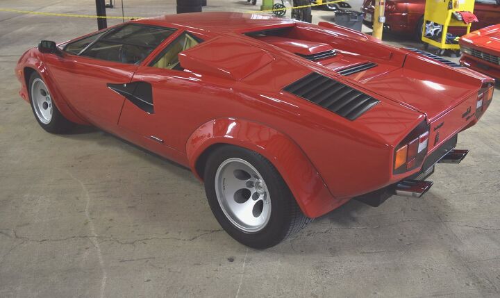
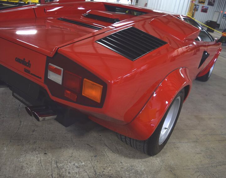
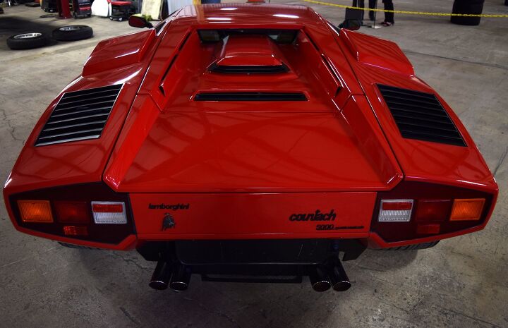
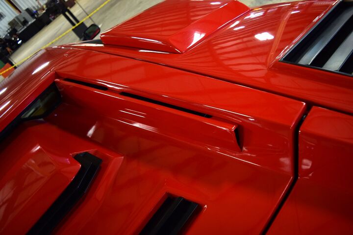
I’ve alluded to Brutalism, and the Countach’s posterior geometric architecture makes a strong case for the minimalism better known from concrete postwar buildings. You’d think Brutalism would make the Countach appear slow, but no!
Like a cheese wedge presented on a platter, with its pointy edge rudely cut by an uncouth guest, another triangle theme emerges at the rear. If that analogy didn’t work, consider this like a Play-Doh extrusion tool with the cut-off lever.
If only Play-Doh had an extrusion tool with this shape!
This posterior’s aggressive shape blends logically with every triangle theme from the B-pillar forward.
The vents on said extruded form aren’t flush fitting; disappointing in a minimalist-interrupted way.
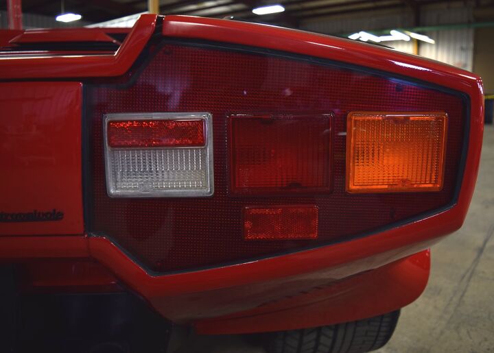
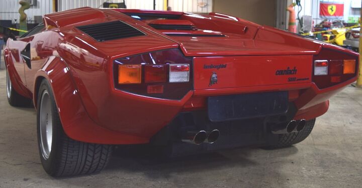
Much like that rear fender flare sealed with black silicone, too many parts make up a single taillight.
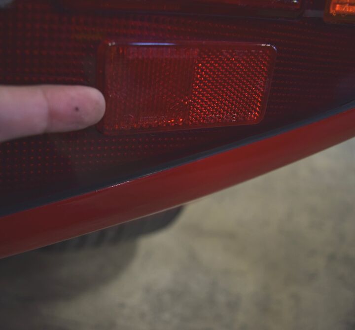
Separate red reflector.
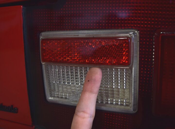
Three layers: the red base, the white backup lease and the red icing atop the white lens.
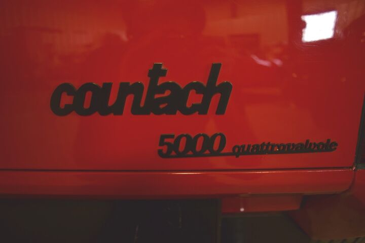
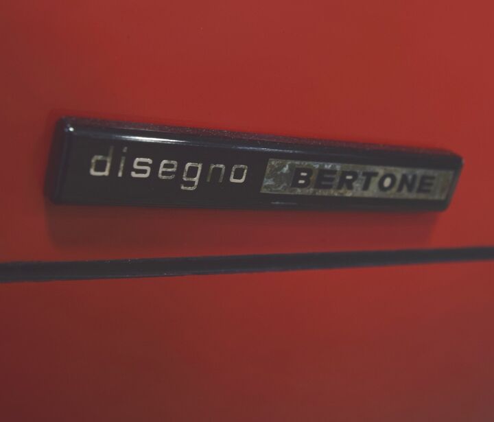
All lower-case lettering is an exciting contrast against today’s MINIs, FIATs, and KIAs. But the clumsy one-piece, underlined emblem underscores this design’s “I’m too advanced for current production techniques” demeanor.
That extruded, brutalist shape has serious depth. Oh, and more black goo, too.
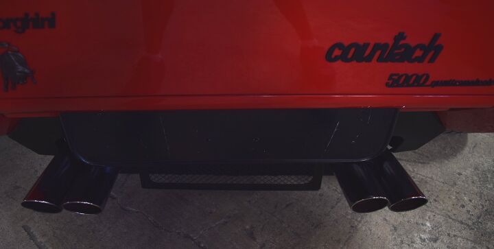
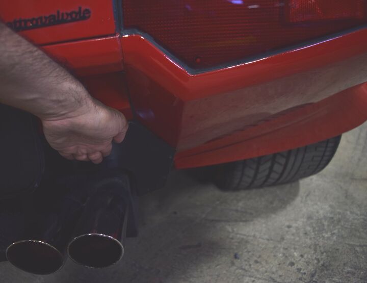
Rear plate holder aside, the volume of negative area on this posterior is a Sir Mix-A-Lot song played backwards.
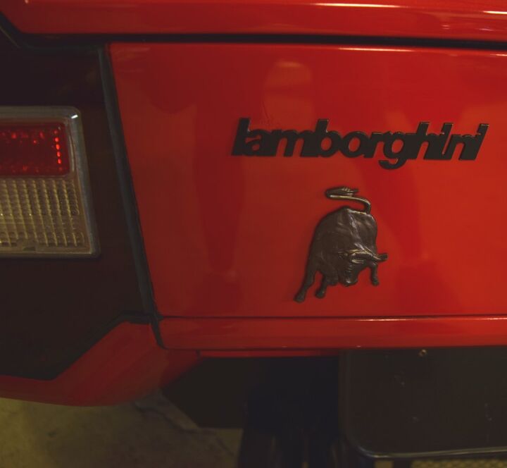
Again, lower case because it’s a lamborghini. And flat black for understatement, because chrome is for jerks.
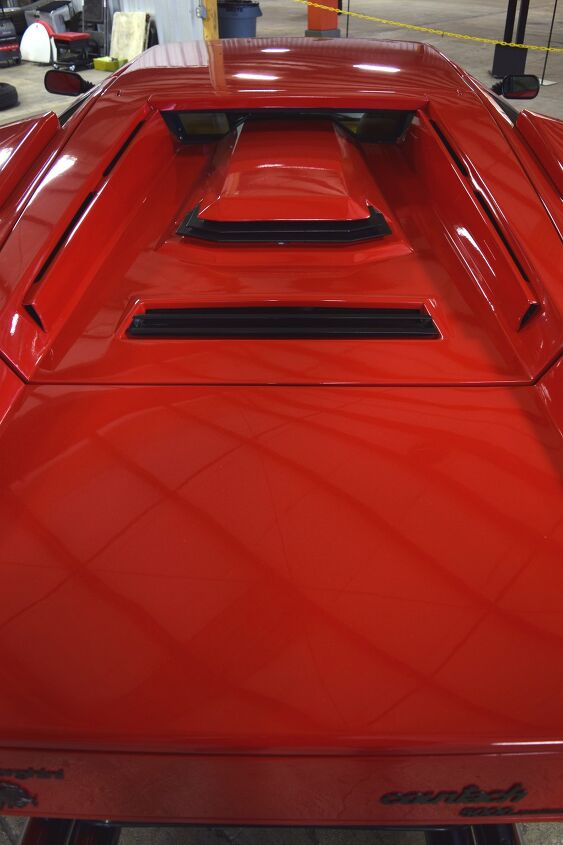
Is that another triangle shape inside the hood/cargo area?
And does it add even more negative area excitement to the Countach? Why yes, yes it does.
“You want more trunk space and I want more negative area! How much crap you wanna carry in this masterpiece, anyway?”
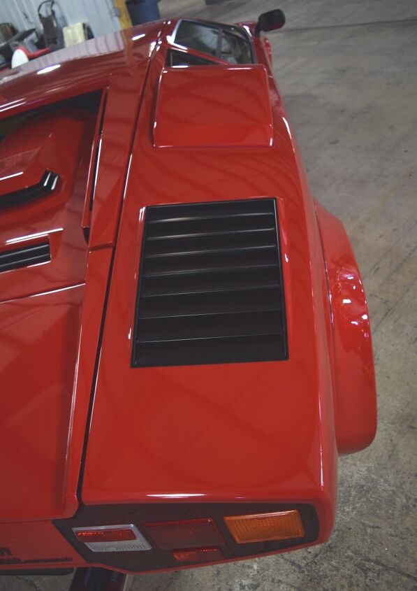
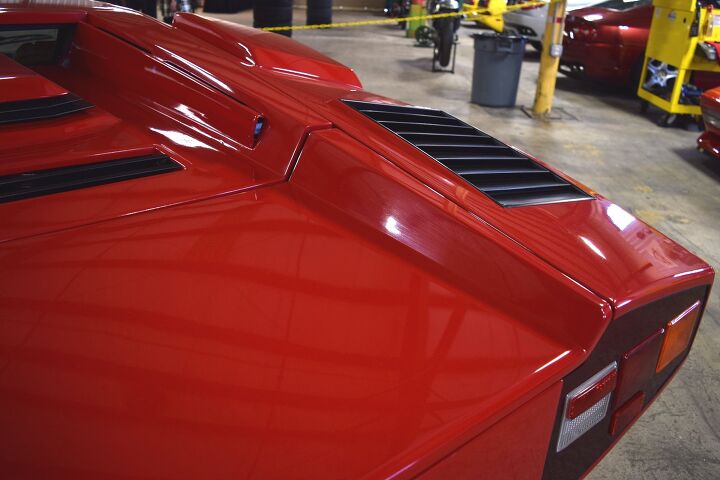
The hood’s “power dome” drives the Brutalist architecture theme home. It’s enamoring, like the Logan’s Run escape scene, filmed at a decidedly brutal location: the Fort Worth Water Gardens.
I wonder how well these cooling vents perform, forced to fit in such a rigid, architectural aesthetic.
Who cares: it’s intoxicating.
“There… is… no… sanctuary.”
Too bad Logan 5 didn’t hop into a Countach after escaping from the Fort Worth Water Gardens.
These cooling features could be the Countach’s most impressive feature. It serves a purpose — an engineering need — while making a statement no less bold than an impossibly low greenhouse with challenging scissor doors.
And yet, it’s somewhat hidden within a large negative area on the body. More to the point: when you think Countach, do you recall these features?
Gandini cared not for ergonomics or conventional supercar wisdom with the LP400 (and its successors). What he gave us is no different than Moroder’s contribution to music. Thank goodness for that: he blended static geometry and the Brutalist Architecture aesthetic into a wildly popular Supercar. Sure, the classically-styled Miura came first, Pininfarina’s Testarossa excels in surface detailing and driver-focused ergonomics, but the Countach pushed the supercar into the stratosphere.
Most importantly, the Countach’s DNA remains abundantly present in today’s Lamborghinis. Can’t say that about any Ferrari from 40-plus years ago…at least not with a straight face.
Thank you for reading (the fruits of my 20-plus hours of labor) — I hope you have a wonderful holiday.
>
Had I but known of this illustrious connection to the Black Jack I once used to patch commercial roofs and slap on chimney flashings.
Nice write up. I’ve never had a chance to look at one of these close up, thanks!
Extra drag notwithstanding, it still looks better with the wing.
In for a dime, in for a dollar.
I agree on the wing. Some people have argued that the wing was tacky. I think this car is so over-the-top self-consciously exotic, why NOT a wing? Might as well go whole hog.
I can see that. Because if you aren’t going LP400…you might as well go all 25th Anniversary on things.
“There aren’t any celebrations anymore. Ours, the scientists keep telling us, is a universe which is disposable. You know it might be just this one outrageous glory of all things, this rich steel spaceship, this epic chant, this gaiety, this grand choiring shout of affirmation, which we choose when all our cities are dust, to stand intact, to mark where we have been, to testify to what we had it in us to accomplish. Our works in stone, in paint, in print are spared, some of them for a few decades, or a millennium or two, but everything must finally fall in war or wear away into the ultimate and universal ash. The triumphs and the frauds, the treasures and the fakes. A fact of life. We’re going to die. “Be of good heart,” cry the dead artists out of the living past. Our songs will all be silenced – but what of it? Go on singing.”
With apologies to Orson Welles. If the Countach doesn’t provoke an emotional response, you’re probably dead. Thanks, Sajeev.
Rap produces an emotional response.
Precisely.
OK, so Countach, rap, babies born without craniums, flesh eating diseases… I’m beginning to understand your concept of Greatness.
OldManPants, I’m not sure you do, or ever will, comprehend my mind grapes. I’ll give you an “E” for “effort”, though.
I’ll still have liver sausage.
You can never take that away from me.
Park that near any other car made before or since, and it will draw the larger crowd of gawkers.
It represents the vulgarity of being able to afford such a thing perfectly.
As a child I told my mother I’d live in a tent, and use the money I’d otherwise spend on a house on one of these! OK, not my best idea, but I desired this incredible machine.
Everything you took issue with, I forgive without batting an eye. Maybe I’m in love with this car.
If I ever win the lottery, this would be the first car I’d look for…but I want the rear wing.
I have some mixed feelings about the reworked Countachs. The original design is so clean and subtle, even though it is extreme, like a late 60’s dream car, not ment to be driven on plebian roads filled with tall slow boxy sedans.
But I never liked the different style of wheelarches from front to back on the LP400, so I feel that the added arches make the front and rear arch cooperate a bit better.
I also like the brutal way they are added. It screams functionality like ;’we did this because we had to’. And even if the parts aren’t added into the design very cleanly they are obviously still tailormade to fit the original design.
And by the late 80’s it was just about to get a lot lot worse before they once again cleaned it all up for the first Diablo.
Lamborghini probably knew that they could never again make a car as beatiful as the Miura (and neither can anyone else), so they went all out for brutality instead with the Countach, which again can never be outdone.
By any street driven production car atleast.
Thank you, thoroughly enjoyed this. Liked the comment about the threaded license plate hardware, but then when I look more carefully (at least from the pictures) it looks like the holes are uneven! So very Lambo.
Also, those wheels are such a huge let down after taking the rest of the car into perspective. No soul at all and arghh why circles after all those polygons?!!
I got stuck on the aluminum front grille-ette.
Do they not have equal spacing between the three? The 4th photo makes it seem like the top bar is a lot farther out than the middle in relation to the bottom.
The 5th photo doesn’t seem as bad.
Is it just the angle of the photo?
Edit: The 3rd photo doesn’t seem as bad.
Sir,
If the Countach is to cars what Moroder was to music… then who is to music what the Cizeta Moroder was to cars?
Sincerely,
Not Giorgio Moroder
Morodor can’t popularize everything. His car is either Yello or Art of Noise. You be the judge of that.
“Morodor”
Twas in the darkest depths of Morodor
I met a car so fair
But Cizeta, the evil one
Crept up and slipped away with her
Ramble on.
I love the taillights, looks like Darth Vader’s chest.
Has any car graced so many 80s male high schooler notebooks? Usually in the form of some hastily drawn illustration with 4-color BIC.
All it needs is a cheap dealer placard on the tail. Something like, “Town and Country Imports and Exotic Cars.” Hehehe
This car is so crazy it works. It seems as if every design challenge was meet with an “OK just stick it here” approach. Normally this would result in a mess of shapes but somehow this car pulls it off. I think because as kids when we drew cars or built them from Legos they always looked this way too. Angles on top of angles, huge fender flares, intakes, grills, random cut lines… a fine wedge of cheese it is. This car looks best in black, to hide those terrible fitting panels.
Most shocking in retrospective: notice the huge profile of the tire’s sidewalls. The wheels / rims are downright tiny (15 inches!) but wrapped in big meaty, brute force tires. Makes today’s rubberband looking 22″s wrapped in cardboard thin 20 series shoes look even more silly.
“because as kids when we drew cars or built them from Legos they always looked this way too”
Great analogy but this is more like melted Legos.
Melted legos or the lego pieces from the really cool lego kits that we envied in the toy store (but couldn’t afford).
The space collection of Legos I had features lots of angled pieces… thus all my cool cars were grey and blue with yellow windows:
http://brickset.com/sets/487-1/Space-Cruiser
I like the flared and bespoilered and scooped later versions more than the original, even though I see the purity in the original. This car is all about being more daring and extreme than anyone else, and the additions serve the goal perfectly.
The uncompromising pursuit of that goal puts it in strong contention for being the best sports car design of all time.
Lol @ the badging. If you don’t know what this is, you don’t deserve to know.
Articles like this are exactly why I started reading TTAC in the first place. MORE!
Look at at original, then look at this. One too many facelifts, far to much coke.
But if you had a Countach without coke and facelifts you were doing the ’80s wrong.
For me and countless other guys who are Children of the 80’s, the Testarossa and the Countach will always define “supercar”. The Porsche 959 was awesome too, but its design didn’t scream exotic.
In my eyes , the Testarossa is a properly gorgeous car, especially in a Knight-Rideresque black-and-tan color combo. It still looks good 30 years later. I can’t say the Countach is beautiful in a conventional sense. It’s certainly not graceful. Brutish is the right word for it, but somehow it works in its own way.
I find today’s Lambos look like bloated angular spaceships. They look powerful, but not very sleek or sexy. Ferrari may have been less consistent over the years, but I really like the 458 and 488 styling. Ferrari still knows how to do sleek.
Somewhat pedantically, but a truly Brutalist (re. Beton Brut) Countach would be made from concrete. Which, from everything I’ve heard about actually driving a Countach, seems like the best way to handle the thing.
Also, seeing a Countach and Vulgarican or whatever the new Lambo is beside each other just makes the new car look a bit puffy and oddly stanced.
Sajeev,
I for one appreciate the effort for these! Vellum Venom is one of my favorite features on TTAC.
You folks are quite kind. This was totally worth the 20 hours of not doing anything else but this.
Thank you for sharing with us not educated in design, why certain design elements work or do not work.
Now about that “mere” Jaguar in the background…that would be a worthy follow-up article!
Nice write up. Thanks.
It was brutal, profane and vulgar. And we all wanted one.
I wanted a Trooper.
I was privileged to be the caretaker of this Countach for a few months. It was an honor not only to be around the car, but for Sajeev to come in and take the pictures for this article.
In case it was not clear in the article, this is a 1985 European “downdraft” Countach, much more desirable than the US-spec injected cars of the same year. The car has 8K KMs, with almost all original paint, and is in amazing original condition. But, not only does it look outrageous, it also drives wonderfully, something that I got to sample as well.
About a month ago, the car was treated to a full paint detail, and if you thought it looked good before, you will be blown away now. It has now gone back to its home in a private collection.
Great analysis Sajeev!
I think that for men of a certain age, the Countach represents that green light at the end of the dock across the bay, that “je ne sais quoi” that perfectly captures all of the best qualities of a time and place without rigidly defining them or otherwise sullying them.
Even as adults in the age of the internet, second-hand experience with the talismans of the past are the closest we’ll ever come to grasping that green light, but it’s enough. And in my most humble voice – speaking for those of us that I imagine actually exist outside of my own solipsist experience – thank you for providing access and detail. Thank you for sharing your experience.
Must you soak everything in elegy? The guys who actually buy cars like this would just laugh at you.
It doesn’t mean that much to me, to mean that much to you.
Awesome analysis. I disagree on the wheels – imitation is the sincerest form of flattery, and the CRX sporting the same design is awesome given how cool and angular it is in it’s own right.
This mid cycle model gets the worst of both worlds in my eyes, as the beauty of the LP400 has been messed with, but it hasn’t gone to the absolute deep end yet.
I think you focused on the details too much and missed the point. The most important feature of the Countach is the profile, a smooth arc from stem to stern. The black seams do look crappy up close, mainly due to being uneven, but from anything further than 10 feet somehow work. This to me is one of the essential things about a lot of Italian designs, the things that would be ugly on any other design somehow enhance this one. The louvers and scoops on the rear haunches just add to the design, even though they break up the surface the basic design is so strong it doesn’t matter. The whole thing looks mean as hell, no car will ever top the impression a Countach makes. It’s Brutiful.
There is always a photo (or three) where I step back and look at the profile, but this entire series is founded on focusing on the details.
And there are sooooo many of them on a car like this.
Ick: the Pamela Anderson of supercars.
Silicone and protruding bits included.
Make mine a Miura, thank you.
Awesome article. Awful workmanship! My $20k Hyundai is like a polished jewel in comparison. I know it was low volume, and a while ago, but seriously – it at least ought to look better than something that you bought out of the back of ‘Popular Mechanics’ and bolted on to a Beetle chassis.
But yeah, more of these articles, please. Just keep writing!
Had a yellow lp5000. I know the dd is faster but otherwise they are broadly similar.
These are show cars rendered for the road.
Literally you can’t see out the side or what’s behind. To move through traffic then you have to accelerate into
Open spaces ahead of you and hope no other car has the same idea.
Above an indicated 160 the front end gets real light and the car weaves down the road. No surprise as it hasIt a wing shape.
Above an indicated 168 or oil
And water temps rapidly climb into the red.
On the other hand only a Renault r5 turbo has better or
More direct steering below 120.
The transmission sounds and shifts similar to a Massey ferguson and no Lamborghini v12 has the sublime smoothness of a Ferrari 12.
A Ct is art, a showcar for the road, you would
never tire of looking at it. On a crisp Sunday morning on clear open roads with big sweepers it would entertain and challenge where any modern would just be competent. But in every other circumstance it will tire you out.
I love this series, may be my favorite since the ‘convert a caravan to JDM laws’.
Yeah, the scoops feel tacked on and weird from certain angles. None of the rest of it bothers me at all.
Thanks for your hard work, Sajeev!
ghandi would have ordered his countach with the spoiler
Hello Sajeev! Stranger here, but this write-up was very helpful. Thank you so much. i needed to know some of the details in this article, and here they were. Thank you for taking the time to put it all together. i created an ID and logged to simply say that, and thanks again.