


Michigan Trumpets Award for "Beautiful" License Plate Design That It's Already Revising Because It's Illegible

Step back from your monitor and just try to read that license plate.
You know those “wait! what?” moments? So I’m perusing a local news site and I see what is surely a press release from Michigan’s Secretary of State, Ruth Johnson, about how the Automobile License Plate Collectors Association ( ALPCA, Inc.) has overwhelmingly voted to select Michigan’s new mostly blue and orange license plate depicting the state’s Mackinac Bridge as the world’s best new automotive registration plate. First released last summer, the new plate portrays one of the world’s great spans against what the SoS’ office calls a “sunrise sky”. The registration numbers are white, the background is mostly orange and an almost parakeet blue. In addition to the press release, the SoS’ office also released a photograph to commemorate the award, with Sec. Johnson, and the Bridge Authority’s chairman and secretary jointly holding up the award. So what could be surprising about that announcement? It took place a couple of weeks after a spokesman for the Secretary of State’s office specifically told me that the license plate their office describes as a “beautiful plate” is going to be redesigned due to complaints about illegibility from law enforcement officers.
No mention of that planned redesign was made in the agency’s press release concerning the award. I found out about the change on my own after I noticed, while driving in traffic, that from 100 feet or farther, in full sunlight, it’s much harder to read the plate than most of the other Michigan plates. Those plates typically feature dark blue characters against white backgrounds. What makes the new plates almost impossible to read at distance is that they put white numbers and letters against a medium orange background. There’s just not enough contrast. Though the reflective beads on the characters give them a darker cast when illuminated at night, that grey against orange is also very difficult to read.
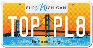
It’s a little easier to read close up.
After I first noticed how hard the new plates were to read, I looked at the Secretary of State’s web site, or at least the parts that allow comment, and I noticed that I wasn’t the only person complaining about the new plates’ illegibility. My first thought was that if I and other regular folks are having a hard time reading the new plates, what about cops? My second thought was that maybe, since many police cars are now equipped with infrared license plate scanners, perhaps law enforcement doesn’t care that they can’t be read by humans. To find out if they were aware of the problem, I called the SoS’s media office and a spokesperson got back to me.
Though people have been complaining about the lack of contrast since the plates were issued, the Secretary of State’s office apparently took particular notice when they started getting complaints from law enforcement. The agency’s spokesperson referenced complaints from law enforcement as the reason for the revision.
It turns out that I was wrong about police being able to rely on license plate scanners, though they are part of the story. Not only are the new plates difficult to read with the human eye, our new surveillance robots have a hard time deciphering them too. I guess the infrared signature of the two colors are too similar, because the spokesman told me that testing showed that license plate scanners also had difficulty reading the new design, which was created by Brian Whitfield, a Michigan Department of Transportation employee.
As a result of those complaints from law enforcement, I was told that the new license plate will undergo a revision.
Since my day job involves layout and lettering, I suggested that a black outline around the characters would work just fine, but according to what the SoS’ spokesperson told me, they’re going to use a darker color for the plate numbers to make them easier to read, by humans and by machines. The new plate colors have been tested to make sure that license plate scanners can indeed read them.
The ALPCA has been making the award since 1970 and last year they opened it up to a world wide competition. ALPCA members worldwide submit nominations and then vote based in part on the “overall attractiveness of the license plate design”. “I knew it had an excellent chance of winning the moment I first saw it,” said Gus Oliver, ALPCA’s Best Plate Award Coordinator. This was the second time Michigan won the award, the state’s U.S. bicentennial 1976 plate having previously won.
The license plate collectors make their evaluations based on photographs, not the actual license plates, so they had no way of knowing just how illegible the plates are in real life. I spoke to Mr. Oliver and he said that he recently heard rumors that the plate might be changed.
I don’t take any issue with their award of the prize in the first place. I like it when people say nice things about my state. I do think that it’s a bit inappropriate, though, for Ms. Johnson and her office to brag about Whitfield’s design receiving plaudits for its beauty at the same time that they are changing the design because the original didn’t quite work as an actual license plate.
For the record, though I’m fine with the award, I personally didn’t like the plate before I realized how illegible it was. When I first saw the new plate design, my thought was that with those shades of blue and orange, it looked more like license plate for New Mexico, Arizona or California than for the Great Lakes state, the water-winter wonderland.
If you’re looking for a specific license plate for a project or for your wall, ALPCA has a number of state and regional meets, plus Canadian and European license plate collectors also have their own get togethers.
Ronnie Schreiber edits Cars In Depth, a realistic perspective on cars & car culture and the original 3D car site. If you found this post worthwhile, you can get a parallax view at Cars In Depth. If the 3D thing freaks you out, don’t worry, all the photo and video players in use at the site have mono options. Thanks for reading – RJS

Ronnie Schreiber edits Cars In Depth, the original 3D car site.
More by Ronnie Schreiber


Comments
Join the conversation
For some reason states don't seem to test legibility of plate designs. I am often utterly amazed by how many states use a font for the license plate number which have letter characters that are difficult to distinguish. Florida and Michigan are particularly bad but that's just off the top of my head. Here's a hint states: upper case letters are not as legible from long distance as lower case letters are. Stop using upper case letters.
My family left West Michigan in 1987,when I was a little kid. But I still to this day think the blue plate with white lettering with "Great Lakes" is quite possibly the best license plate ever issued. Looks unique, but simple. I just have always liked it. My grandmother still lives there and she still rolls the special issue (1996?) Worlds Automotive Capital Centennial plate on her car. That one is my number 2. Looks good and rare. And I agree, too many states are trying to do too much. Keep it simple. Oh, and get rid of the front plate requirements! (never understand why some states require this and claim it is so important... If it was so important then why don't all states require it?)