


Ten Years Of Traffic Fatalities In One Interactive Map
Published: November 23rd, 2011
Share
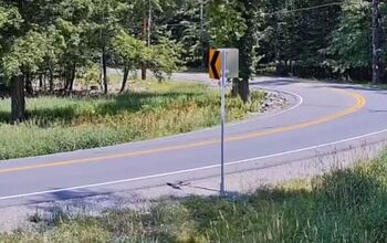
Some 369,629 Americans lost their lives on the road in the period from 2001 through 2009. Now ITO World has mapped every single one of them onto an interactive map that promises hours of morbid fun. Where do accidents happen? Who do they happen to? What kind of vehicles tend to be involved? Are there high-fatality areas near you? The answers to these questions and more await in this one-of-a-kind map.
More by Edward Niedermeyer


Comments
Join the conversation
It's a little chilling that you can blow the map up to a certain point and trace out the entire Interstate Highway System. I thought the interstates were supposed to have a better safety record than many local roads. Does that get overshadowed by the higher traffic volume on the interstates?
Where I live I noticed a disproportionate amount of motorcycle deaths. Considering that the volume of automobile traffic vastly outnumbers that of motorcycles, that bike deaths should be such a large percentage of overall deaths is scary.
I don't see the accident where a high school classmate lost her life back in December of '05. It was on a deserted rural road that is pretty easy to pick out.
It's a little sobering to see this map, then zoom in on the dot that was my fault. Great demo for my next driver's ed class discussion -if nothing else gets through to these kids, maybe this one will.