


Book Review Go Faster – The Graphic Design of Racing Cars by Sven Voelker
Gestalten, a German publishing house specializing in books on design, has published an intriguing book on a subject that surprisingly has previously only been addressed tangentially but is sure to appeal to most auto enthusiasts: the graphic designs of race cars.
While the shape of racing cars has been the subject of endless technical and aesthetic discussion, Voelker points out that the history of the colors and liveries that have been applied over those shapes has not been particularly well documented. Considering the emotional and aesthetic impact of the colors and graphics used, this is surprising. As Voelker says, who would want to watch a plain white Ferrari race?
Documenting the development and history of racing cars’ graphic design presents a challenge to historians. Manufacturer and team archives are relatively bare of original drawings or concepts, the liveries being the usual province of engineers, the cars’ actual designers’ whims, and more often as the years went by, sponsors.
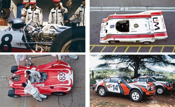
This lack of attention to the background of graphic design in racing is somewhat ironic in light of how iconic the graphic designs of some race cars have been. The light blue and orange Gulf sponsored Ford GT40s immediately come to mind as do the black and gold John Player Special sponsored Lotus F1 cars, or the Camaro and other racers carrying #6 and Sunoco’s blue and yellow livery. As iconic as those cars’ graphic designs continue to be, and Go Faster features examples of all of them, Voelker stresses how many famous race car liveries were almost accidental afterthoughts.
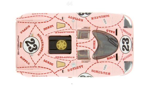
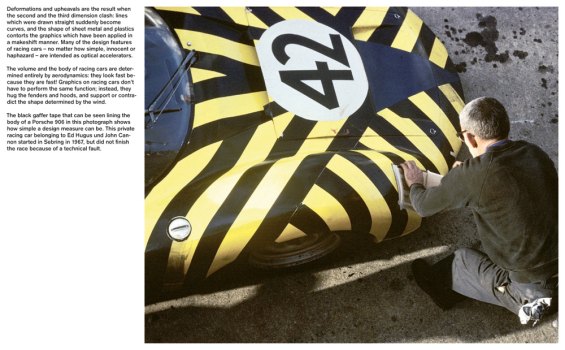
Tony Lapine, who headed Porsche design in the 1970s, was responsible for some of the greatest racing cars in history, like the legendary 917 variants. Though the shapes of the cars were meticulously crafted, the liveries were effected in a casual manner. The famous “Hippie” 917LH had its psychedelic purple and green swirls applied by Lapine in the pits just prior to its first race. Sometimes the teams’ casual senses of humor were not appreciated at the corporate level. Martini, the spirits company, has been a long time sponsor of auto racing. When Count Rossi, the head of Martini, saw how the Porsche team had painted a 917/20 in pink, with the dotted lines of a butcher’s diagram of a pig, he insisted that if they didn’t repaint the car, they must remove the Martini logos immediately.
In the early days, at least in international racing, cars wore national colors. That’s why Ferrari race cars are painted in rosso corsa, and Jaguars are still offered in British Racing Green. German race cars were silver like the famous Mercedes and Auto Union racers. Nowadays white with two blue racing stripes is a color scheme associated with Mustangs and Shelbys (as is the reverse white over blue layout). The blue and white combination was America’s original national racing colors and before it was used on Mustangs, Briggs Cunningham used that color scheme as did the Grand Sport Corvettes in the early 1960s.
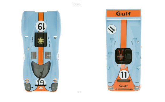
Still, in the 1970s, F1 cars were small and fairly cigar shaped. Sports cars racing at circuits like LeMans had larger bodies and the greater billboard space attracted sponsors. As John Wyer’s team moved from racing Fords to Porsches, the Gulf livery followed, and cemented in enthusiasts’ minds that if a car wore blue and orange, it was fast.
Voelker does cite BMW as an exception in that the Bavarian company has not treated the graphic design of its race cars as an afterthought. The book includes photos of Andy Warhol and David Hockney painting their respective M1 and 850 Csi cars that were part of BMW’s well known Art Car project.
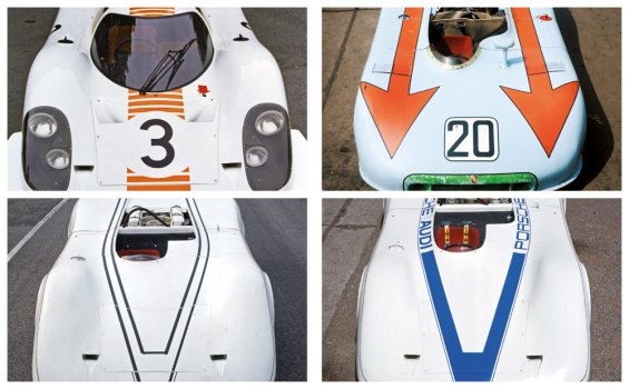
Other historical photos go back to the earliest days of auto racing, to Baron Pierre de Caters’ 1904 90HP Mercedes. The heart of the book, though, is not historical photos. This is a book about graphic design and Voelker uses a novel graphic method of showing the impact of the liveries of race cars. Starting with his own extensive collection of toy and model race cars, Voelker painted each of the cars with a blanking coat of white chalk and had Daniel Schludi take hundreds of detailed close-up photos both before and after painting. It’s absolutely fascinating to look at the ghostly images of famous historic race cars whose shapes are deeply etched into our brains and see just how much the overlaying graphic designs have affected our perceptions of those shapes.
Since Voelker, like everyone, has his own tastes, there are some cars well represented with varying body styles and liveries, particularly the 917, 911, and 908 Porsches. Those multiples allow you to see just how the differing liveries look on the same basic underlying shapes. Also, there are examples of the same livery on different cars, like the aforementioned Wyer Gulf racers, and the Martini colors (red, dark blue, light blue and white) on Porsches, a Lancia and even a VW Type II Transporter.
The photography is beautifully done and in addition to over 100 pages of large scale photographs, some double spreads, of the cars both nude and painted, are 25 pages of thumbnail images of all 131 of Voelker’s scale models used in this book in full liveries.
His use of scale models allowed Voelker to look at race cars in a way not really possible in real life. Though it’s possible to see race cars sometimes test without liveries, and while you might actually find a tifosi who would watch a white Ferrari race, you’re definitely not going to get the owner of an irreplaceable historic racer to let you repaint it matte white. What are the chances that one could even find, in presentable condition, a VW bus in team colors? So using toys and scale models is a clever solution to an interesting question.
The use of models, though, is also the books only real drawback. Not all models are really made to scale. In design, some features scale well, and some don’t, and not all model companies make true scale models. They want the final product to look good, and if that means slightly larger than scale wheels or the like, oh well. Sometimes the fact that they are models is a bit too obvious. Also, Voelker’s been collecting model cars since he was a boy. These are not obsessed Hot Wheels collectors who won’t let his kids open the blister packs model cars. They’ve been played with. Though many of them are obviously high end, high detail models that I’m sure Voelker treasures, a number of the models are a bit worse for wear, with chipped paint and obvious signs of hard play.
Though the scale and scratches sometimes get intrusive, the overall effect of Voelker’s ‘white out’ is literally illustrative. It will give you a new perspective on scores of your favorite historic race cars.
Go Faster – The Graphic Design of Racing Cars by Sven Voelker

Ronnie Schreiber edits Cars In Depth, the original 3D car site.
More by Ronnie Schreiber


Comments
Join the conversation
Based on this review, I asked my wife to get me this book for my birthday. I like it a lot. Very cool concept, nice historic pictures, cool info on design and racecar history. If it were a physically larger book, it would be the perfect car-geek coffee table book: not much text, lots of pictures, cool idea. As it is, it's close, and frankly I don't NEED it to be huge, it would just be a bit more striking if it were.
This book got very bad reviews on Amazon.