


What's Wrong With This Picture: And You Thought It Couldn't Get Any Worse Edition
Published: August 18th, 2009
Share
More by Robert Farago


Comments
Join the conversation
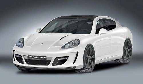
Hmmm... It looks like the steroidal bastard love child of a 911 and a current generation Dodge Charger. Sheeshhh, it's really fugly. It's just wonky lines and mismatched shapes and a stupid high beltline.
Bumblebee's cousin!
Are we sure that this is not the new Sebring?
Surely this thread should have been called, "What's Wrong With This Picture: It Was Only A Matter Of Time Edition." The car looks like the usual inverse relationship between money and sense is still holding true.