Vellum Venom: 2014 Rolls Royce Wraith

While designing top-dollar luxury cars was a rare success during my year at CCS, it’s gotta be tough to get these into production. Consider competition from lower-rung manufacturers, namely those parent companies owning the likes of Rolls Royce. How much shared engineering is forced upon them? What financial (beancounting) and legal (pedestrian safety, carbon emission) design constraints are forced upon the uber-luxury Transportation Designer?
Design directives get muddy in any vehicle, yet weak design is intolerable at a $354,000 price tag.
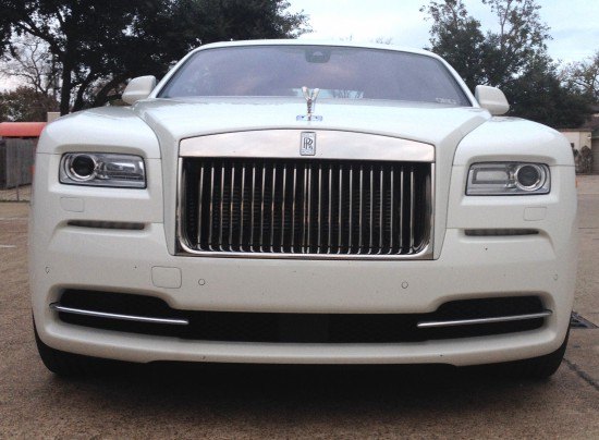
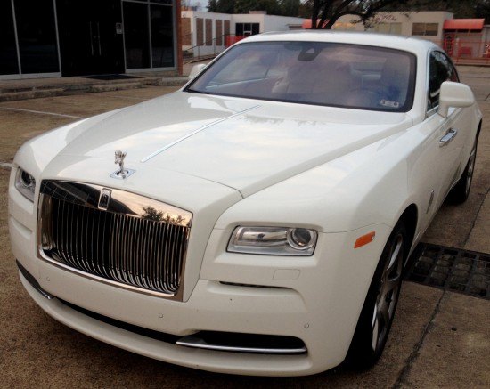
The (legendary?) Chrysler 300 became such a force that the Wraith seeks relevance from that aggressive face. Not a bad thing: it worked for Chrysler, it’s a no brainer here.
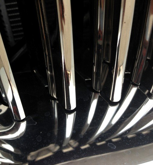
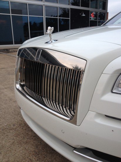
But that grille! Old world craftsmanship never goes out of style, even if the individual “teeth” have more gaps than Cletus from The Simpsons. Perhaps meant to fold away in an accident, let’s hope today’s grilles are more pleasant to get jabbed into your rib cage.
Many vehicles from the 70s-80s sported safety-minded stand up grilles matching their 60s counterpart’s swagger. But they usually implemented energy-absorbing, spring-loaded grille teeth nestled behind a one piece grille shell.
Not so here, perhaps safety takes a step forward…at the expense of elegance.
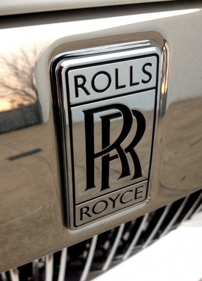
Emblematic of success, far above your peers.
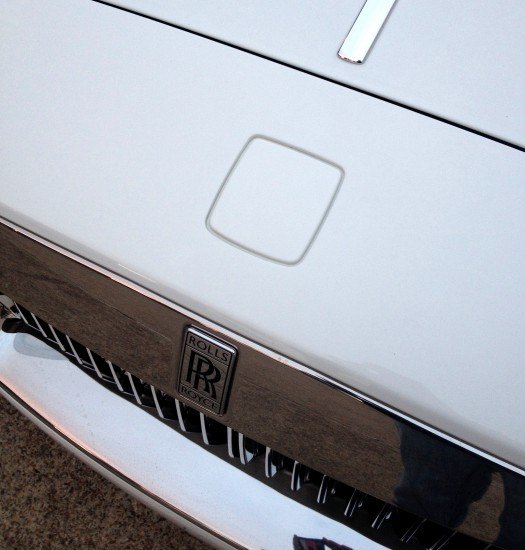
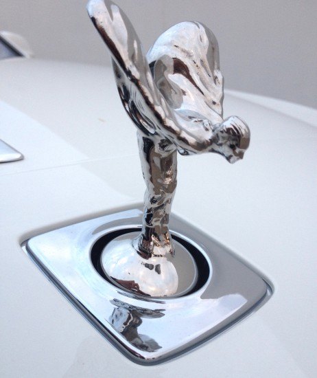
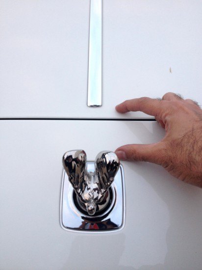
Rolls Royce’s trap door for their signature hood ornament is fantastic: even looking cool when retracted, because you know what’s going down later.
The “flying lady on a ball” is a fantastic piece of kit from a design and user-interface standpoint.
Perhaps a short video (shot incorrectly, rushing at dusk, sorry!) is in order.
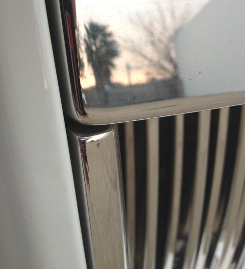
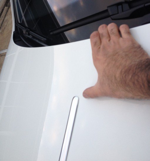
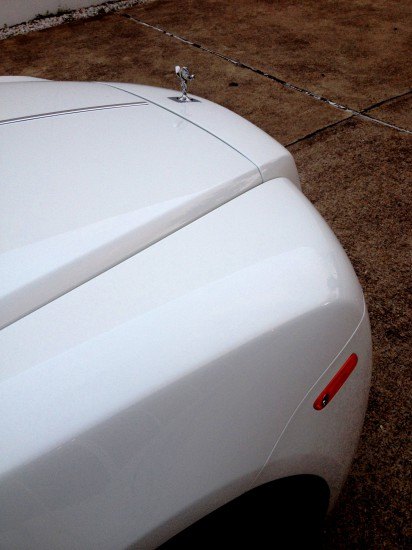
The chrome strip is frustrating afterthought. Not long enough to reach the grille, the ending point seems arbitrary and…well…cheap.
Even worse at the tail: it’s the same class of fail seen in the concept-to-production of the third-gen Chrysler Sebring’s hood.
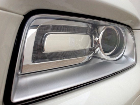
The lighting cluster looks suitably upscale, though every car maker encrusts corporate logos/ easter eggs on lighting pods.
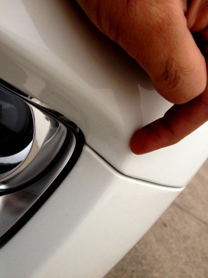
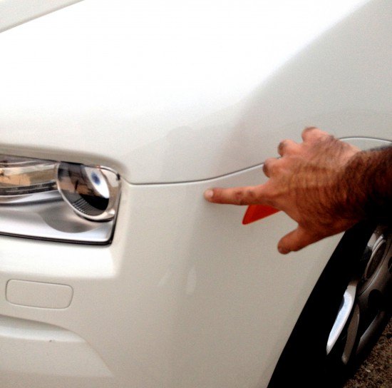
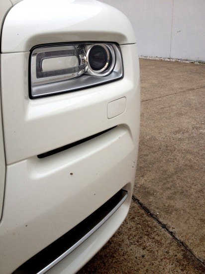
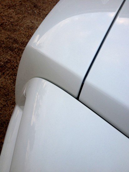
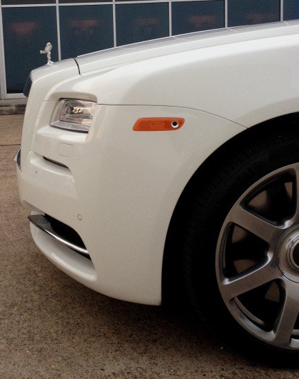
Step back: a cheap cut line, worthy of the Chrysler 300. One of this era’s big design sins is making the front fascia into a bumper. Contrasted to making a lower bumper that’s a “shelf of protection” for the fascia due north. The cut lines between fascia and body go higher, therefore far more visible.
And curb appeal goes down.
Imagine if the fender flowed down to a point far south of the headlight. Imagine the uncluttered, expensive look this provides.
Large fenders dipping below the lighting pods is commonplace for Aston Martins, ya know.
Insurance constraints or whining about a dent in a big metal fender are the least of a Rolls Royce owner’s worries. They worry about the SEC, or other First World Problems.
The bumper cut line wouldn’t be visible from this angle if the bumper started at the slot below the headlights. The Wraith walk-around experience deserves an uninterrupted fender free fall.
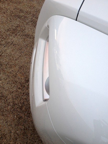
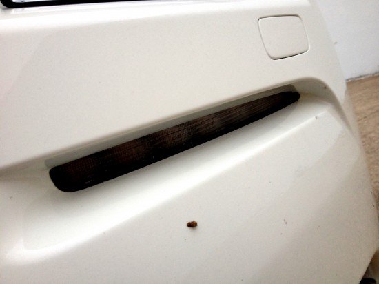
For the love of all that’s holy, the correct cut line is presented as the fake, just a few inches south of the real one! Perhaps the taller bumper/shorter fender was a last-minute addition from the beancounters/lawyers?
But that’s more than a fake cut line, it’s a light. Fantastic, even more reason to make the fender/bumper transition at this point.
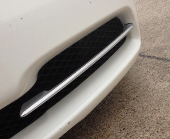
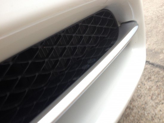
Every modern car needs a lower valence with big speed holes, helping visually reduce the bulk associated with the ridiculous height.
Especially when $300+k ensures no solid castings with fake mesh textures. Whew!
The chrome grille lives in a painted shell, with another bizarre choice for the hood cut line. Pushing the cut line forward makes the hood more unwieldly to operate and extra vulnerable in an accident, but again, First World Problems.
The Wraith’s grille shell is an awkward, cetacean tribute to its ancestors. A clumsy integration for modern pedestrian safety standards?
A better way is to move that hood forward, extending the chrome strip too. And since First World Problems are ‘fo real son, you just go right ahead and make the hood share the same cut line as the chrome grille.
Can you visualize the two new proposed cut lines from this angle?
And if pedestrian safety regulations allow for a “shelf-like” bumper, shrink back the fender/headlight area to give a subtle homage to the exposed fenders of pre-war Rollers. Kinda like the shelf you’ll see at the rear.
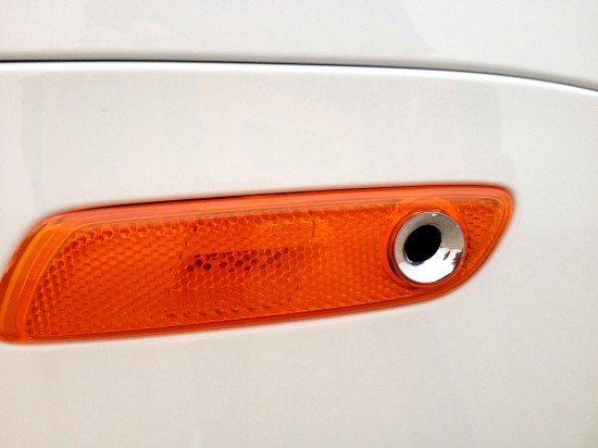
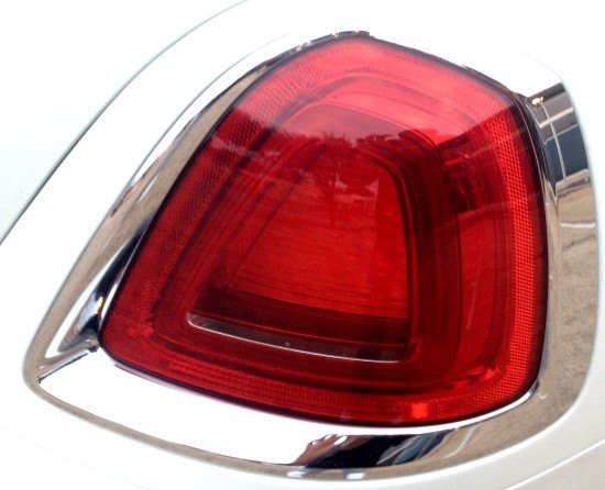
Proper cut lines also mean an unobstructed view of the Wraith’s clever light/sensor assembly. The chrome ring is a nice touch, but it sorely needs a chrome casing for the light. It worked for the 2008 Chevy Malibu’s rear marker.
See? First World Problems!
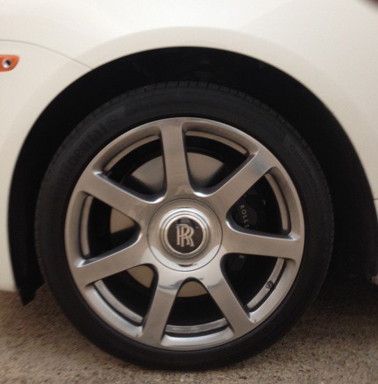
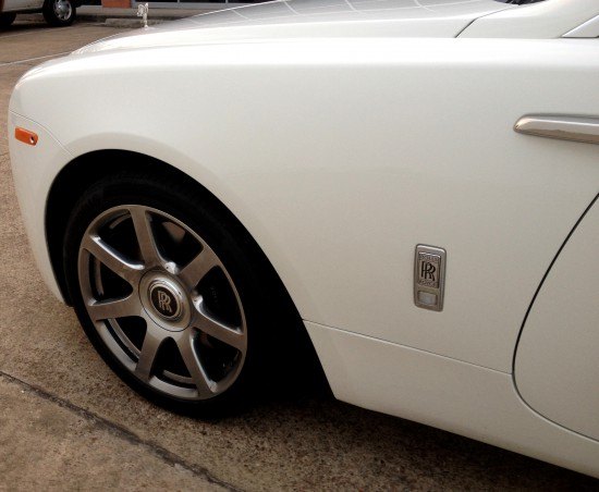
A timeless wheel design is mandatory on any Roller, these pre-war Bugatti-alike spokes do the trick.
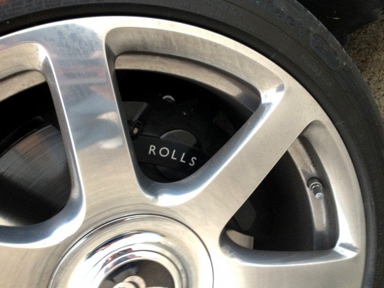
Branded performance brake calipers have jumped the shark when Rolls Royce does it.
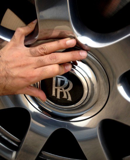
Rolls Royce’s hallmark self-aligning hubs make any shot a perfect one. And some know-it-all-fulla-crap AutoJourno can’t casually spin them by hand, either!
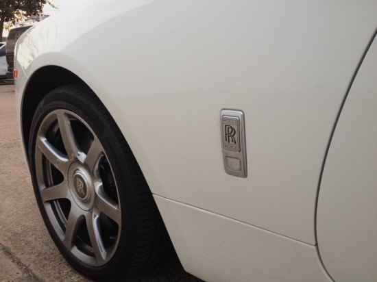
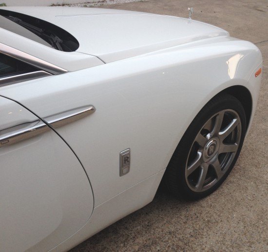
The space behind the front wheel is thanks to a liberal “dash-to-axle” ratio. It’s a perfect place to affix an emblem promoting a history of superior proportioning.
Let’s marinate on this beauty.
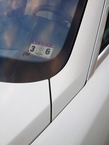
Like a BMW 7-series, the Wraith’s A-pillar extends deep into the hood: a sad reality of modern car design.
You know what’s coming.
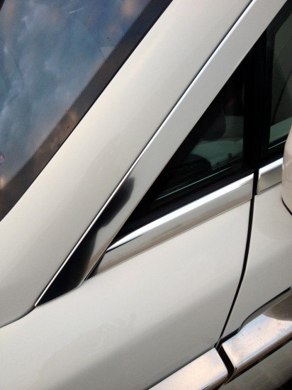
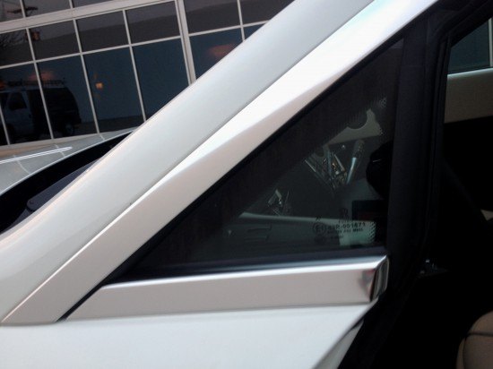
DLO FAIL!
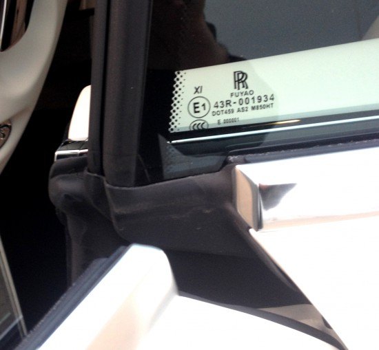
Yes, that’s a sheet of glass where cheaper cars opt for a solid plastic triangle. But glass is an acceptable DLO FAIL alternative for cars like the $14,000 Nissan Versa Note…but for $340,000 more? Inexcusable bullshit.
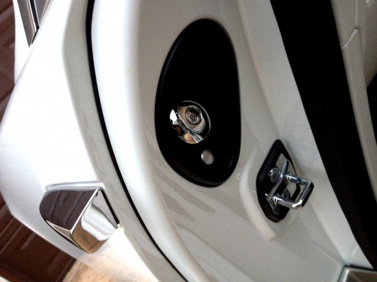
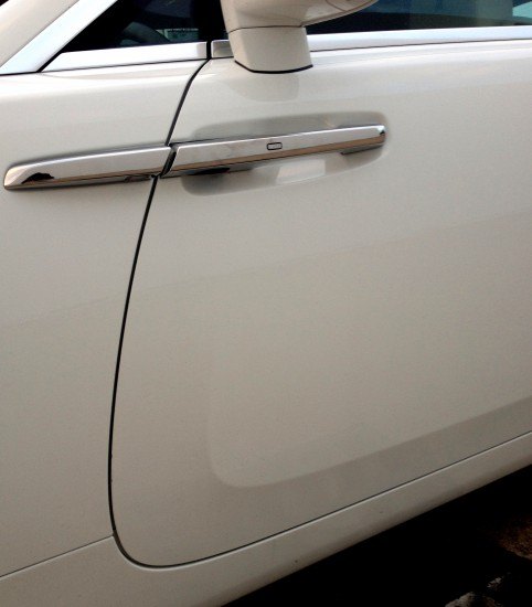
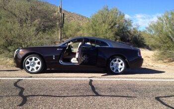
The problem worsens when opening the (excellently suicide-hinged) door. Redesigning a firewall’s hard points for a Wraith can’t be that resource consuming, considering it lacks door hinges!
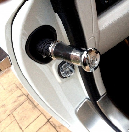
Perhaps the classy umbrella demanded a door cut line in a certain place. Perhaps DLO FAIL met its match: the umbrella conquers all.
Truly a magnificent piece of product design (umbrella), integrated into a sad work of transportation design (firewall).
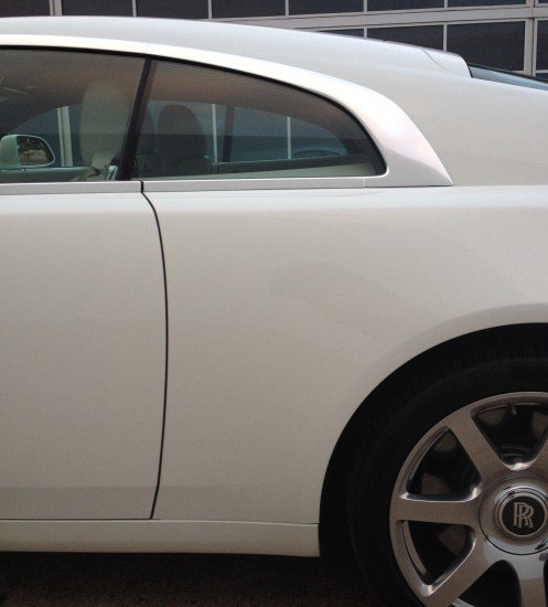
Even worse, the door cut line is a whimsical curve worthy of a yacht, forcing your eye to naturally follow the curve up to triangular DLO FAIL.
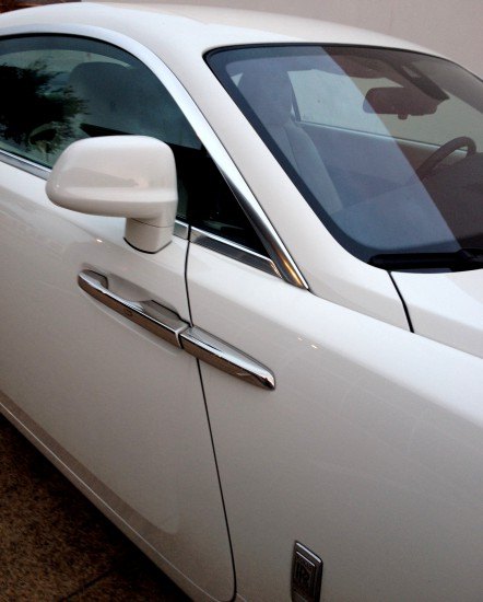
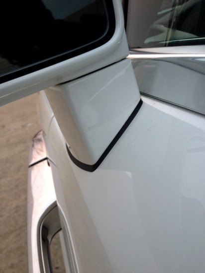
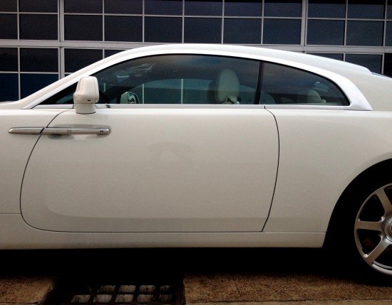
The Wraith’s side has sculptural elements. Note the steep grade on which the side view mirror bolts to the door.
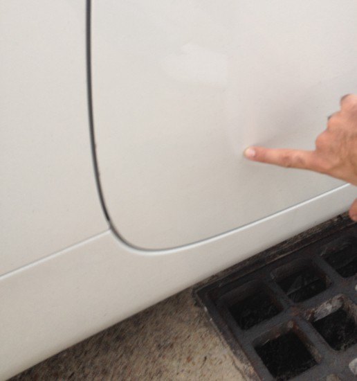
There’s a subtle character line that also reduces visual heft.
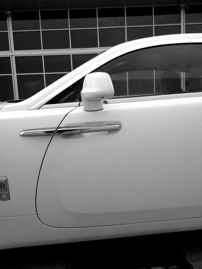
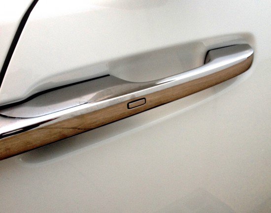
The door handle is masterful metalwork: reassuring in touch, packed with modern keyless functionality.
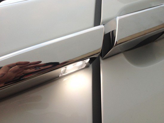
The extra metal spear not only lengthens the door handle’s appearance, it houses a fancy LED puddle lamp.
The spear forces your eyes down, south of the DLO FAIL.
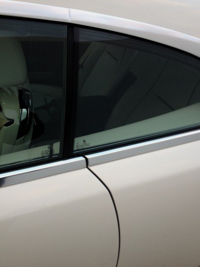
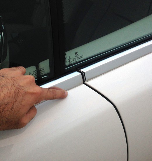
The door’s cut line doesn’t meet the starting point of the quarter window. Frustrating on the CTS-V coupe, far worse on a vehicle nearly four times more expensive.
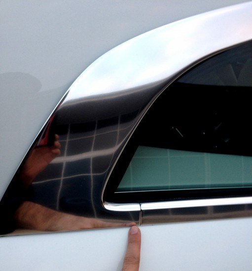
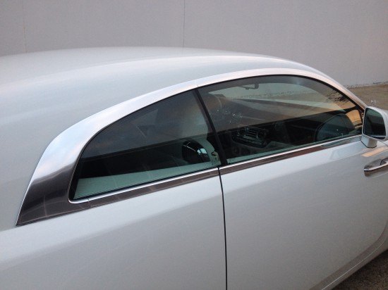
NOTE: see the chrome’s break point atop the greenhouse. More on that later.
Not having the window and door cut line match is beyond frustrating. Suicide Door Lincoln Continental it ain’t.
Start the cut line there, make whatever changes are necessary south of that for a functional hinge. Could the revised cut line look much worse?
The chop-top school of thought is getting very, very old.
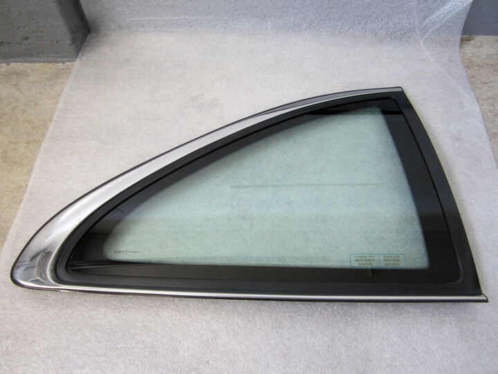
(Photo Courtesy: eBay.com)
If this relatively affordable luxury coupe made it with one piece, what’s the Wraith’s excuse?
The beancounted quarter window trim, bizarre B-pillar cut line and played out chop-top: the Wraith’s greenhouse is like a greatest hits of poor vehicle design from the last decade.
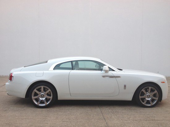
We expect ostentatiousness, not clumsy and chubby. The flat-not-fastback roof, misaligned B-pillar, whimsical door cut line that missed the A-pillar by several inches: all sloppy in side profile.
A less swoopy door starting at the beginning of the A-pillar loses the yacht like swage line, but that’s a good thing: it’s too “fast” considering the surroundings.
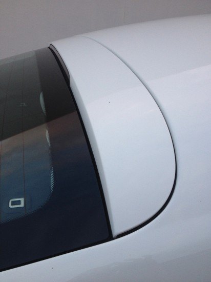
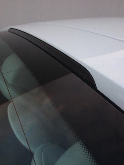
The rear window has a false panel (or is it a spoiler?) giving the impression of hatchback functionality.
The CHMSL in this false panel is a nice touch.
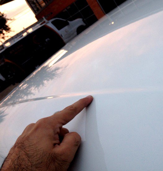
Ditto this roof indentation: perhaps for rain water drainage, but definitely excellent for breaking up an otherwise huge swath of sheet metal.
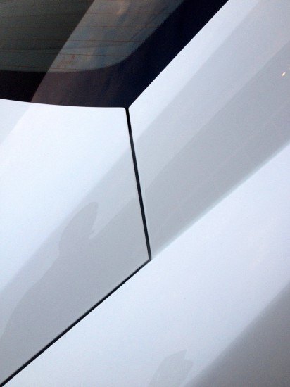
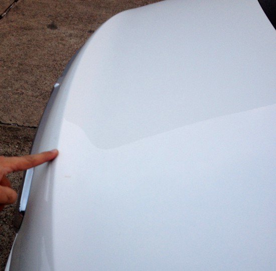
Here’s the actual cut line for the trunk, yes a conventional trunk. Perhaps it could use some of the door’s whimsical curvature.
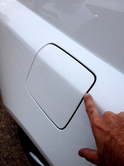
While the fuel filler door has a respectably located bend matching the body, it’s better seen south of the wheel arch, deeper into the quarter panel.
Because it’s kinda bland here! Nothing wrong with an uninterrupted panel, but take the “clean design” hit to clean up the wheel arch. Priories!
No, it’s not a 3rd Gen Hyundai Grandeur/XG350.
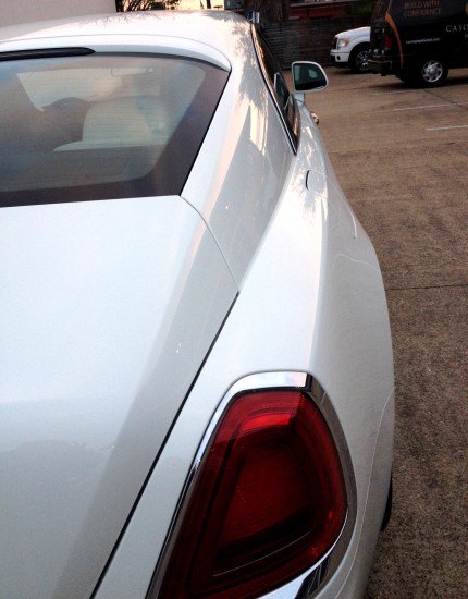
The Wraith’s fantastic wheelbase and strong proportioning is marred by a smooshed roofline giving the appearance of a decadent automotive cockroach.
Perhaps this is an XG350 that met a very well-endowed cockroach.
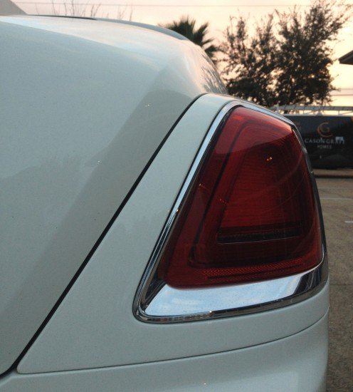
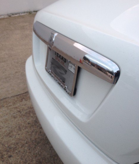
But there’s no Hyundai’s with a chrome frame this massive, with lighting elements so harmonically layered. All elements compliment the chrome trim: nothing screams like so many OEM lenses in lesser vehicles trying hard to be cool.
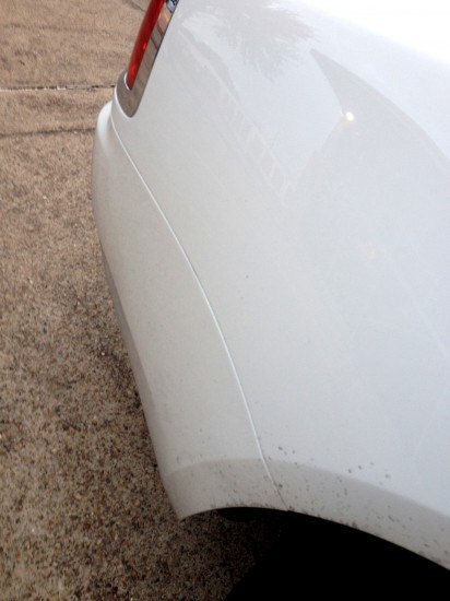
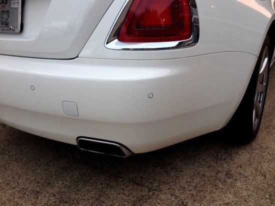
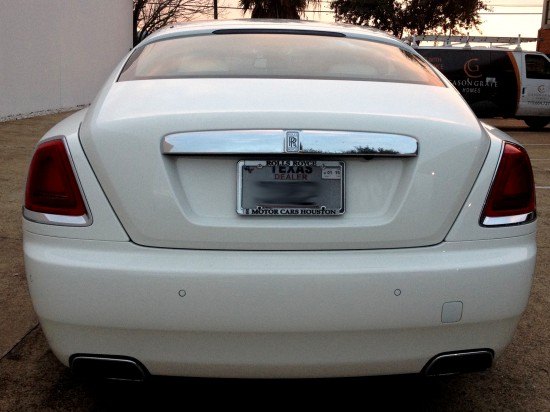
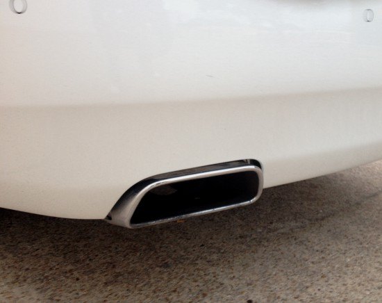
So the rear gets a proper bumper shelf and the front does not? This transition adds depth, texture and refinement: even if the cut line is unnecessarily north of the bumper shelf.
A subtle crease in the Wraith’s trunk keeps it from appearing bloated, bubbly.
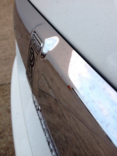
The Wraith’s softened contours on the chrome trunk mustache needs the front grille’s sharp drop off for more bite.
Add some tooth to the chrome’s bends (around the logo, at the drop off to the license plate) and it’d look like a Rolls and less like a Chrysler 300 emulating one.
The massive rear bumper is another reason the flattened cockroach roof has gotta go.
Or perhaps the bumper needs to taper up (same height by the rear wheel, 1-2 inches higher from this angle) making a thinner and rounder posterior?
A thinner bumper isn’t happening: Rollers need substance to make presence. This bad ass bumper is brand honest. It’s one of many great landings at a Frank Ghery designed airport.
Thank you for reading, I hope you have a lovely week!

More by Sajeev Mehta
Latest Car Reviews
Read moreLatest Product Reviews
Read moreRecent Comments
- Sayahh I do not know how my car will respond to the trolley problem, but I will be held liable whatever it chooses to do or not do. When technology has reached Star Trek's Data's level of intelligence, I will trust it, so long as it has a moral/ethic/empathy chip/subroutine; I would not trust his brother Lore driving/controlling my car. Until then, I will drive it myself until I no longer can, at which time I will call a friend, a cab or a ride-share service.
- Daniel J Cx-5 lol. It's why we have one. I love hybrids but the engine in the RAV4 is just loud and obnoxious when it fires up.
- Oberkanone CX-5 diesel.
- Oberkanone Autonomous cars are afraid of us.
- Theflyersfan I always thought this gen XC90 could be compared to Mercedes' first-gen M-class. Everyone in every suburban family in every moderate-upper-class neighborhood got one and they were both a dumpster fire of quality. It's looking like Volvo finally worked out the quality issues, but that was a bad launch. And now I shall sound like every car site commenter over the last 25 years and say that Volvo all but killed their excellent line of wagons and replaced them with unreliable, overweight wagons on stilts just so some "I'll be famous on TikTok someday" mom won't be seen in a wagon or minivan dropping the rug rats off at school.













Comments
Join the conversation
Needs some stick-on chrome side vent grilles.
Thanks for opening my eyes a little wider. Some of the things mentioned in this article would otherwise have escaped my attention.