It's a Drab, Drab World
Remember when you got your first 64-count box of Crayola Crayons? After inhaling the trademark smell, your eyes were dazzled, your left brain inspired by an eye-popping kaleidoscope of colors. You never knew there were so many different shades of blue and yellow and red and green. You could draw anything you wanted and you’d always have just the right color. And when you started drawing cars – man! That’s when you’d pull out all the best hues. Never ecru or black or white or gray, though. No way! You always drew your dream cars in the brightest Technicolor hues you could find. Too bad today’s designers don’t remember those fun times.
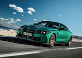
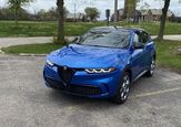
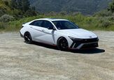
The next time you’re stuck in traffic, look around. Check out how many vehicles have been painted in minor variations of the same generic colors. Carmakers’ color palettes currently range from uninteresting to downright depressing. The occasional vivid yellow or red stands out like a hooker at a Liberty University pep rally. Visit any car lot and you’ll find yourself awash in a sea of black, white, silver, gray and beige. If you want something a bit more vibrant, you’re probably out of luck; most car makers who offer reds, greens, or blues usually do so in the darkest shades possible. Even if you find a manufacturer willing to serve up something brighter, chances are you’ll have to special order it.
Boldly colored cars drove off the automotive scene at about the same time as bold styling disappeared into a gaping sinkhole of mediocrity. Starting in the late ‘70’s, automobiles– and their Armani-clad designers– began to look more and more alike. As the “bean counters” took over from the “car guys,” designers began copying each other and, eventually, themselves. Mass market motors went straight from bold to boxy to droopy to dull. The trend to dreary colors moved in perfect synchronicity with the shift towards dreary styling. The relentless excretion of cookie-cutter, cost-cutting crap continued into the ‘90’s and the new millennium. And now, even though fresh thinking has finally appeared on the design front, color choices are still stuck in the ‘90’s.
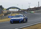
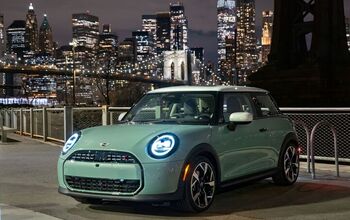
When the distinctive colors disappeared, they took the distinctive graphics and trim packages with them. I guess we’ve become too sophisticated to be seen in cars decked out with stripes or other graphics. Sure, there are the one-size-fits-all graphics you see on the rice burners; the ones that look like someone slapped paint on with a broom. Close but no cigar. Graphics should be tailored to the design of the individual car, highlighting its lines and making a statement specific to that model’s character. (Only the MINI “gets it.”) Think of your favorite Detroit car from the ‘60’s or early ‘70’s. Chances are it has distinctive graphics that complete the overall “look” for that particular model.
With a few notable (and expensive) exceptions, interiors are just as lackluster as the exteriors. If you’re offered any choice at all, it’s usually between funereal black, sallow tan, or death-pallor gray. Even cars lauded for their interiors use varying shades of these same colors, just in higher-quality materials, with better workmanship. Why did they stop offering the reds, the greens, the blues? Where is it written everything inside a car has to be the same color? A few cheerful colors on the inside would help alleviate the claustrophobic cave effect so common to today’s cabins. Surprisingly, the designers’ color blindness extends to their concept cars. Auto shows offer the expectant public radical shapes and funky designs– in the same four uninteresting colors as their production cars: white, beige, gray or black.
Instead of coming up with exciting new colors, car makers take the easy way out. They commission their marketing lackeys to think of exotic-sounding names for the same old colors. So now you can get Abyss, Neptune, Alloy or French Silk instead of black, dark blue, gray or beige. But as the Bard noted centuries ago, a rose by any other name is just as red (or something like that). Call them what you like, they’re still the same old boring colors that make the automotive landscape meld into a miserable melange of monochromatic monotony.
What ever happened to the automobile as a vehicle for individual expression? Where are Sassy Grass Green, Carousel Red, and Statutory Grape when we need them? Why no modern equivalents to the John Player Specials, strobe stripes or screaming chicken graphics? We need choice, we need flair, we need pizzazz! We need to bring some vibrancy back into the picture. Perhaps we should send every design studio a brand new 64-pack of Crayolas. I reckon it’s time they got back in touch with their inner child.
More by Frank Williams
Latest Car Reviews
Read moreLatest Product Reviews
Read moreRecent Comments
- Corey Lewis It's not competitive against others in the class, as my review discussed. https://www.thetruthaboutcars.com/cars/chevrolet/rental-review-the-2023-chevrolet-malibu-last-domestic-midsize-standing-44502760
- Turbo Is Black Magic My wife had one of these back in 06, did a ton of work to it… supercharger, full exhaust, full suspension.. it was a blast to drive even though it was still hilariously slow. Great for drive in nights, open the hatch fold the seats flat and just relax.Also this thing is a great example of how far we have come in crash safety even since just 2005… go look at these old crash tests now and I cringe at what a modern electric tank would do to this thing.
- MaintenanceCosts Whenever the topic of the xB comes up…Me: "The style is fun. The combination of the box shape and the aggressive detailing is very JDM."Wife: "Those are ghetto."Me: "They're smaller than a Corolla outside and have the space of a RAV4 inside."Wife: "Those are ghetto."Me: "They're kind of fun to drive with a stick."Wife: "Those are ghetto."It's one of a few cars (including its fellow box, the Ford Flex) on which we will just never see eye to eye.
- Oberkanone The alternative is a more expensive SUV. Yes, it will be missed.
- Ajla I did like this one.













Comments
Join the conversation
I completely agree with this. One of my fondest memories so far is from a few summers ago, when my dad and I repainted my car to my ideal specifications. We replaced the stock maroon with a vivid metal-flake grass green. It was extremely eye-catching, and made me very proud of an otherwise lackluster car. Unfortunately, that fall, it met its end on the front of a semi-truck, but those three months of bright green were awesome.
I had noticed many cars are biggest terrible and ulgiest car with many silver, white and black this year. I don't like the color's ulgiest car. However, I do like the best in 1950's,1960's,1970's and 1980's car had various pretty colors are better red,blue,yellow,green,orange,purple,brown,teal, turspious,gold,candy pink (fuschisa),grey,and more color selection are better than big ulgiest a silver, white and black, so we can force other poeple need to less buy to silver, white and black. So,My favoite's color is red metallic,blue metallic,yellow and yellow metallic,lime and lime metallic,orange and orange metallic,purple metallic,dark pink metallic,tursqiuose metallic,teal metallic,gold metallic,black with gold stripes or silver stripes,white with blue stripes or orange stripes,silver with blue stripes or black stripes and cute color metallic are better than silver,white and black is strink!!