#Iconography
BMW Revives Historic Logo for M Division Vehicles
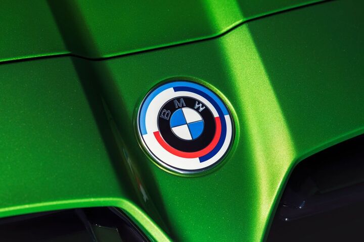
BMW is dusting off one of its older logos for select vehicles and a bevy of vintage colors to celebrate the M Division’s 50th anniversary. Those with a functional memory will recall that the brand streamlined its corporate iconography in 2020, making its already basic logo flatter and less colorful than ever before. It was a monumental achievement focused on helping the image come across better electronic screens that have been in existence since 1927, began supplanting printed office memos in the 1980s, and have evolved to support the kind of graphical clarity that now rivals your own eyes. The automaker also claimed the bare-bones logo stood for “openness and clarity” and would be used primarily for marketing and official communications — rather than occupying valuable hood real estate.
The new celebratory emblem — used during the 1970s and 80s on the occasional BMW Motorsport product — will be permitted to adorn the sheet metal, however. You simply have to purchase an M vehicle, ask for it to be adorned with the retro iconography, and then pay some extra money.
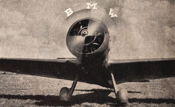
BMW Gets Another New Logo, Insists Symbol Never Stemmed From Aviation
BMW is updating its logo for the modern era. The old glossy emblem with the dated lighting effects the company has leaned upon for the last 23 years will be replaced with a new transparent image that nixes the black background entirely while maintaining the lettering and central blue-and-white roundel. You’ve probably already seen it on the Concept i4, or are perhaps familiar with its monochrome cousin intended to help distinguish the brand’s flagship models.
The manufacturer has said the new logo aims to establish a new corporate identity for online and offline communication purposes, so it could be reserved for press materials and advertising. Yet it has appeared on one automobile already, indicating the brand may eventually have bins of them at the end of every assembly line. Is it a fashion faux pas or the perfect reimagining of the brand’s longstanding iconography?


Recent Comments