Chevrolet has gone to great pains to remind everyone that the 2018 model year marks the 100th anniversary of Chevy Trucks. A hundred candles is a big deal, so Chevy reached into its lengthy history for a few design and detail cues to mark the occasion.
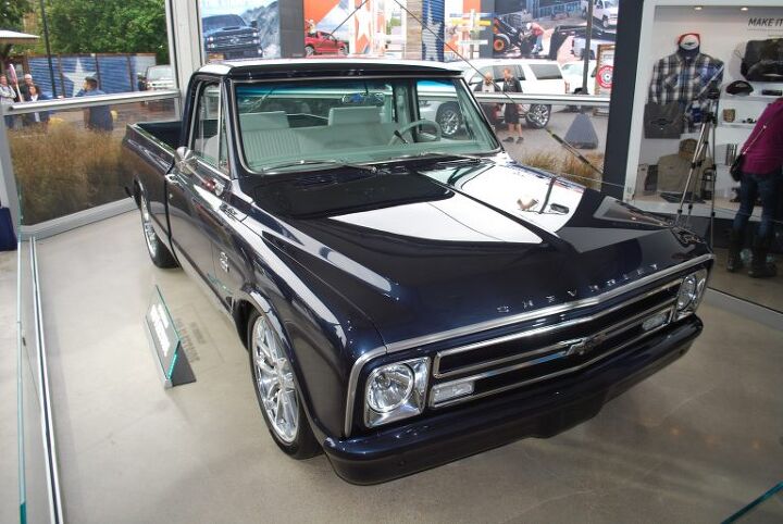
I’d wager a hefty amount of money that most people reading this either had or has a Chevy truck in their family or know someone who did. They’ve produced over 85 million of the things, after all.
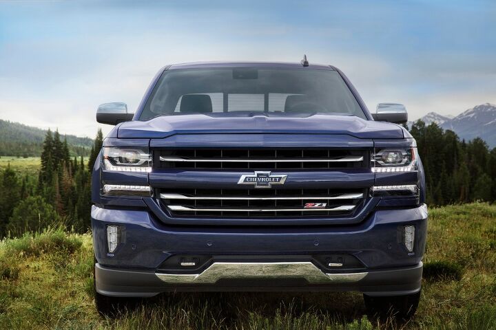
Kicking off the centennial year are a brace of special edition trucks, one each for the Silverado and Colorado line. The Silverado Centennial Edition is available on the LTZ Z71 crew cab trucks, adding a few emblems and door badges advertising their status to lesser Chevy truck drivers.
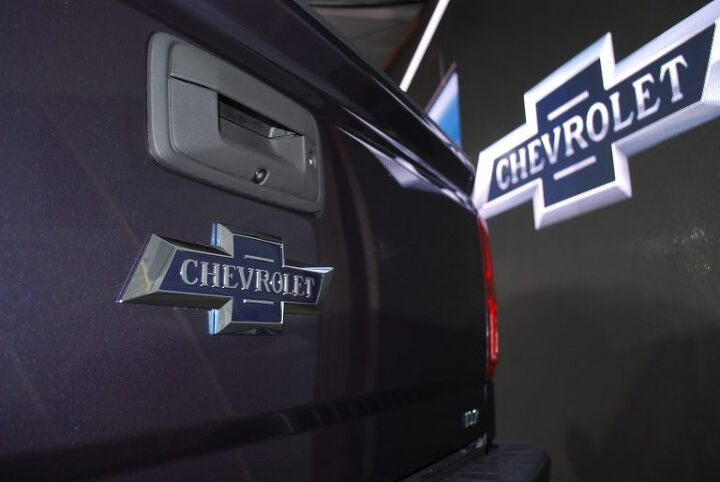
I know a few of you are rolling your eyes at the addition of a special edition badge being news, but Chevy has done a clever job of imbuing the new bowtie with just the right amount of heritage. Spelling out the brand within the badge and framing it with a couple of hashmarks recalls what was found on Suburbans in the mid-1930s. Plus, let’s face it, those who get misty-eyed over the vehicles in which they grew up often have the cash to indulge in their nostalgia.
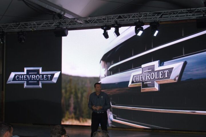
“The Chevy Trucks Centennial is a huge milestone for us, and is equally important to our customers,” said Sandor Piszar, Chevrolet Trucks Advertising and Marketing director. “That’s why we will be celebrating 100 years of Chevy Trucks over the course of the next 100 days. It’s important that we share this celebration with our loyal customers who have helped us achieve this accomplishment.”
Chevy put more than a couple of badges on the truck, of course, recognizing that you can lose with 22s and slathering the whole thing in a great shade of Centennial Blue. matching the badge. The heritage emblem shows up on the floor mats, spray-in bed liner, and tailgate, too.
Lead designer for the Chevy Truck brand, Rich Scheer, told me the new bowtie actually uses the same font as one of the historic logos, and that they drew upon some of the old plans and design material from back in the day. He also has custom a ’71 Camaro resto-mod in his garage. Just sayin’.
The mid-size Colorado gets the Centennial treatment too, with the same paint scheme and heritage bowtie. Nostalgic customers of the littler truck can choose between crew and extended cabs, so long as it’s a Z71-equipped model.
The General is actually devoting a full 100 days to celebrating 100 years of trucks, capping off with a Centennial Celebration at Texas Motor Speedway on December 16th. The event will feature opportunities to experience the latest Chevrolet products, such as the new HD diesels and a range of Corvettes. Newly-retired Dale Earnhardt Jr. will also be in the house.
Chevy also announced that the Silverado nameplate will be extended to the 4500 and 5500 Medium-Duty line of trucks. Apparently, the hard working folks running dump trucks and stake bodies like the Silverado name as much as the rest of us.
[Images: © Matthew Guy/The Truth About Cars; General Motors]
If they wanted to make a big splash, all they needed to do was bring back the logo tailgate. First brand to figure this out will see huge bump in truck sales.
Probably costs money to do that as new sheet metal tooling would have to be made. Who knows how many sets of those tools are used for a model year. I’m sure badge engineering is much more economical and GM has a great history of just that. So it seems fitting they would engineer some new badges at the request of the marketeers.
Literal “badge engineering”? Hilarious.
That looks way better than the current logo. They should keep it.
Agreed. Hate that yellow thing. Clashes with every vehicle. Looks like “hi, I’m cheap” coming down the road.
Amazing how much better the black bow tie looks. Chevy should really be embarrassed that people think so little of their logo that they will pay money to change its colour.
Agree 1000%.
A million times this. Bring back the blue bow tie.
Seeing those two trucks side by side really demonstrates just how big these new trucks have become. They are simply massive. And those square wheel arches do nothing to help the looks of these trucks. Man, I miss the GMT 400s (1988-1998 GM/Chevy trucks). In my opinion, the high point of truck design in regards to style and size.
Those were good looking vehicles, but I’d go with the current F-150 as my example of Peak Truck Styling.
The current F-150 looks good enough that I actually could actually picture myself driving one…and I’m not even remotely interested in owning a pickup.
(And that’s probably not accidental, if you think about it…)
They were really good. I especially liked the two-door reg cab short bed. The 454 SS being the example of the best look. They kind of have to style them differently now, as I cannot imagine how odd a 1989 would have looked as a modern sedan-truck.
My favorite Chevy/GMC is the 74-87. But my favorite pickup design is the 97-2004 Ford. I’m weird that way, as the 2004 begat the size-race in pickups that’s still going on, but I really liked my 1998 extended cab. Small V8, 2wd, easy to see out of, one extra back door for kids and stuff. It had a bed protector and that’s all the frills it ever needed. I look back on pictures of it fondly. My regret being I couldn’t afford to get the black and red Heritage Edition in 2003.
I’m with you Willyam on those Aero smoothy Fords. Jalopnik had an article on a guy getting his stolen ’03 back, and my first thought on seeing the picture of the dark blue single-cab stepside on some nice looking modest size alloys was that it was a fine looking little truck. Much better than the same era GM products, and not as ridiculously butch as the “big rig” Dodges.
My ’96 agrees with you.
Goes double for two-tone.
Also agreed, when a guy as big (6’2″) and long-armed as me can’t reach over the side of the bed and pick something up off the floor, you are doing something very wrong with your pickup truck. And this is my brother’s completely stock GMC, not a jacked-up Brodozer.
Maybe Cadillac could don some manhood by it’s 120th anniversary.
I’ve seen plenty of Escalades with truck nutz. ;-)
I like it. It looks classy.
All Chevy bowties should revert back to being blue on cars and trucks. A classy move.
Well count me as the one % here , again the wrong 1% , do not know anyone with a GM pickup truck, in a family of 7 drivers growing up no pickups and that is in 40 years of owning cars, I think the only pickup I know people own is a rigdeline and I think most pickup drivers do not consider that a pickup truck. I do not get how GM builds good trucks and not so good cars.
trucks are easier, as for the most part they all use the same platform just different variants of size and the interior is largely the same it only differs behind the front seat: regular cab, extended cab, or CC.
Cars may use the same platform but the sheet metal is all different as is the interior.
GM does build a decent car BTW, some better than others is all.
Incidentally, I was surprised to learn that the increasingly common blackout bowtie is a factory option.
It should be blue, it always was blue except for 1962 when changed temporarily to gold for the 50th anniversary (and the ’68 Impala SS427 where it was red for all 1,778 copies produced).
The out-sized gold bowtie used ubiquitously today is cheap and cheesy looking.
I like it. But I have always much preferred the blue Chevy emblems going all the way back to when? And I like the old shield or whatever they had in the 50’s.
But then I seem to be a sucker for either 1)old emblems or 2) going back to just writing the make in big letters on the car. Like the old Chevy truck in this article. The newer “TOYOTA” you see on some 4runners or Tacomas, or “P O R S C H E”, or “V O L V O”, or heck even “SONATA” plastered on the car.
Don’t know why I like it. Maybe its just that emblems have gotten so odd and overly stylized these days, the simpler stuff just looks classier and sticks in my brain better? Current Chevy badge…boring and just appears to have come out of some massive consumer taste study or something. Corporate image wrangling so good it loses all personality? What is the Toyota emblem anyway? Or Mazda’s looks like bird.
And look at the most recognizable emblems in the world, Coke and Ford. Great from day one, never changes, instantly recognizable. Still cool to plaster on a shirt or hat.
I applaud GM on this one.
The good news is that the gold bowtie insert isn’t always glued to the frame properly, and tends to fall off, leaving the chrome outline with a glue squiggle where the gaudy gold used to be. If GM can’t even make the emblem correctly, that doesn’t bode well for the way the rest of the vehicle is built.
I do like the pseudo-retro emblem on these new trucks.
The gold emblems delaminated like crazy, and if you were out of warranty, they were insanely expensive. I sold lots of them.
I used to have a Mazda Protege, back in 91. Then, Mazda had a nice nameplate that said “mazda” on one side of the grille. I thought that was classy.
I like that new blue bowtie.
I like the Centennial Blue paint. What’s the source of that? Is it the bowtie color? It looks familiar, like some older blue that had a different name.
They’d be crazy not to make this the permanent logo.
First they put the colors back on the Tri-Shield, now this.
I like it!