


Get Used to Seeing This Design On Future Mercedes-Benz Small Cars


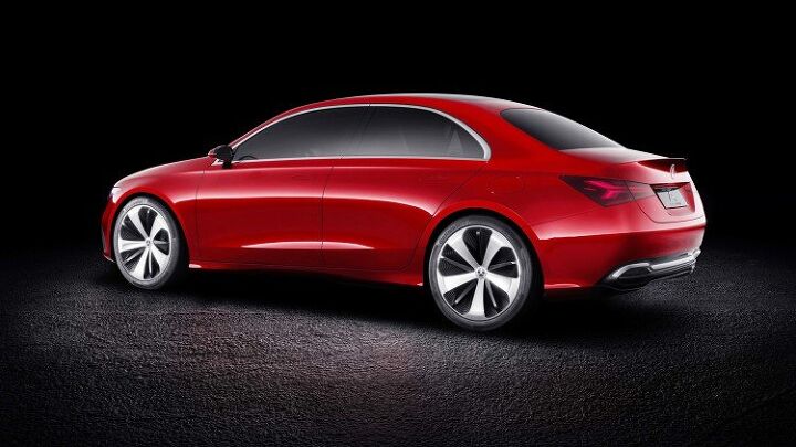
Mercedes-Benz is showcasing its updated design language via its new Concept A Sedan. While many of its production cars have gradually adopted the new “no folds” philosophy, the Concept A Sedan and earlier AMG GT Concept are the premiere examples of the styling theory.
The flowing bodywork and absence of hard edges is likely a precursor to what Benz will roll out in the coming years, especially after the A Sedan arrived at the Shanghai Motor Show looking like the GT Concept’s baby brother.
Mercedes is definitely sticking to this aesthetic and, when it begins production on its next generation of small cars using the MFA2 architecture, expect gobs of similarities between those vehicles and these concepts. While 2.76 inches shorter and 1.18 inches lower than the present-day CLA, it’s the easiest car to parallel the A Sedan with. It doesn’t take much imagination to see the CLA reemerging with the concept’s more rounded shape and smaller headlamps.
“Our Concept A Sedan shows that the time of creases is over,” said Gorden Wagener, chief design officer at Daimler AG, in a media release. “With its perfect proportions and a sensual treatment of surfaces with reduced lines, it is the next milestone of ‘Sensual Purity’ and has the potential to introduce a new design era.”
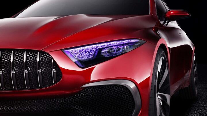
Adding to the Concept A Sedan’s evolved design scheme is an AMG Panamericana grille, multi-color headlights, panoramic glass roof, and a fairly high beltline. While none of those are guaranteed to make it onto a production vehicle, odds are good that those side windows aren’t going to get much bigger.
Sensual Purity has garnered a lot of praise in recent weeks for its clean lines, but it’s also a little vanilla from some angles. That could be the reason Mercedes keeps showcasing these hypothetical models in hyper-gloss candy apple red instead of the typical silver paint jobs synonymous with modern concept cars. Red is the more exciting color and might keep would-be detractors from realizing just how round the new design actually is. Still, nobody is going to accuse the Benz concepts of having the bubble body of a third generation Ford Taurus.
[Images: Mercedes-Benz]
A staunch consumer advocate tracking industry trends and regulation. Before joining TTAC, Matt spent a decade working for marketing and research firms based in NYC. Clients included several of the world’s largest automakers, global tire brands, and aftermarket part suppliers. Dissatisfied with the corporate world and resentful of having to wear suits everyday, he pivoted to writing about cars. Since then, that man has become an ardent supporter of the right-to-repair movement, been interviewed on the auto industry by national radio broadcasts, driven more rental cars than anyone ever should, participated in amateur rallying events, and received the requisite minimum training as sanctioned by the SCCA. Handy with a wrench, Matt grew up surrounded by Detroit auto workers and managed to get a pizza delivery job before he was legally eligible. He later found himself driving box trucks through Manhattan, guaranteeing future sympathy for actual truckers. He continues to conduct research pertaining to the automotive sector as an independent contractor and has since moved back to his native Michigan, closer to where the cars are born. A contrarian, Matt claims to prefer understeer — stating that front and all-wheel drive vehicles cater best to his driving style.
More by Matt Posky


Comments
Join the conversation
This is the nicest gift that Mercedes could have given to Cadillac, but I'm sure GM will screw up this opening. At least Audis still look like they have a bit of class.
I like the front-three-quarter top image. It looks chunky and cute, like a cartoon Lancia Appia. It doesn't look premium though, not even a tiny bit in some ironic way. The rear-three-quarter just looks awful.