


No, Really, This Is The Worst Button Of All Time

Long-time TTAC readers will recall an occasional contributor to these pages who was kind of the Dave Barry of auto writing. He wrote articles with titles like “Has BMW Lost Its Mojo?” and “Has Audi Lost The Plot?” and “Has CarMax Lost The Invoice I Sent Them?” Unfortunately for him, however, there is a limited number of automakers in the North American market about which to generically speculate, so he eventually turned to a series of articles about “This Is The Worst Button On A Car Ever” and “This Is The Worst Warning Light On A Car Ever” and, just possibly, “This Is The Worst Turn Signal Lever Since The Dawn Of Time.” Articles like that are popular because they invoke a sort of Pavlovian response in readers. “Wait … that son of a bitch says the BMW temperature control blend knob is hard to understand? I’LL SHOW HIM!”
I tried to do something similar to get my clicks up and convince our august Managing Editor to pay for my next Kiton sportcoat, but he rejected my take on the formula, which was tentatively titled “How Can The New Camaro Ask The Mustang To ‘Step Outside’ When Cars Can’t Even Fuckin’ Talk Most Of The Time, Except For The Nissan Maxima, And Maybe The Frank Sinatra Imperial, And In Those Cases Weren’t The Cars In Question Restricted To A Fairly Basic Set Of Phrases,” calling it “thoroughly asinine and far too recherche for all but the most tasteful of search-engine spiders.”
That was the end of my career as a pure clickbait writer. Until this morning, when I looked down at the console of the Ecoboost Mustang I was renting in San José and realized I’d finally found the worst button ever!
There are four reasons why … and Number Three Will Blow Your Mind!
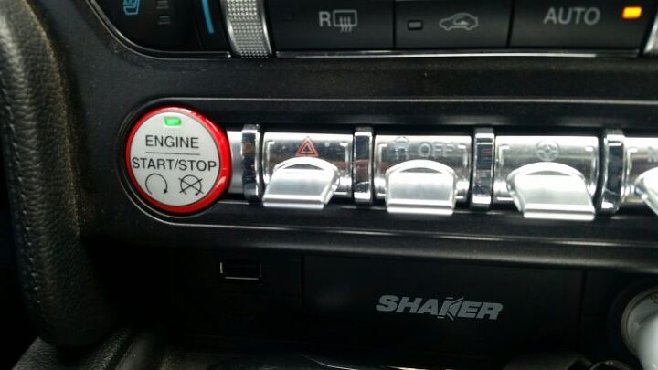
The button in question is actually a toggle switch. It activates the hazard lights and it’s all the way to the left in the photograph above. As you can see, it looks just like all the other toggles on that row. You’ve probably noticed lately that more and more cars are doing something similar with secondary-function switches. There’s nothing new about the idea of having a group of essentially identical buttons that perform widely divergent functions; the German automakers started the practice in the ’70s. It allows an automaker to offer a variety of optional extras at the lowest possible expenditure in both cost and assembly time. Not incidentally, it also made it absolutely plain to customers, and their passengers, when said customers hadn’t bought all the available options. Some manufacturers took this too far — for example, a fully loaded Mercedes W140 600SEL still had two empty blanks in the center console — but the advantages were too compelling for it not to become industry practice. Everything from a Mirage to a Wraith has a modular dashboard now as a result.
When the first-generation New Mini arrived, it had a line of identical toggle switches in a row on the console. This feature was meant to recall the great British cars of the ’60, which frequently had something similar. The reason behind that was because their makers couldn’t afford to tool up for a variety of switches, so they bought generic components from Lucas. The minute it became practical to have unique buttons for everything, every British car from the MG Midget to the Jaguar XJ6 promptly did so. Insofar as that was far from the least objectionable aspect of a “Mini” that was massively larger than the original and seemed to have no additional space, the critics gave BMW a pass on the matter. Before you knew it, the row-o’-toggles was once again fashionable.
This time, of course, the toggle switches all connect to a CANBUS, so it’s entirely an affectation. Yet there’s something genuinely satisfying about them. Maybe it’s nostalgia. Maybe it’s race-car chic — although, as a racer, I completely despise toggle-switch dashboards and would give the proverbial left nut for unique switches that make it easy for me to distinguish between flipping on a cooling fan and switching off the fuel pump. Whatever the reason, toggle switches are fun and cool and the worst thing you can say about them is that they are a small distraction from the road for most drivers. At worst, you’ll have to look away from the road to distinguish between the seat heater and the rear defroster until you’ve owned a car for some time.
The problem with the recently redesigned Mustang is that it puts the hazard switch in this same line of identical switches. It’s a serious no-no and it’s enough to give me reservations about recommending a vehicle that I think is otherwise best-in-class by a margin that borders on the intergalactic. While it’s certainly true that the most frequent use of the hazard flasher is directly related to double-parking somewhere, there are several serious uses for the function that require rapid selection and activation.
I’ve used flashers for a variety of reasons: making my car visible in fog, warning drivers behind me of a sudden lane stoppage ahead, dealing with a sudden failure of the engine or transmission, and a few others. And that’s just on the public road. During open track days, quick use of the hazard flasher serves as a poor man’s yellow flag. It can also help protect you from being hit by much faster traffic coming up behind you.
Incidentally, this is one of the few things that General Motors got right from an interior ergonomics perspective. Nearly every GM car since the Sixties has offered hazard-light activation right on the steering column. I prefer the Mercedes design, which puts the hazard flasher in plain sight as high on the dashboard as possible, but there’s something to be said for the steering-column location as well. In either case, you can activate the function quickly with a minimum of searching around.
I’d defy anybody who wasn’t intimately familiar with the current Mustang to quickly activate the flasher in an emergency. I’m not sure you could do it without really searching for it, even if you knew exactly where it was. Ford knows better than this, particularly given the Mustang convertible is hugely popular with rental fleets. There’s just no excuse for putting aesthetics this far above function, even in a car that isn’t necessarily intended for workaday use.
Worse yet, this sort of silliness encourages the Ralph Naders of the world to get involved. Somebody, somewhere, someday is going to be injured by the side of the road because they can’t find their hazard flasher in a new Mustang, and that will lead to somebody demanding a law. Before you know it, the hazard button will be the size of the Staples Easy Button and it’ll be mounted on the top of your dashboard. This is how we got the annoying CHMSL regulation of the ’80s; everybody knew the government was going to get involved but only GM bothered to try offering the customer a relatively decent-looking solution. As a result, when the law was written, we got CHMSLs that blocked rear vision, burned out easily, and ended up being a single point of failure that led to more rear-end collisions.
You can argue that we should have far greater mandatory standardization across secondary controls than we have today. Why does the law prevent manufacturers from putting the clutch to the right of the accelerator but let them to put the cruise-control stalk where most people expect to find the turn signal? But that’s a discussion for another time. So feel free to tune in again next week, when I ask: “What’s The Deal With Headlights, Anyway?”
More by Jack Baruth


Comments
Join the conversation
This is far better placement than the previous generation car, which located the hazards on the console next to the trunk release. And coming from the company that thought moving the horn to the turn signal stalk was a "better idea," this is ergonomic brilliance by comparison.
Demuro is so annoying in his youtube viseos. That big fat tongue hangs out of his mouth like he's a rabid dog. And his voice and general demeaner are so hard to take. Baruth at least has some charm and wit.