


Escalades to Lose Basketball Sized Laurels, Cadillac to Prune Wreaths
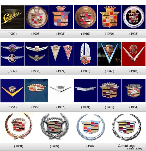
Cadillac is making a major change to its logo for the first time since 1999, rumored to be appearing for the first time next month at Pebble Beach. If Cadillac does use the Pebble Beach festivities to introduce the large RWD flagship sedan that Dan Akerson recently announced, you can expect to see it bearing the new logo for its public debut as well. The current logo is rather long in the tooth for a Cadillac emblem. It’s usually changed more frequently, 40 times since it was first used in 1906. The latest iteration will not have the laurel wreath that currently surrounds the coat of arms.
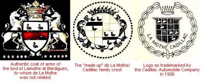
According to Cadillac PR, the original Cadillac crest was inspired by the family coat of arms of Antoine de la Mothe Cadillac. Apparently, though, the founder of Detroit and the namesake of the car company was really named Antoine Laumet and he not only borrowed the la Mothe Cadillac name from an actual French nobleman (in the New World, who would know?) he also borrowed elements of the crest of the la Mothe Cadillac family to create his own (that’s where the ducks, marlettes, or swans came from). The car company borrowed from Laumet/Cadillac’s crest when designing their first logo, which included the wreath.
The change is apparently in reaction to the desires of both consumers and Cadillac designers. Cadillac has been trying to have a more youthful image and focus groups reported perceiving the wreaths as “outdated and obsolete”. Considering the wreath first appeared in 1906, that makes sense. Actually, Cadillac’s logo didn’t have that element from 1920 until it was restored in 1968. Of course to most young people, anything from 1968 might indeed seem outdated and obsolete. Cadillac designers would also prefer a simpler, one-piece emblem because it gives them more flexibility in terms of placement. It also may look better with the cars’ lines. While the Art and Science theme that identifies current Cadillacs is changing, introducing more sculpted elements, from the look of the new CTS, hard edges will be part of Cadillacs’ look for the foreseeable future and round wreaths don’t work so well with designs that have sharp creases.
While Cadillac marketers and designers may cheer the change, dealers will have to pay for new signs and anything else that bears the logo.
More by TTAC Staff


Comments
Join the conversation
Since they vertically stretched the Corvette logo for 2014, I'd like to see if a similar vertical treatment of the 1959 Cadillac logo wouldn't fit with the Art & Science design vocabulary.
I like the idea above of no logo on the front - it would stand out. Nowdays everyone has a logo on the front center, and one on the rear center typically flanked by the model name and trim.