

Vellum Venom: 2012 Nissan Juke

I was in a bad place about a year ago: fighting problems that resurfaced 10+ years of (secret) regret that my life at the College for Creative Studies shoulda ended differently. But then a few silver linings showed up, motivating me to write the first installment of this series. While I still am in (occasionally) bad places a year later, designs like the Nissan Juke keep me motivated, excited.
So, to celebrate this series’ First Anniversary: THANK YOU for letting me share my Venom. And know how much I appreciate it when you click that link:
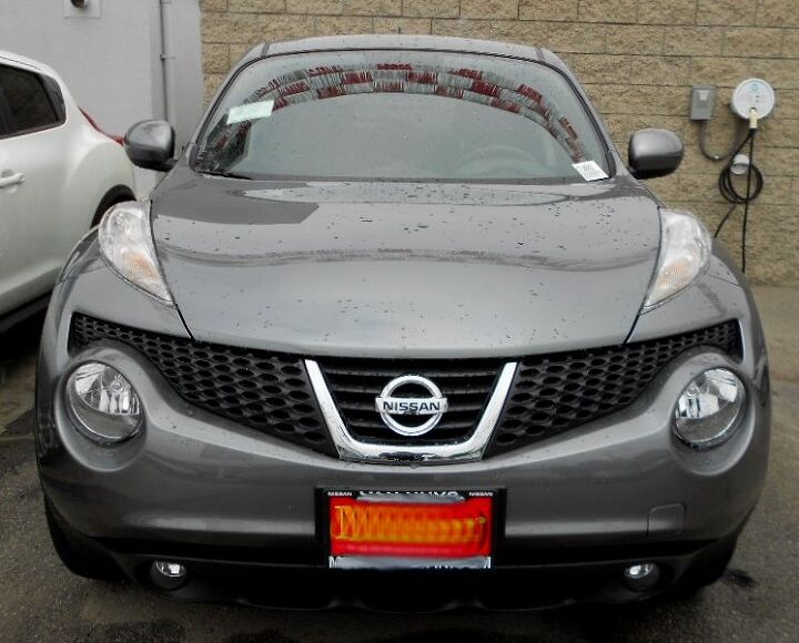
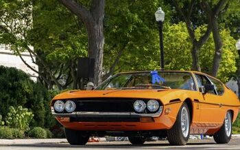
The Nissan Juke is one of those concepts-come-to-life that did the original proud. If the concept’s truly bizarre styling offended you, well, that’s understandable. But remember it’s still a well sorted piece of Transportation Design kit. The six eyes (on the hood, in the bumper, in the lower plastic valence) do offend me…in a good way.
Even though I hate the lighting pods, the multiple grille textures, and the emblem’s “U” chrome surround…I can’t help but admire it. The Juke is just so fantastically well executed.
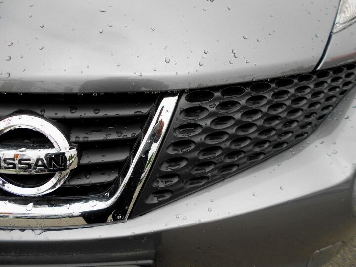
But still, I could do without the oval grilles on the side. The Juke is more logical and cohesive with the same “slats” of the grille’s center portion. Plus, the oval grille casting looks cheaper than the vents in the center.
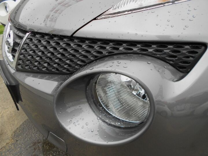
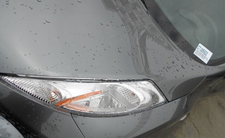
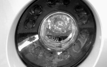
Much like the curiously placed headlights of the Rolls-Royce Phantom, the Juke uses what would make a fantastic Rally Car fog light for a head light. Unlike the Roller, the headlight is made to dominate the bumper and grille. It’s vulgar and beautiful at the same time.
If only the grille had the same texture: the strong linear elements of a “non-ovoid” grill would let you enjoy both the grille and the headlight far easier, with less distraction.
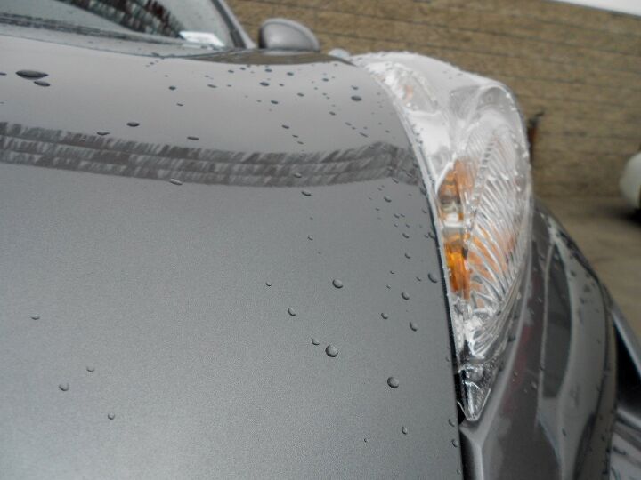
The swept back, lumpy and bumpy signal/marker light? Pretty insect-like hideous, though I suspect ( much like the LEAF) its shape is dictated by the wind tunnel for less wind noise around the A-pillar. I’d prefer if this lamp assembly was flush-mounted above the grille, matching the linear tone of the center portion of the grille. Then the Juke would look like a tall (yet right sized) Chevy Camaro. Distraction: gone!
But again, I hate yet wholly admire this element at the same time. Argh, nothing is ever easy!
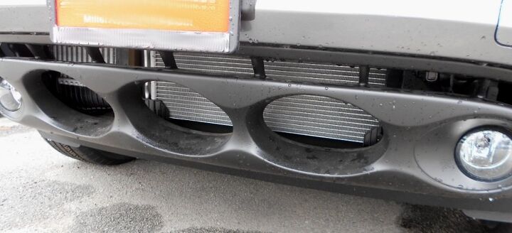
Present in the original concept, these round forms made production. They work, unlike the ovals that dominate the grille. And looky here: those be the real fog lights, too!
Perhaps if these were the only set of “eyes” on the front end, but since there’s another set of headlights and foglights…no. Too polarizing.
Except polarizing is often a good thing. Especially when it comes to the Juke.
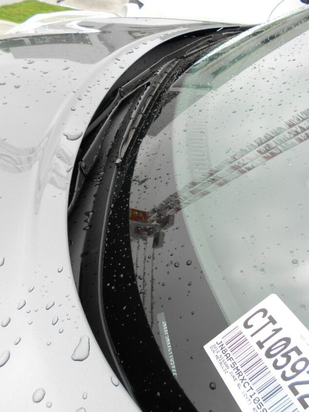
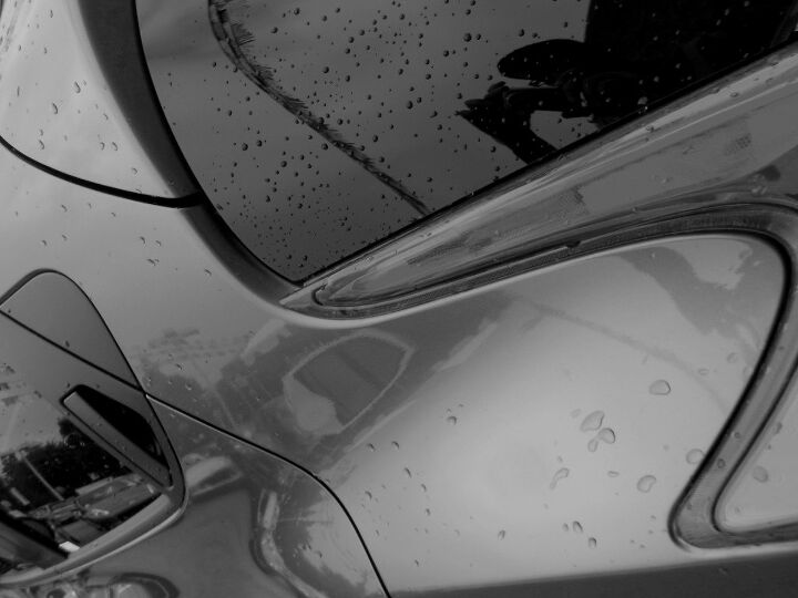
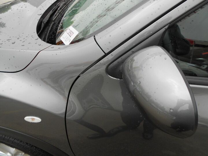
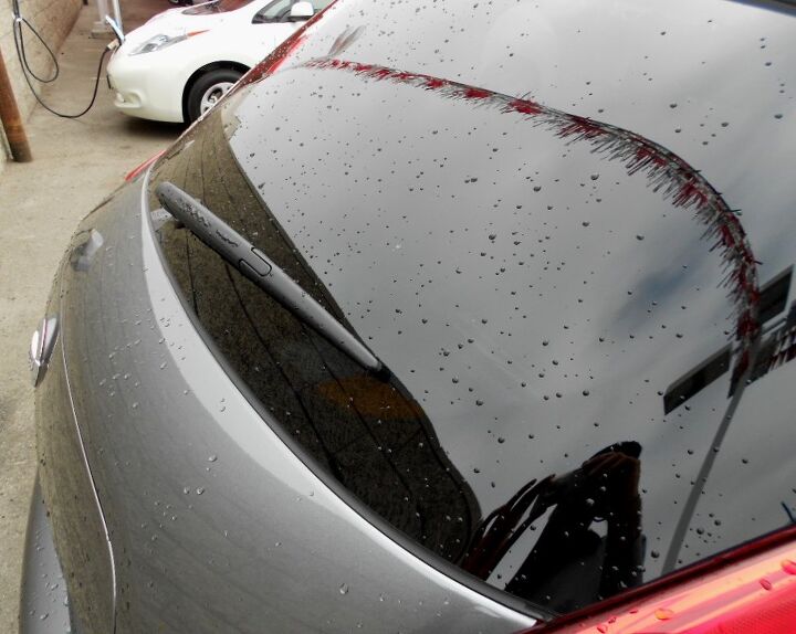
The windshield/cowl/wiper trim is very well executed: clean and elegantly tucked under the painted hood. That’s the perk of a vehicle with a retro-sized windscreen, I suppose.
What did I say about a retro-sized windscreen? Apparently the people who made the roof expected it to go up further: the glass’ natural end point is where the A-pillar turns into a flat roof, instead we get a “bendy” roof. Which is truly odd.
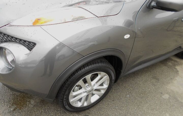
Speaking of, the bumper-to-fender crease isn’t especially logical. This is an unfortunate by-product of making a radical concept car come to life, cost effectively. My suggestion?
Perhaps if that crease started at the trailing edge of the grille instead of some random point at the light. The hood-to-fender has a similar problem: it should start from the top of the light assembly and end at the base of the A-pillar.
Why did Nissan make the least flowing, smallest possible fender? Cost effectiveness, insurance repair concerns…or both. Sad.
If the fender was allowed more real estate on this form, the Juke would be a far prettier vehicle. Or perhaps it’s just best in a panel-hiding black. No matter, look at those fender haunches, front and rear! What a quirky and fun design!
(That you must love even if you hate it.)
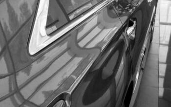
Note the lack of a black plastic triangle aimed to lengthen the greenhouse (DLO FAIL) on the Juke. This rig is happy being in the dimensions bestowed upon it. But while the fender was shrunken elsewhere, it creeps up the A-pillar? I’d prefer if that fender-to-A pillar seam began at the base of the DLO…
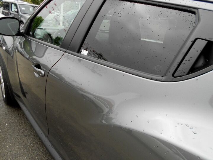
The window weatherstrip smeared over the B-pillar is impossible not to fiddle with. Good thing I didn’t have an X-ACTO knife handy.
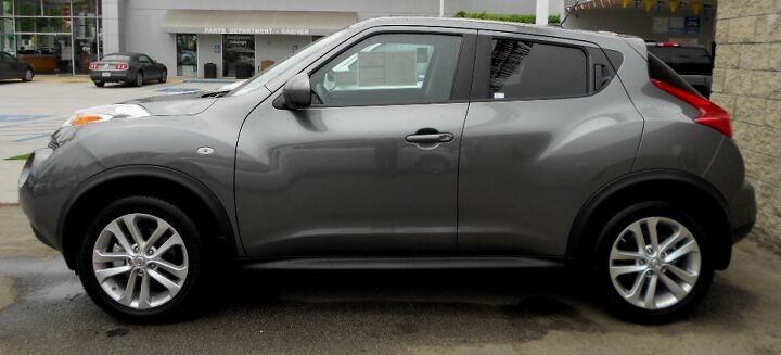
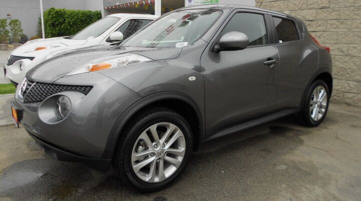
Short wheelbase. Impossibly short overhangs at each corner. Tall roof that immediately sweeps down. Oversized wheel flares. Volvo like hatchback design. This rig is just plain cool, even if you’d never buy it. Or would you?
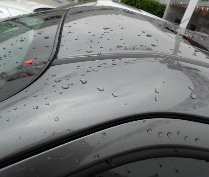
That “slopey” roof just does it for me. What a fantastic design element!!!
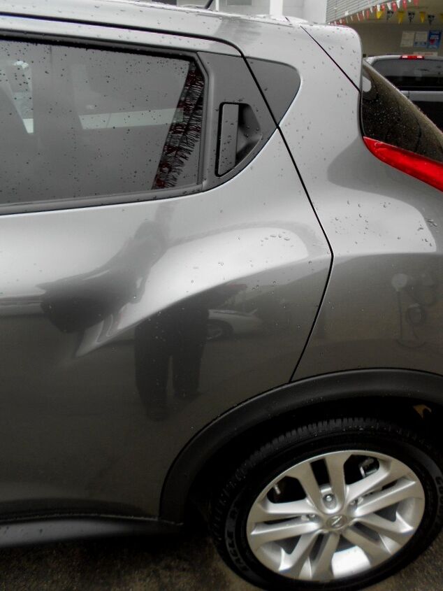
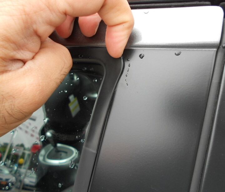
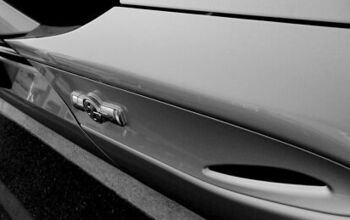
I’ve enjoyed door handles blended into a vehicle’s greenhouse ever since the introduction of the GM-10 Coupes, even if they are magnets for scratches in a super visible place. Combined with the little black plastic triangle of DLO FAIL in the C-pillar, perhaps it doesn’t work here. I’d suggest eliminating the DLO fail and making the rear door end in a voluptuous curve instead. There’s no need for a curvy triangle of FAIL if the door was rounded from the git-go.
While it’s always important to have a blend of hard bends and soft contours, the mix here is off. Round off the door to match the “thrusting arch” of the wheel wells, eliminate the DLO FAIL and call it a day.
Can you imagine this body if the rear door ended with something as round as these fender haunches?
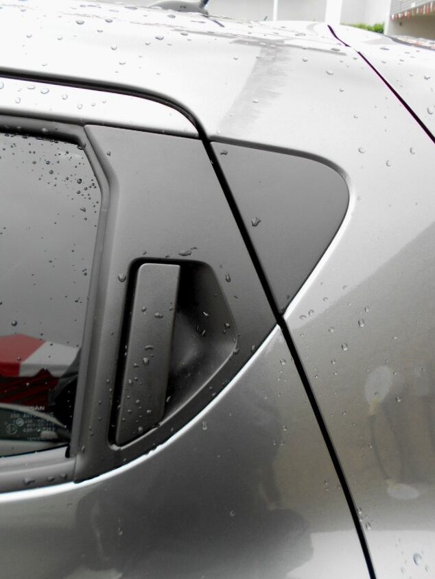
Here’s a close up of the DLO FAIL so you can imagine a rounded rear door that could eliminate this.
The rounded curves (and inward bending of the body) adds a bit of needed surface tension to the Juke’s very tall profile. Note the wave in the cutline between the doors. If that “wave” wasn’t there, this would be a boring panel.
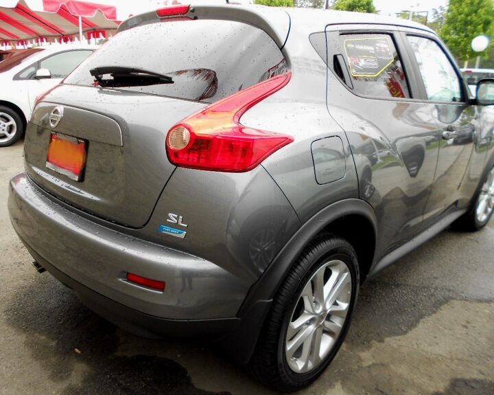
Speaking of waves, the tail lights are a fantastic piece of kinetic lighting art. Maybe the rear door’s redesigned curve should be just as radical as the lights. Oh, and replace the dumpy square gas filler door with something as round as the back up lights, please? The natural curve of the tailgate and fender haunches demands something less static.
I wonder if it’s the same filler door as the Nissan Cube. Hmm…
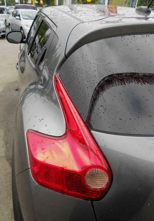
Is this a Volvo or a Nissan? No matter, this huge slice of non-functional red lense does something I thought I’d never say: be an important design element that looks better than if the same real estate was painted body color.
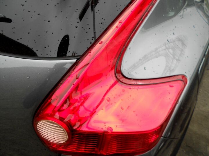
To my earlier point about having a blend of hard bends and soft contours, the Juke’s rear lights embody that belief. There’s so much surface tension presented here! And the way it naturally flows into the rear haunches? Close to perfect for such a small vehicle.
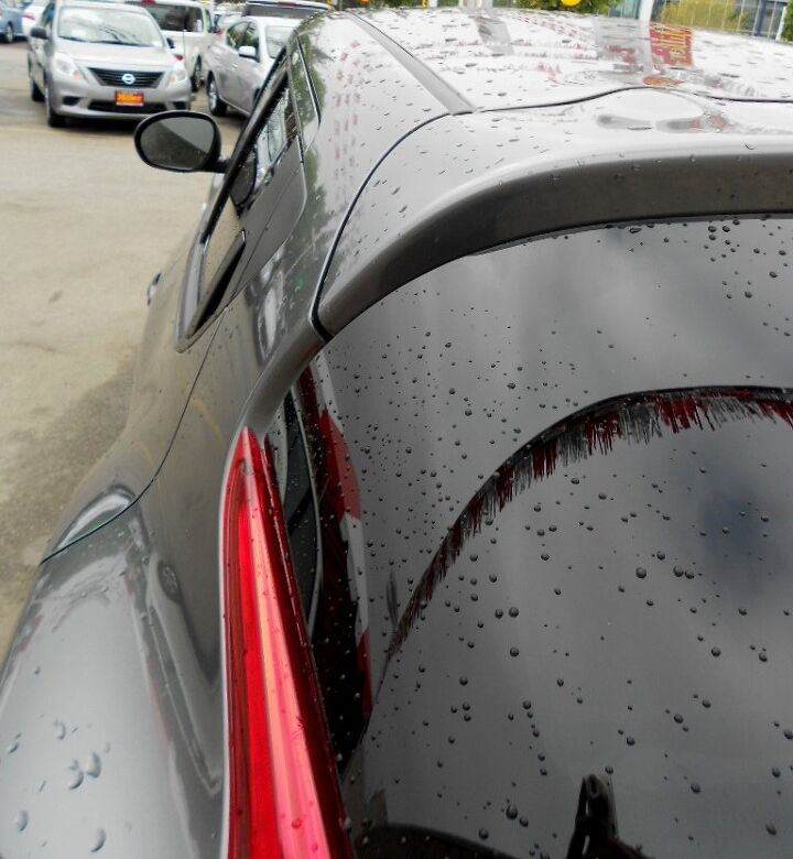
Note the odd lump at the top of the roof, where it meets with the hatchback. Considering the downward sloping roof and rather tiny rear dimensions, I suspect these “external” hinge covers are necessary. It’s much like the bubbly roof on a Dodge Viper GTS, except the Juke didn’t make it into a noteworthy highlight. If only it had more “oval” like qualities, like the front lower bumper valance, perhaps.
While I usually like clean and minimalist rear window wiper arms, the Juke demands something more garish and over-styled. Too bad about that.
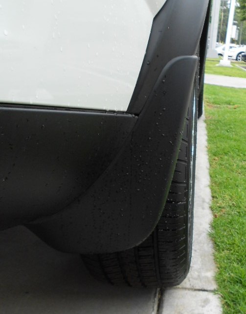
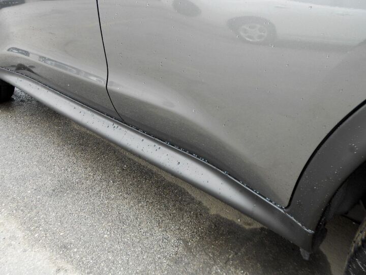
Tacky rear mud flaps are tacky. Boo for the lack of integration.
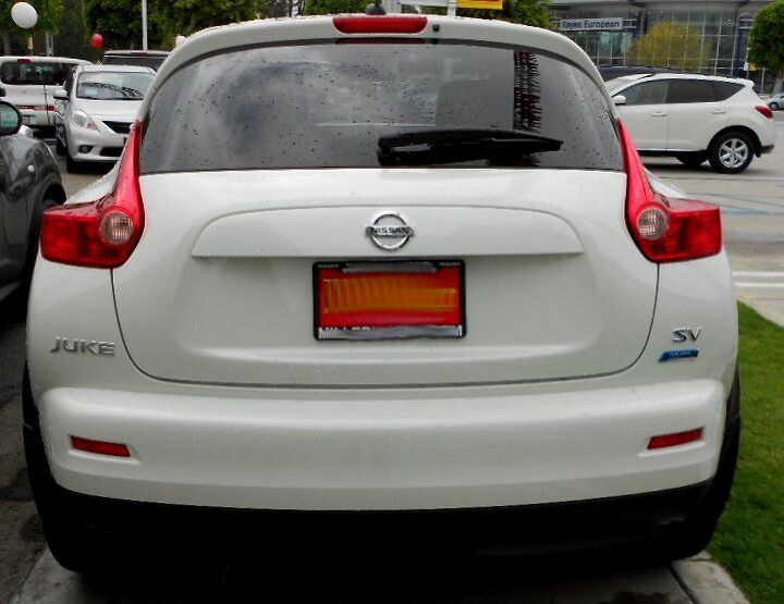
The gray Juke was backed up against a brick wall, so its white neighbor will do. While very Volvo-like, this isn’t necessarily a bad thing. Note how the lighting pods add excitement to the body, while complimenting the curves and cutlines: the hatchback cutline doesn’t look out of place…even if it sorta is. I’m even digging the oversized license plate mustache with the Nissan logo. While the mustache has been done to the point of death elsewhere, it looks good on the Juke.
If only the front end’s lighting pods were as logical as the rear. Then again, the Nissan Juke is impossible to miss, and easy to appreciate. While it may never grace your parking space, it deserves your respect.
The Juke is a nice piece of Vellum, that made production without much Venom. Thank you for reading, I hope you have a wonderful week.
More by Sajeev Mehta


Comments
Join the conversation
It looks like this car is pinching its eyes and smirking at the thought of you having to look at it. It beats the Fiat Multipla in terms of ugly and round shapes. Why exactly did carmakers decide to design parodies of cars? This could be the life-size version of a toy car. Personally, I believe that Nissan couldn't decide whether they wanted to call the car a Joke or Puke and thus ended up with Juke.
As a Nissan driver and skier in the Northeast, since 1991, all I wish for is a entry level Nissan with AWD. Suzukis are too risky an investment, Subaru, not the solid body I enjoy and no other AWD's to choose from. Put all wheel drive on the Versa and I, too, can dismiss the Juke. The Juke is an imitation of the Porche Cayenne. Where did the name Juke orignate from? Joke and Jerk come to mind when I even say the name. And for anyone who has worked in a cubical, the Nissan Cube while comfortable, is a small business vehicle. Does Nissan employ any female car designers?