


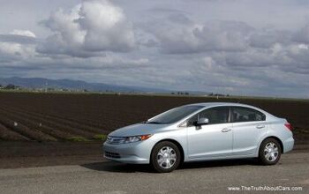
Vellum Venom: 2012 Honda Civic (Hybrid)

Sometimes promises are kept in the car design biz: the 2013 Civic sounds like a big step up from this 2012 model. Which was a big step down from the ’70s concept car chic of the 8th generation Civic. Aside from Wayne Cherry’s professional nightmare, how often does a manufacturer make such significant changes after one year of production? This model insulted more than one autojourno and countless fanbois, apparently Honda doesn’t mess around when reputation and $$$ are on the line. But just how bad was it in 2012?
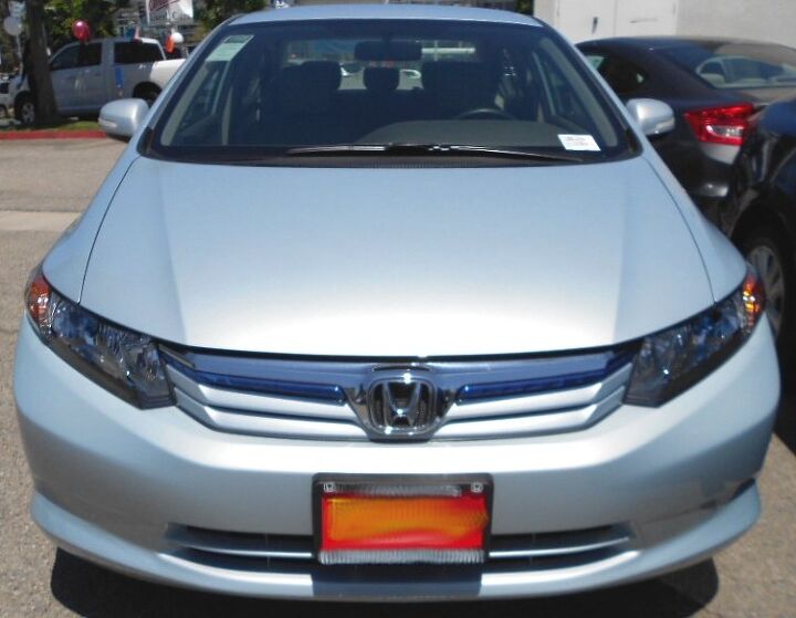
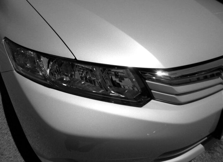
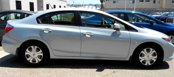
The 8th generation Civic’s bumpers had a flat and clean, 1970s People Mover vibe to it. Radical yes, but not offensive. The 9th Gen’s redesign added lumps and bumps to the bumper, with the aesthetic pleasure of a pear-shaped silhouette. Adding insult to injury, all the folds and unique planes on the bumper’s face. This nose doesn’t work on a body this tall and, um, People Mover like.
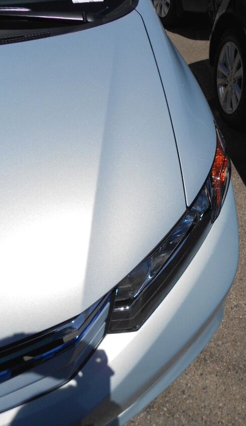
The pear shape isn’t obvious from this angle. Aside from the blocky-cheapness of the grille (even in fancy Hybrid trim), the Civic looks okay from here. A perfectly flat nose (without the high point for the license plate) woulda been nicer, however.
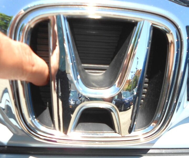
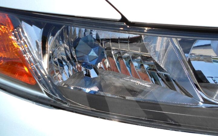
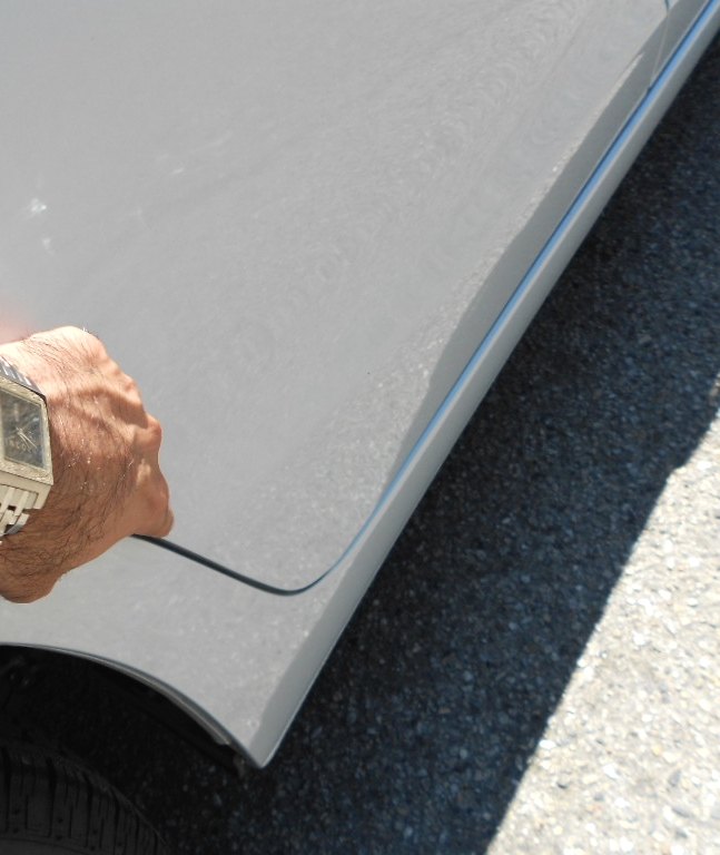
This is a good time to mention that I gladly put my fingers in strange holes for TTAC’s readership. And, that solid casting behind the logo looks even cheaper in real life. Shouldn’t Hybrids have a flat, solid badge for better aerodynamics?
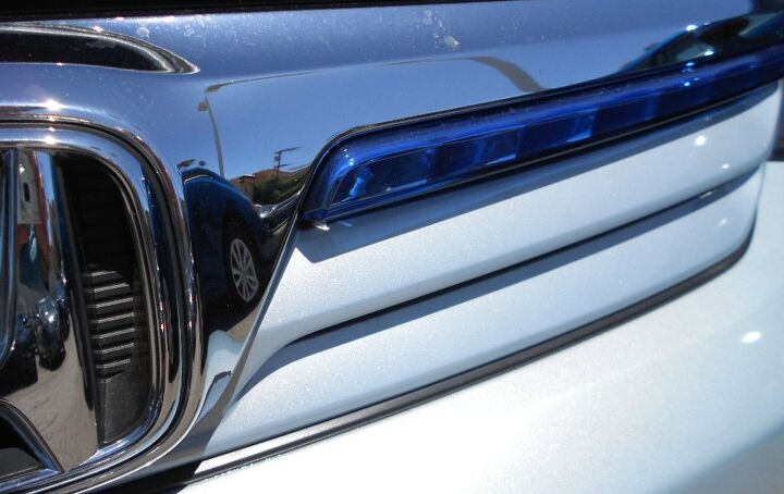
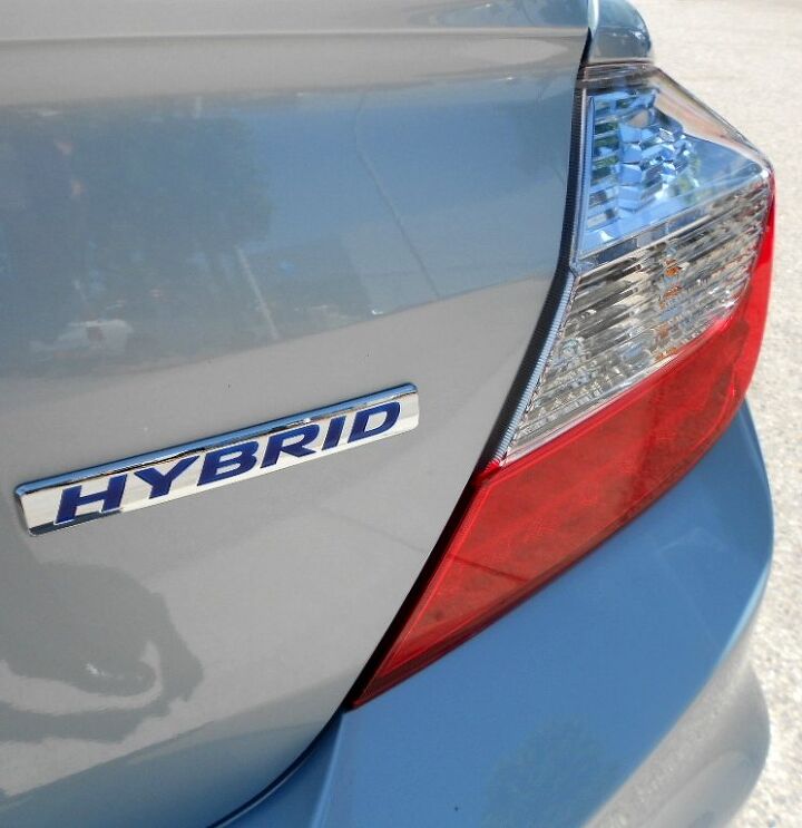
This blue strip of Hybrid Snobbery is kinda cool. First green was marketed for unique Hybrid markings, now blue. Which any luck, we will see more brown hues taking over in the Eco-Friendly color challenge. After all, isn’t the earth mostly made of brown stuff? There’s just a lot of green and blue on top of the chocolatey goodness!
While I’m all for unique trimmings on unique models, this blue lightbulb umbrella is a bit much. Anodized(?) blue on a cheap metal stamping doesn’t look better, it accentuates something that’s better left in chrome camouflage. The only thing worse would be my brown remark from above, translated here.
If there was no fender flare, no pear shape to the bumper, this would be a decent enough looking machine. Then again, the 8th Gen Civic already had that covered. Much like the awful Chevy Uplander (CUV-wannabe) to the mediocre Chevy Venture (Minivan) that came before it, sometimes change is a very bad, very half-assed thing indeed.
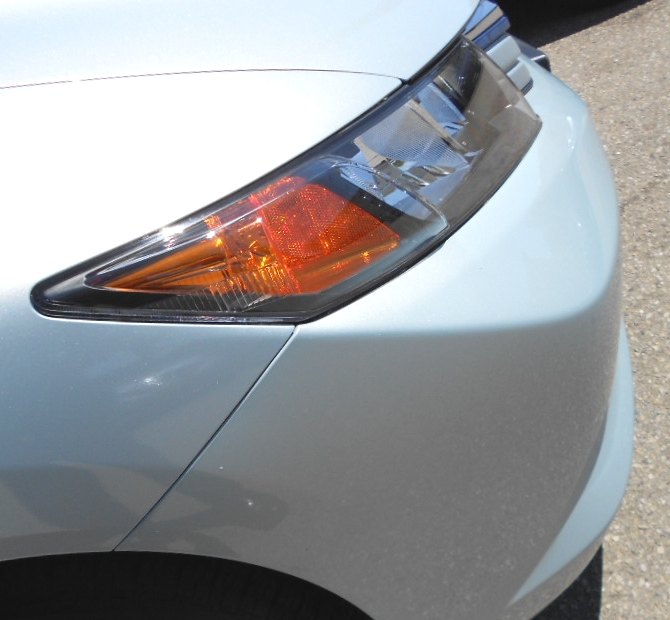
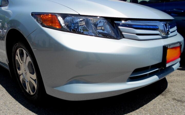
On the plus side, the plane of the bumper that flows into the headlight is pretty cool from here. And the bumper to fender seam is logical. There’s a bit of the 1970s wedgy perfection here. Just not enough of it.
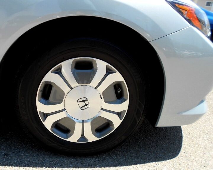
The 9th Gen Hybrid wheels are as contrived and overwrought as the front end. The 8th Gen’s totally futuristic wheels were so much better.
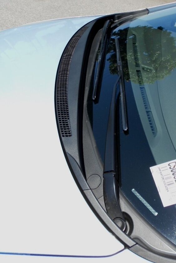
Contrary to most cab-forward designs, the Civic’s plastic trim on the cowl is quite minimal and clean. It’s nice to see more painted hood and less black plastic in this manner.
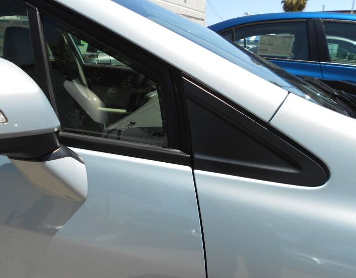
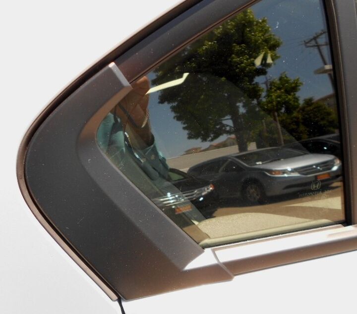
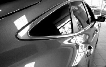
Too bad about this slab of plastic. The Daylight Opening (DLO) of the 9th Gen is so, so much worse than the 8th Gen. What used to be a cool ’70s people mover with those sleek bits of glass in front of the door turned into plastic triangles of DLO FAIL. It’s very sad to see Honda go to Pontiac Aztek levels of cheapness in their quest to…well, I have no idea what they were thinking.
That’s right, they were thinking about the $$$. And since the 2013 model still has the plastic triangles of DLO FAIL, we see that it’s still all about the money. Ain’t a damn thing funny!
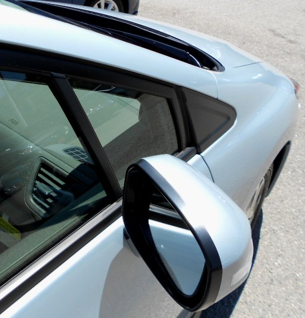
DLO FAIL from another angle, complete with round-ish mirrors that fight the very wedgy greenhouse. Remember when Honda spent the money to put covered headlights on the 3rd Generation Accord? Oh, how the mighty have fallen. Hyundai and Kia: the ball is in your court.
And yet, just like my review back in 2007, I still hear Jazz-Rock Fusion when I see a Civic. The 70’s never died, it just went mainstream pop. The watered down wheel design, big hunka DLO FAIL, unnecessary muscular crease by the door handles and generic taillights don’t totally negate the wedge greenhouse. Probably.
Ack: bargain basement Hofmeister Kinkery!!! Try saying that three times fast!
Another reason to love the 8th Gen Civic. While this isn’t DLO FAIL like the front, this cheap bit of (tacked on, not-flush fitting) trim at the end of the DLO means Honda took a page from GM’s beancounting playbook. A very sad move indeed, son.
Since I am not one of those autojournos that gets all-expense paid trips to the LA Auto Show (sorry about that), I don’t know if the 2013 Civic improved here. From what I see on the web, I have my doubts. Too bad about that.
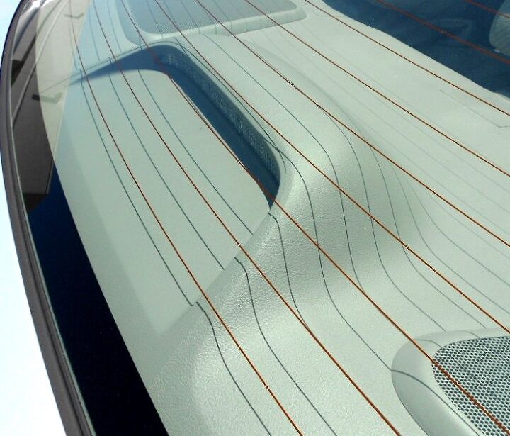
Is this one piece plastic casting of parcel shelf and high-mount stop light (CHMSL) a clean and modern design, or a cheap bit from the dark days of GM and Chrysler interiors? I like carpet better, personally.
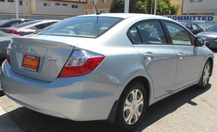
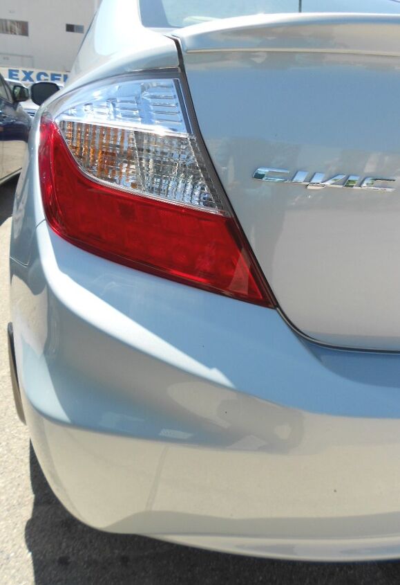
Most (all?) Civics in the history of Honda Awesomeness sported taillights that were either full width or something close to it. This cheapness is too Toyota like, and shameful. Luckily the 2013 model goes back to a lamp arrangement befitting the brand and the Civic lineage. Now if only I knew for sure that bumper shelf below the taillights also met the chopping block for ’13.
At least you can’t see the DLO FAIL from this angle.
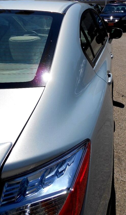
The strong shoulder line in this panel extends logically into the rear door. It looks good enough, but the flat and wedgy profile of the 8th Gen was far more appealing from this angle. Mostly because it didn’t over promise on style, in an overwrought Toyota way. Hondas used to be so lithe and clean!
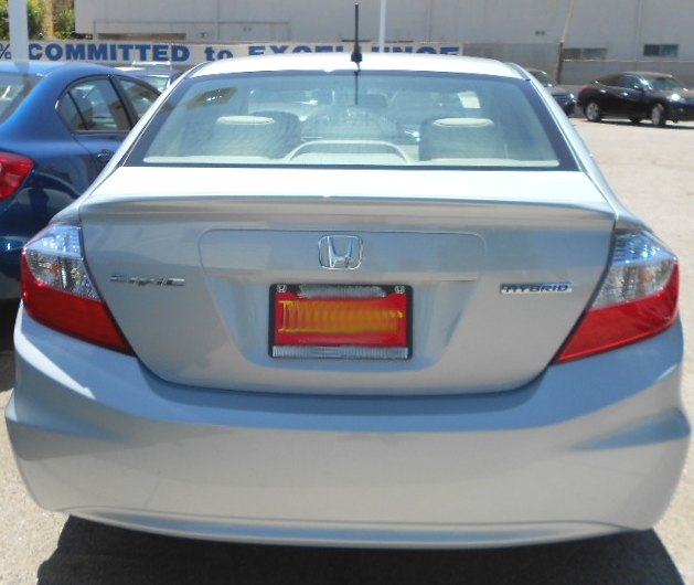
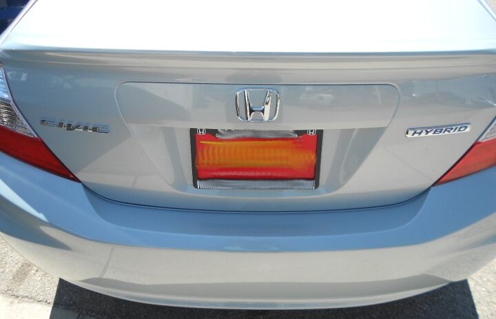
Thank goodness that mustache above the license plate isn’t chrome, as Honda would be just a fender ventiport away from copying every design cliché in the book! And that “shelf” at each corner really needs to go from this angle. The pear-shaped Civic must never been seen again!
While there is an interesting dynamic of busy angles at the border of the Civic’s body, it is lumpy and frumpy. This design will not age well.
Dare I say that, compared to what you see here, the 8th Gen Civic was downright gorgeous from this angle? While all the planes and wedges all lead to complimentary vanishing points somewhere out there in interstellar space (hopefully), there are simply far too many of them.
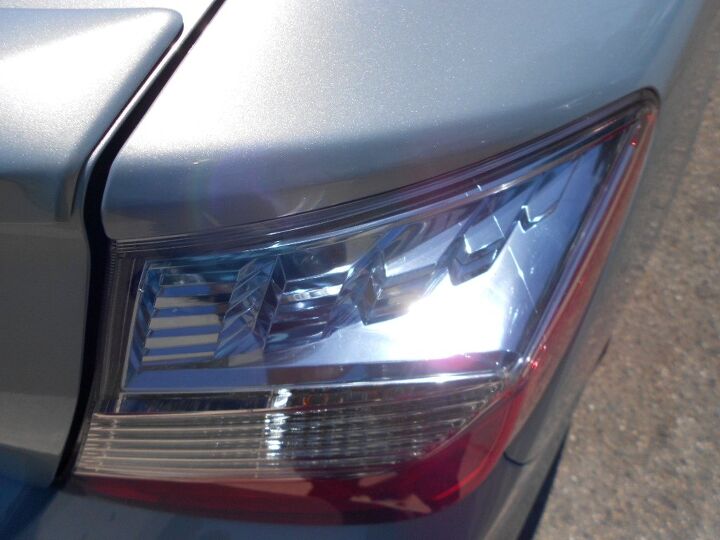
More blue tinting and pointless chrome bits. The lights would look better if they were flush to the body. It would also eliminate many lumps you’ve seen in the last two pictures.
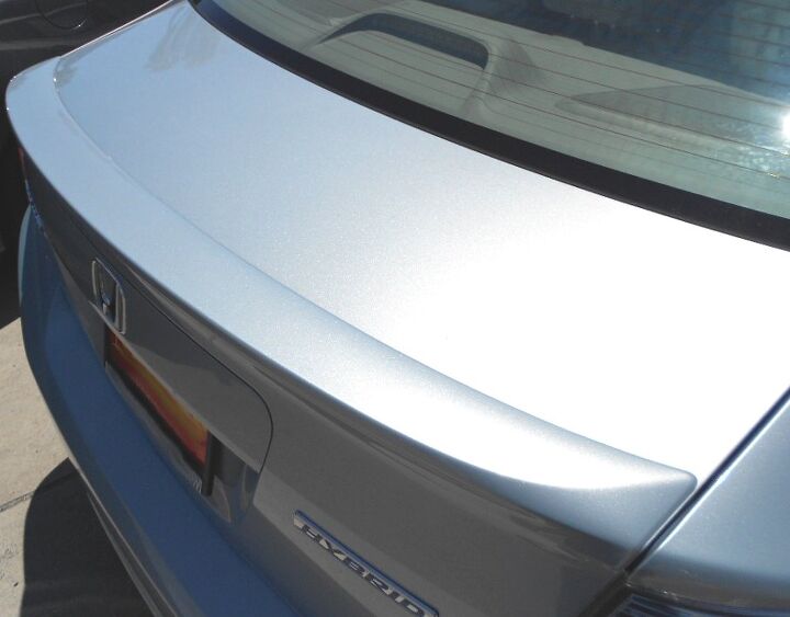
And the spoiler adds a coupla more unique planes into the mix. Just waaaay too busy.
Too many clichés, too much abandonment of what made the Civic a quality product with progressive and/or upscale design. The best thing you can say about the 2012 Civic is that the 2013 model should be in the showrooms very shortly.
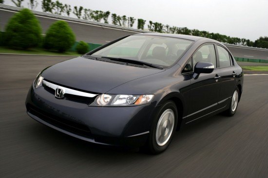
Thanks for reading, you have a lovely weekend! This photo from 2006 will help.

More by Sajeev Mehta


Comments
Join the conversation
Re: Hybrid "blue" themes You might notice the blue trend signifying Hybrid and "green" cars is mostly on Asian vehicles thought the Germans seem to have caught the trend. As a Japanese friend explained to me, this is because traditionally some of those languages did not distinguish between blue and green, they are the same color. (http://en.wikipedia.org/wiki/Distinguishing_blue_from_green_in_language) e.g. A Hyundai Elantra Blue makes a bit more sense when you realize it is the equivalent of what we would call "Elantra Green" being the high MPG model.
The difference is most obvious when you see them next to each other. The 9th generation is just so anonymous - the taillights, the back bumper, the side-view mirrors. I don't hate the 2012, but the 8th generation was just so nice I guess it was hard to beat. I personally didn't think the interior of the 2012 was too bad. To me, Hondas are more about the superior engines and transmissions. To drive a Honda is to feel the difference.