

Vellum Venom: 2013 Scion FR-S

Damn near everyone in the Industrial Design department at CCS said my engineering/gearhead/history buff background was killing my potential Car Design career. In hindsight they had a point, but most were complete jerks about it. With three art history courses at three different colleges in mind, automotive brands/models/trim levels do indeed nod to something more than PR-hyped styling takeaways: perhaps a vintage automobile, a vague reference to a sub-culture not normally associated with a large corporation, or an entire genre of fine art. But the Scion FR-S isn’t retro…
…it’s retro-futurism.
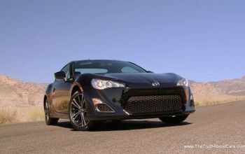
Toothy and fang-like. The FR-S has an assertive stance, made clear with pointy scoops at the base of the bumper and a hard cut line separating the bumper’s snout against the headlights. Nissan 370Z it ain’t, there’s another hard crease between the headlights and the fog light area, making for three pairs of hard lines that give the FR-S a very angry look.
The round bulge for the low-beam headlights adds a more-than welcome soft point to all these fierce elements, but something about the Scion emblem in the center looks less like an organic extension of natural facial features…and possibly more of a wart on an otherwise lovely face. Even the hood cut lines are clean and logical.
The depression around the emblem is what kills the nose. This is far too cute and soft, which has nothing to do with this car. While corporate logos housed in round casings is more than a little trite, combining it with the bumper’s reverse pimple takes away from the design’s overall aggressiveness.
A mail slot grille, individual S-C-I-O-N lettering…heck even the flat spot/round logo combo of the last Toyota Supra is a huge improvement. Maybe on the mid-cycle refresh!
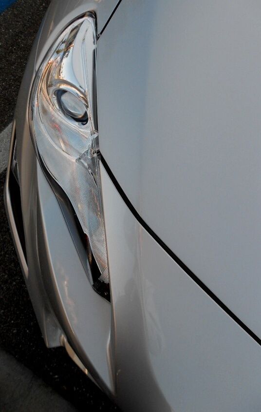
We discussed the hard, fierce lines before, but there’s more to the FR-S. Note the gentle bend in the hood and bumper, creating a new point of surface tension. It keeps the bumper from being too bloating and boring. If there was a slotted grille (a la mid-cycle refreshed Lexus SC400) using this soft curve and its genesis, the nose would be far more aggressive. It would no longer have a self-congratulatory wart for the Scion brand.
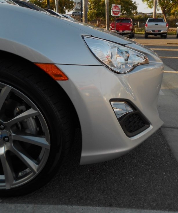
And if you missed the round element of the headlight, note how it breaks the surface tension of the front end from this angle. Less techno-future, more retro Ferrari headlight from the 1950-60s. Retro and future combine to form one being. Dang.
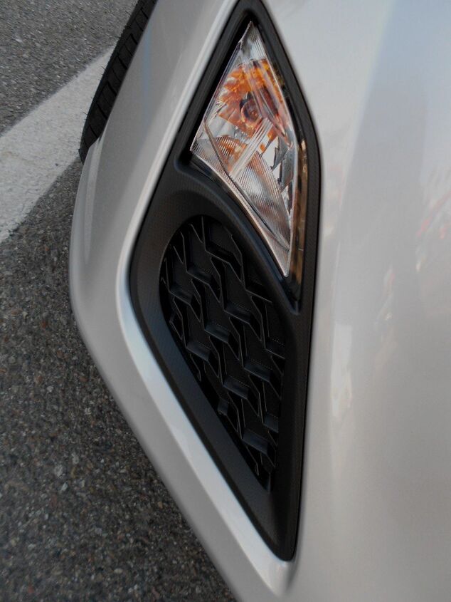
The fog light pod is a different story. The gigantic black plug is pretty tasteless, though I am sure the aftermarket can make it into a functional speed hole for something. Perhaps a brake cooling duct, or something turbo-intercooler related. No matter, the entire form is a key element to the FR-S’s fierce nose. And the strong linearity of the beveled edge around its bottom and outer edge looks pretty trick.
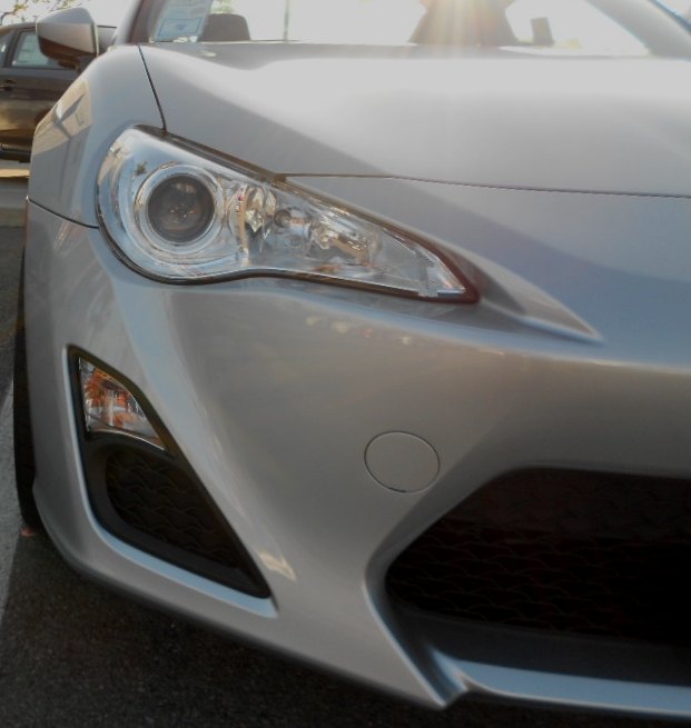
The angry creases of the lower bumper, the headlight, the fog light look absolutely sinister. But the subtle crease above the headlight? That’s like a flirty eyebrow on a very pretty face. It’s like a Maserati Gran Tourismo coupe, but not Italian super car pompous. Me likey.
Nicely integrated signal light! But the front end’s angry lines look so tough because of one design feature: front end overhang allowing for an organic tapering of the snout. Repeat after me, “Overhang is a good thing. A GOOD THING!”
Put another way: you ain’t nothin’ but a hound dog, Mr. Scion FR-S!
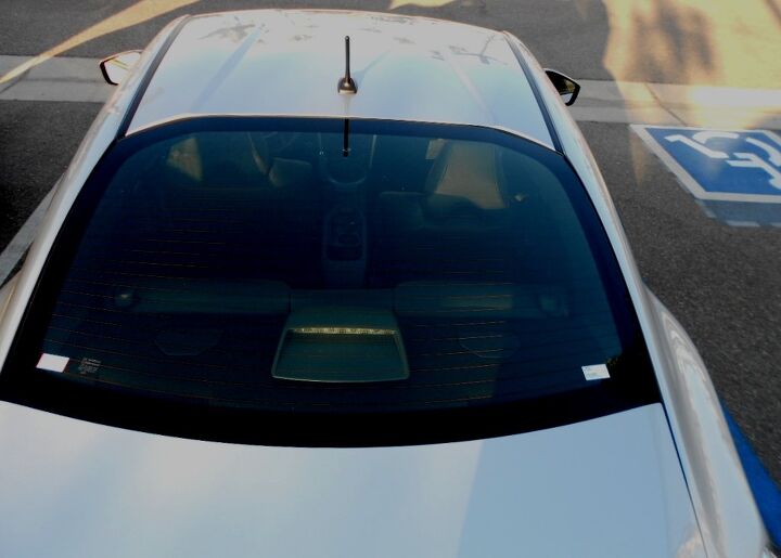
OMG SON, am I really seeing a non-Ferrari-Corvette-Panther with an impressive amount of space between the firewall and the front axle? This dash-to-axle ratio is more than a little delicious, and such a great value compared to the others! (except the Panther, ‘natch)
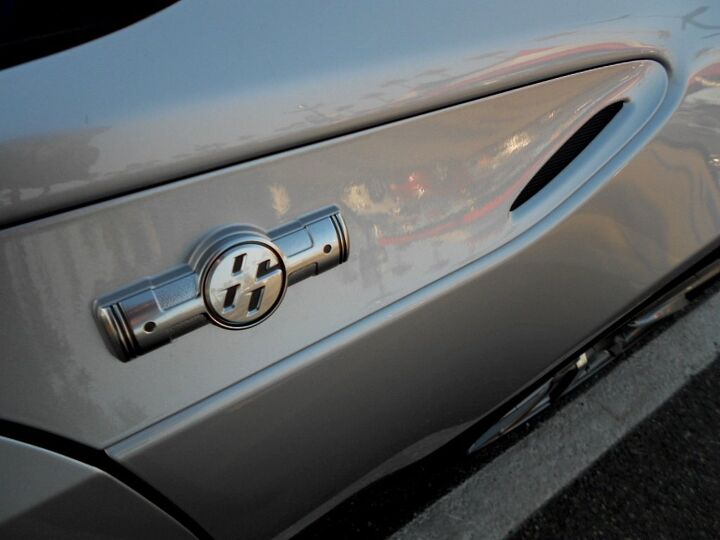
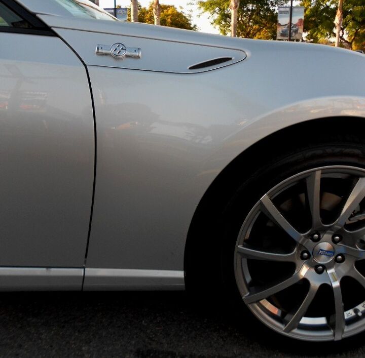
While this 86-boxer emblem is “emblematic” of the limp-wristed motor beneath, you can’t deny the presence of such a “fast” looking line on the expansive canvas of a rear-wheel drive fender. Even better, this painted fender trim lies on a separate plane from the sheet metal itself, adding surface tension to a tall (by retro standards) belt line.
But I’m seeing another, far bigger problem. More on that later.
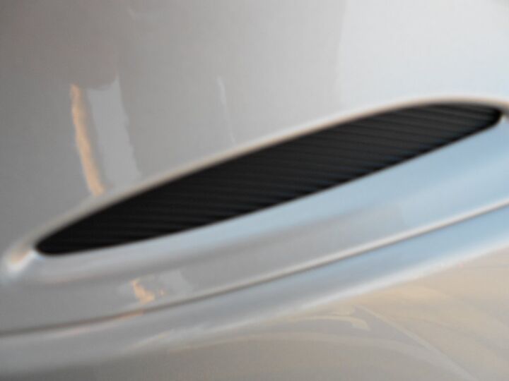
Thank goodness my camera phone couldn’t properly show this fake fender vent. Oops on my part, double oops on the designer’s part.
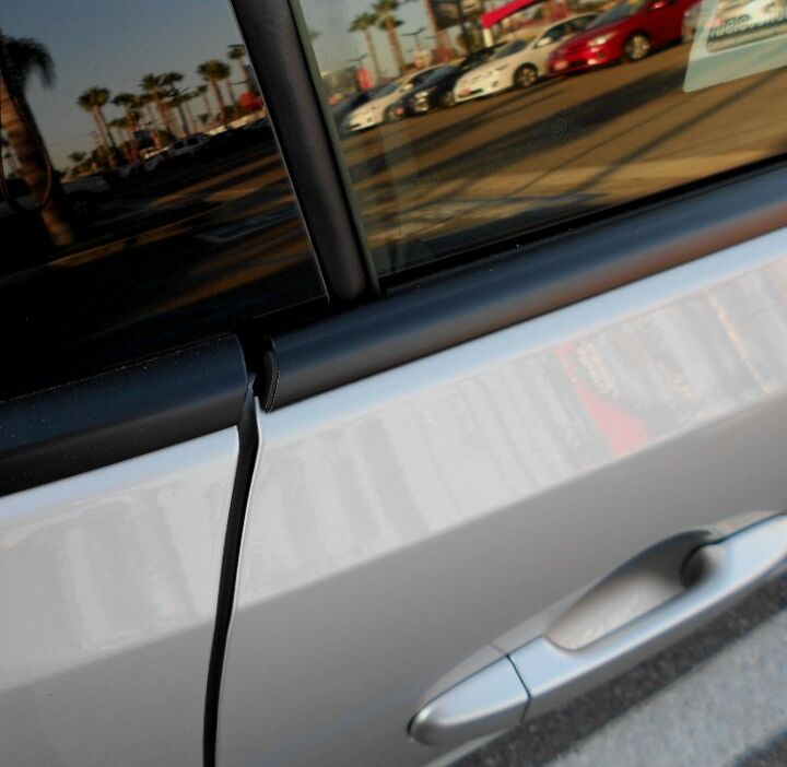
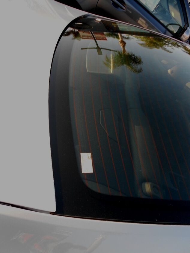
That “far bigger” problem mentioned two photos ago? Take a look at the sheer number of panel gaps, and their terrible sizing! The door to fender is the worst, until you spend a little more time with the plastic cowl trim that starts with the wipers and ends at the base of the A-pillar.
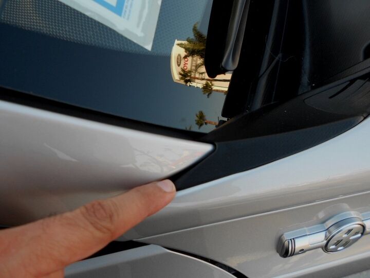
Chintzy. Cheap. In poor taste for any non-Yugo product. Go back to the last photo and note the sloppy end-point installation of the black plastic cowl trim. Hell, even the Yugo didn’t f–k up a fender’s meeting point this badly. It doesn’t take much to visualize a fender that fixes this problem, too bad they couldn’t metal smith that plastic tab out.
You can see a bit of the black cowl plastic here too. And the gigantic panel gap of the A-pillar to fender. While Toyota generously gave a glass triangle instead of the typical DLO FAIL at this point, this area suffers from a unique form of FAIL: the DLO slides below the A-pillar, the fender AND the fender vent panel, adding another unnecessary line to the profile!
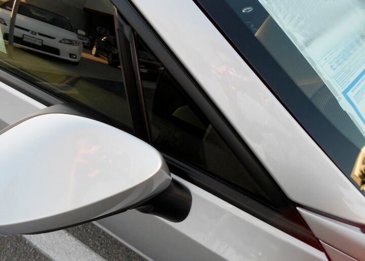
On the plus side, the unique plane of the fender vent/emblem continues across the top of the door. Back on the minus side again, the side-view mirror’s black plastic base fights this plane with pudgy, bulge-y, overlapping curves. It reminds me of when I used to pour batter into the waffle iron as a child, and spill it over the “lines”.
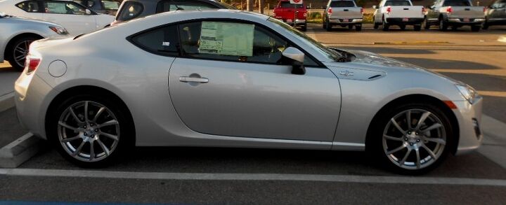
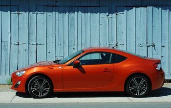
In collector car speak, the FR-S is definitely more of a 20-footer. The ungainly cowl plastic, the hideous panel gaps and unnecessary meeting points blend into a smooth and slick coupe. While the FR-S is still tall and mid-heavy like most modern cars, the ample greenhouse, flowing C-pillar and elegant “swoop” of the door’s cut line are an instant classic. I love the complementary swoop of the rocker panel, especially as it naturally flows to the rear wheel well! Retro-futurism, indeed.
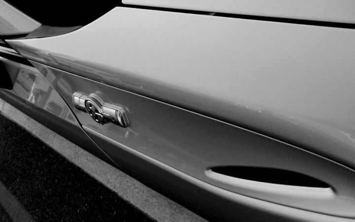
Not as lovely as a Porsche Cayman from this angle, but quite a stunner compared to everything else on the market. While I’d like more chisel to the quarter panel’s “shoulders” on the C-pillar and a bit less hard/perfectly round negative area behind the door handle, this car is still the business.
Except for that droopy, chubby side view mirror. I can’t wait for the aftermarket to “fix” this with a more suitable replacement.
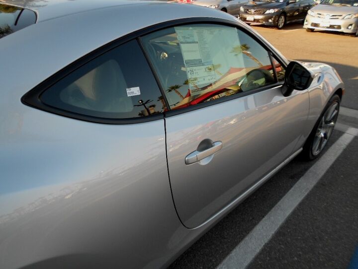
Ack! The door cut line doesn’t end at the same point where the B-pillar begins! While not as horrendous as the CTS coupe, it’s the same buzz kill. The extra line presented here never had to exist. And the FR-S deserves better.
Then again, this ain’t nothing compared to the nightmare of panel gaps and extraneous lines at the A-pillar…so the B-pillar is like totally my second favorite pillar on this car!
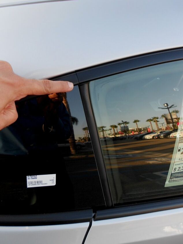
But kudos to the team responsible for the window trim and weatherstripping: the mating of two unique parts above the B-pillar is super tight and very intuitive. Yup, this is totally my second favorite pillar on the FR-S.
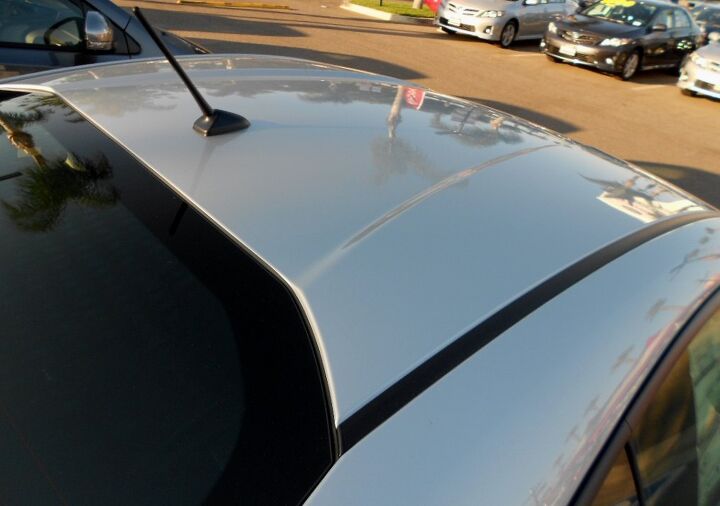
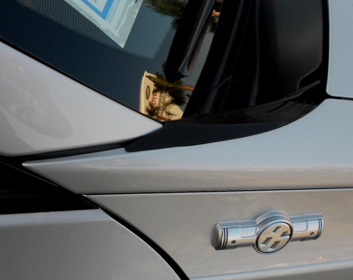
But there’s something about the FR-S’ C-pillar: it starts with this reverse power dome roof, continues to the glass shaped like the “T” of Toyota’s Truck emblem…even the black plastic rain gutter looks fast and powerful.
Note the amount of tumblehome between the roof and the quarter panel’s wheel arch/flares: significant! This is a straight up sexy roof. The Toyota Truck themed glass is very Toyota/Scion modern, but the forms presented in silver paint are just so, so classic. Retro-futurism ahoy!
The trunk shares its endpoint with the rear glass. The quarter panel and trunk share a common line with the side of the glass. Combined with the classical goodness of a proper RWD sports coupe in proportioning, this is one of those classic moves we just don’t see enough.
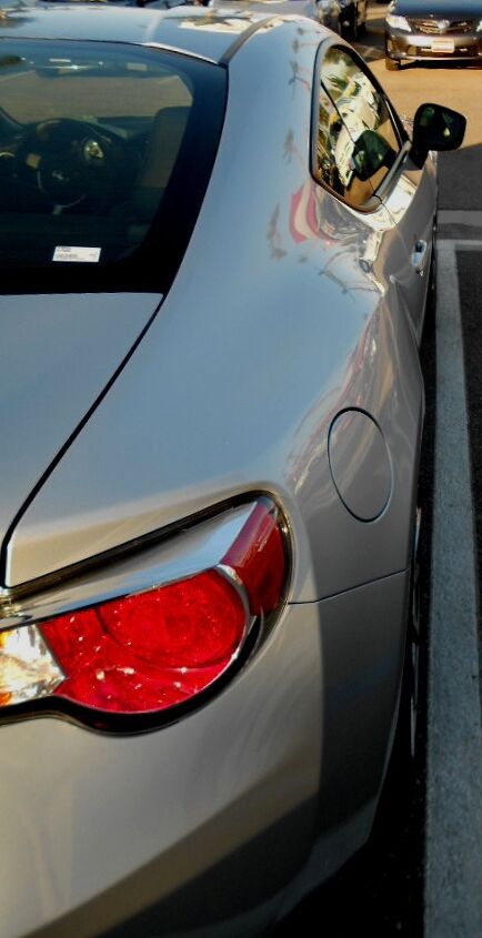
Oh yeah baby, that’s a C-pillar to die for. Like I mentioned before, the gentle bend above the gas door should be a little more creased: this blends the hard edges in the bumper to the rest of the body far more elegantly.
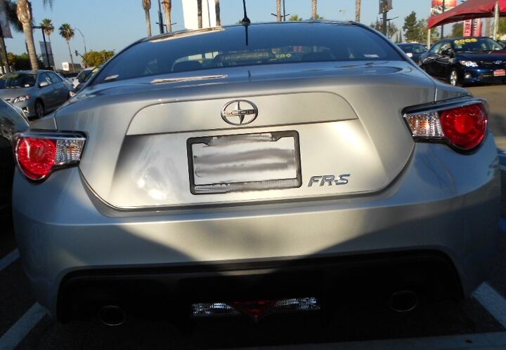
What the heck is that??? As a Lincoln-Mercury fanboi I’ve always enjoyed the round Continental kit, grudgingly appreciating the goofy trapezoidal butt of the 1977 Mercury Couga r…but seeing this all over again on the FR-S? Some elements of retro-futurism MUST DIE!
This trunk needs a serious diet. Just like the Cougar, when 1983 rolled around and that bustle got borderline beautiful. Perhaps just raise up the bumper’s middle section to make the trunk a little smaller…but do something, ANYTHING to get that gaping maw outta my face!
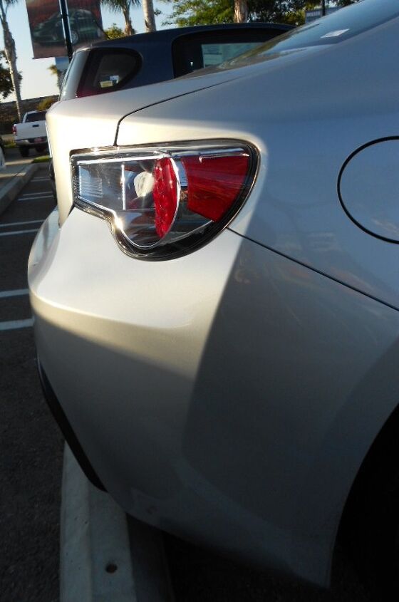
Far less annoying is this subtle Bangle Butt on the rear. Trunks don’t need flame surfacing, nor do they need a solid chunk of chrome tail light for no good reason. Don’t make me wish this was an AE-86 liftback instead!
The Bangle Butt goes up. The bumper slides down like Homer Simpson’s gut. The trunk thinks it’s a 1977 Mercury Cougar for a new millennium. I really hope Toyota cleans this mess up in the mid-cycle refresh.
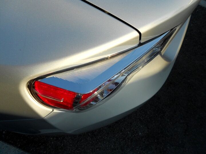
Flush-mounted tail lights would help too. The chrome spear adds another layer of gravel to this talus pile of FAIL. Imagine lights that are flat and form-fitting, and the FR-S could have more of a Lotus Elise “cove” treatment instead!
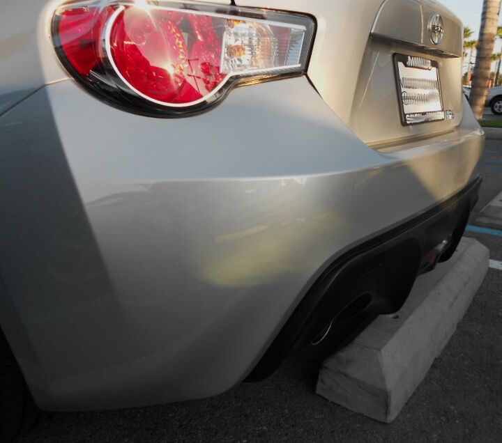
Another problem: the flat face of the trunk fights the downward sloping curve presented from corner-to-corner of the bumper. I’ll go into further detail, three pictures from now.
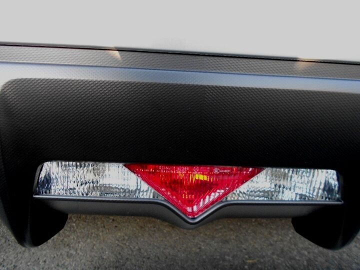
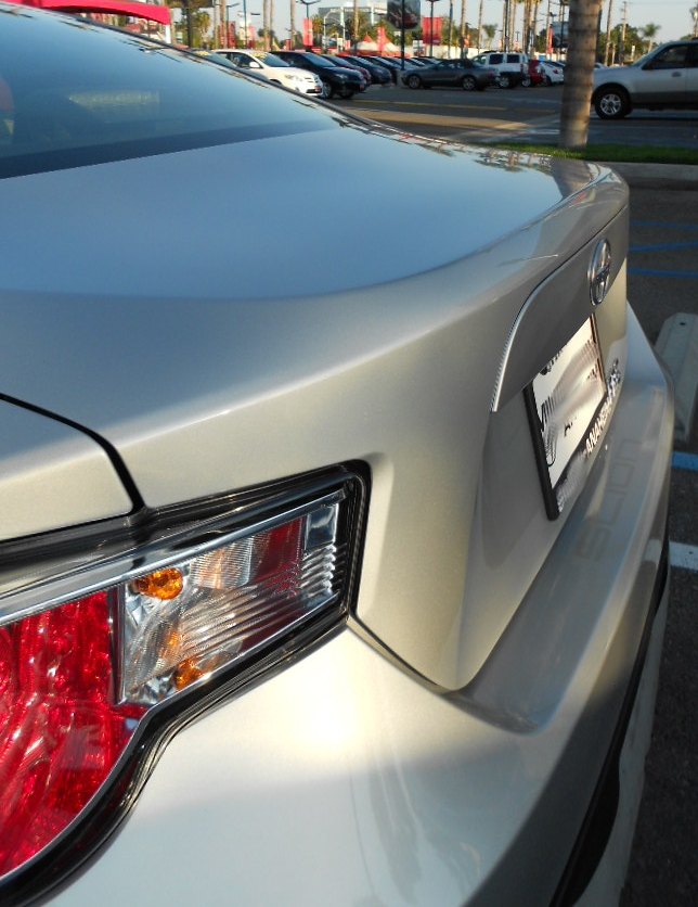
I guess the red triangle in the backup lights is cool, but it is another busy element to this convoluted rear deck. It also reminds me of the over-the-top literal rotary theme on the Mazda RX-8 in the same place: considering their flawed engines, is it no surprise that both of these machines have this quirky styling element?
I’d prefer a smaller version of this emblem on that massive plastic mustache above the license plate instead. Leave the Scion emblem in its place, but shrink it down a good 25% too. Then put “FR-S” in the lower RH of the mustache. Maybe emboss it into the plastic…nah, that’s a bit much: stream of consciousness writing FTL.
Remember what I said about the trunk needing a little slope? If it leaned (from the top, leave the bottom’s location as-is) juuuust a bit, if the signal light didn’t thrust toward the center of the trunk so violently, there’d be a sweeter face to this sour puss.
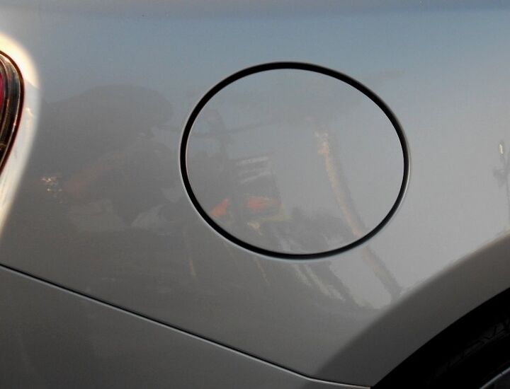
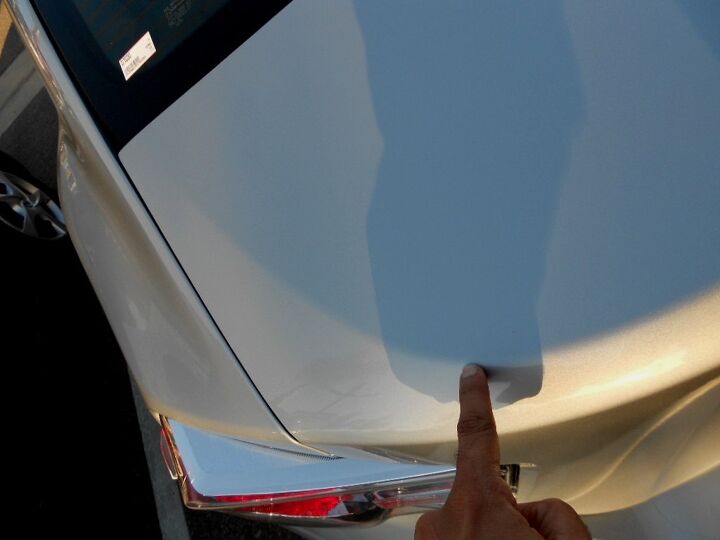
The gas filler door is slightly melted over the fender bulge, but not bad enough to offend. Safe!
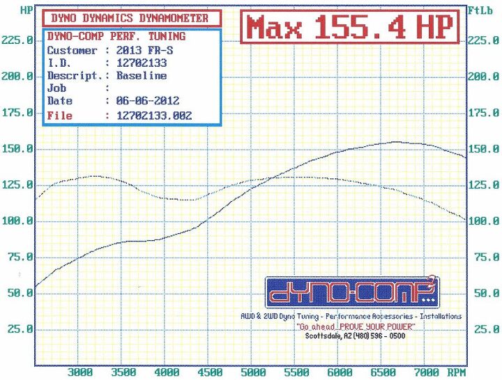
One last curve: now you know why my professors/classmates at CCS said my automotive passions handicapped my designs! How slow can you go? Sure it’s got a pretty face and a lovely hood, but open the bonnet and the FR-S’ retro-futurism officially failed.
Thanks for reading, I hope you have a great week!
More by Sajeev Mehta


Comments
Join the conversation
I just love these! What amazes me is that it would seem that the mess at the A pillar would be cheaper if it was done right instead of that mishmash. Fewer parts count and easier assembly. One thing that I really like about VW's, especially the Golf, is that attention to detail through engineering and styling that makes so much sense once you really look at it.
Thank goodness you didn't critique the interior, because as much of a mess as the exterior is in places, the interior is just horrific.