


The Wrong Typeface Can Kill You. Unless You Are A Woman
Researchers at MIT’s AgeLab finally have proven what designers have long suspected: Some typefaces are easier to read than others. Because this would be a boring message, and because the New England University Transportation Center and typeface vendor Monotype were also involved in the study, the researchers put it in context with in-dash menus. And came to the conclusion that the choice of typeface is a matter of life and death.
Bad: Eurostyle

A white paper released recently reports about two studies which found that the Eurostyle typeface commonly used in many vehicle device displays takes more time to read than the more elegant “humanist” style typeface. The blockier Eurostyle was traditionally preferred in electronic display because it did not break up as easily at lower resolutions.
Good: Humanist
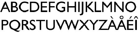
Among men, a “humanist” typeface resulted in a 10.6% lower visual demand. To make it, um, more eye-catching, researchers said this “difference in glance time represents approximately 50 feet in distance when traveling at U.S. highway speed.” Which, says IT World could be the difference between a close call and an injury — or worse.
Oddly enough, the “impact of different typeface style was either more modest or not apparent for women,” says the study.

Bertel Schmitt comes back to journalism after taking a 35 year break in advertising and marketing. He ran and owned advertising agencies in Duesseldorf, Germany, and New York City. Volkswagen A.G. was Bertel's most important corporate account. Schmitt's advertising and marketing career touched many corners of the industry with a special focus on automotive products and services. Since 2004, he lives in Japan and China with his wife <a href="http://www.tomokoandbertel.com"> Tomoko </a>. Bertel Schmitt is a founding board member of the <a href="http://www.offshoresuperseries.com"> Offshore Super Series </a>, an American offshore powerboat racing organization. He is co-owner of the racing team Typhoon.
More by Bertel Schmitt


Comments
Join the conversation
I haven't paid attention to the "font" in any of my vehicles ever. I prefer white face "gages" and know that in my current ride that 3000 rpm steady on flat Illinois Highways in 5th is 70 mph (yes, I'm courteous enough to hang out in the right lane).
Does a typeface annoy and distract me? Sometimes, but I generally adapt to anything pretty quick - the key to survival and a low-stress life. The movie "2001: A Space Odyssey" prominently highlighted the Eurostyle font, also called "Microgramma". I liked it and thought it was very technical and modern. I really like Helvetica, too, as JCPenney loves to use. Arial? Yes, I default to it on all my e-mail settings because it is so easy to read. One of my graphic arts teachers taught us: "When in doubt, use Caslon"! Sometimes that works, too. The only thing that irks me, no matter what typestyle, is when auto name and alpha-numeric emblems are affixed crooked. I'm looking with aching eyes at you, last-gen Camry! Glad Toyota fixed that.