


Vellum Venom Vignette: Restyled 2012 Nissan GT-R

by
Sajeev Mehta
Published: July 17th, 2012
Share
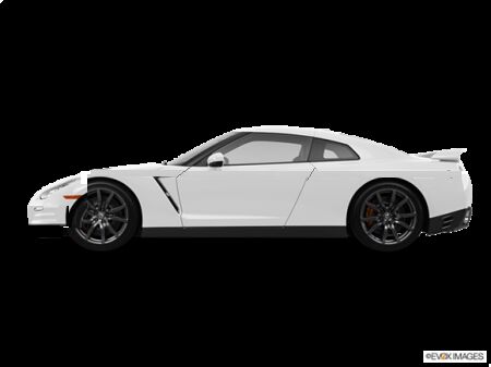
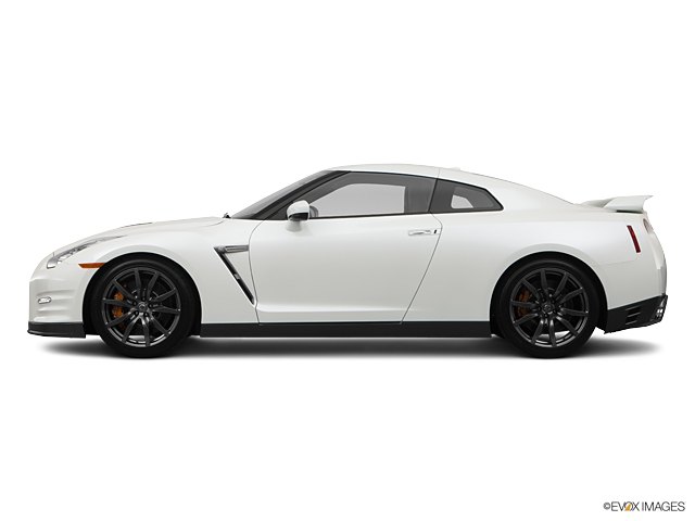
Christopher writes: Sajeev,Great analysis of the GT-R. Slow day at work, so I decided to cut a few inches out of the middle as you suggested (maybe more than just 2″…). Please excuse the crappy “MS Paint” editing and my poor editing skills… but I still think the profile looks so much better. Like a real super car. And it eliminates the fake fender vent!
Sajeev concludes:
One of the B&B’s counterpoint to my analysis was that the GT-R is massive and not especially pretty by design, compared to other vehicles in this class. Which is 100% true. But does that mean the GT-R should be massive like a CUV? Absolutely not! Thanks for proving my point, but you did take a little too much out of the middle. But still…
Your quickie redesign takes the GT-R back to the 4th and 5th generations of the Skyline GT-R: long, low and still pretty dumpy looking. That’s the way I like my GT-R. Welcome to The World of Proper. And, to wrap things up, here’s the original photo with your modified photo.
More by Sajeev Mehta


Comments
Join the conversation
I think the current GTR's nose just don't have that blunt-ness that the older ones are known for. They weren't supposed to be GT/Sportscar in the sense of a Z or something, but they are more along the line of more ordinary cars with muscle pills....R35 is kinda somewhere in between....
With all respect, this is plain wrong and not an improvement aestecially. The Skylines of yore were never meant to appear sleek. They were always rather bulky, but handsome/cool looking vehicles. I think the R35 better represents this than your rendering.