


Vellum Venom: 1989 Ferrari Testarossa (RIP Sergio Pininfarina)

It was 1986. One of the cruise ship’s ports of call was Puerto Rico. At a local gift shop, a 9-year-old boy received his first “nice” car model, a 1:18th scale Ferrari Testarossa. He’d spend far too much time in his stateroom, with no lights but the small bedside reading light, turning the model while admiring how the light danced over the curves and edges of Ferrari’s most influential car: a World Car in every way. The vehicle that refined the Super Car. It defined a decade, and warped the minds of several generations of car enthusiasts. And it took this boy to a Motown design school, and eventually to a little car blog called TTAC.
Sergio Pininfarina once called the Testarossa “an exaggeration in flamboyance.” A fitting quote for what must be the most famous vehicle to leave his design studio. And while he might be right, compared to today’s flamboyant Fezzas, the Testarossa was veiled in understatement and modernist modesty.
So let’s dig deep into the Mehta Brothers garage, and check out Dr. Mehta’s 1989 Testarossa: a car we’ve wanted for decades.
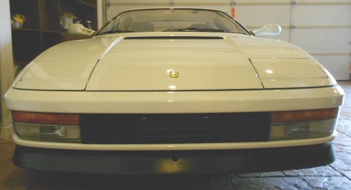
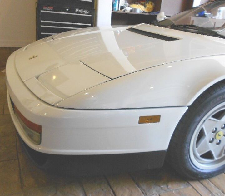
Oh yes, the Testarossa is an icon, especially in Miami Vice white. But what made this icon so unique was the lack of flair in the typical areas. Chrome grille? Nope. Angry eyes and a pointy beak? Nope. The Testarossa sports a modest black egg-crate grille, grinning fog lights, a deep chin spoiler (masking its size via black paint) and a borderline bland hood. But look how the hood bulges meet with the head lights, which meet with the fog lights. The harmonious lines work almost too well: this is almost boring in comparison to its 512BB predecessor and 512 TR successor. But those machines were so busy! This is beautiful.
This car is so subtle it hurts. Even better, this US-spec Testarossa (TR) shows how well-integrated “our bumpers and lighting pods worked with the package. It was the hallmark of this vehicle, as the TR was the first Ferrari to successfully globalize the brand…in such a tumultuous time in Automotive History. This was no small feat for the design team involved.
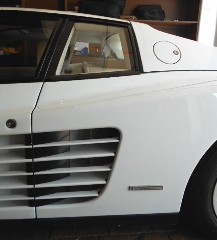
Even this cooling duct barely makes its presence known. A good thing, as there’s only one on the bumper…which leads to an asymmetric design. Why many owners paint this item body color is beyond me. It ruins the look.
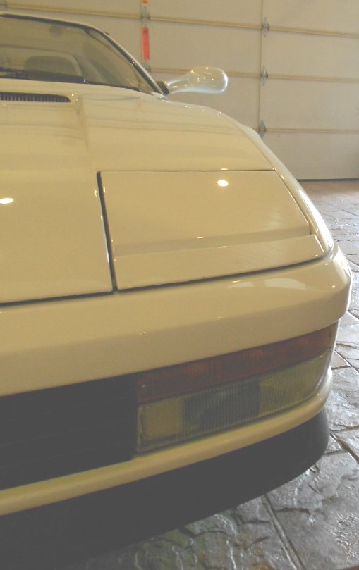
So my only real problem with the front end is the filler panel between the headlights and the bumper. I wish the hood was incorporated into this part, even though I know it would be a borderline impossible task.
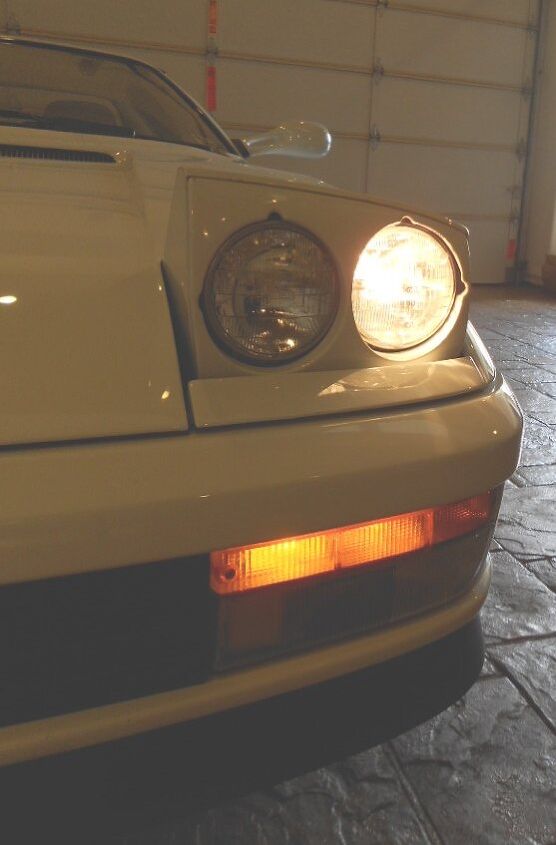
Pop-up headlights need to come back, in a big way. The Testarossa looks great with the lamps up, as their taper adds another complementary form to the package. To the nay-sayers that suggest that these items are complex and harm aerodynamics at night, I suggest you quit pretending you are a 24-hr Endurance racer and get back on the right side of Automotive History.
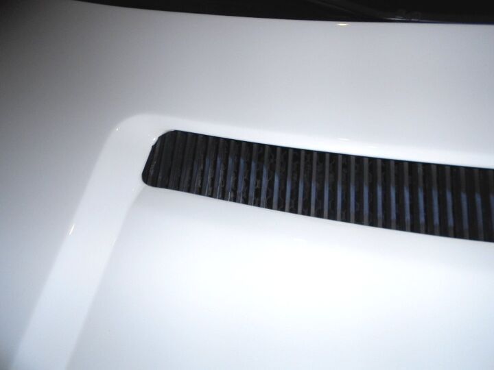
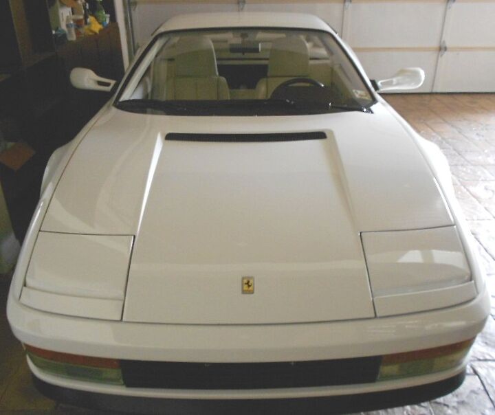
This subtle grille emulates the far more famous engine cover on the back. The picture doesn’t show the fine craftsmanship tucked under the hood’s sheet metal, but the little aluminum louvers are a slick affair.
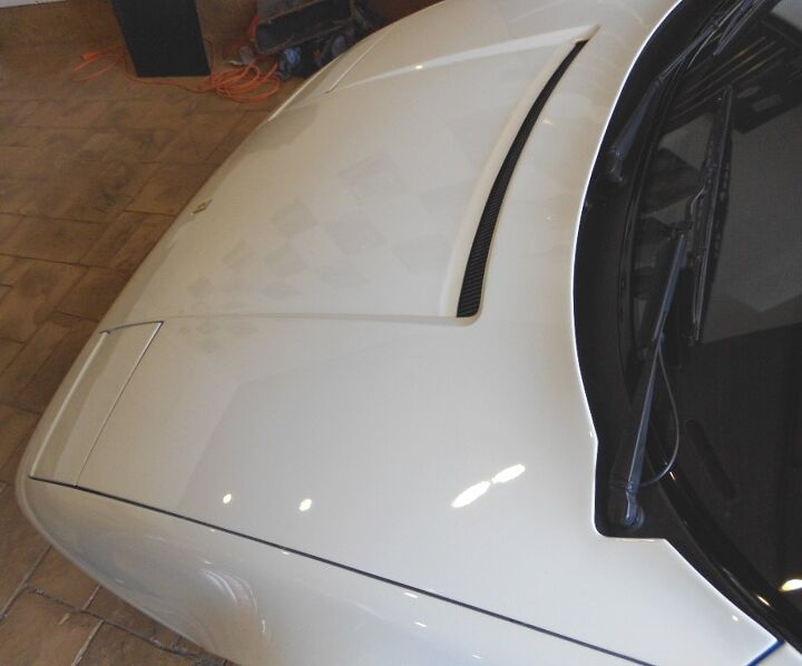
Then again, if you need have the wiper arm at a certain point, why not just cut a divot in that hood? You did a bang up job elsewhere, so let’s just hope people don’t mind this! Honestly, the wiper arm cut is so ballsy that I can’t help but admire it as part of the TR’s character.
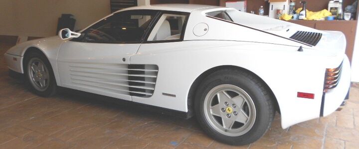
That’s a lot of front overhang. While I find it beautiful, it’s a bit much from a straight side shot. But long noses make for lower noses, with less surface area to multiply the effects of drag.
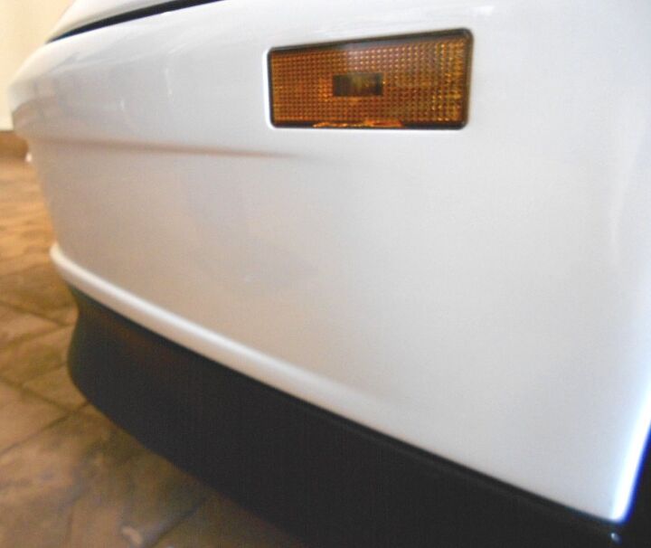
But note the scalloped contouring from the fog lights to the side, complete with a side marker light that met US regulations and managed to look like part of the whole, not an afterthought. Beauty comes in many subtle shades of gray, so to speak.
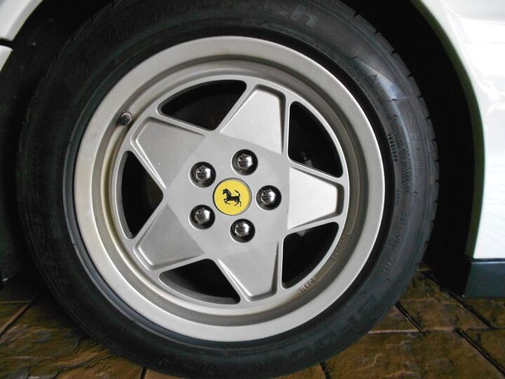
This 1989 model doesn’t have the single bolt, TRX metric, design wheel. And while some originality is lost, the flat faces of this 5-spoke affair are pure minimalist design. Note how the center “floats” inside the rim, and the spokes bend inward oh-so-gently. Damn.
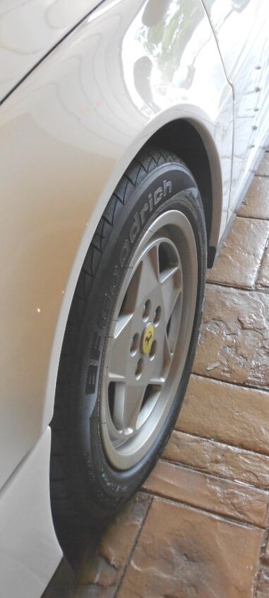
These wheels are very flat indeed. Much like a Toyota Prius, I suspect they also do a fine job cheating the wind. And the subtle fender flares leave you no sign of what’s coming before you get to the rear wheels.
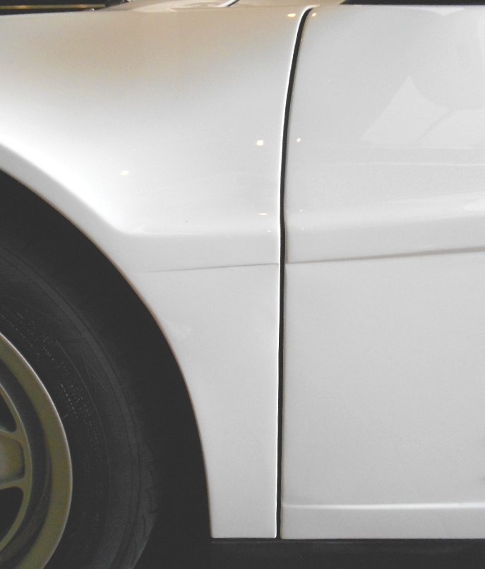
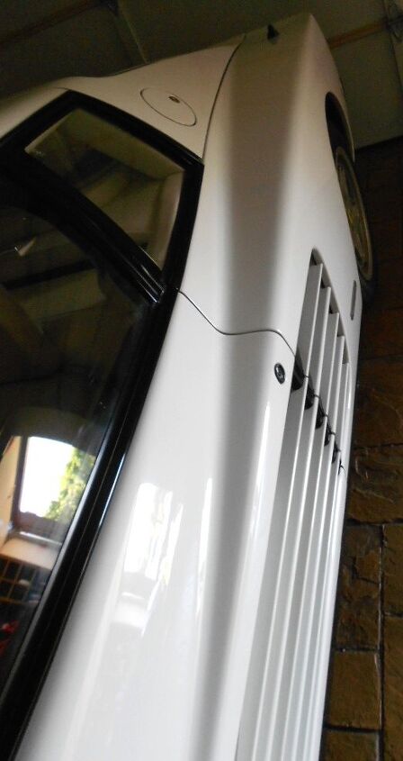
The A-pillar to fender to hood meeting point is a little odd. Much like the dead space between the headlight and front bumper, I wish this oddly shaped A-pillar ended at the base of the windshield, and the hood took up that real estate instead. Sometimes I wonder if Sergio Pininfarina thought the same thing.
Look at the fine dots at the top of the windshield: the shadowing effect of these can’t be shown well on camera. But this was a design hallmark of many vehicles from this era, and I truly miss it.
This rain gutter was probably acceptable for the day, but I wonder what a modern designer could do with a lot of fancy CAD drawings and new-age plastic castings. That said, I like how damn near everything on this body is made of aluminum, not a chintsy part in sight!
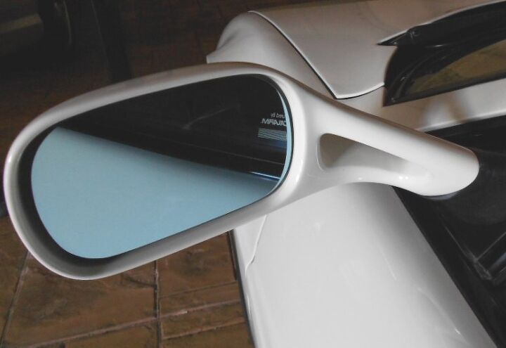
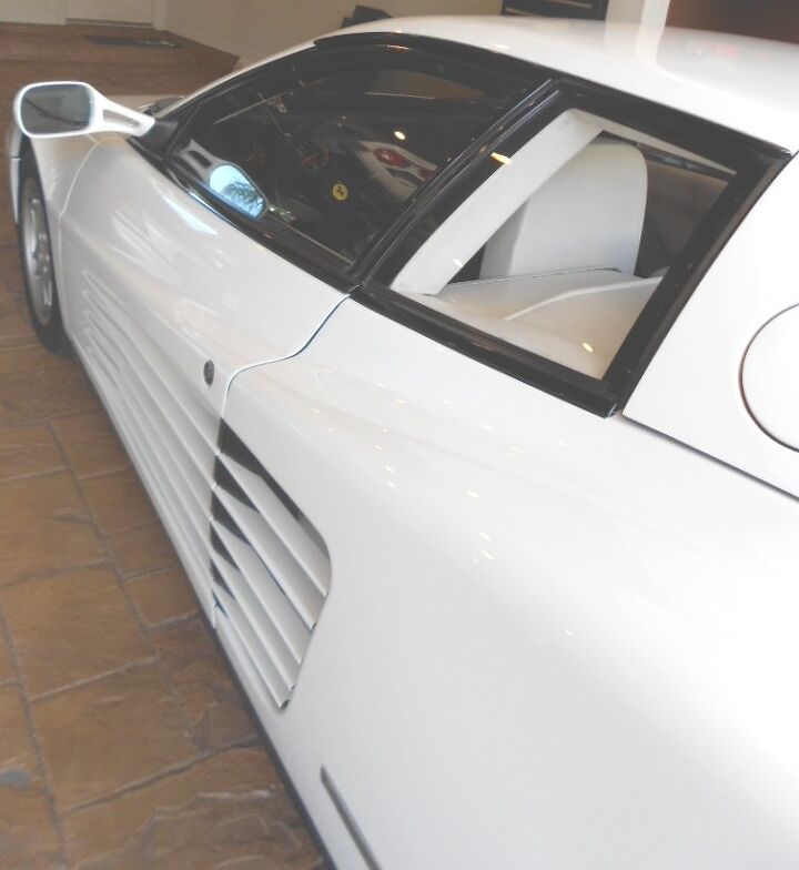
The Testarossa’s rearward visibility was quite good, especially compared to the Lamborghini Countach. These wispy mirrors certainly helped, and proved that Pininfarina sweated the details…in a time when Italian Super Cars were loved for their horribly quirky nature. No excuses, no compromises with this car.
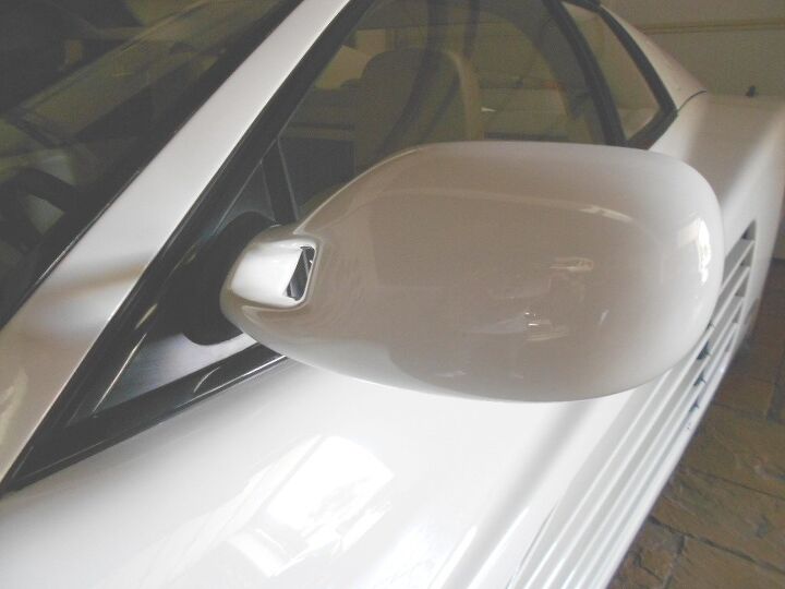
Well, sort of: the original Testarossa had a single mirror that sat at the top of the A-pillar. It. Was. Awesome.
But this design is far more effective and doesn’t detract from the whole package. Even though I wish this was a single “flying mirror” TR.
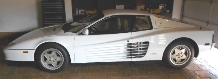
Finally, the side view. Massive front overhang, but the nose sits so low compared to the front wheel. This isn’t possible with today’s Eurozone safety standards, which is tragic. The TR simply has more presence than any other Ferrari on the planet. Which is a bad thing, if you ask your average Ferrari club member. And I have. And the Fanbois can all go pound sand, because this is the car that made Ferrari an international sensation with rock star levels of mainstream appeal.
THIS IS THE ONE.
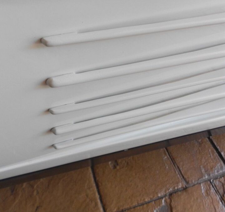
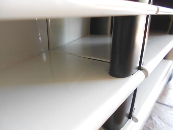
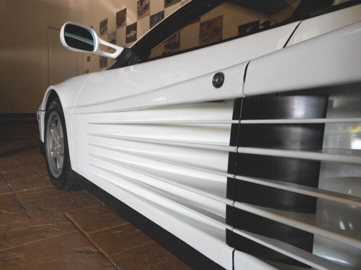
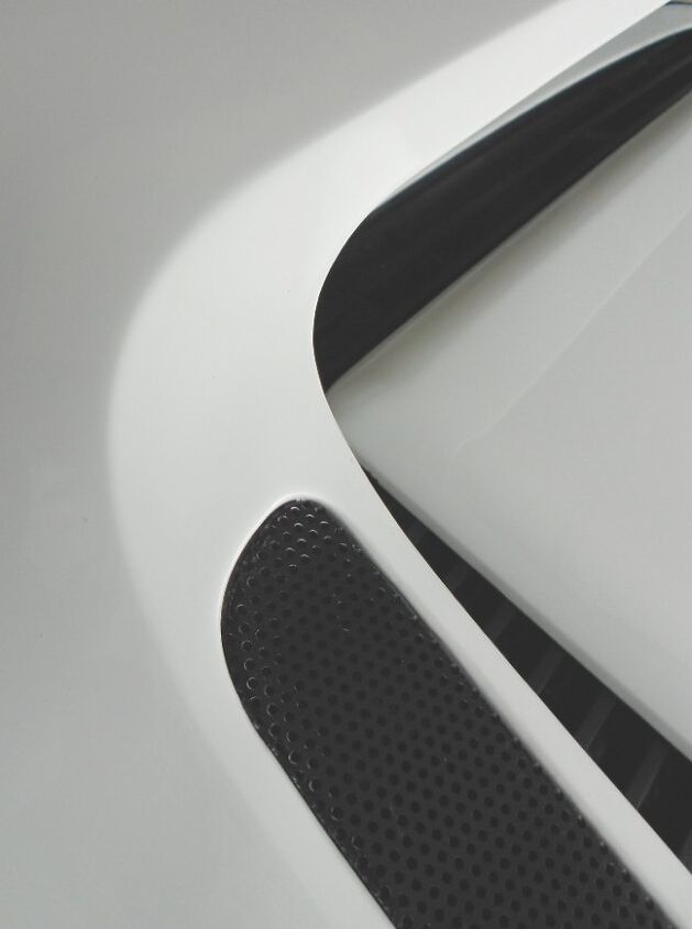
We all know the insane Testarossa body scoop, but have you looked at it from up close? Note how the aluminum strakes are clumsily attached: some sort of slip fit (flush to the body) woulda been nice.
The strakes meet with this black air diverter thingie, forcing air into the radiators. Black paint does wonders at making you overlook things that shouldn’t be there. I wonder if modern technology could improve on this, without ruining the look.
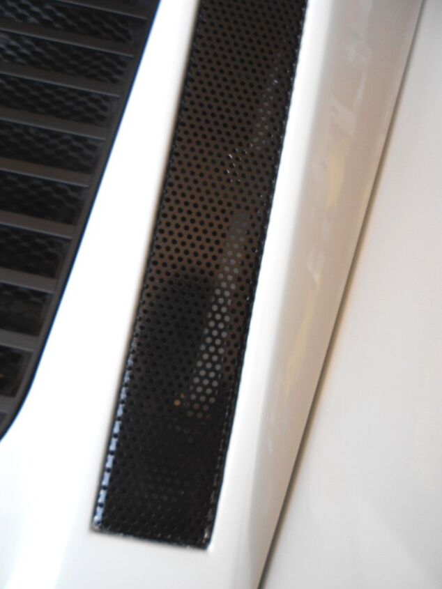
Note how the door’s strakes meet with the ones in the quarter panels. Not a very good fit, but it gets the job done. This car is an amazing piece of architecture, in many respects.
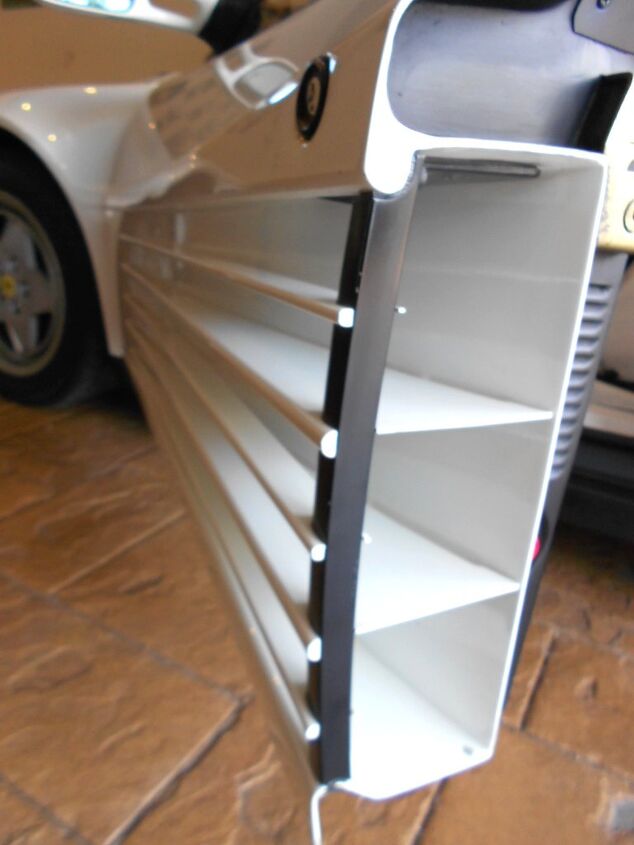
Each element of this design is made from an individual sheet of aluminum. It’s completely awe-inspiring in person. And tragic, because nobody will ever have the balls to do this again on a production vehicle.
Welcome to an Icon of the 1980s. Static, architectural elements (the big scoop and the boxy glass) meet with strong, fast, thrusting forms to make the dream vehicle of many a child. Will we ever see an Icon of this scale ever again?
That quote from Sergio is more than apt from this angle. Wow.
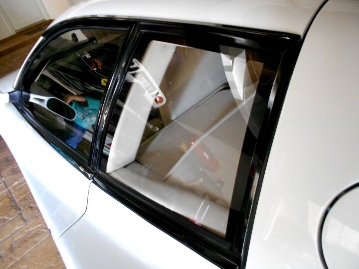
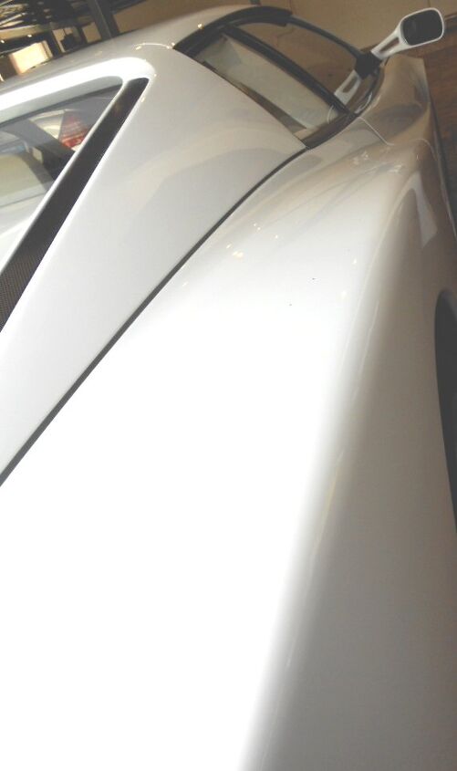
How can such an amazing Super car wear a quarter window so unbelievably boxy? Why did we (Gen X-ers) all have a poster of this ride on our bedroom walls?
Tumblehome, that’s why. The way in how this square pulls inward as it meets the roof is positively fantastic. You can see the “rake” of the tumblehome in the shape of the white trim behind the B-pillar. This is how you take a hard nosed form and make it round…without actually needing a round shape!
And yes, this is a White on White example of Pininfarina’s most famous (?) designs. If my (unverified Internet) research is correct, us Mehtas own 1 of 4 ever sold in this configuration to the USA. And yes again, I have every Miami Vice episode on DVD. Believe that.
While the cooling ductwork is excessive and insane, that’s only when you see it up close. With the whole package, we see that Pininfarina’s design studio integrated the form: adding a similar theme to the rear fascia and the engine cover. But I’m not done with the side just yet.
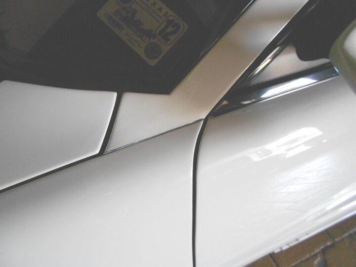
The insane side treatment also has a borderline criminal application of a wide body kit. No car has ever matched this body, so let’s start from the top. And a nit to pick: why does the top part of this wide body start at a natural point at the wheel well, while the bottom part begins at the door? I really wish the line started somewhere between the beginning of the wheel well and the midpoint of the fender, at that location. It would feel much more organic. And yes, this is a very organic design, even if the modern wedge shape is truly jarring.
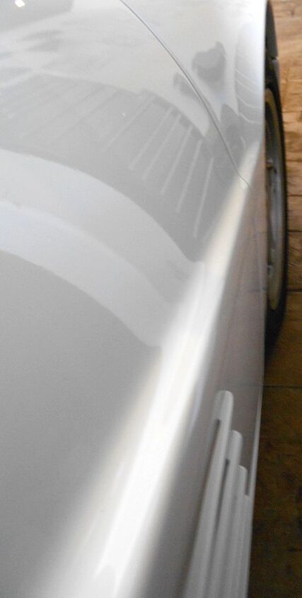
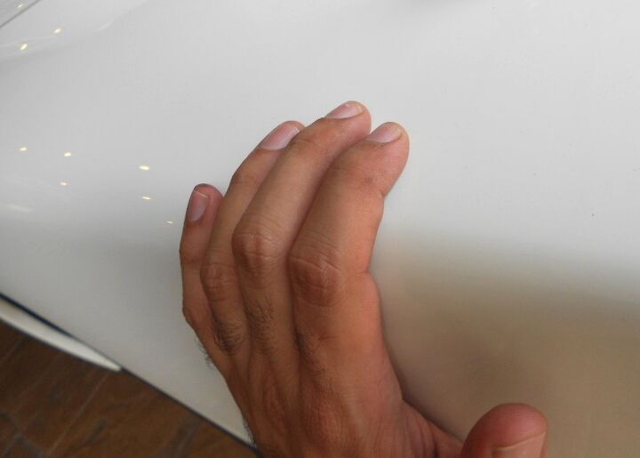
Back to the genesis of the wide body. The point by the front wheel is so tiny that your pinky finger can’t rest on it. If that means nothing to you, scroll down to the next picture.
You’ll need all your fingers to cover the wide body’s form by the time you reach the middle of the door. Towards the end of the door, your pinky and thumb are stretching apart to mimic/measure the space.
And when you reach the end, well, let’s just say that most people can’t cover the width with their hand. It’s upsettingly wide, but toned down by the gentle curve in the form, and the stunning amount of tumblehome in the glass. Simply put: it works.
No caption necessary.
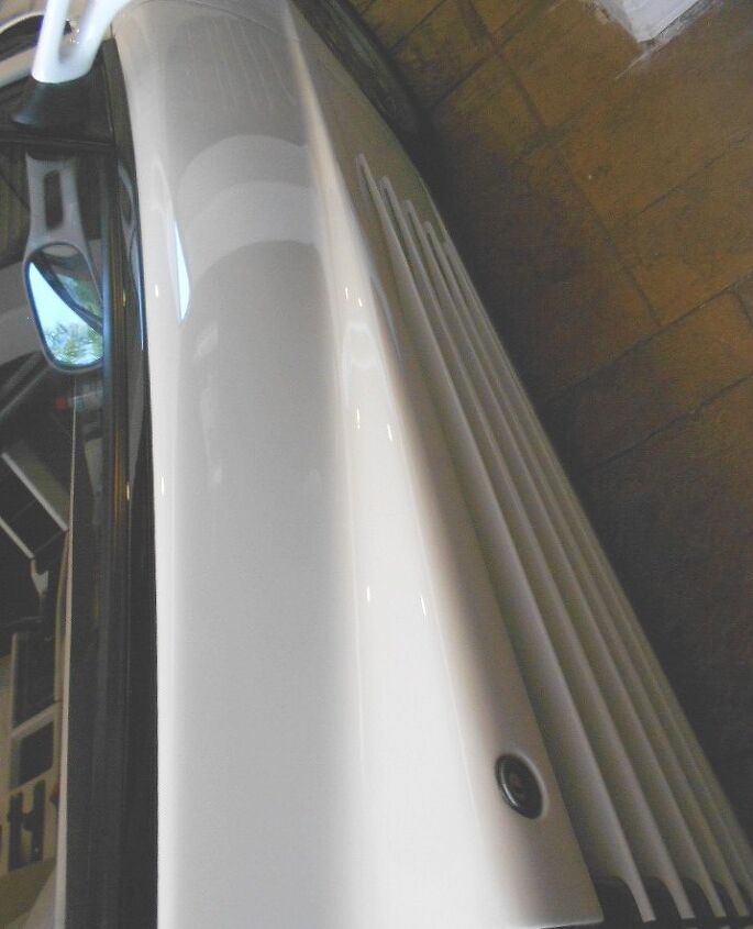
I’ve touched on the Testarossa’s fantastic blend of hard edges with soft curves. Here’s my hand following the wide body on the quarter panel. It’s a lovely curve, and keeps the TR from being a cut-rate hack job (did I just say that? ) like its Countach counterpart.
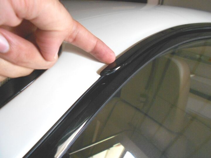
And to make sure the roof isn’t boring, there’s a nice hard bend at the rear hatch. No soft and forgettable transition here, which is just what the doctor ordered.
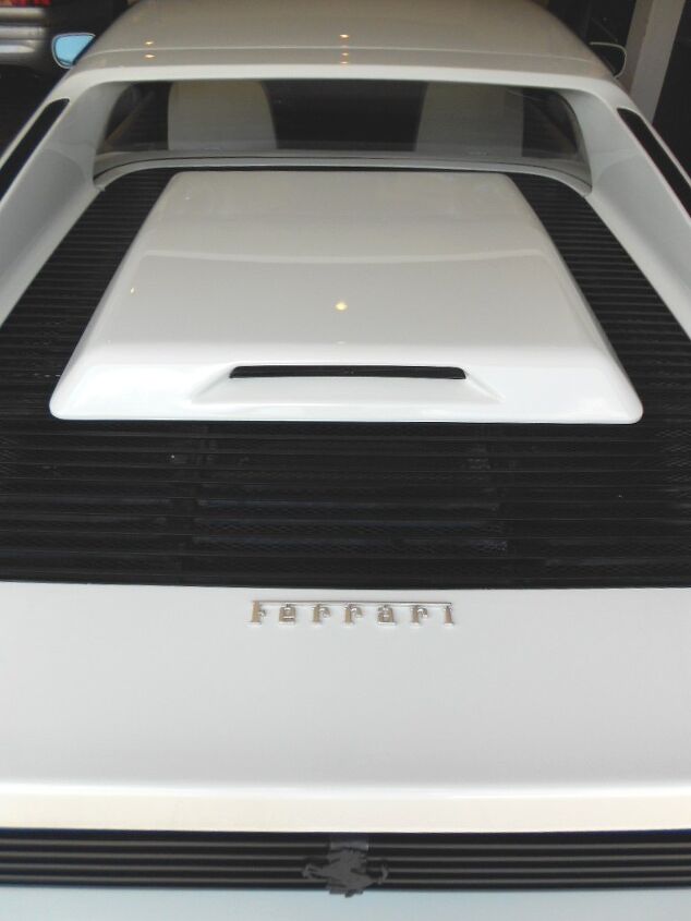
This same part on the hatch doubles as a passive venting/cooling duct for the radiators. It is absolutely brilliant in execution, and I long for the day when modern Ferraris do something this simple, yet so damn functional.

The slats on the hood integrate the Testarossa’s theme so well. And touching them just feels right: like damn near everything else on this machine, they are aluminum. Super Cars are expensive for a reason!
As if to stress the Testarossa’s massive tumblehome, the tapered rear window and massive buttresses in the hatch are an unspoken element that blends well into the package. Sure it hurts rear visibility, but you won’t fight the flow when you are one of the fastest (the fastest?) vehicle of the era! This angle is another iconic shot of an iconic car, even if most folks will never consider it.
Also note how the 1986-up models wore a CHMSL (Center High Mount Stop Light) in the engine cover, which was pretty well done. When you consider the Italians lack of R&D funds, this Corvette/Camaro part (yes, really) looks rather wonderful on a Ferrari.
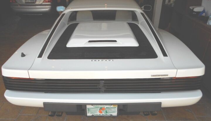
More louvers. Where are the tail lights?
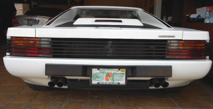
There they are! See how the buttresses add a dynamic element to the blocky and tough rear end? Pininfarina did a wonderful job making the package work. Except for the lights: I wish the reverse lights matched the hatch’s cut line. And that the lights went all the way to the end of the body. Wishful thinking, as you will see in the next two pictures.
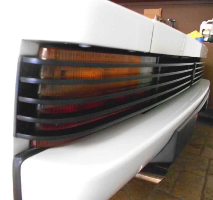
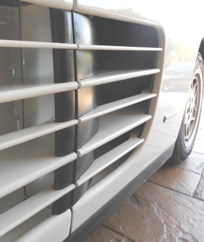
I think it took brass balls to make these flat black aluminum louvers. But without them, imagine how silly the side scoops look! Everything has to play well, otherwise you get something non-Italian, something cheap and compromised.
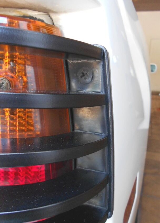
That said, I wonder how modern designers could make these forms integrate much nicer. The gap between the light and the body is pretty bad, and the louvers would look so much cooler if they started at the top of the light! Not to mention the rather cheap and obvious mounting method.
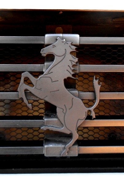
A flat-black Prancing Horse? I wonder if Sergio and Enzo ever duked it out over this one. But, without a doubt, the black emblem was needed to keep the design consistent. Adding the chrome emblem (which many a Fanboi does in a misguided attempt to be more Italian) only adds a big-ass pimple to a super model’s perfect complexion.
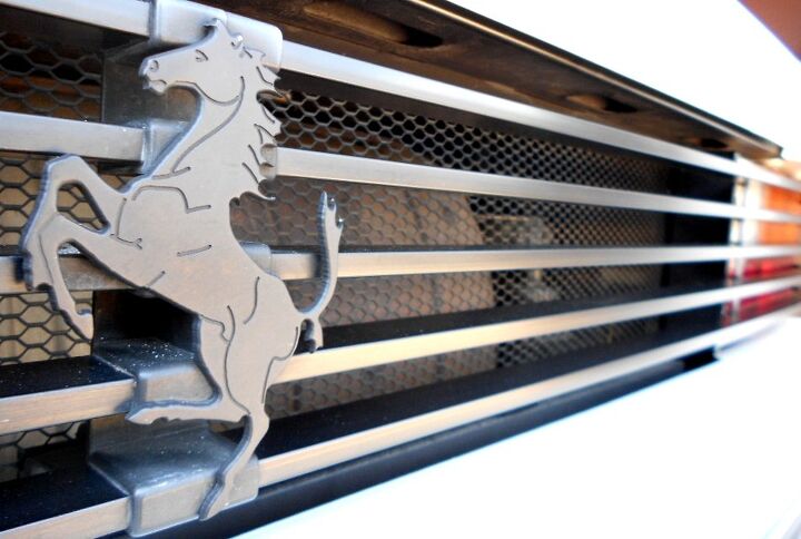
This uninterrupted flow is brought to you by the Testarossa’s former owner, who wisely left this vehicle untouched. Nothing burns me more than seeing Pininfarina’s finest distorted to fit a misguided notion of what a Ferrari should be.
That’s because a Ferrari is whatever the hell Pininfarina says it is.
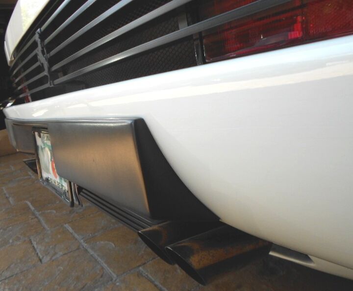
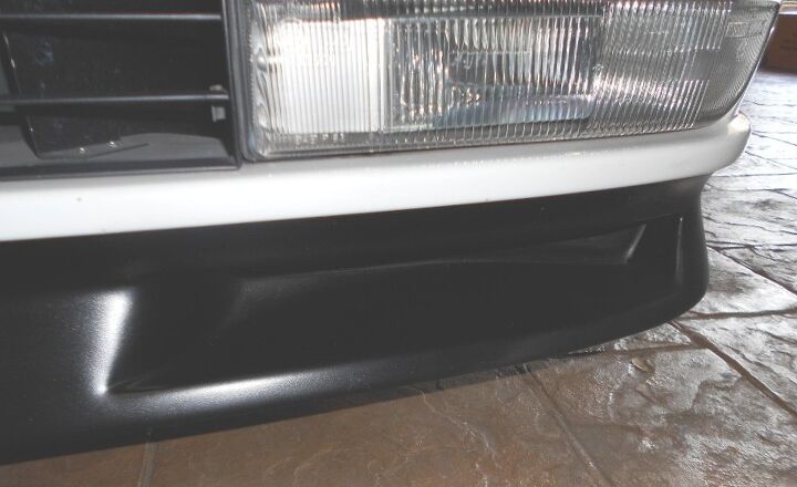
Even the US-spec bumper crash pads are beautiful. They make sense, they are not an afterthought. Pininfarina truly made a successful World Car for the most famous automotive make. Don’t take my word for it, just clock the sales figures.
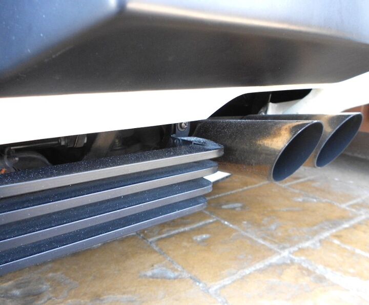
Note the louver theme on the rear diffuser at the bumper. Louvers everywhere, and yet they seem to be almost no where at the same time!
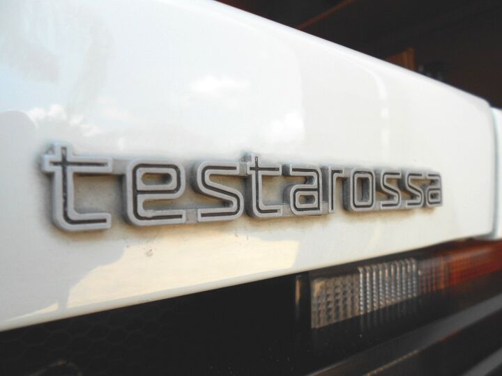
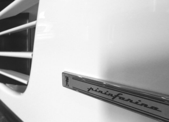
Even the name is written in lower case letters: testarossa. Subtle and almost perfect, just like the rest of the car. Kudos to the design team at Pininfarina responsible for this iconic car, you all definitely made a famous marque into an interstellar sensation.
And you will be missed, Mr. Sergio Pininfarina. Thank you all for reading, have a great week.
More by Sajeev Mehta


Comments
Join the conversation
This is a few years late but I just had to comment. Your styling analysis is spot on...I thought I was the only one to appreciate the true art of this car. I had a very nice UT 1:18 (I think that was the brand) model black TR, and as a teen I would stare at every angle and imagine the care that went into designing every crease and gill. 25 years later I have a real black '85 Testarossa of my own, flying mirror and all. It IS awesome!
I thought of this article from almost 10 years ago when I saw John Temerian's video about the white Testarossa used on Miami vice. What a great writeup Sajeev.