


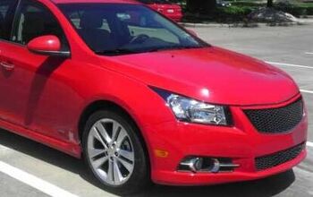
Vellum Venom: 2012 Chevrolet Cruze LTZ – RS

Here’s the thing about design school, and designers in general: you are taught to fully express your creativity…which sounds like a great idea in theory. In reality, there’s very little “reality” in the situation. This is a creative art for profit, by a multinational, publicly traded corporation. Design school students frequently have to un-learn their training if they want to make the nut.
When my freshman year Transportation Design class at CCS was tasked for a third world mode for transport, the teacher chose one country in particular: India. Luckily, since I’ve regularly visited that nation and know a tad bit more about it than most car designers…well, I thought I’d nail this one. Because who in India (circa 1998, and still to this day) can afford a car? Rich people, not the masses with no hope of education and/or career advancement…they stick with their feet or perhaps a motorcycle. Sad, but true.
Would a car maker risk billions in stockholder equity in making a people’s car that ignores the “vehicular reality” of a particular country? I think not. And well before the TATA NANO, I tried to do that: super cheap and cute/ugly design sketches designed around an aspirational point: the 4-door sedan. And sometimes the most formal Three Box Sedan. Because when I think of pushing the envelope in terms of design culture, I think of several other democracies before India.
Unfortunately, my NANO like creations were awful in the eyes of everyone else. I wasn’t trying hard enough at all. Which is fair, if the teacher never suggested that we research the country…socio-economic conditions make just about every piece of Design School masturbation absolutely irrelevant. And quite possibly, stupid enough to bankrupt a car maker.
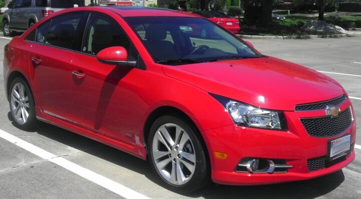
You pay a driver to do things for you, would you really want to sit with him? Absolutely not! This ain’t no damn school, this is Vellum Venom. Case in point, the Internationally designed and suitably conservative Chevy Cruze sedan.
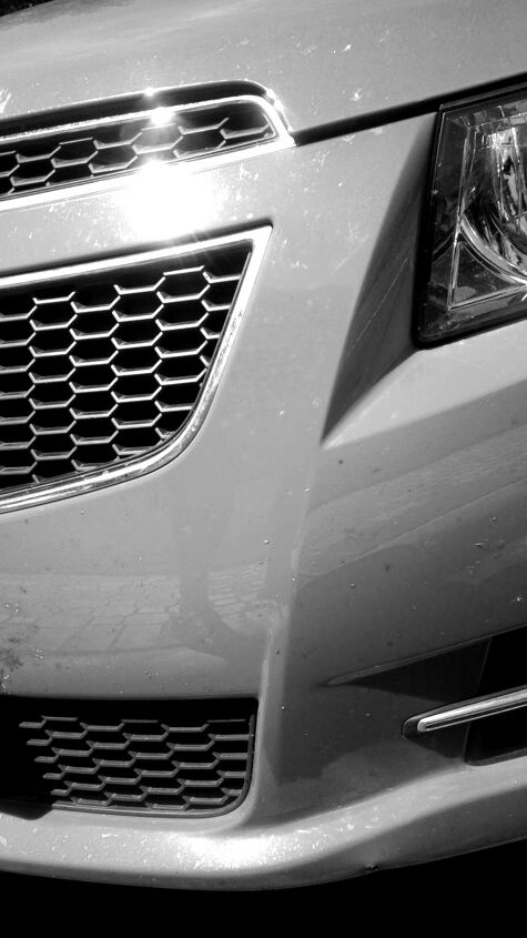
There are elements that work very well here, most notably the headlights’ strong “brow” against the hood and front bumper. My problem is the corporate branding of the Chevrolet grille onto the Daewoo body: it’s so big that it crosses the natural boundary between grille and hood, giving the nose a top-heavy and tipsy appearance. Chevy’s trademark split grille needs the bowtie lowered about 3″, so the hood can “breathe” and clean up the package.
To make things worse, the grille looks even taller because it’s too narrow. If the grille extended to the same end points as the lower valance’s grille, we’d have a far more upscale motor. We’d have a serious threat to all those conservative Corollas. And we do want to beat the Corolla, right?
Yup, a tall and clumsy grille. And even from this angle you see how the grille’s top-tier becomes like eyebrows on one’s face. In the case of the Cruze, it has eyebrows attached to the top of its forehead. And that’s just not pretty.
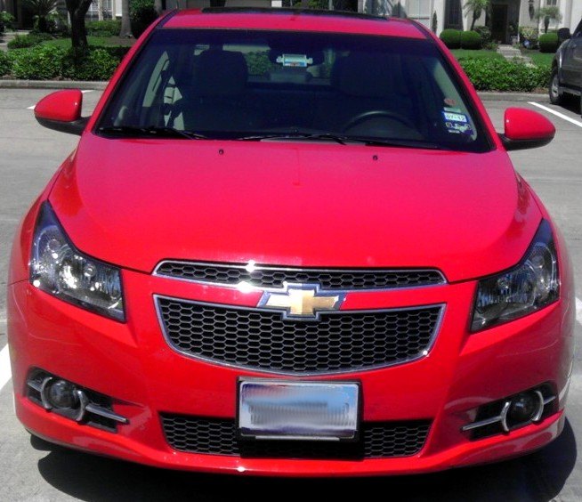
The eyebrow analogy not jive with you? Well, take a gander from here. Imagine if the grille ended at the same height of the headlights! Wow, it’d be a beauty!
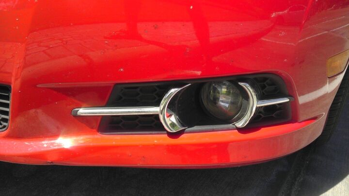
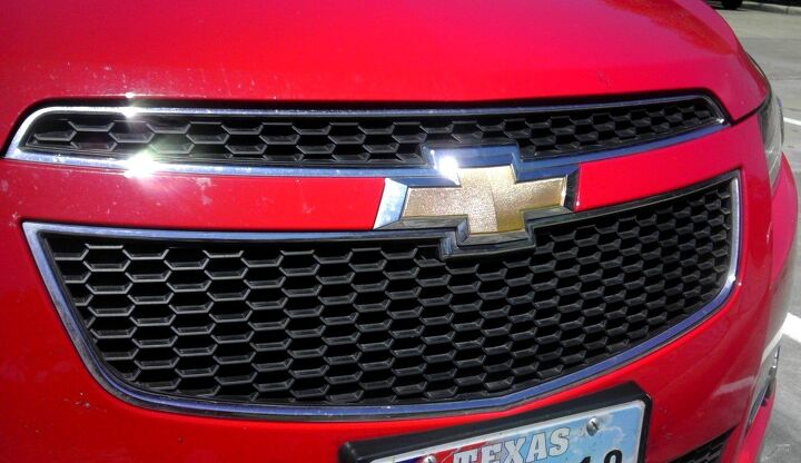
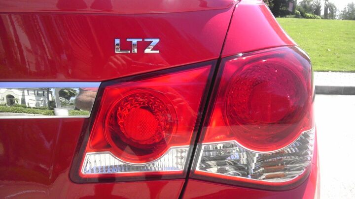
The chrome detailing on this top drawer LTZ model is pretty cool, if a bit corny and obviously tacked on. But at this price, who cares? It’s an eye catcher for all the right reasons.
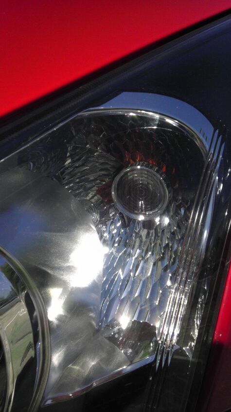
ADHD moment: the honeycomb treatment on this signal light is quite appealing. It gets the job done without resorting to cliché over styling, which happens far too often in cars that need to look more expensive than their window sticker suggests.
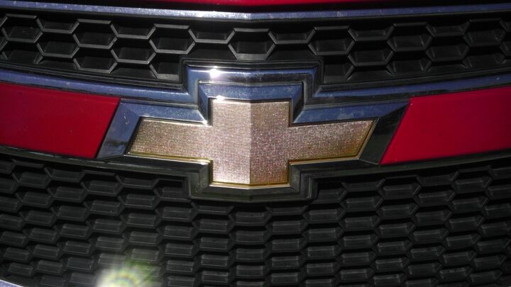
Speaking of, these new Chevy badges have some great material and texture selection going on. While the camera doesn’t do it justice, it makes me more than a little proud of this brand. Ford, Honda, Toyota, Hyundai and the others all have pretty junky brand tributes in comparison.
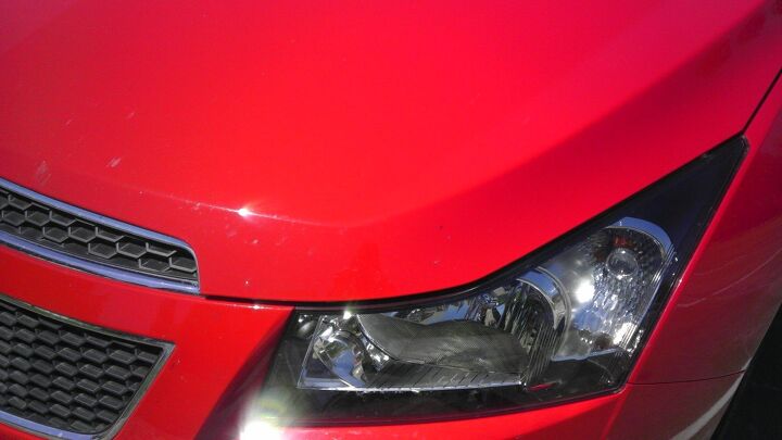
From this angle, perhaps the grille is acceptable, but the headlights are too short. One of them needs to match the other, because the more you see of the Cruze’s side profile, the more you see a well designed compact car.
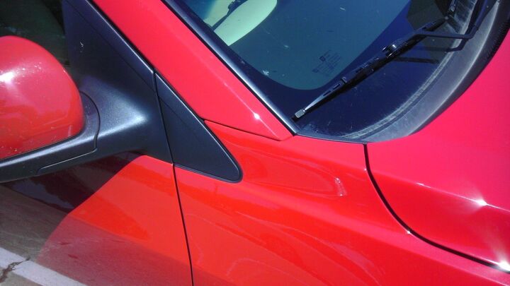
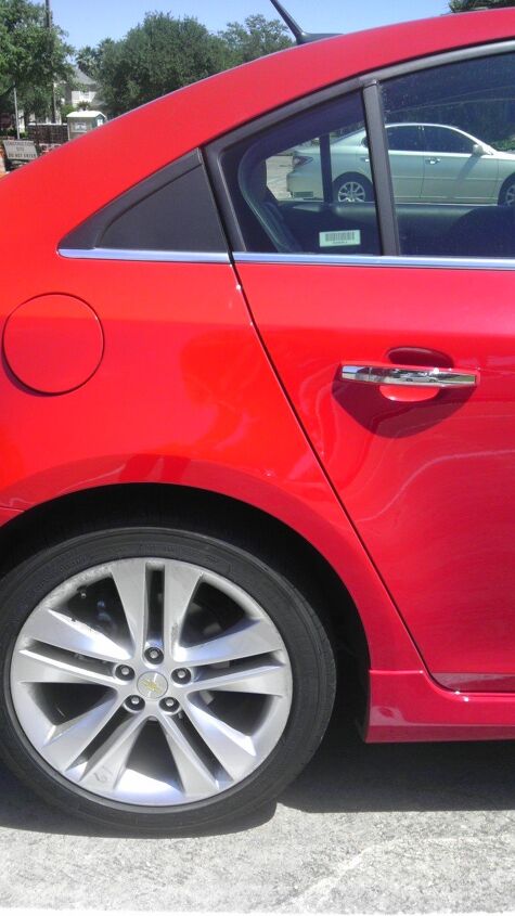
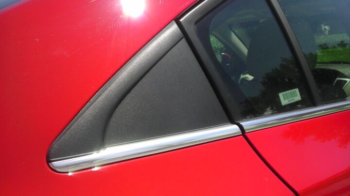
Fender. A-pillar. Door. Hood. They all look horrible butting up to each other in this manner! While that’s far from ideal, the black plastic triangle is just twisting the knife. I feel more venom oozing out of my wound.
Black triangle in full effect = DLO FAIL!
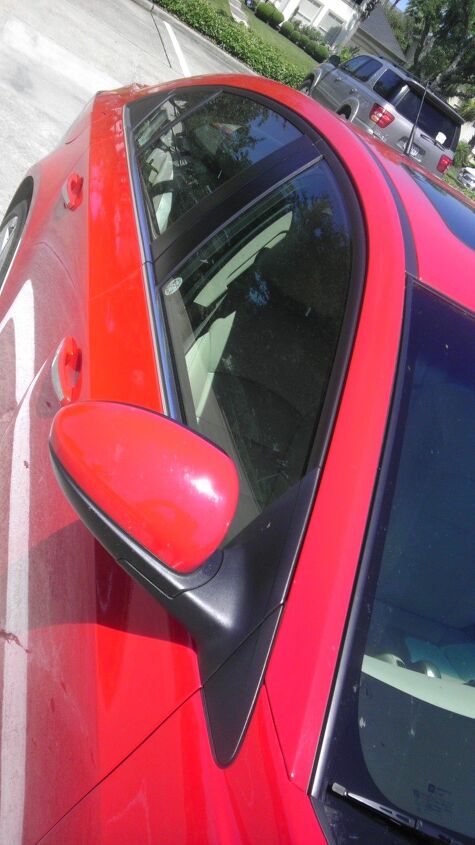
On the plus side, at least the triangle makes sense with the door cut line. No wait, that’s still not acceptable. The Cruze would look upscale (so to speak) and downright lovely if the plastic side view mirror holder (and door cut line) was shaped to eliminate the triangle of DLO FAIL.
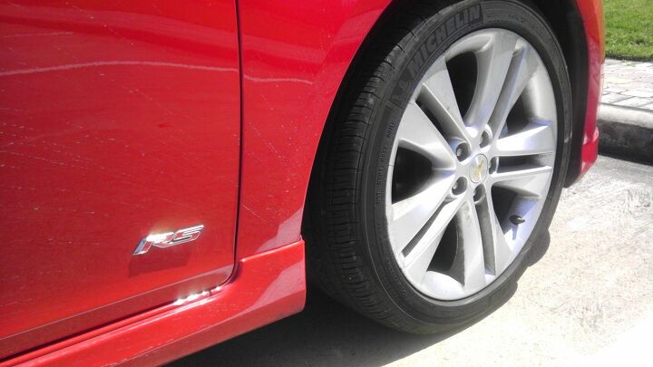
The RS appearance package is a little silly, but the stick on body-kit is far, far superior to the awful Tupperware they glue to the Corolla “S” model. Plus, I do like the upscale RS badging, even if the irony of such a boldly American trim designation used on a Daewoo design is a little depressing.
Hey wait…are those Michelins on a compact General Motors product? Maybe the RenCen is taking the Civic and Corolla seriously this time ’round.
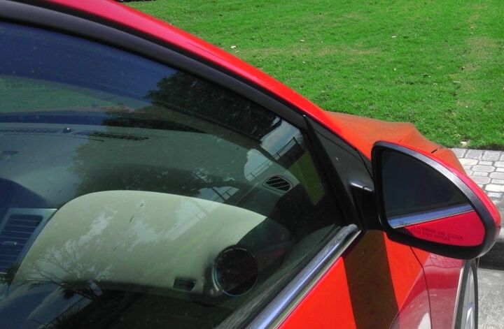
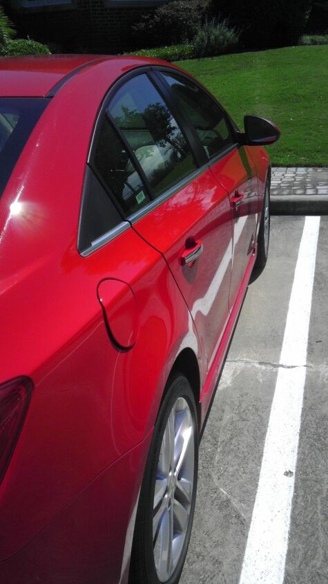
I do my best to avoid interior design analysis in this series, but you can see how the greenhouse complements the dashboard from this angle. It’s very appealing from the outside, and those of us who’ve experienced the Cruze can certainly appreciate it from the inside too. Kudos to the Interior Design folks, they integrated the form very, very well.
Oh my (expletive). The black plastic triangle shows up once again, this time trying way too hard to extend the Cruze’s DLO into the territory of a more upscale vehicle. Once again, it doesn’t work.
What was the right move? Add a little more “hip” to the straight-edged door cut line, going up to a more hourglass shape as it reached the DLO. From there, the rear door glass can elegantly continue the hourglass shape. The smooth curve will look good in both glass and the nearby sheet metal of the C-pillar…thus eliminating the hideous FAIL you see here.
Oh my damn…son!
They even tried to mask this triangle’s hideousness with a bit of chrome trim extension and a contrast texture in the center. If you have to add chrome to your DLO FAIL, perhaps you are being penny wise and pound foolish. Redesign the rear door contour to make this thing unnecessary instead!
Trust me, eliminating something instead of adding chrome is far, far cheaper! Or not.
This angle normally makes the black plastic triangle look more acceptable. But this one is so large that any angle is helpless to the cause. Ignore the impossible to close gas cap, this is a rental..and shit happens to rental cars. Instead notice the clean, unmolested lines separated by only one hard-edged crease.
And while I nailed the CTS-V for its terrible gas cap location, the Cruze’s round door with a hard bend isn’t nearly as offensive as the slimy egg look. Matter of fact, it’s a cool bit of surface tension.
If it wasn’t for that hideous plastic triangle, this would be an absolutely lovely machine. Of this I am certain.
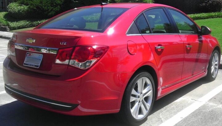
From here I make another case for a shorter deck, more overhang and less of a fastback C-pillar. This would eliminate the bumper’s “double chin” and the need for, once again, the black plastic triangle. And I also hope that one day we don’t need chrome license plate mustaches, as they are totally played out and always look tacked-on.
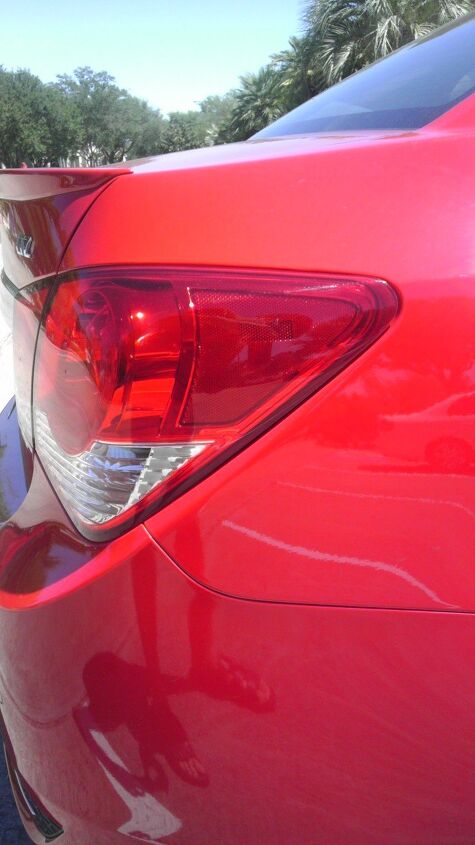
The way the tail lights play into the bumper’s hard downward slope and the smart-looking cut line of the trunk is quite appealing. This isn’t an amorphous blob like so many other tail light designs in this class, it actually works very, very well!
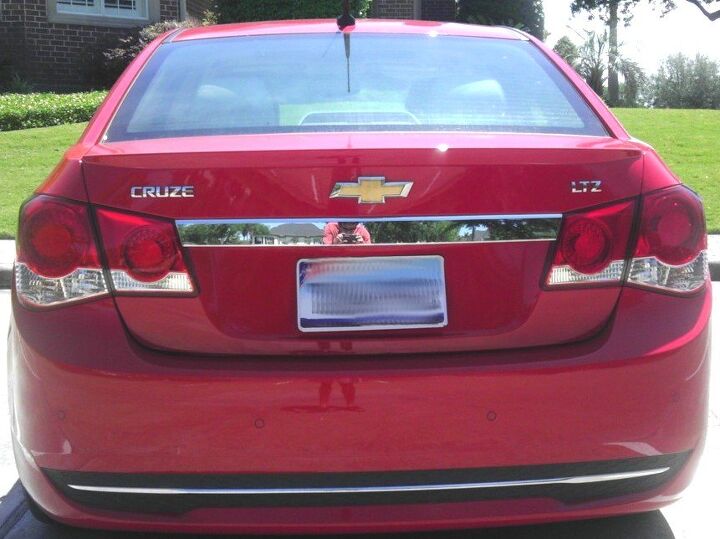
Seriously folks, the chrome mustache needs to die a quick, yet very painful death. It looks tacky and absolutely ruins a lot of hard work done to the Cruze’s rear surfacing. I like the extra chrome trim at the bottom, even though it reinforces the fact that this bumper is too tall…because this butt is too tall.
And I’ll let you mull over the contrast of Chevy’s somewhat famous LTZ trim level sharing real estate with the very famous RS trim level. In the Cruze’s case, RS is just as much of an afterthought as the Corolla “S”. And I think that’s an insult, to a certain extent.
I don’t much care for it, but perhaps someone in the B&B will prove me wrong in the comments section.
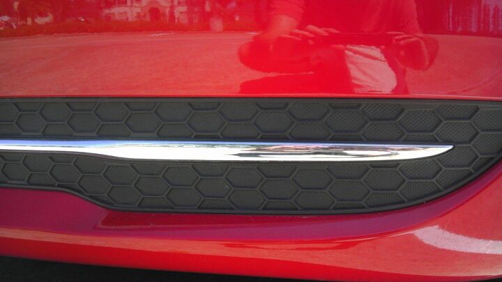
Make note: this kind of trimming is cheap and cheerful, perfect for a car in this price class. When you see gigantic hunks of plastic and/or afterthought chrome accents on vehicles costing far more than a Cruze, like perhaps a Cadillac CTS-V Coupe, it is absolutely inexcusable. But here, yes…it should bring a smile to your face.
Because I am smiling, and you should too.
Thanks for reading. Have a great week.
More by Sajeev Mehta


Comments
Join the conversation
to bumpy ii's comment about the triangle: I think the triangles on the Sebring/200 are so much worse because of the larger door frame - the triangle's cut line doesn't line up with the door cut line. I think glass or glossy black would be an improvement on the Cruze (not good, just better). Sajeev gave some good ideas on how the design could have been done sans triangle. Someone must have really wanted the Audi-like DLO on this car to approve the dreaded triangle.
"Imagine if the grille ended at the same height of the headlights!" Then you'd have a huge area of vertical sheetmetal at the front of the bonnet / "hood". "Wow, it’d be a beauty!" No, it'd look like Boris Karloff in _Frankenstein's Monster_ with that humongous coffin-shaped forehead.